UX/UI Design for CDS Healthcare Platform
Yana Hrynchuk
Problem
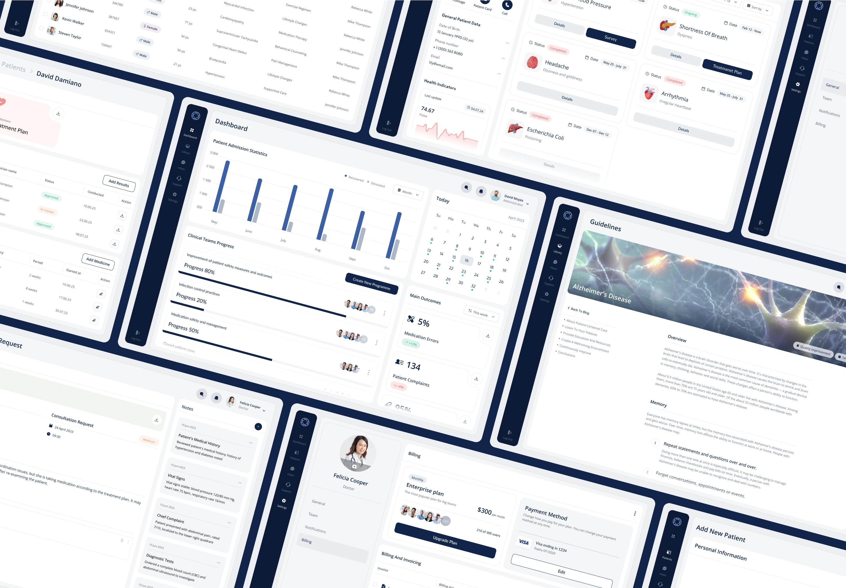
Initially, the platform was plagued by a cluttered interface and convoluted navigation paths that severely hindered quick decision-making—an essential requirement in high-stakes healthcare environments where every second counts. Users struggled to complete even routine tasks efficiently, and the experience was far from intuitive.
Several critical issues contributed to this problem:
Cluttered interface: The screens were overloaded with competing elements and lacked a clear visual hierarchy. This made it difficult for users to focus on what mattered most and introduced unnecessary distractions during time-sensitive workflows.
Convoluted navigation: Users often had to navigate through multiple, unintuitive steps to reach core functionalities. This increased task completion time and created frustration, especially during urgent clinical scenarios.
Increased cognitive load: Rather than supporting users with predictable patterns and clear paths, the platform demanded constant mental effort. Users needed to memorize tool locations and workflow sequences instead of relying on intuitive design.
Inconsistent UI elements: Variability in terminology, icons, and layout across different modules disrupted users’ ability to form mental models, adding further confusion and reducing efficiency.
Scattered access to tools: Essential features were buried deep within the system or inconsistently placed, resulting in frequent delays and workflow interruptions.
These UX flaws not only reduced user satisfaction and adoption rates, but also had a direct impact on clinical outcomes. Delays in accessing critical tools increased the risk of errors and hampered the platform’s role as a decision-support system in fast-paced medical environments. Ultimately, what was meant to streamline and support healthcare delivery ended up adding friction at every step.
Our Solution
Solution Overview:
To address the critical UX challenges, our team took a user-centered and iterative approach, focusing on simplicity, clarity, and task efficiency. Key improvements included:
Adoption of a Minimalist Design System:
Introduced a clean, distraction-free interface that emphasized essential elements.
Reduced unnecessary visuals, allowing users to focus on the most important information and actions.
Restructured Information Architecture (IA):
Prioritized core clinical actions (e.g., patient lookup, order entry, and record updates) in the navigation hierarchy.
Streamlined workflows by reducing the number of steps required to complete frequent tasks.
Redesigned Interface Layouts:
Implemented consistent UI patterns across modules to reinforce predictability and reduce cognitive load.
Used visual hierarchy, spacing, and grouping to make interfaces more scannable and task-focused.
User-Centered Feedback Loops:
Conducted usability testing and interviews with frontline healthcare workers throughout the redesign process.
Gathered continuous input through A/B testing, beta rollouts, and user surveys to validate design decisions.
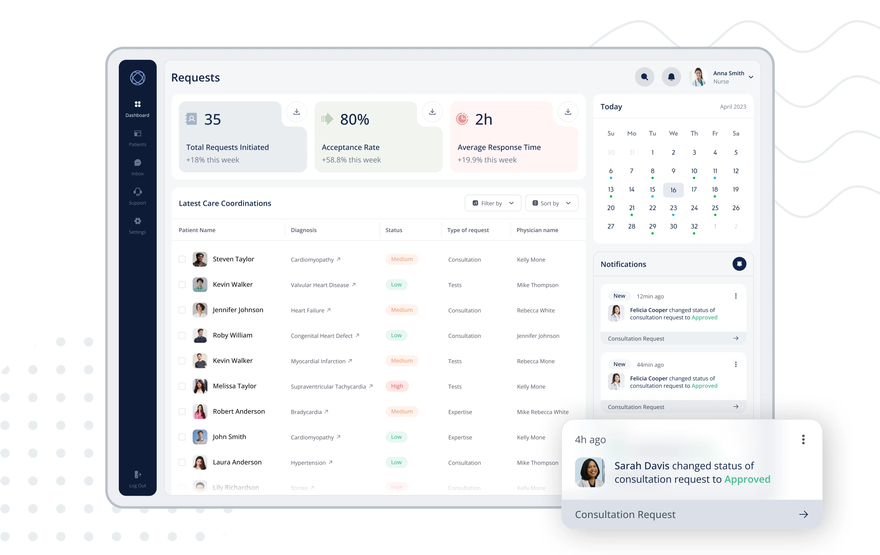
Improved Tool Accessibility:
Surfaced high-frequency actions on dashboards and contextual menus to minimize searching and clicks.
Added intelligent shortcuts and search functionality for rapid navigation in time-critical scenarios.
Outcome-Driven Design Process:
Focused on metrics like time-on-task, error reduction, and user satisfaction to guide and evaluate progress.
Collaborated closely with clinicians, nurses, and IT staff to ensure real-world relevance and safety.
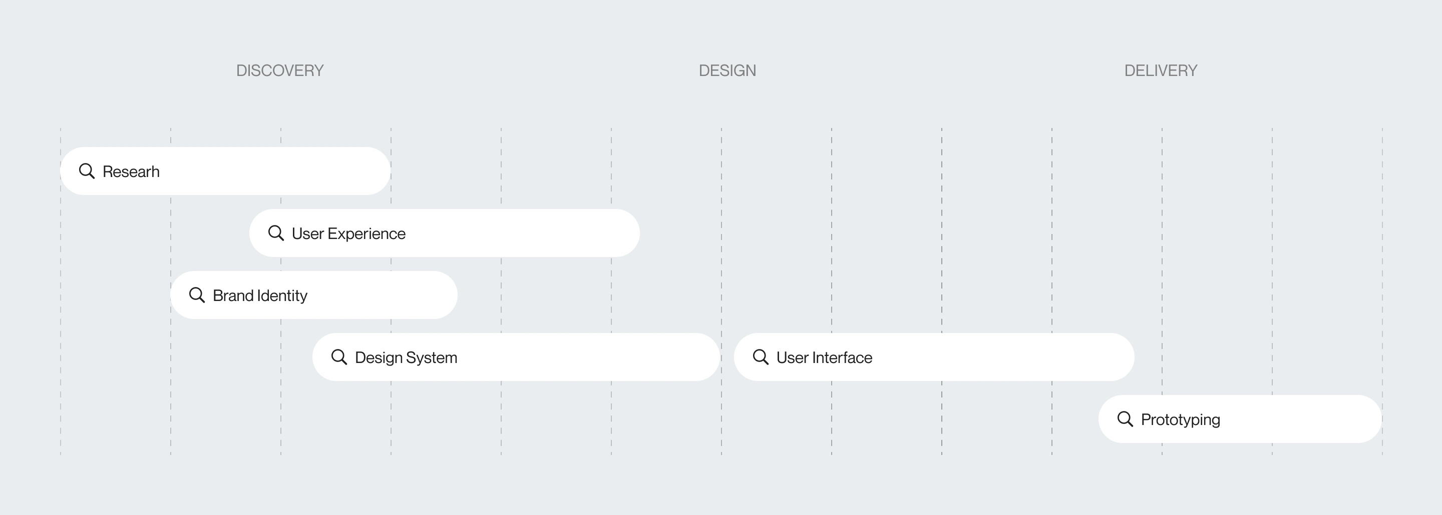
Design Process
Discovery Phase
Research:
Conducted in-depth market analysis and user research—including interviews, contextual inquiries, and competitor benchmarking—to align the platform with real-world clinical workflows and unmet user needs.
User Experience Strategy:
Mapped out end-to-end user journeys focused on reducing friction, supporting rapid decision-making, and ensuring clarity in high-pressure healthcare environments.
Brand Identity:
Developed a brand personality that communicates trust, professionalism, and innovation, positioning the platform as a dependable and forward-thinking tool for medical professionals.
Design Phase
Design System:
Built a scalable, component-based design system to ensure UI consistency, accessibility, and maintainability across all modules of the platform.
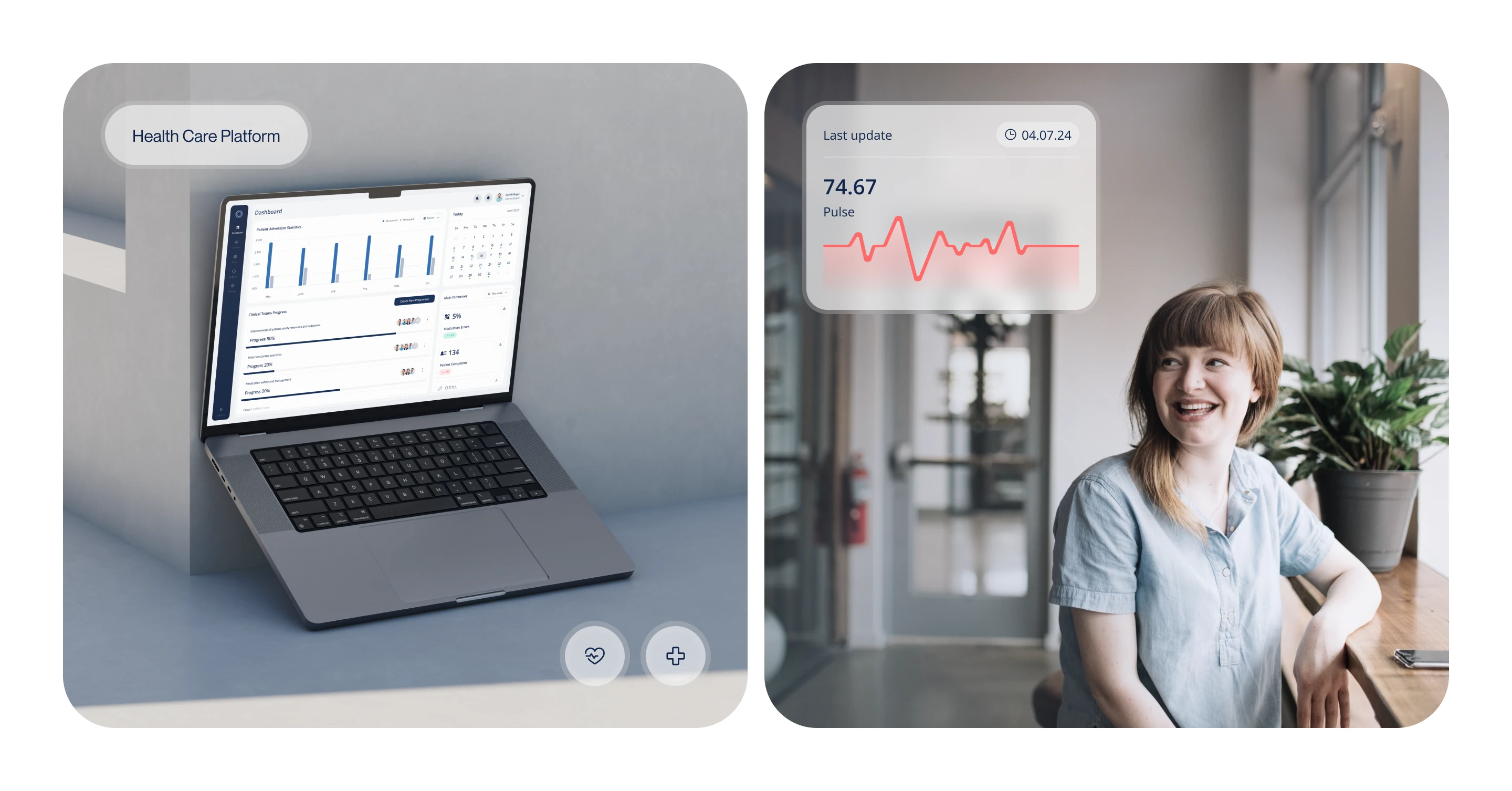
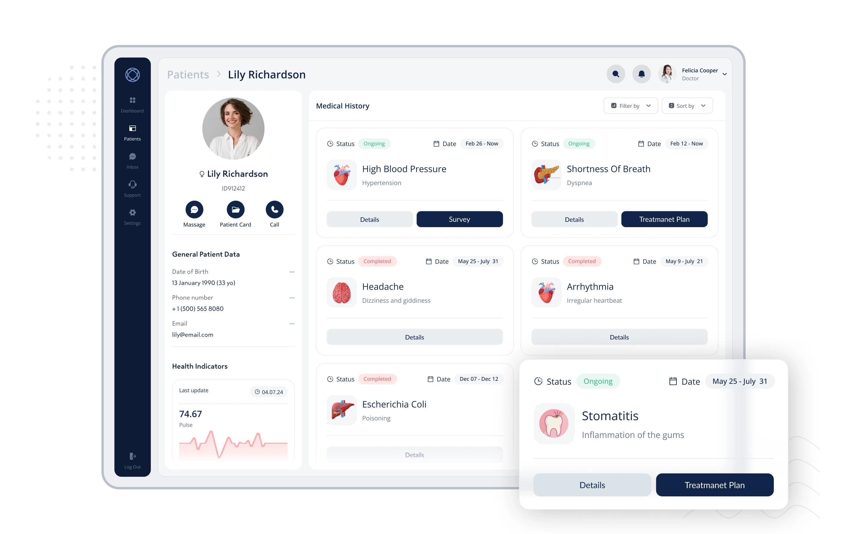
User Interface:
Designed a clean, intuitive, and responsive interface tailored to the cognitive demands of clinical users. Emphasis was placed on minimizing visual noise and optimizing key task flows.
Delivery Phase
Prototyping:
Developed interactive, high-fidelity prototypes that mirrored real-world usage. These were used in iterative testing rounds with stakeholders and end-users to validate functionality and usability early and often.
Validation Phase
Testing and Refinement:
The final design was rigorously tested in two clinical settings using real medical scenarios. Feedback from doctors, nurses, and administrative staff was used to refine the UI and workflow details.
Outcome:
Both clinics adopted the platform shortly after testing, committing to annual subscriptions—a strong signal of product-market fit and user trust. The validation phase confirmed that the solution met the high standards of healthcare environments and was robust, scalable, and reliable for long-term use.
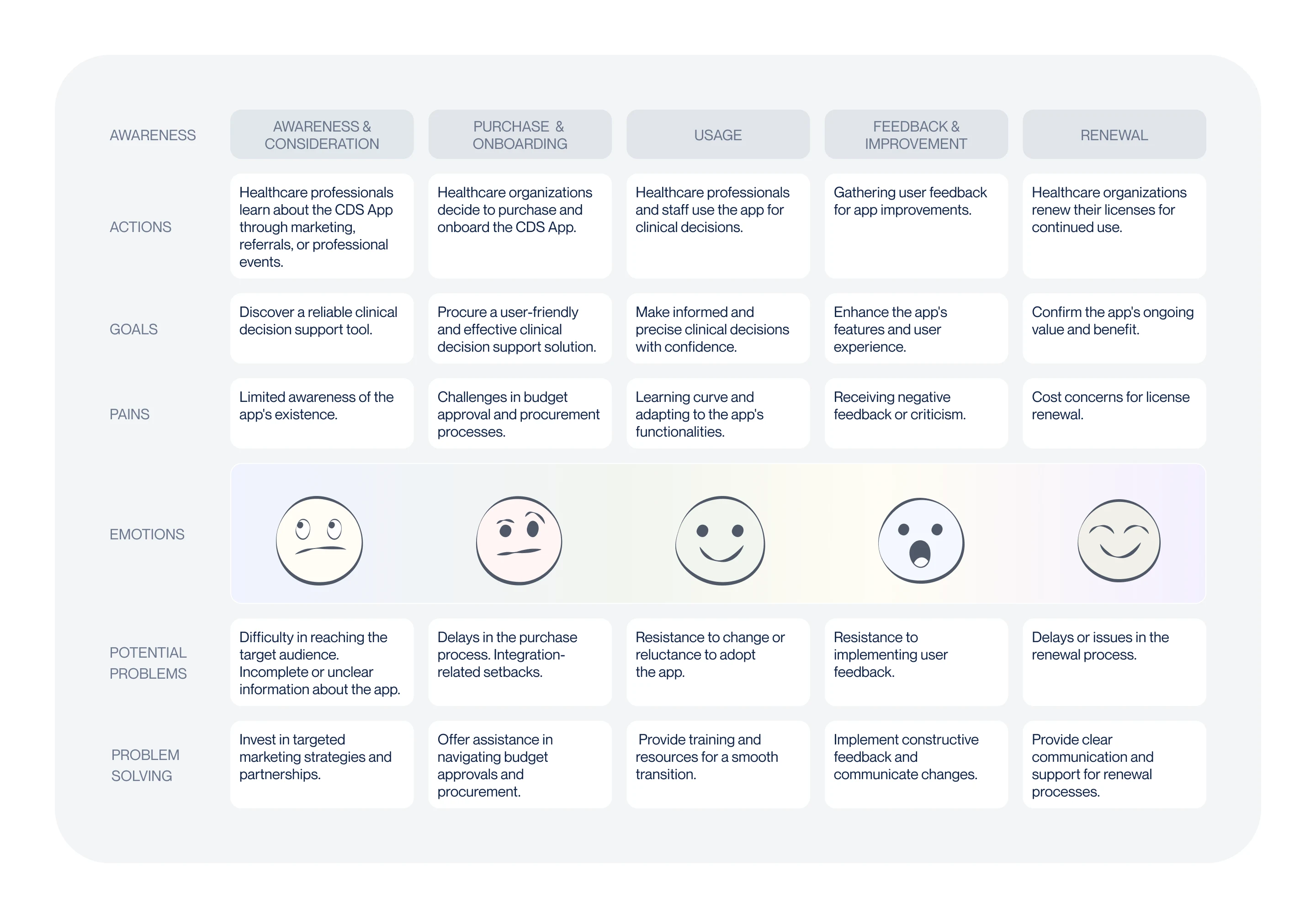
Customer Journey Map: Nurturing Intuitive Design
The Customer Journey Map served as a foundational tool in designing intuitive, user-centered experiences. It allowed our team to visualize and empathize with the end-to-end experience of medical professionals using the platform in real-life scenarios.
By mapping the user's journey across every stage—from initial login to task completion—we were able to identify friction points, emotional pain triggers, and opportunities for seamless interaction.
Key Contributions of the Journey Map:
Unified Vision:
Provided all stakeholders (designers, developers, clinical consultants) with a shared understanding of the user’s context, needs, and expectations.
Task-Driven Flow Design:
Helped prioritize core actions and anticipate user intent, which informed a streamlined navigation structure that aligned with natural workflows in a clinical environment.
Empathy-First Approach:
Highlighted the stress points in high-stakes scenarios (e.g., emergency documentation, quick patient data retrieval), allowing us to design with clarity, speed, and emotional ease in mind.
Data-Informed Decisions:
Journey map insights, combined with user interviews and behavioral data, guided decisions about layout, hierarchy, and UI responsiveness.
End-to-End Optimization:
Shaped the entire experience—onboarding, task execution, feedback loops, and post-task confirmations—ensuring that every touchpoint felt logical, supportive, and efficient.
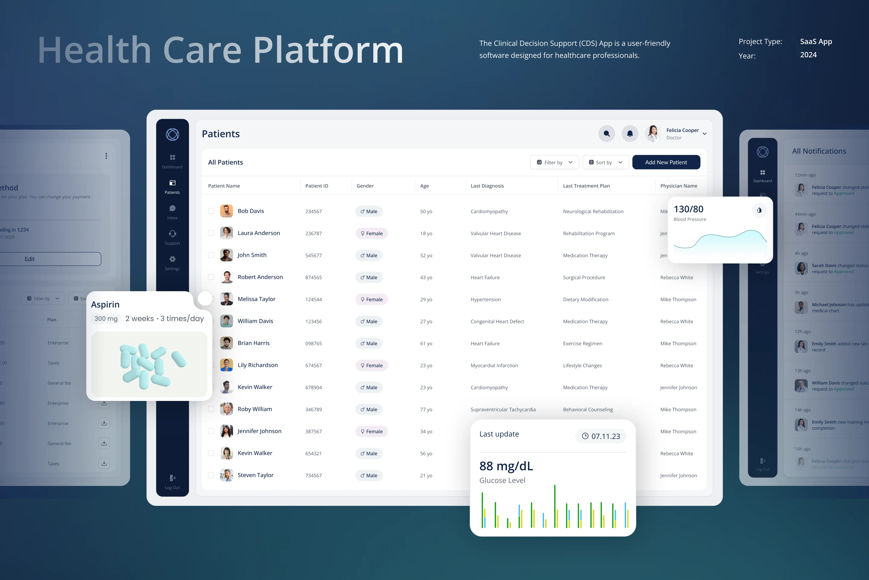
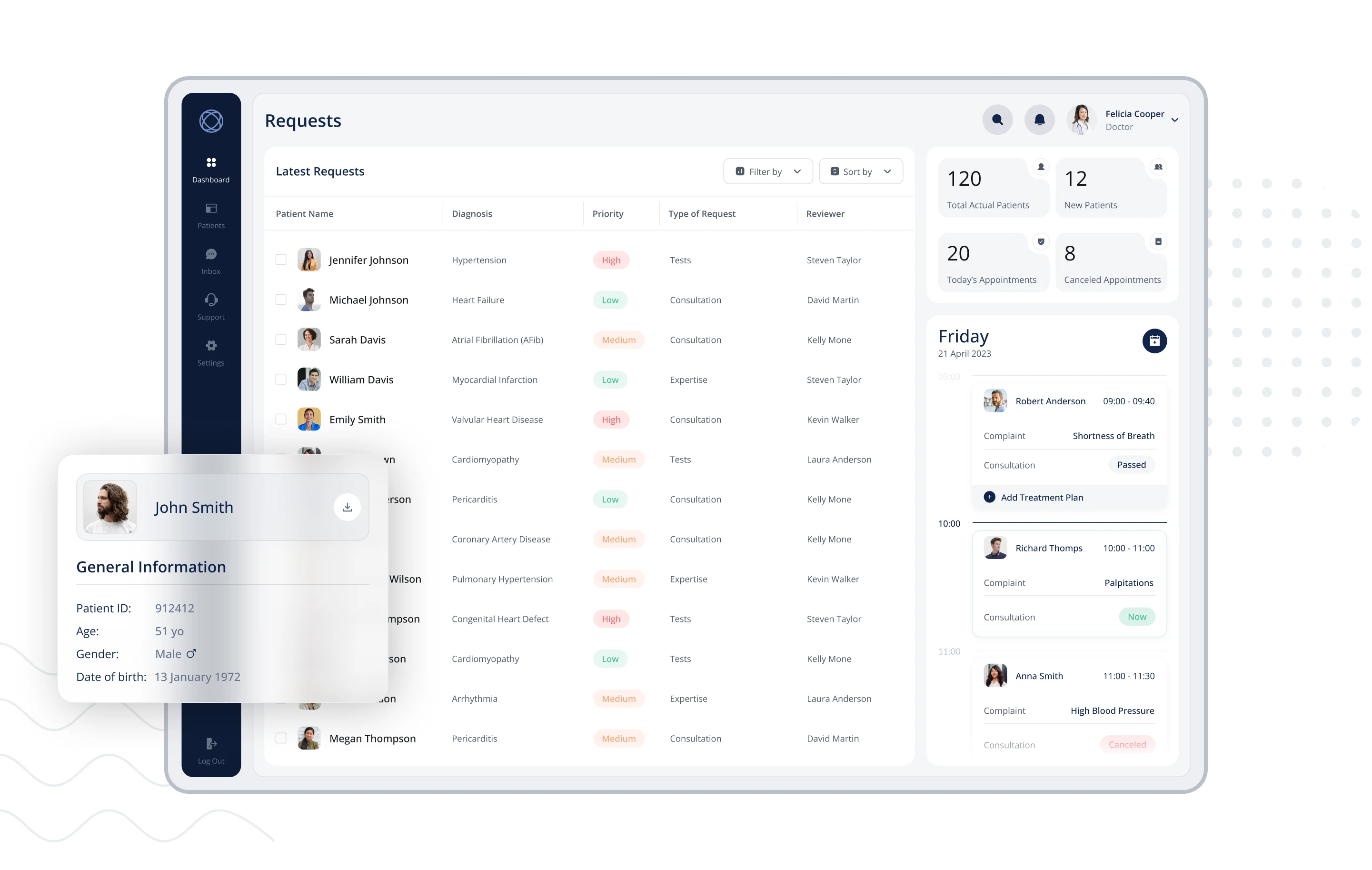
Ideation Matters: An App Without a Dashboard?
One of the client's initial and seemingly essential requirements was the creation of a dashboard—a central hub with charts, metrics, and visual data summaries. Given its familiarity and prevalence in digital products, our early brainstorming naturally centered around this idea.
The Process:
We began with dynamic ideation sessions, exploring a variety of dashboard concepts.
Multiple wireframes were developed, showcasing bold numerics, performance charts, and high-level summaries.
The goal was to deliver a data-driven overview that felt powerful and modern.
However, as we transitioned from concept to strategy—closely analyzing the actual daily workflows of medical professionals—a critical insight emerged:
A dashboard wasn’t solving a real problem.
Key Insights:
Doctors needed to take immediate action, not passively review data.
The most frequent user tasks involved managing and responding to incoming requests, not monitoring trends.
A dashboard would add visual noise and unnecessary complexity to an interface that needed to be quick and focused.
The Pivot:
Instead of a traditional dashboard, we designed a streamlined request table—a functional, actionable gateway that placed users directly into their workflow. It became the true starting point for doctors, helping them prioritize tasks quickly and effectively.
Outcome:
The final design eliminated the need for a dashboard altogether, enhancing usability and focus.
This pivot not only led to a more intuitive product but also saved the client approximately $2,000 in design and development costs that would have gone into building a feature users didn’t need.


Like this project
Posted May 31, 2025
UX/UI and product design for a CDS platform—enhancing clinical workflows, reducing cognitive load, and improving usability for healthcare professionals.
Likes
1
Views
5