Hikari Coffee

HIKARI COFFEE
" Hikari " is a Japanese word that means "light" or "brightness." It can be used both literally, to refer to sources of light such as the sun, moon, or stars, as well as figuratively, to describe someone or something that is shining or radiant.
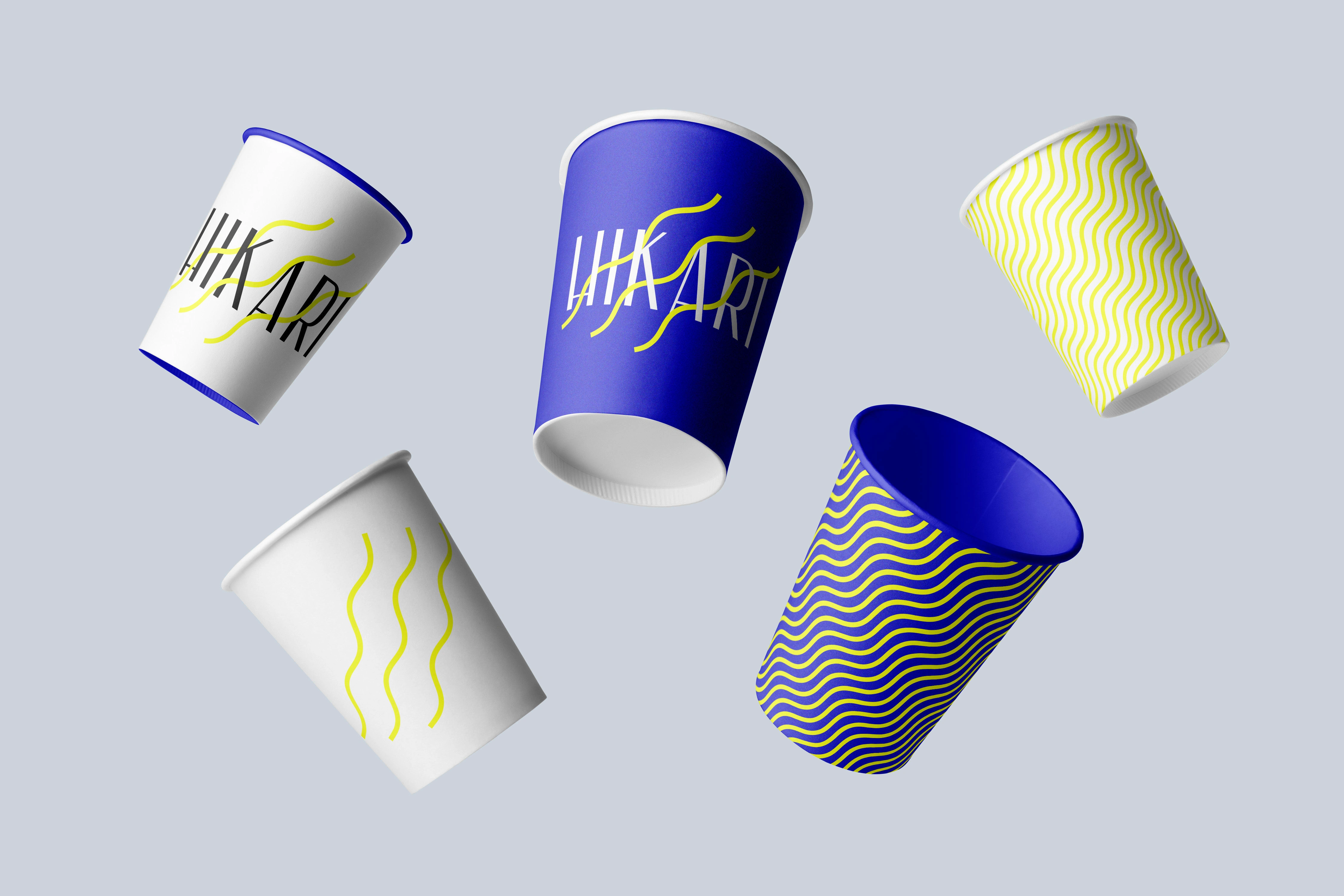
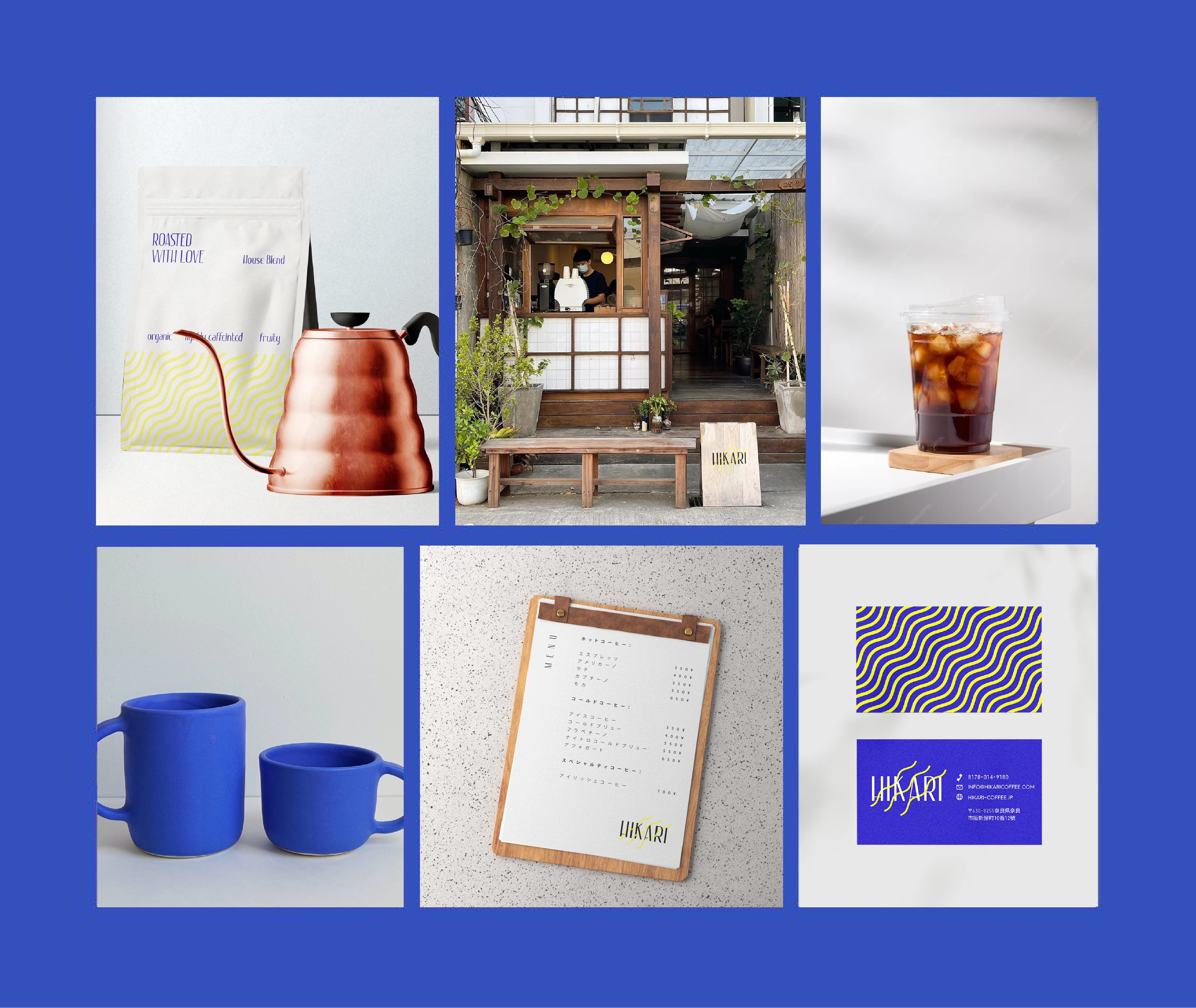
My client and I wanted to create a branding design that reflects the concept of "hikari" and positions the coffee shop as a source of brightness, energy, and comfort for the customers.
The concept of "hikari" can be associated with the experience of enjoying coffee. Just as the sun brings light to the world, a cup of coffee can bring energy to our day. The aroma and flavor of coffee can awaken our senses and provide a sense of warmth and comfort. In this way, coffee can be seen as a source of "hikari" in our daily lives.
The target audience is coffee lovers of all ages who appreciate high-quality coffee that is both flavorful and energizing. We aimed to attract customers who value the experience of enjoying coffee as a moment of brightness and warmth in their day.
The name for the coffee shop, thus the logo, consisted of the name of my client Hikari, with lines alongside the typefont to reinforce the sense of movement and energy associated with the sun. The color scheme consist of bright color such as yellow, which evokes a sense of energy and warmth. The color will be contrasted with a darker shade of blue, which represents purity and quality.

Like this project
Posted Oct 18, 2023
Branding Design for a Japanese client - Coffee Shop "Hikari"


