14OhFour Visual Identity Design

Alex Landrin


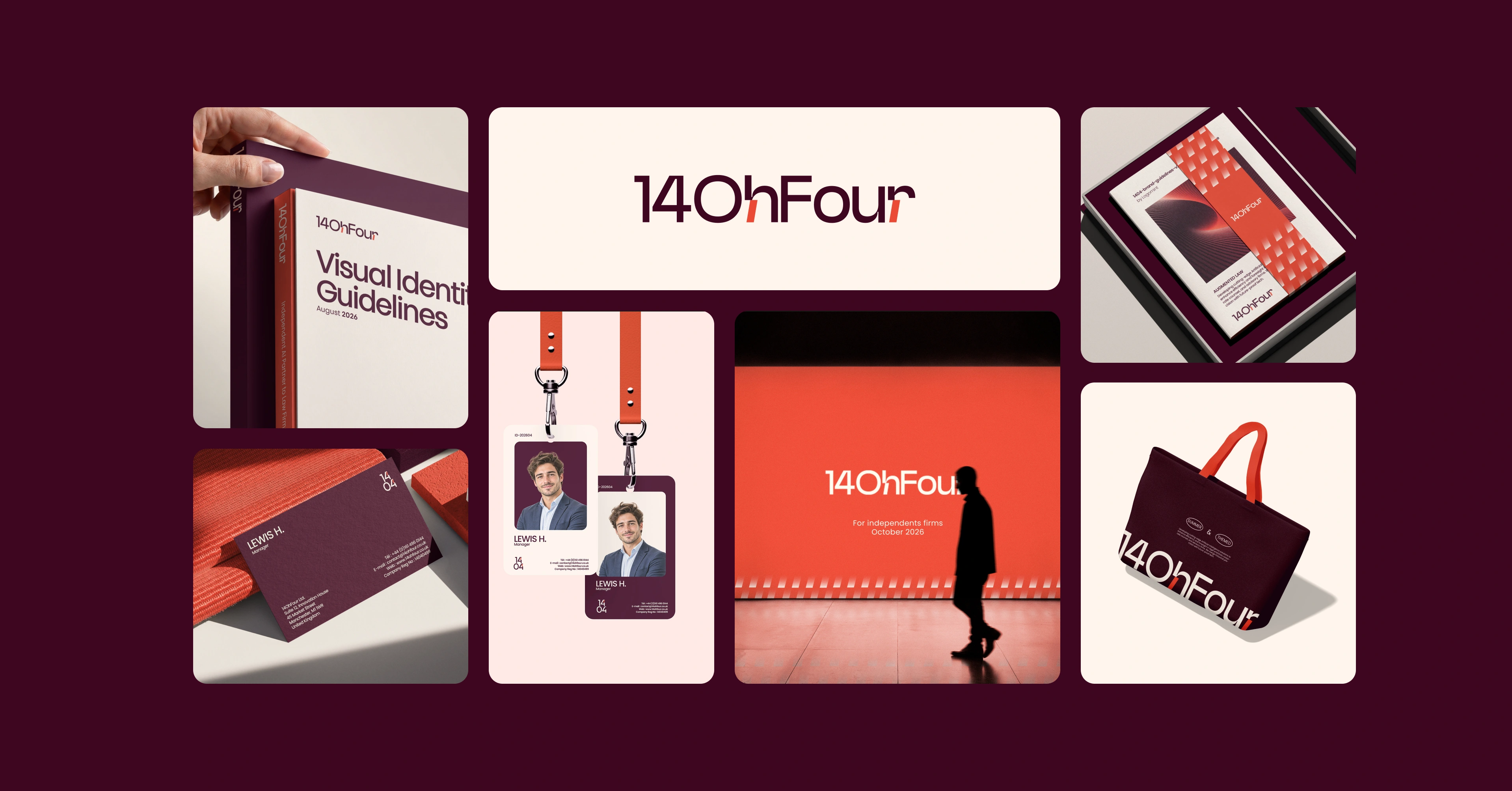
14OhFour is an independent AI consultancy for mid-sized UK law firms. It was founded by a legal-innovation specialist frustrated by how slowly the industry moved. Where others carry out a process, 14OhFour delivers an outcome: moving fast, but never carelessly.
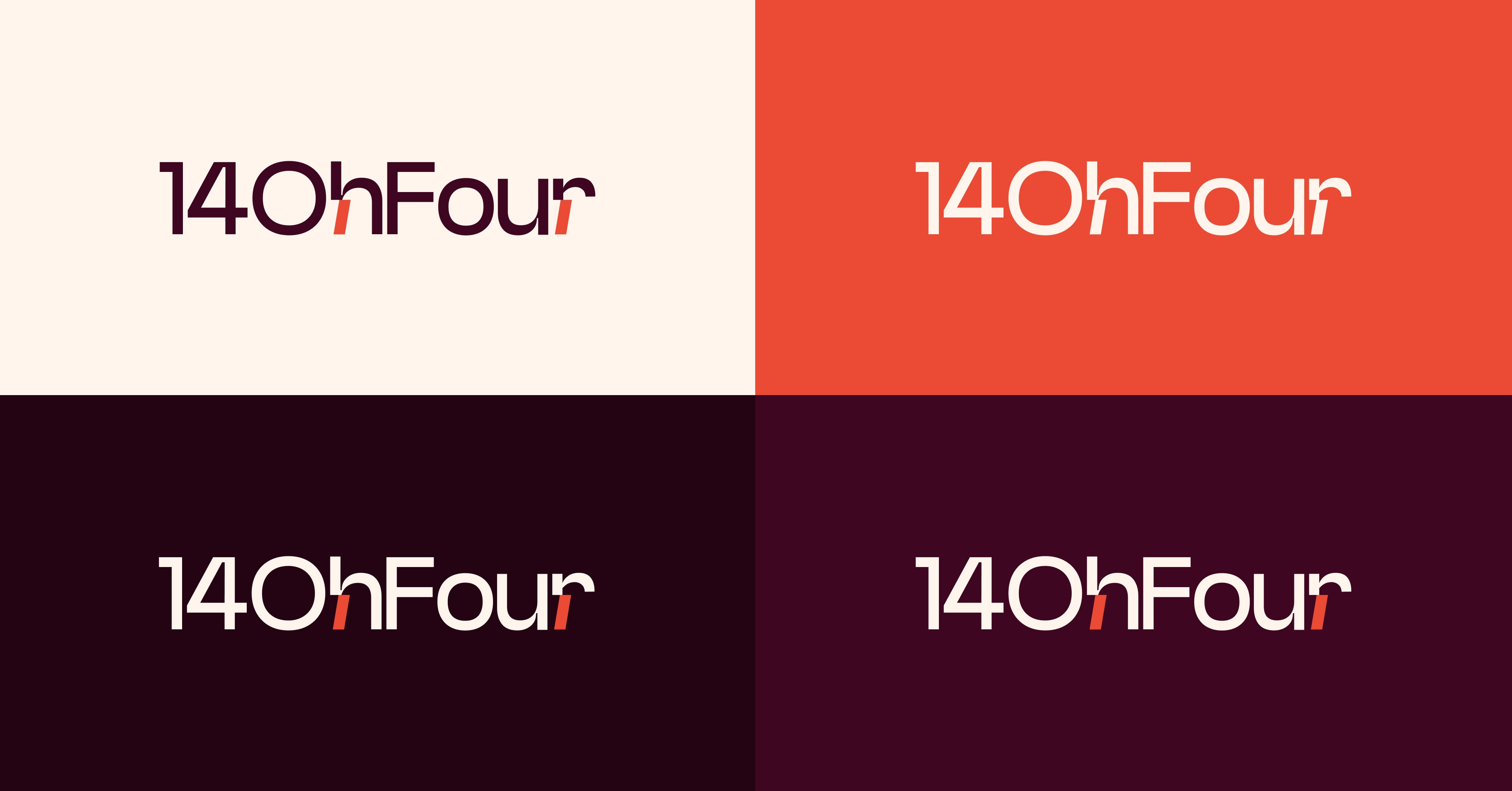
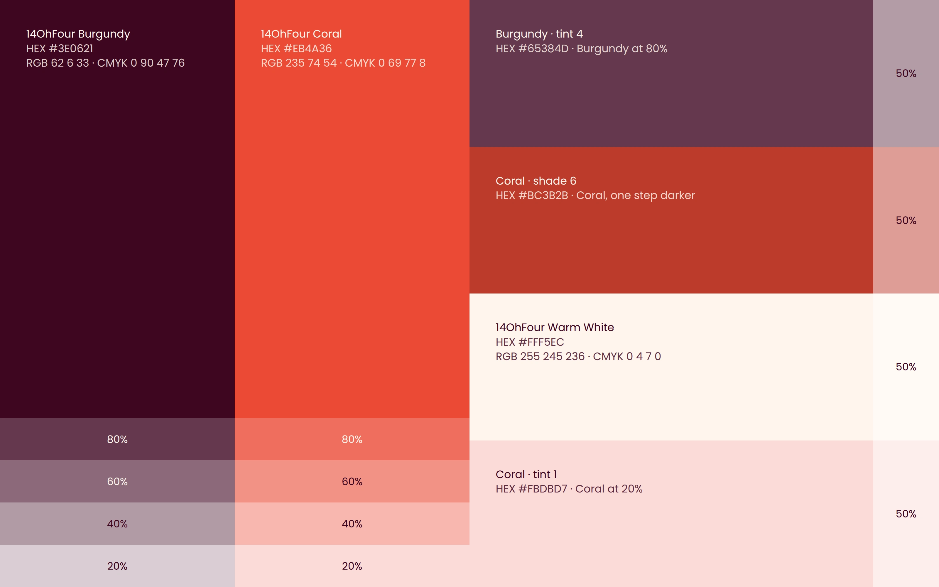
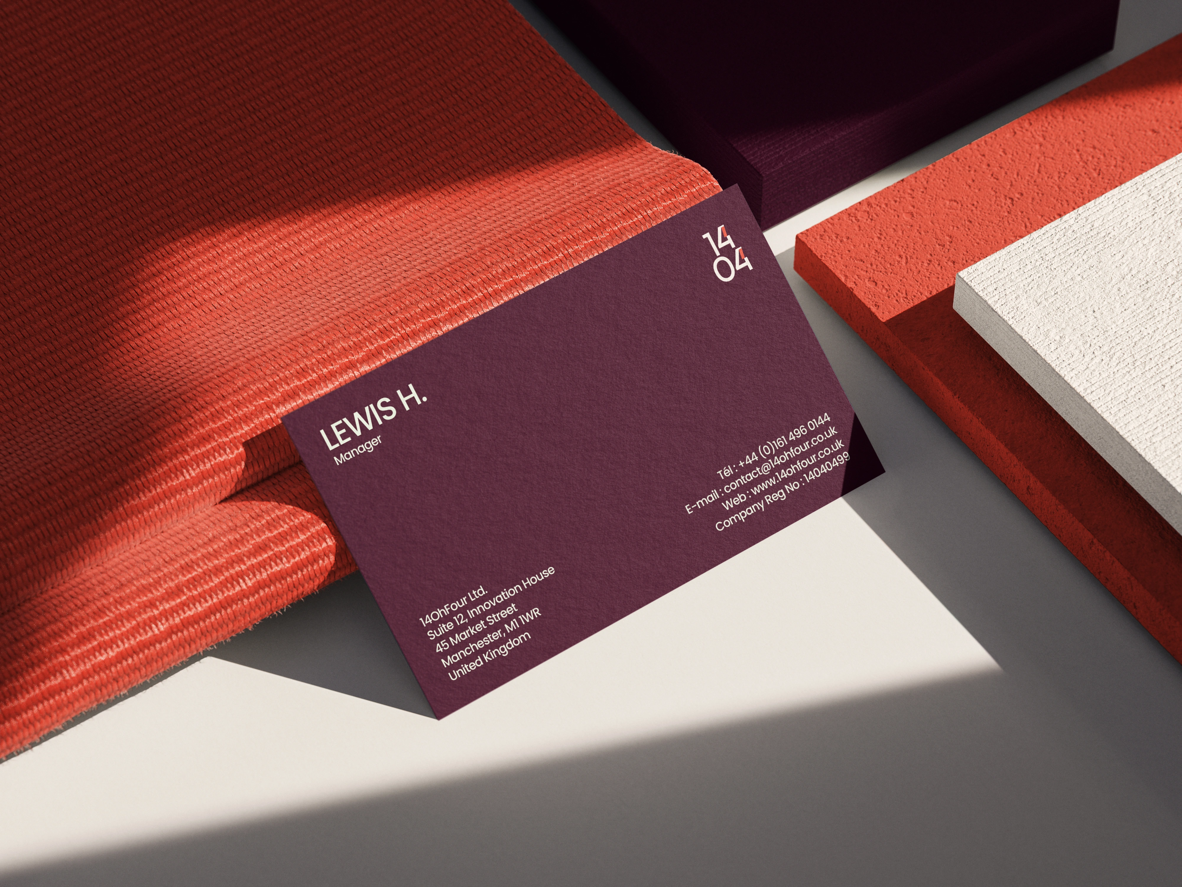
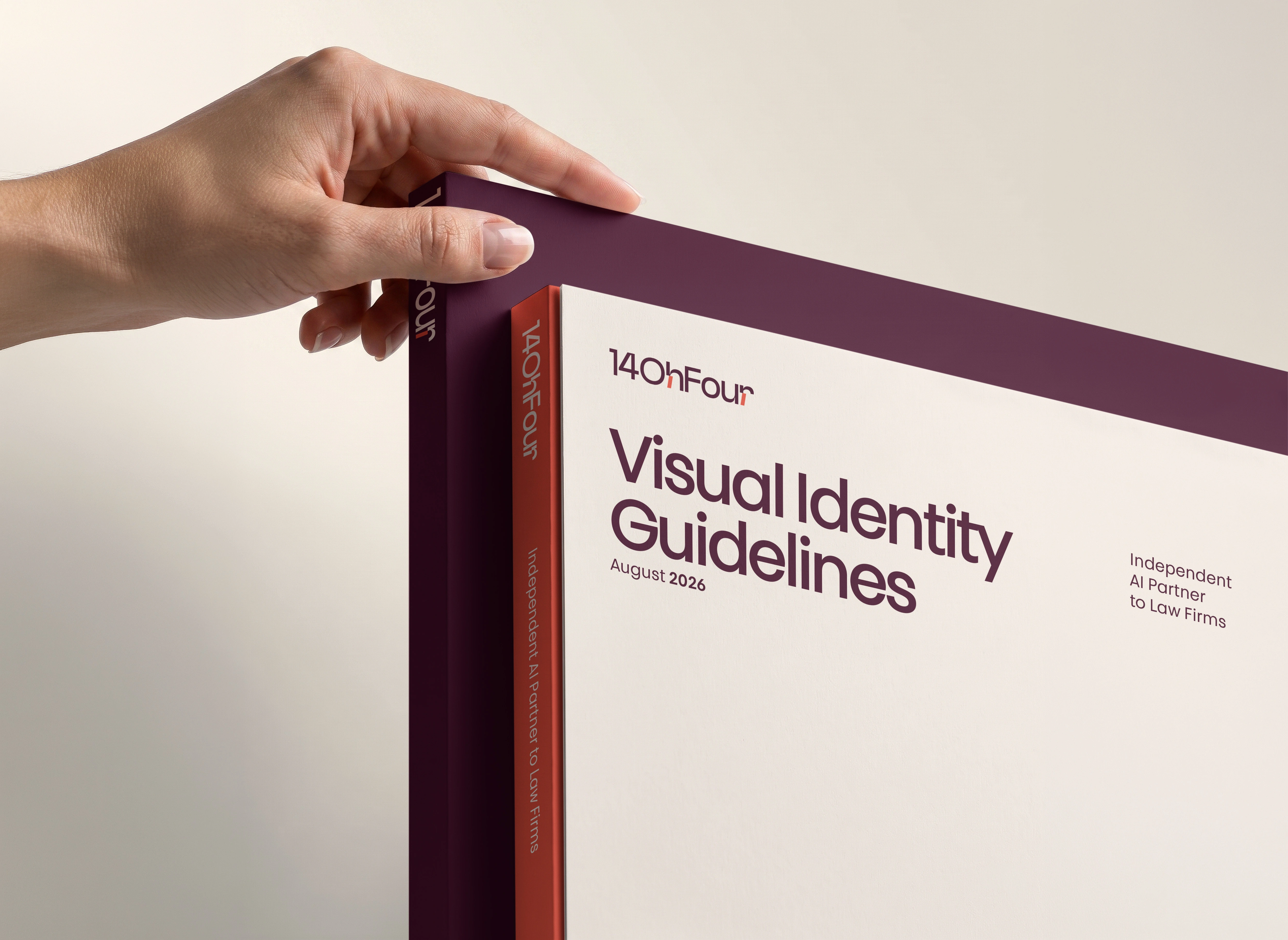
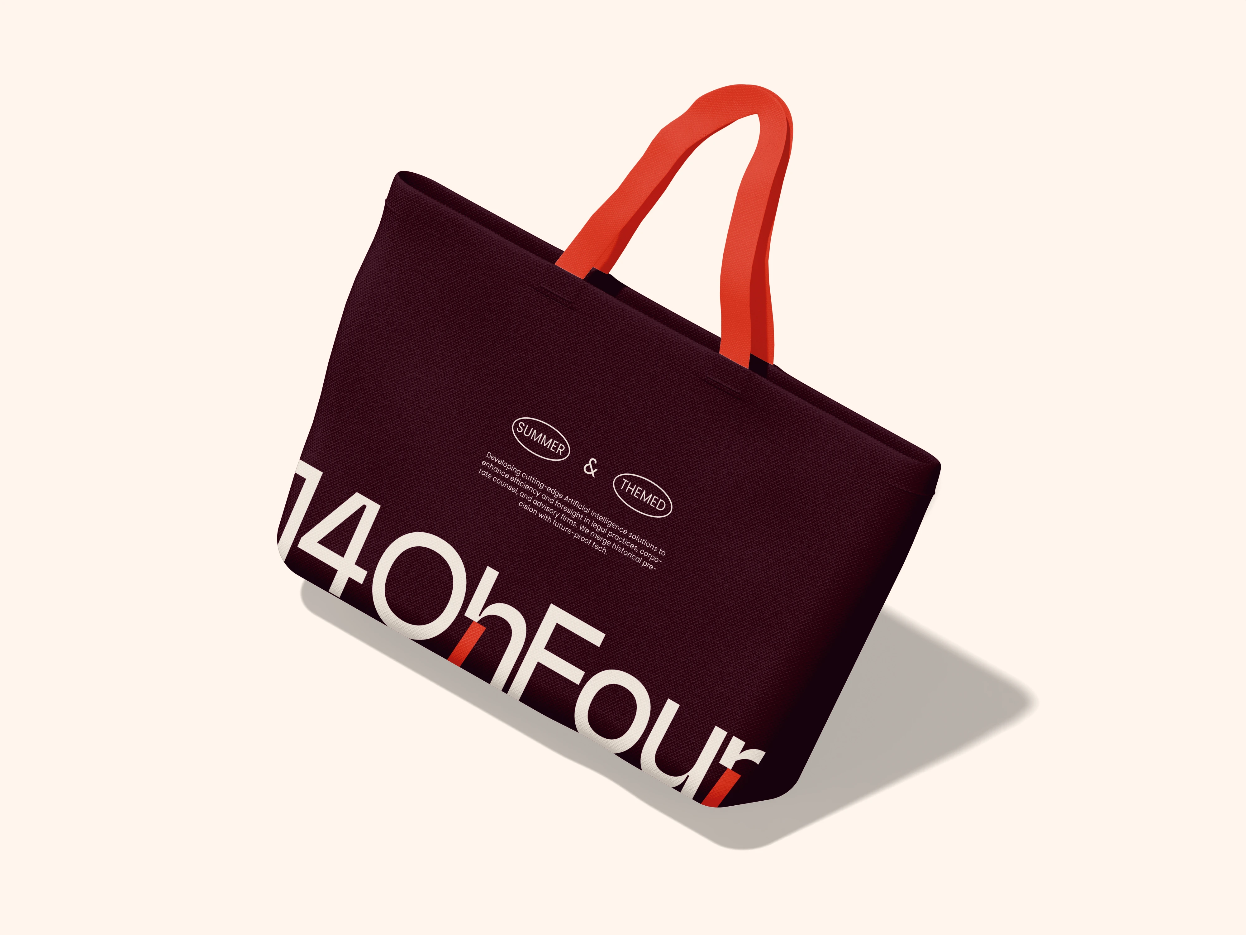
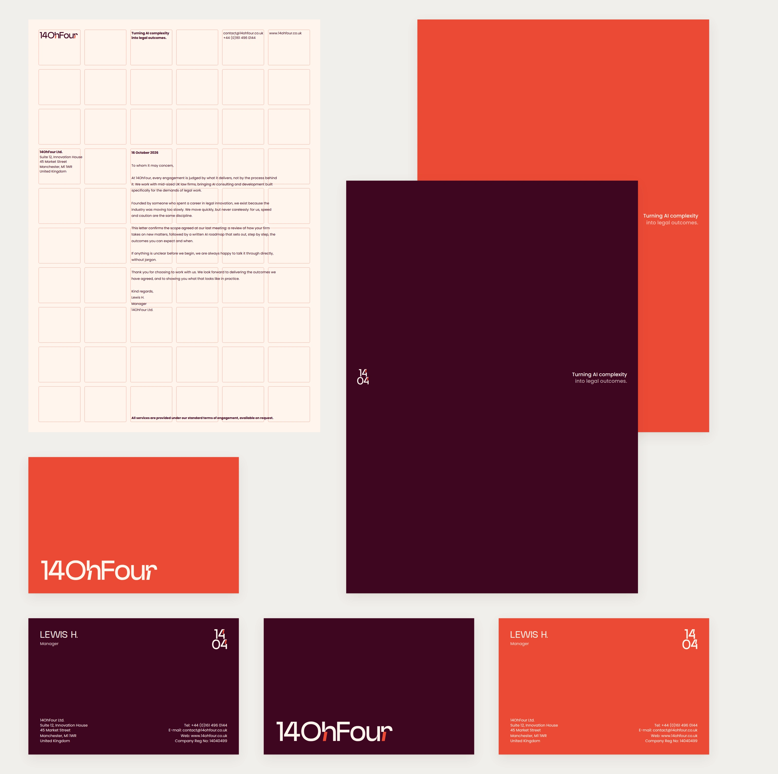
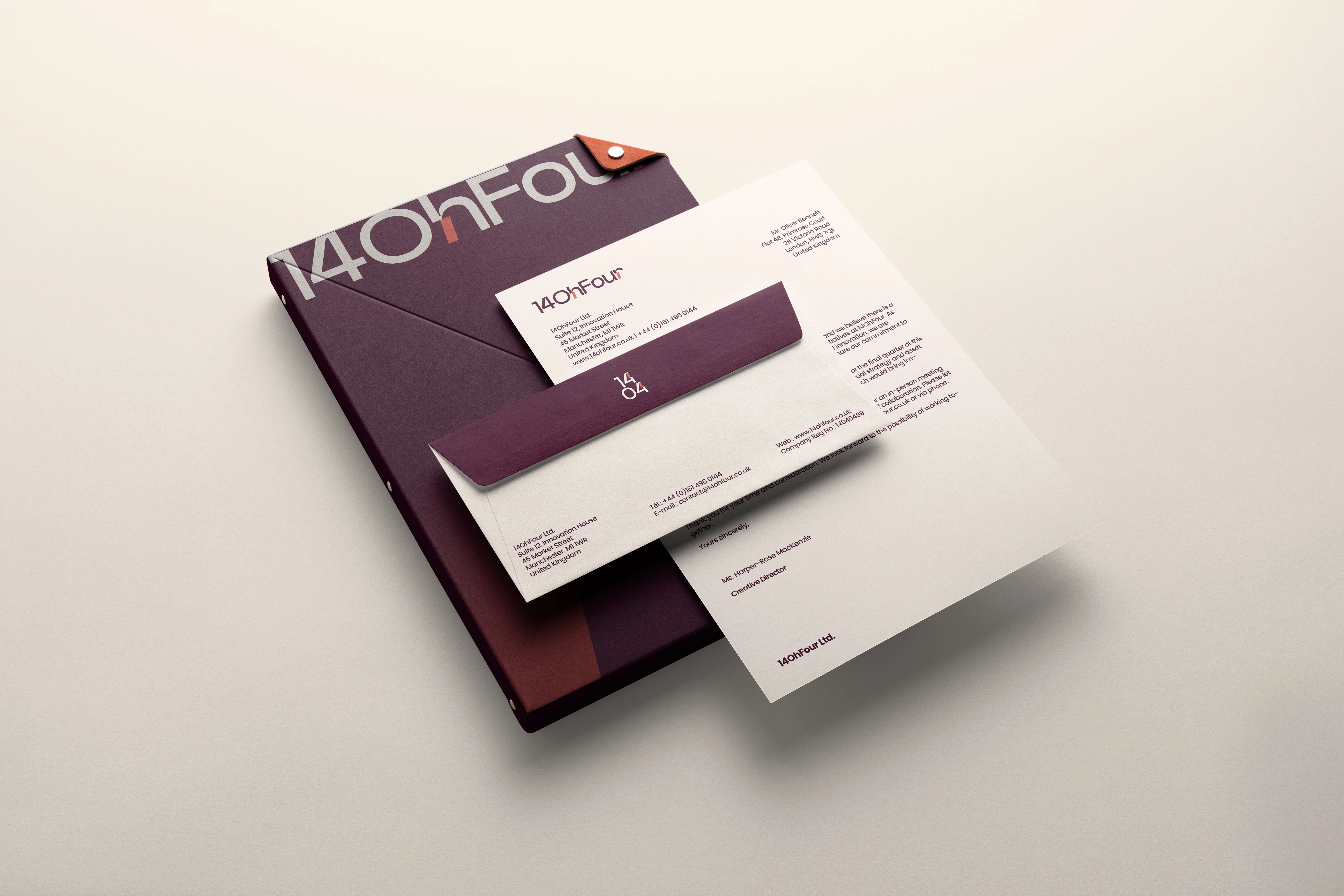
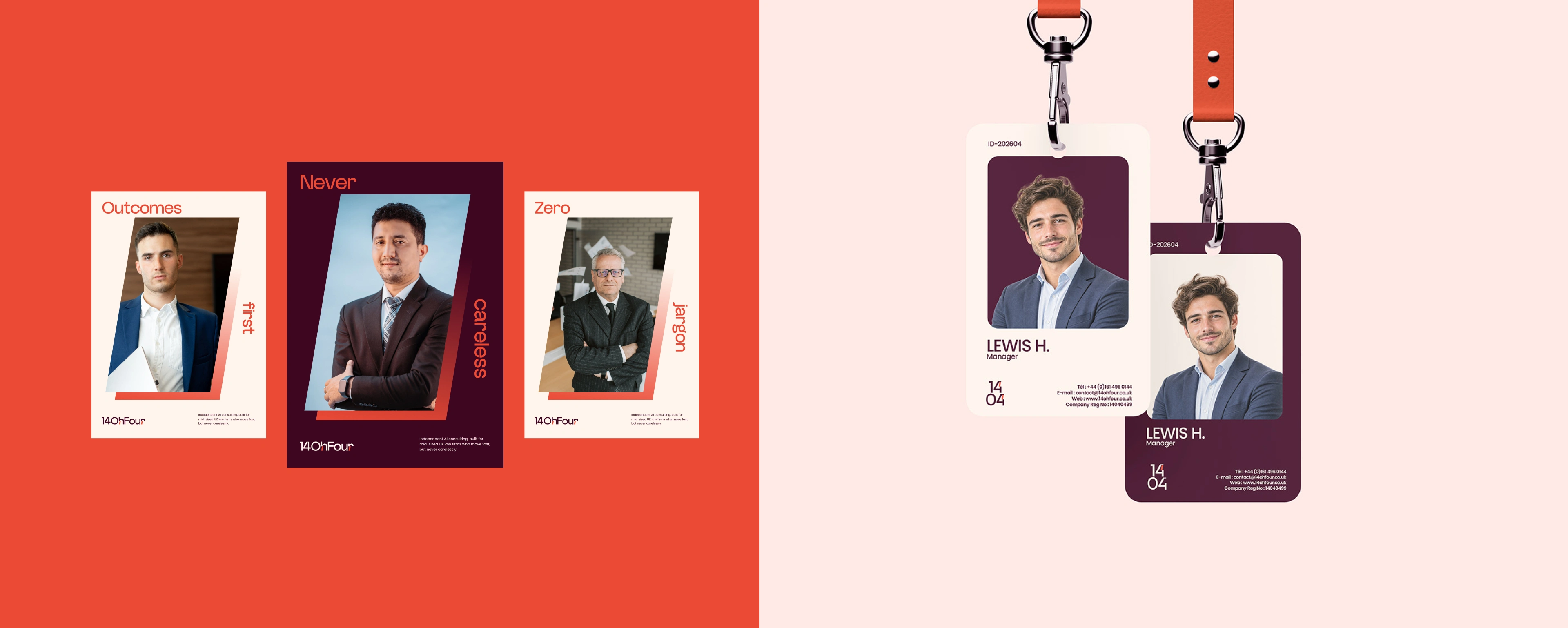
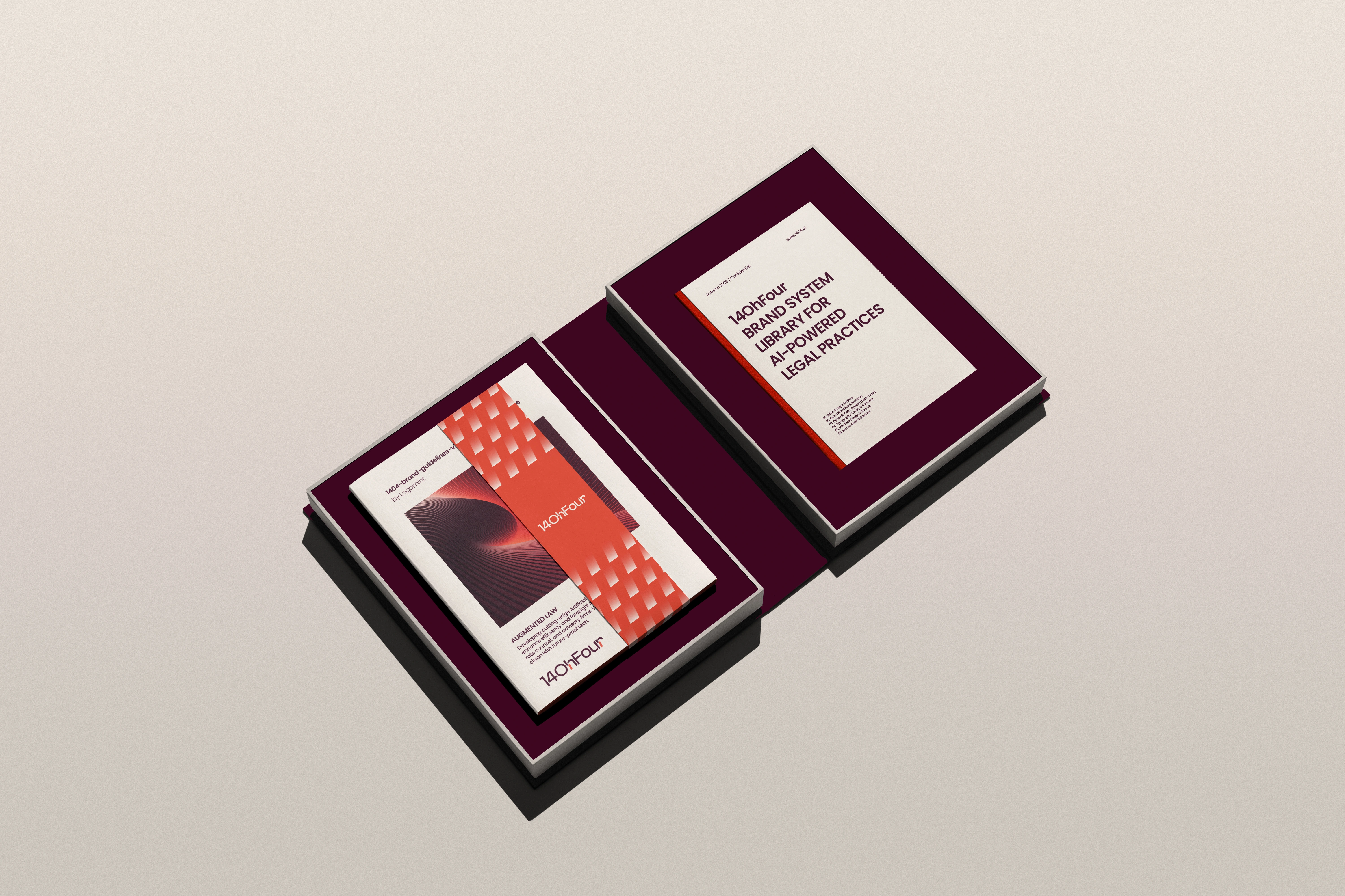
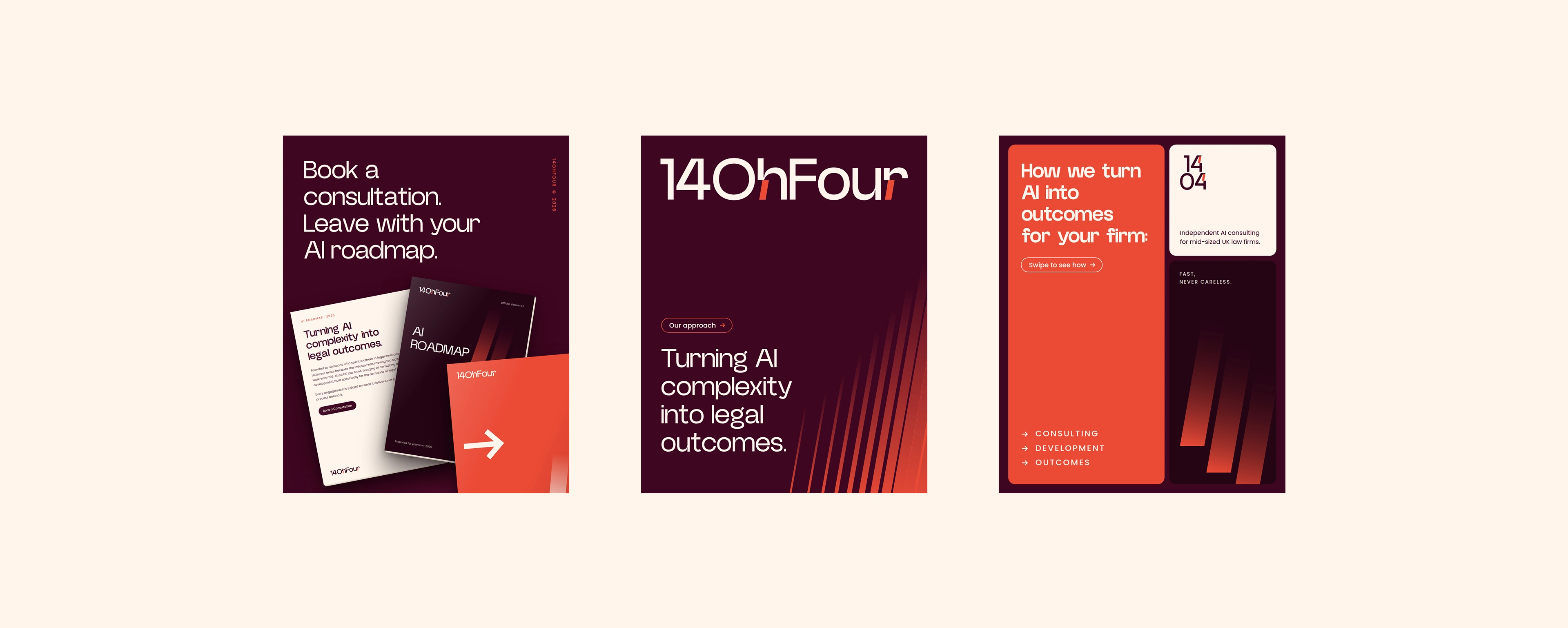
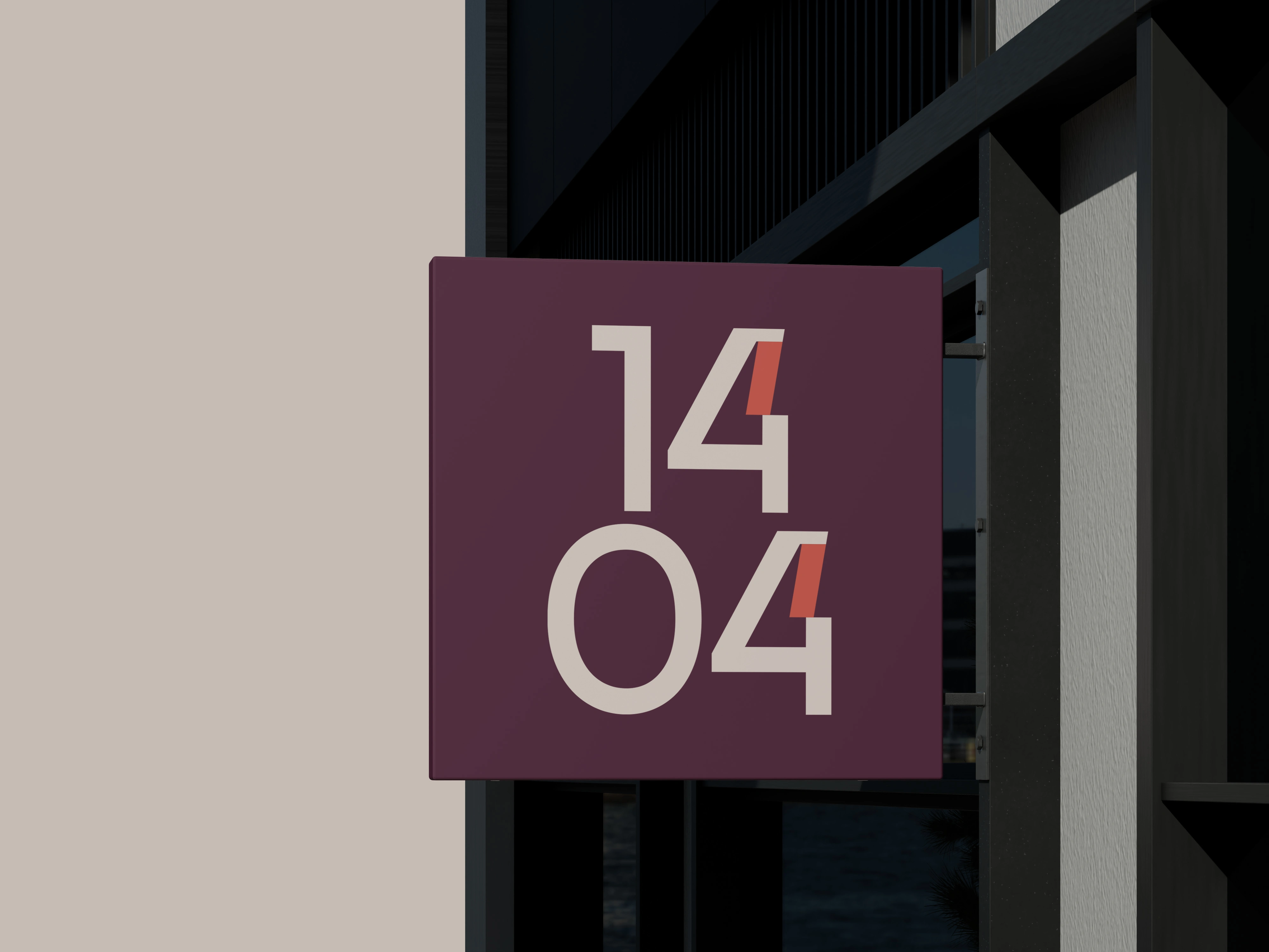
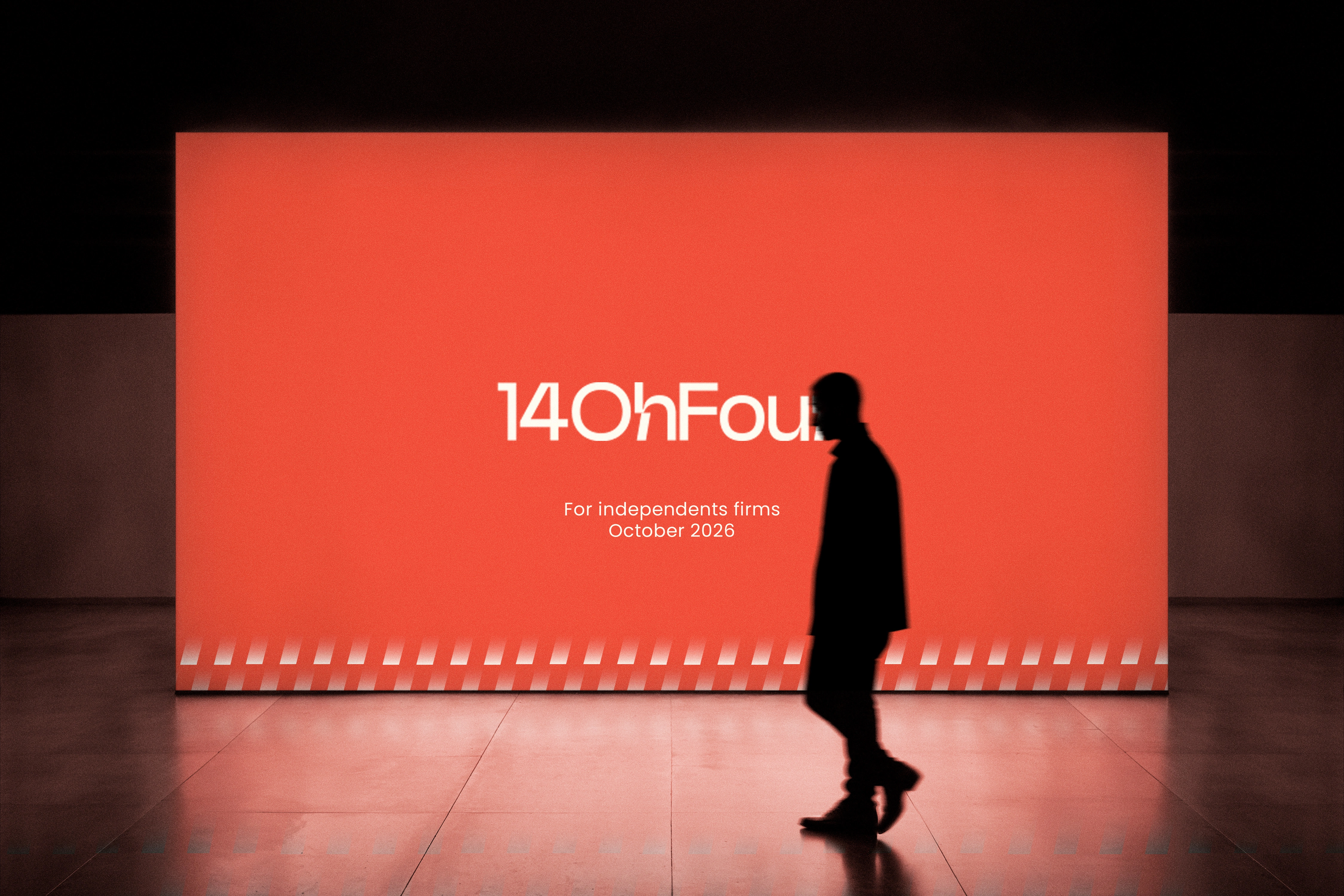
The identity is built on that idea. It is a pure wordmark in a clean geometric sans-serif, with one signature detail: an 81° diagonal cut on the “h” and the “r”. That cut carries the whole system. It becomes the compact 14/04 mark (spoken aloud, “Oh” is zero and “Four” is 4), the caret of the logo animation, the slanted windows of the posters and the billboard, and the coral full stop at the end of every line.


Like this project
Posted Oct 19, 2026
It is a pure wordmark in a clean geometric sans-serif, with one signature detail: an 81° diagonal cut on the “h” and the “r”.
Likes
1
Views
1
Timeline
Aug 18, 2026 - Sep 5, 2026
Clients
14ohfour Limited