Churros

Xandra A


Churros
A Creative Culinary Adventure with a Mexican Food Brand
This project is all about creating a unique, vibrant website that gives customers seamless access to their favorite meals while immersing them in the creative essence of the brand.
For this website, I embraced Neobrutalism for the first time, and I’m proud to say I pushed my creative limits to deliver something exceptional.
Designed as a scroll page website, the concept mirrors a coloring book, making every interaction feel playful and engaging. Using Figma, I meticulously crafted each icon and customized images to ensure a cohesive design that ties all elements into a visually stunning whole.
Key Features:
Vivid, vibrant colors: that evoke a skylike, energetic ambiance.
A subtle nod to Mexican culture: tastefully woven into the theme.
Pixel icons and characters: for a nostalgic yet modern touch.
Animations: that bring the website to life and enhance user engagement.
This project captures the essence of creativity, fun, and bold design—making the brand’s digital experience as memorable as their meals.
"I utilized Framer Motion to infuse a dynamic and interactive feel into almost every scroll, captivating visitors and enhancing their experience. I believe this engaging design is a key factor in encouraging customers to revisit."

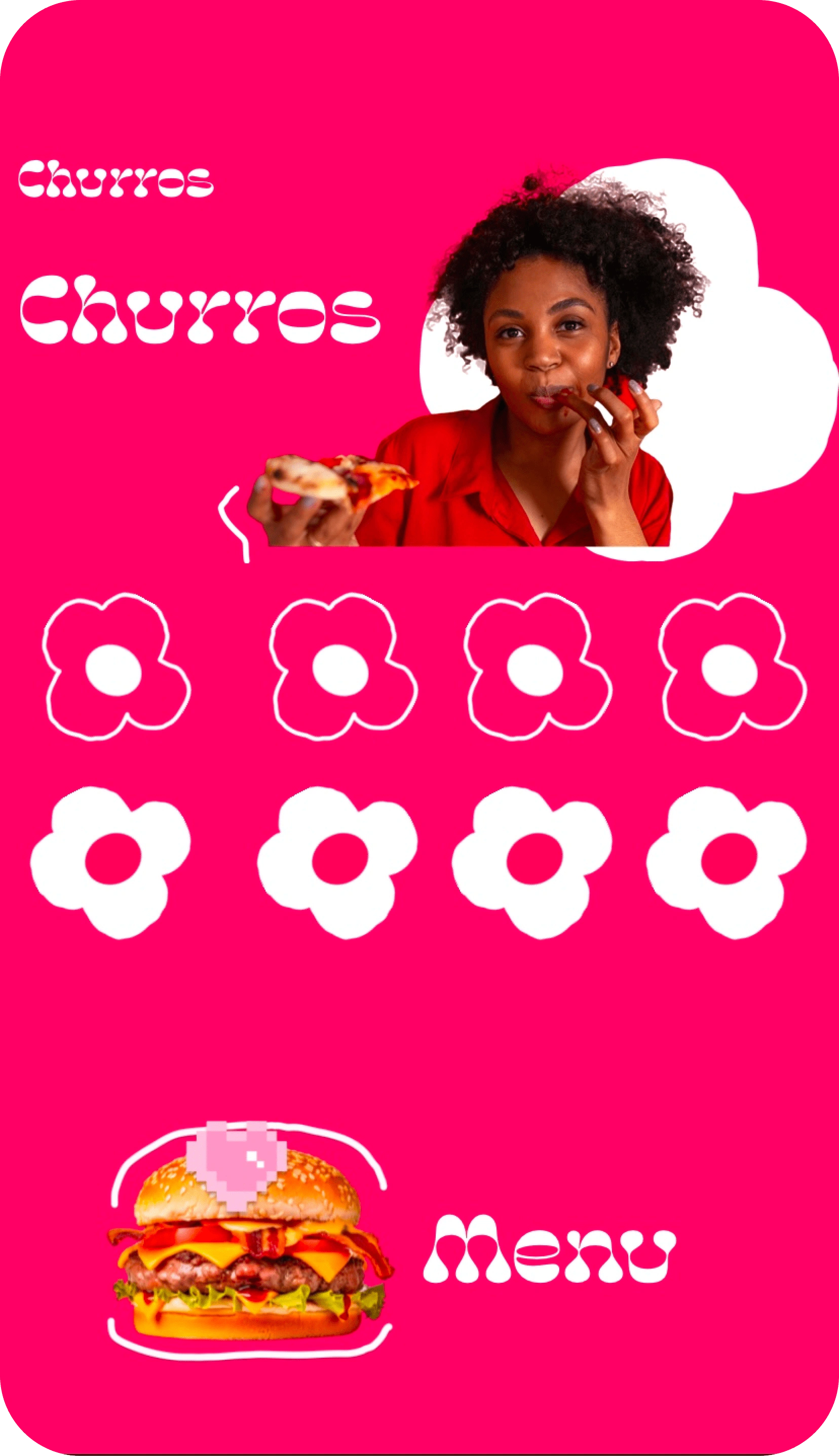
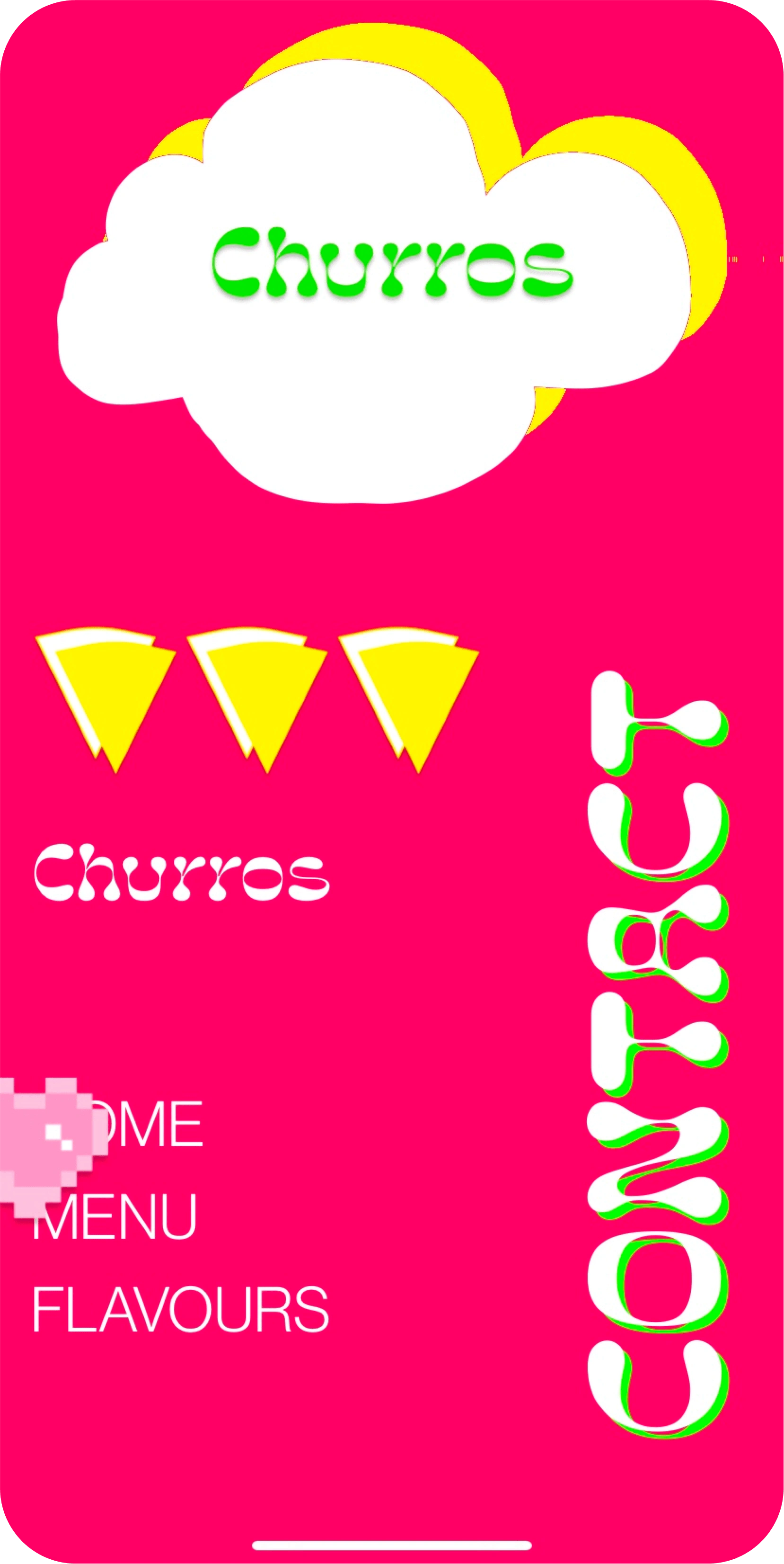
Hero Section
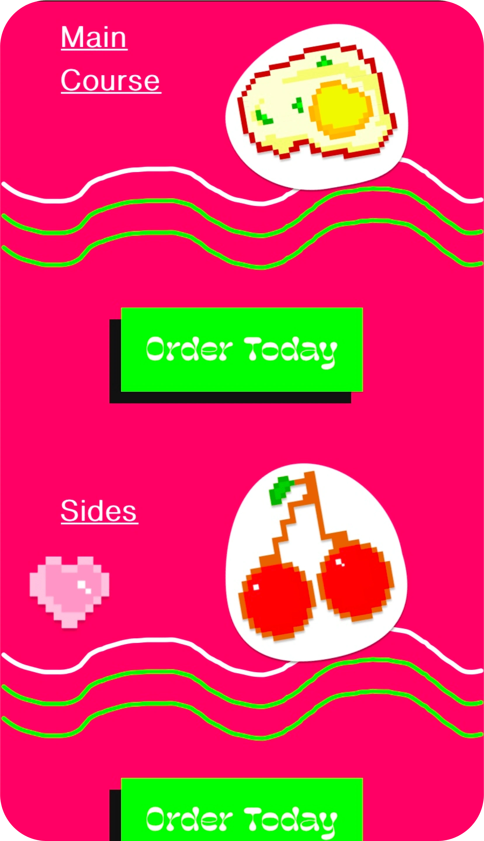
A recess
"I incorporated a recess section after each navigation section to provide visitors with a moment to pause and recharge while scrolling. These sections feature vibrant, dynamic animations that maintain engagement and add to the overall experience."
The menu number
For the menu i designed custom pixel icons to match my previous idea to create a fully pixel website but along the lines i had to go for a partial pixelated site to incorporated other themes. Remember the theme is now Neobrutalism
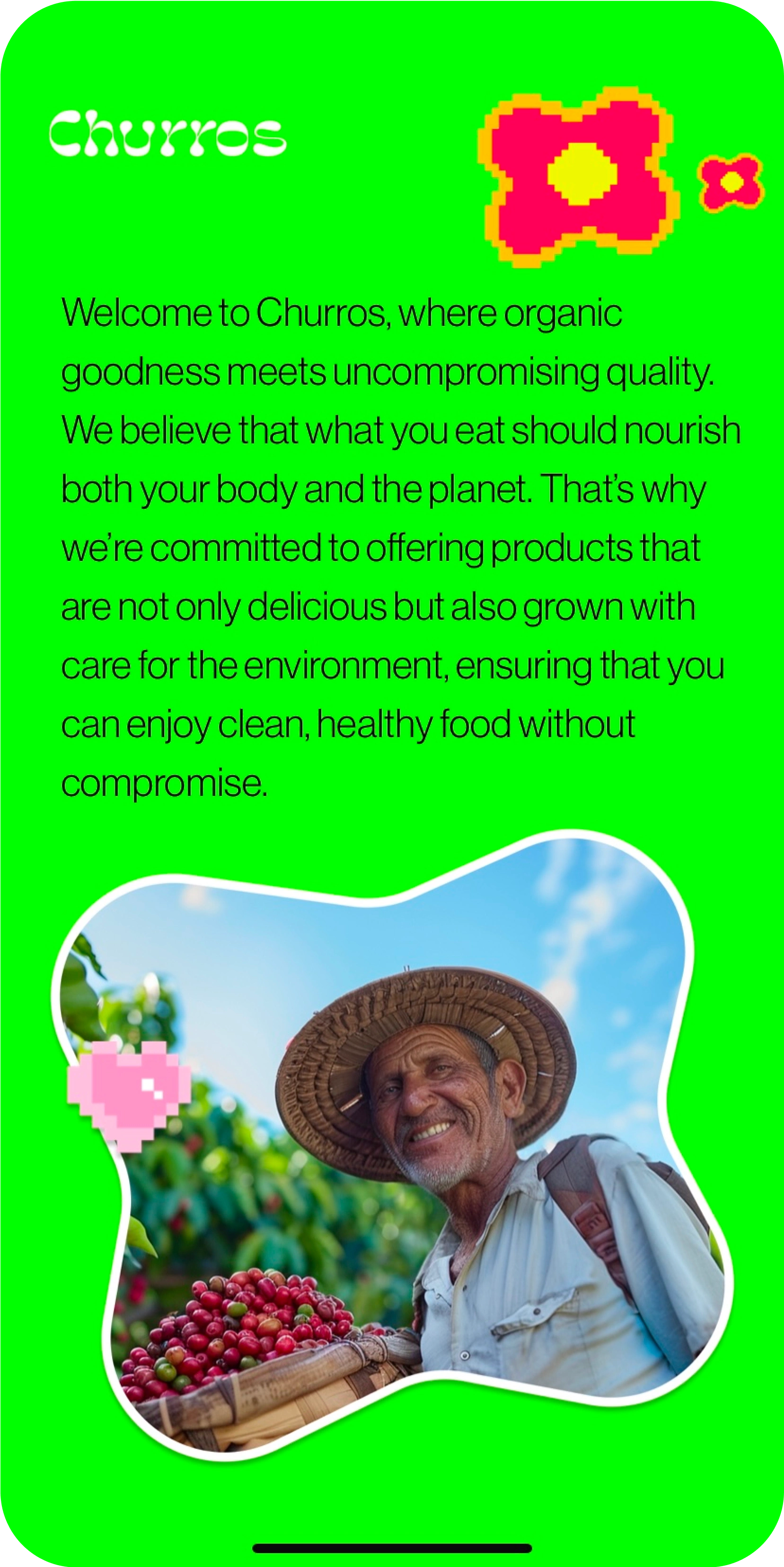
About section
"For the About section, I chose a traditional design approach to authentically reflect the Mexican cultural theme—the foundational concept of this website. With just one glance, I want users to feel a deep connection to the culture and root idea behind the brand."

Customer Reviews
"For the customer reviews, I transformed the design into a playful coloring book aesthetic by using hand-drawn SVG images, giving it the feel of a creative sketchbook page."
The Footer
The footer which also moonlights as the contact section. I designed to look like a rainy cloud and the churros icon i created to mimics little raindrops- For the animation the cloud tilts left and right and the little rain drops tilt up and down subsequently to create rain

The Navbar
The Navbar showcases a captivating curtain-like animation, smoothly unveiling menu items as they elegantly animate into view sequentially.
Here a link to the website if you may; Hope you enjoy it!
Like this project
Posted Nov 7, 2024
Churros is a Mexican food brand. The brand was developed to enable customers have a better experience while having access to their favorite meals on the menu.
Likes
1
Views
9