A closer look at RIZB

Tanvir Ahmed


A closer look at RIZB SKIN 🤎
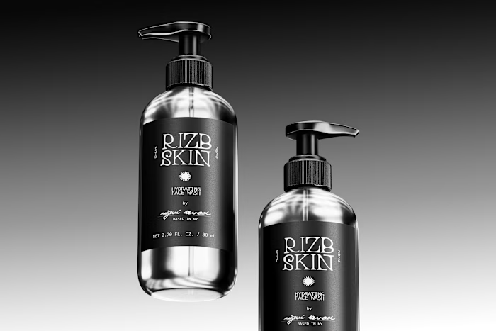
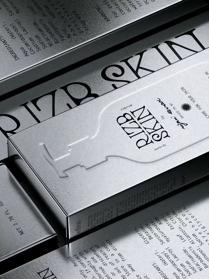
For the second part, here’s a deeper look into the visual details that bring the RIZB SKIN identity to life — from its refined typography and warm colour palette to the clean, minimal packaging system.
The goal was to create a visual language that feels modern and distinctive while keeping the overall experience approachable, calming, and premium.
Every element was carefully designed to reflect RIZB SKIN’s focus on simple, thoughtful, everyday skincare.
What do you think about the visual direction? I’d love to hear your thoughts. 🤎
Like this project
Posted Sep 18, 2026
A closer look at RIZB SKIN 🤎 For the second part, here’s a deeper look into the visual details that bring the RIZB SKIN identity to life — from its refined...