Don't worry, bee hone
Marla Gebauer
About the company
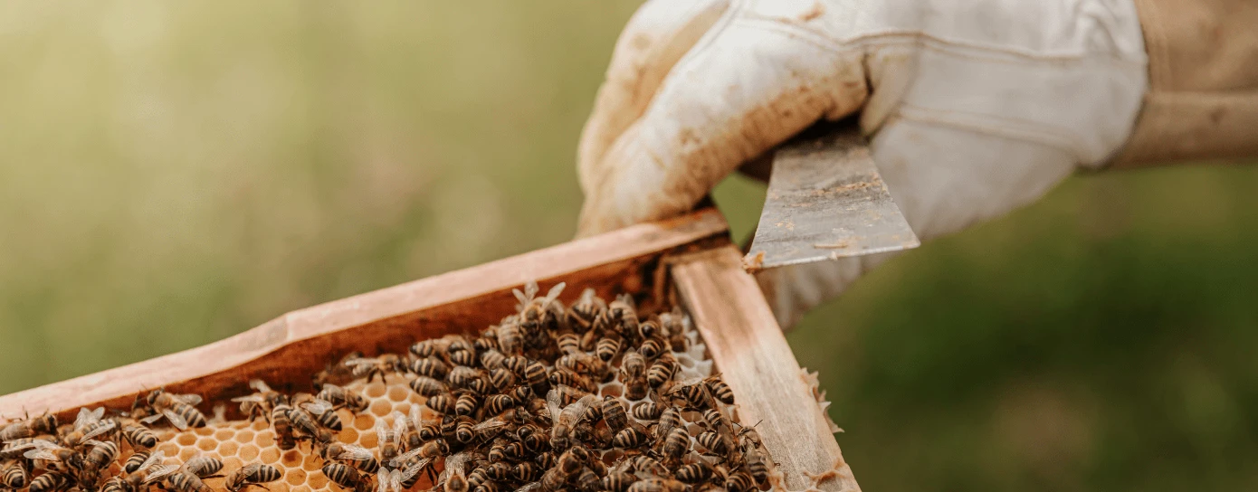
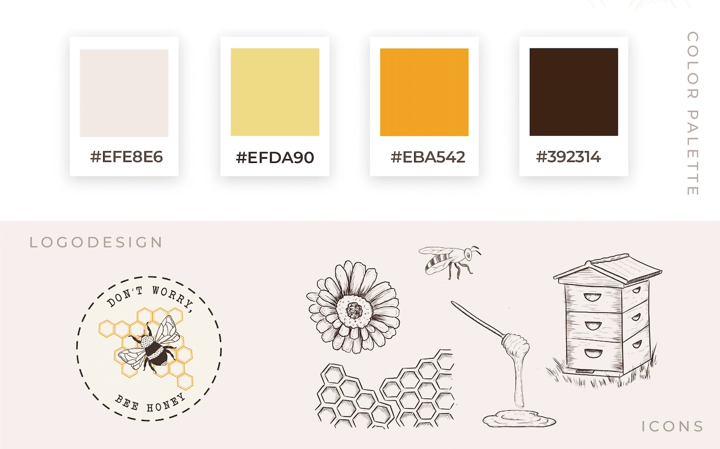
The honey brand from Saarland encapsulates family tradition and craftsmanship in every drop. The logo, a masterpiece of symbolism, portrays a honeybee centrally positioned within a honeycomb pattern shaped like the Saarland region. The typography, reminiscent of a typewriter, emphasizes the handmade and authentic nature of this product.
The Branding Package
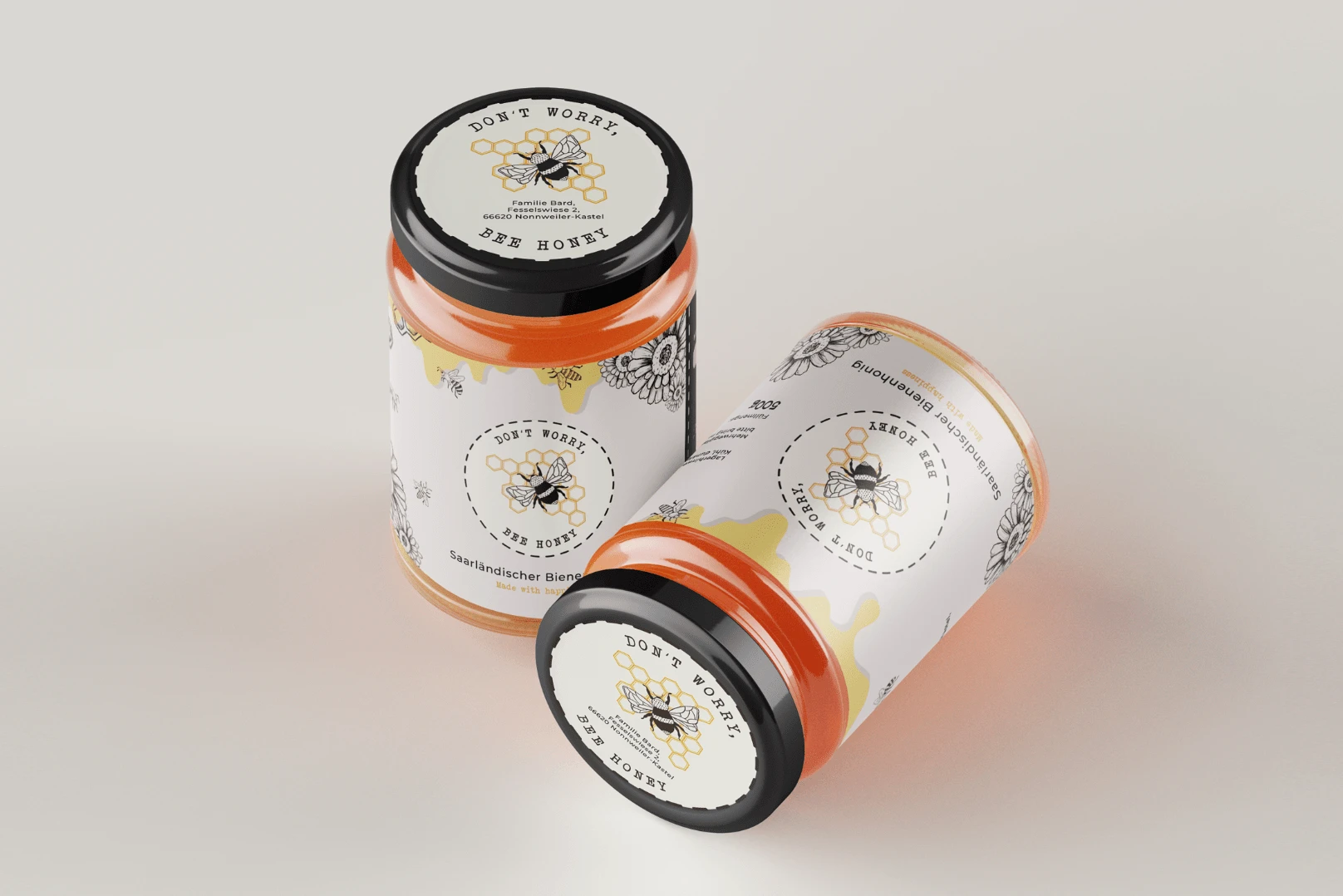
The delicate honey droplets on the packaging not only add color but also evoke a comforting warmth, visually enhancing the product and emphasizing the heartfelt nature of its production. Every detail of the packaging has been carefully crafted to convey a deep connection with nature and a dedication to tradition. This honey is more than just a product – it's the result of a long-standing family tradition, embodied in every jar.
The packaging design
The delicate honey droplets on the packaging not only add color but also evoke a comforting warmth, visually enhancing the product and emphasizing the heartfelt nature of its production. Every detail of the packaging has been carefully crafted to convey a deep connection with nature and a dedication to tradition. This honey is more than just a product – it's the result of a long-standing family tradition, embodied in every jar.
Like this project
Posted Nov 18, 2023
Brand development for a honey brand from Saarland rooted in multi-generational family tradition. Involves logo design, brand identity, and packaging design.