Carrefour Card App Redesign
Laura Magalhães
How I helped boost Carrefour Bank’s NPS by 11%
5 min read
Overview
The Carrefour Card app faced many performance and user experience issues. It was designed for users with a bank account and a credit card, making it easier to manage these products. The app allows users to check their balance, track expenses, view credit card statements, pay bills, and even purchase insurance or loans.
The challenge
The app’s design was inconsistent, with too much unnecessary information, making it hard for users to navigate and find features. On the business side, some key features were not highlighted on the main pages, and stakeholders wanted them to be more visible to encourage usage.
With over 6 million users, these usability and stability issues led to many complaints in app stores, dropping the app’s rating to 3.1 and increasing the number of support tickets.
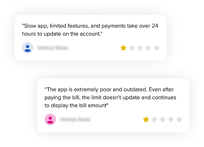
These two statements were made by users on the Google Play and App Store.
The decision
After many discussions and brainstorming sessions, the stakeholders prioritized a long-awaited project: redesigning all app experiences and migrating from a PWA to a native platform. At first, there were some concerns since it was a huge project that could take years to complete. However, we all agreed it was the best decision to improve the user experience and achieve the business goals.
The process
We split into squads to divide efforts and focus more effectively. My squad, the Channels Squad, was responsible for all cross-app experiences. My team's responsibilities include projects like the new Homepage and defining experiences and patterns. To understand where to start, we created a process:
1. Prioritization: Given the product’s complexity, we used an effort-value matrix to identify the project with the biggest impact on user experience and business goals.
2. Analysis and goal-setting: We worked closely with the Business team to define clear objectives and develop a solution that aligned with them.
3. User interviews: We conducted interviews to understand user needs and challenges, collecting valuable feedback and insights, such as:
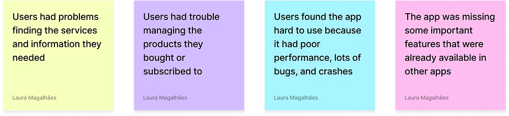
Some of the feedback from users
4. Benchmarking: We analyzed banking apps to identify both good and bad experiences, ensuring our app remained competitive and aligned with market standards.
5. Wireframes: We created low-fidelity wireframes to validate the structure, making it easier to iterate and build a strong foundation for development.
Press enter or click to view image in full size
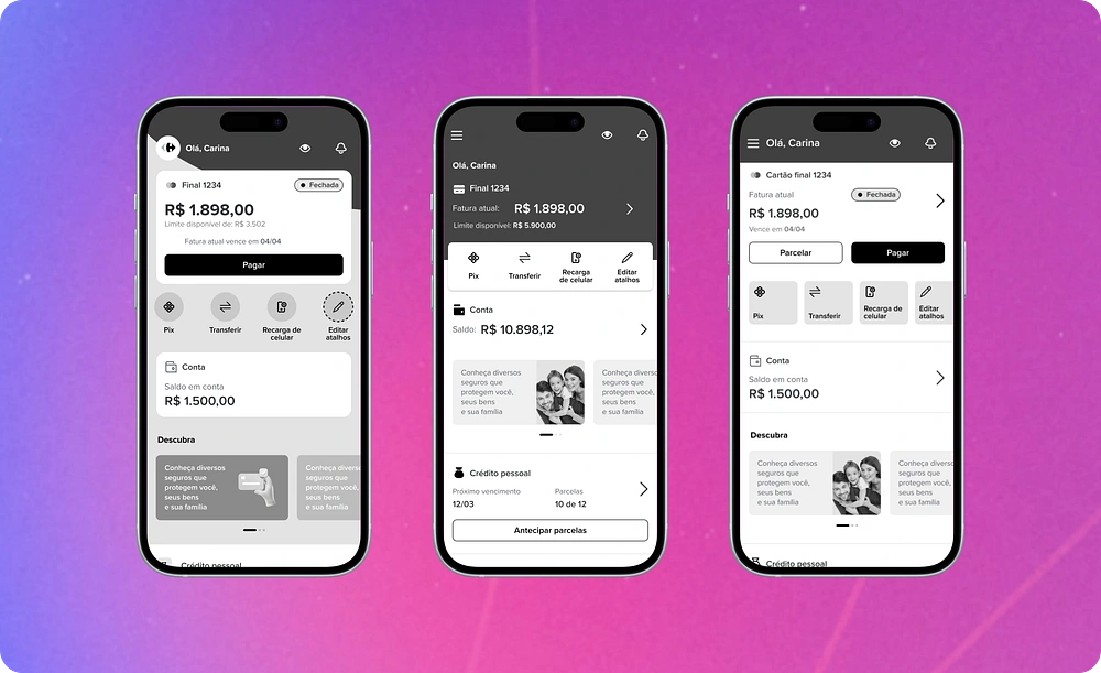
Exploring Wireframes for the Homepage
6. High-fidelity designs: We applied the app’s visual identity and used components from the design system to speed up development and maintain consistency.
7. User testing: We conducted moderated usability tests with ten users, which were crucial for validating and gaining approval for the solution we planned to implement.
Moderated usability test
The changes in the app were pretty drastic, from new components to switching up the navigation (we used to have a bottom bar, which wouldn't exist in the new proposal). So, our goals were:
Understand if users have trouble navigating the areas and features
Check if users understand the information and hear their thoughts on the new homepage
Test key hypotheses
The hypotheses we wanted to test were:
Users won’t have trouble navigating the app
Users will be able to find the products and services they need
Users will find the design more friendly and modern
This screenshot is from a test done through Meet. On the left side, you can see me and two other people in the meeting, one of them being the user. On the right side, there's the spreadsheet we used to document the insights.
Running these tests was crucial to understanding how users interact with our prototype. To ensure diversity, we tested with a group of 10 people with different levels of digital skills, ages, and backgrounds. The entire process of recruiting, testing, and analyzing data took about three weeks.
Fortunately, all our hypotheses were confirmed. Users had no difficulty navigating the app or finding the services and features we wanted them to locate. We received positive feedback about the design and how easy it was to use. Here are some comments they shared:
“I liked having everything on the main page, it’s easy to use day-to-day. I wouldn’t change anything because everything I need is on this screen.” — T.G, 35 years old. “The home screen changed, right? It looks different from all the other apps I use. I liked that you guys added shortcuts because it has the functions I use the most.” — E.S, 42 years old.
Solution
We added areas for subscribed products on the homepage to make management easier
We introduced new features to make the app more modern and competitive
We created tutorials for complex features to reduce the learning curve
We set experience standards to ensure high quality, consistency, and scalability across the product
We improved the design system components to keep the visuals modern
We migrated the app from a PWA to native development, enhancing performance and usability
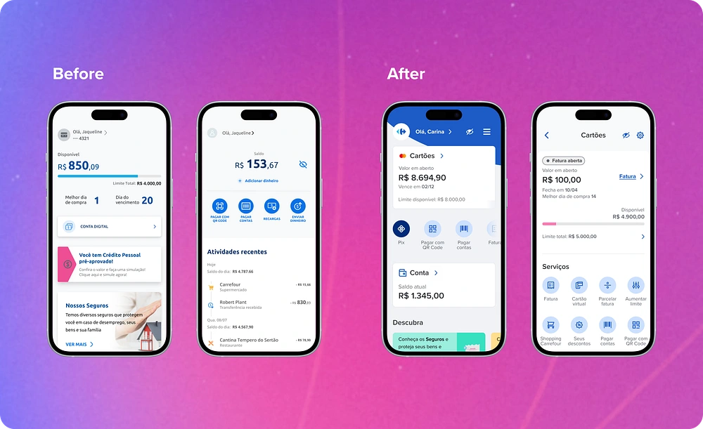
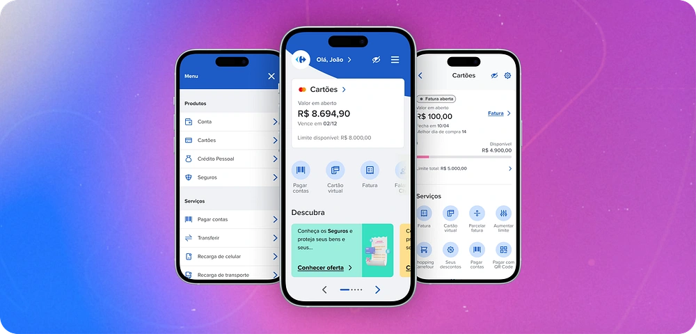
Homepage and Credit Card Screen: Before and After the Update
Results
The design and development process took almost a year, and the new app was launched in the second half of 2023. To ensure the app's success, we tracked key metrics such as churn, NPS, and app store ratings.
After a year of launching, we achieved the following results:
Google Play ratings improved from 3.1 to 4.8
The app’s NPS increased by 11%, from 60.7 to 67.3
Churn decreased by 16%
Conclusion
It was an extensive project, and even two years after it began, we’re still working on features and experiences that haven’t yet been migrated. From the metrics collected and user feedback, we’ve learned a lot. Some things worked well, while others needed to be reconsidered or adjusted — but that’s a topic for another article (coming soon 🤞🏾).
I hope this article has been helpful in some way. If you have any questions, please reach out at lauramda85@gmail.com or grab a time on my Calendly agenda.
Did you enjoy this article? If you're curious to learn more about other exciting projects I've worked on at Carrefour Bank, check out these links:
How we crafted inclusive onboarding experiences (coming soon)
Lessons learned from launching the new Carrefour Bank homepage (coming soon)
Thanks for reading! ✨
Like this project
Posted Mar 19, 2026
Redesigned Carrefour Card app to improve user experience and increase NPS by 11%.
Likes
0
Views
3
Timeline
Jun 30, 2021 - Jun 30, 2023