Improving the Browsing and Booking Experience
CLIENT: Wildflower Studio
TIMEFRAME: 8 weeks
ROLE: Research, UX/UI Design, Visual Design, Usability Testing
PLATFORMS: Responsive Web
What is Wildflower Studio?
Wildflower Studio is a unique establishment that combines a local cat cafe with an art jamming studio. The platform enables art enthusiasts and feline lovers to indulge in therapeutic art jamming sessions alongside adorable cats by booking an art jamming with cats session. Through partnerships with rescue cat groups, Wildflower Studio actively fosters these charming kitties, ensuring their socialization and well-being. Customers of Wildflower Studio have a chance to adopt these loveable companions.
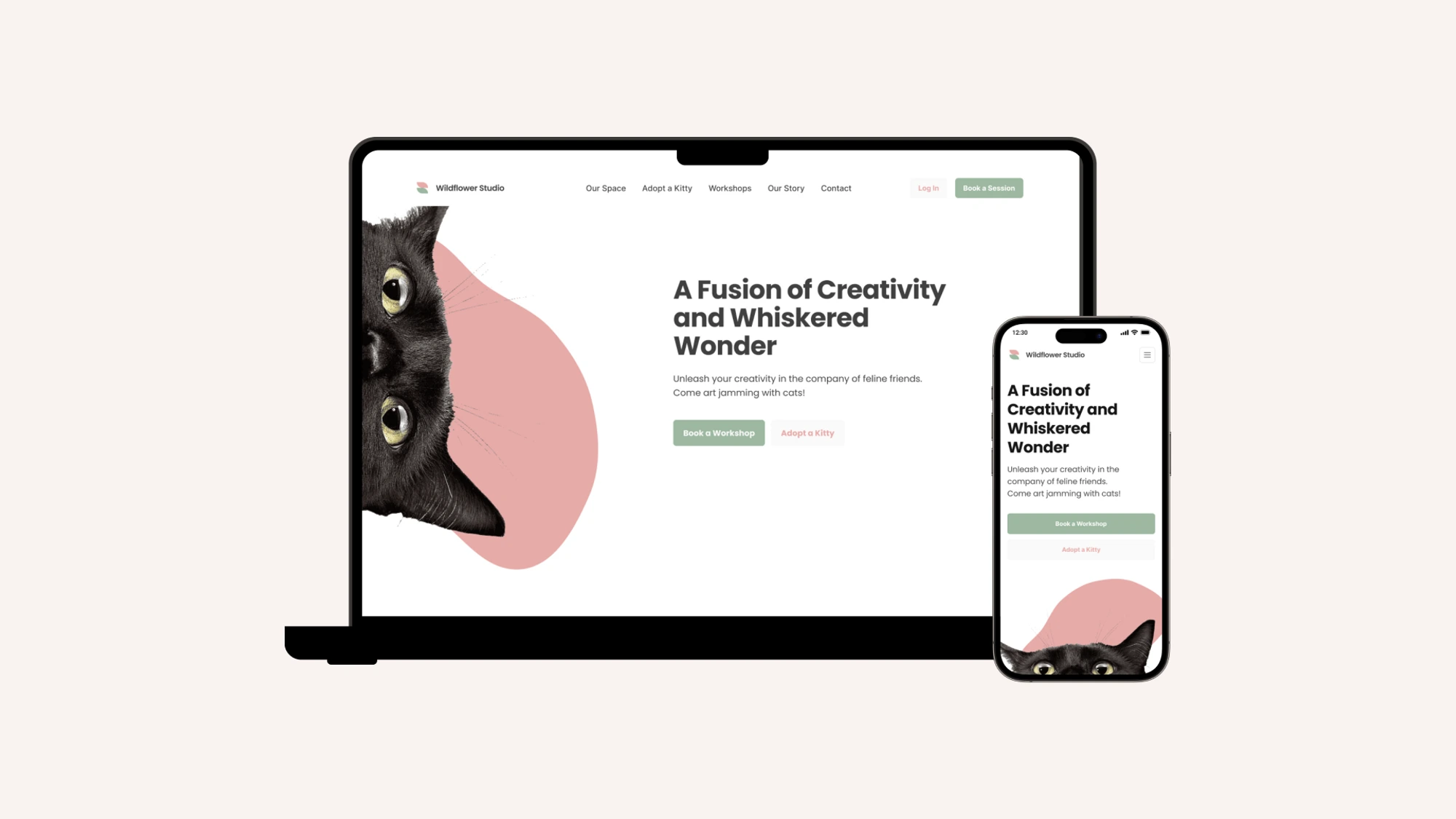
The aim of this project is to create a responsive website that improves the user experience, facilitates content organization, and focuses on highlighting to the user that they can adopt cats at Wildflower Studio. The website will feature a convenient appointment booking feature for users to schedule visits and interact with the cats before making an adoption decision.
Problem
The current website suffers from cluttered and overwhelming information. The absence of an efficient organizational structure hampers the user's browsing and booking experience. Moreover, the lack of clear calls-to-action and easily accessible content leaves users unaware of the option for cat adoption. As a result, users are compelled to manually contact the brand to find the desired information and get their questions answered.
Solution
I consulted the owners of Wildflower Studio to implement a responsive website redesign within the limitations of Wix. The focus is to establish an effective organizational structure that encourages visitors to engage more frequently with the platform. By doing so, users will be able to effortlessly find the information they seek, eliminating the need to manually contact the brand for clarification or additional details.
How might we strategically redesign the Wildflower Studio website to prominently feature cat adoption information and enhance the user experience, enabling visitors to easily find what they are looking for?
Problem
To identify the issues, a usability audit was conducted on the current website. The findings are:
Non-intuitive header tabs with hidden menus make content difficult to locate.
Messy visual hierarchy impacts alignment and typography.
Scanning information is challenging due to chaotic eye movement while scrolling, lack of images, and inconsistent alignments.
Inconsistent visual brand identity with varying colors.
Missing features: inability to book appointments to view cats before adoption, reliance on external Google forms.
It has also been highlighted that users would often reach out to Wildflower Studio via Whatsapp or other platform to address their concerns. This indicates that the current website has poor navigation and content organization.
Goal
To develop a responsive web with a brand identity refresh that empowers users to find what they are looking for on the Wildflower website.
Gathering Insights
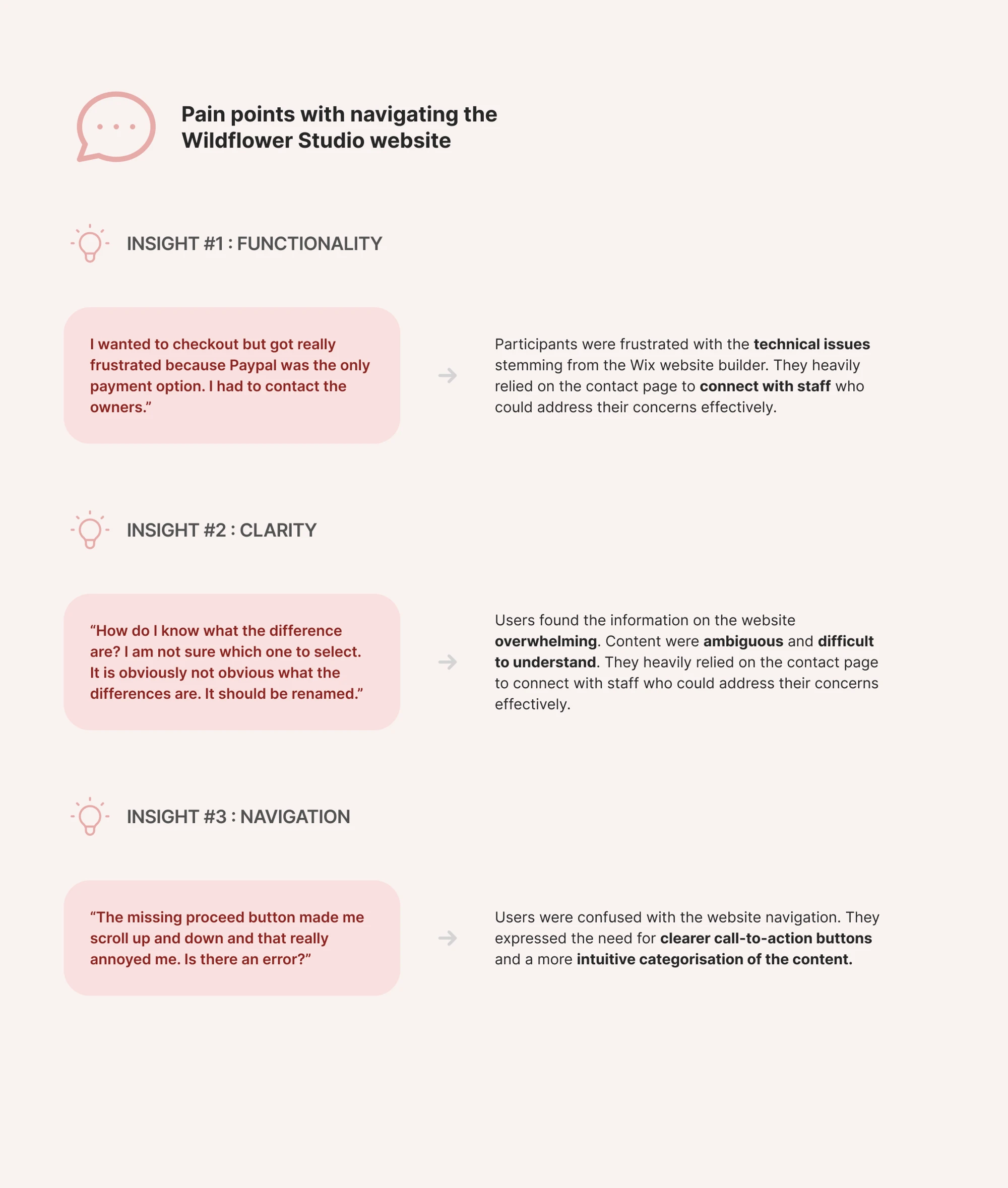
At the beginning of the project, I dived into an intensive two weeks user research sprint to gain a better understanding of the user’s wants, needs, and expectations. I did a survey among six users, conducted six user interviews, sought out feedback on Instagram regularly, and mapped out a competitive audit to understand the market demand, product gap, and current product offerings that the industry provided.
The overall findings were as follows:
Sarah’s POV
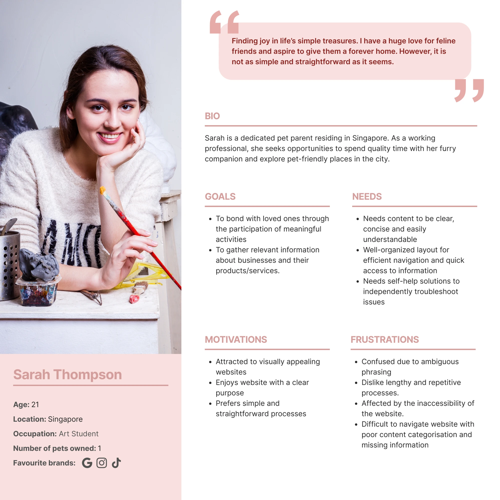
With the insights gathered, a persona was created to focus on the user’s goals, needs, motivations, and frustrations.
Enhancing content discoverability
To ensure a smooth browsing and booking experience for users, the focus was on enhancing the following key areas:
Locate essential information on the homepage, including booking a art jamming session
Navigate the cat adoption process, including finding a cat from the gallery, viewing its profile, and filling out the adoption appointment form.
The process outlined below begins with a product feature roadmap where I drew reference from the defined sitemap and task flows. I documented each potential feature and its corresponding UI requisites before translating my concepts into sketches and, ultimately, a high-fidelity prototype. In this concise rendition, you can observe my approach to address user needs below.
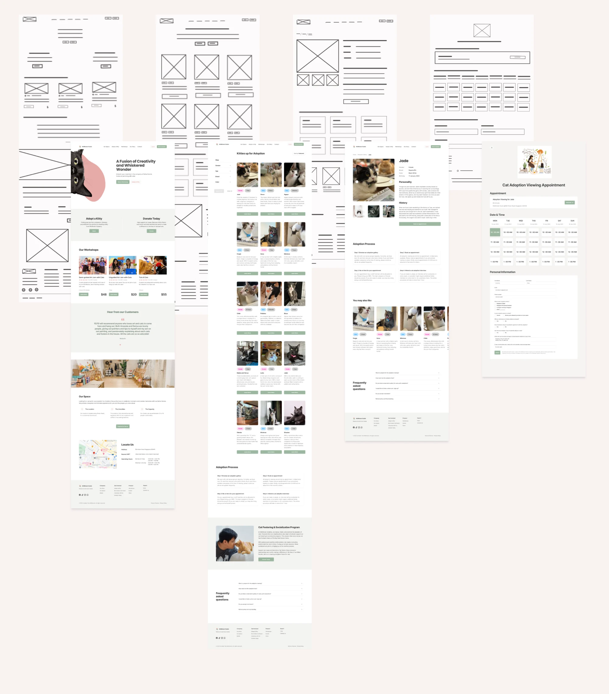
The key solutions implemented in the prototype are as follows:
How might we optimize the website's navigation to enable users to efficiently find the information they are seeking?
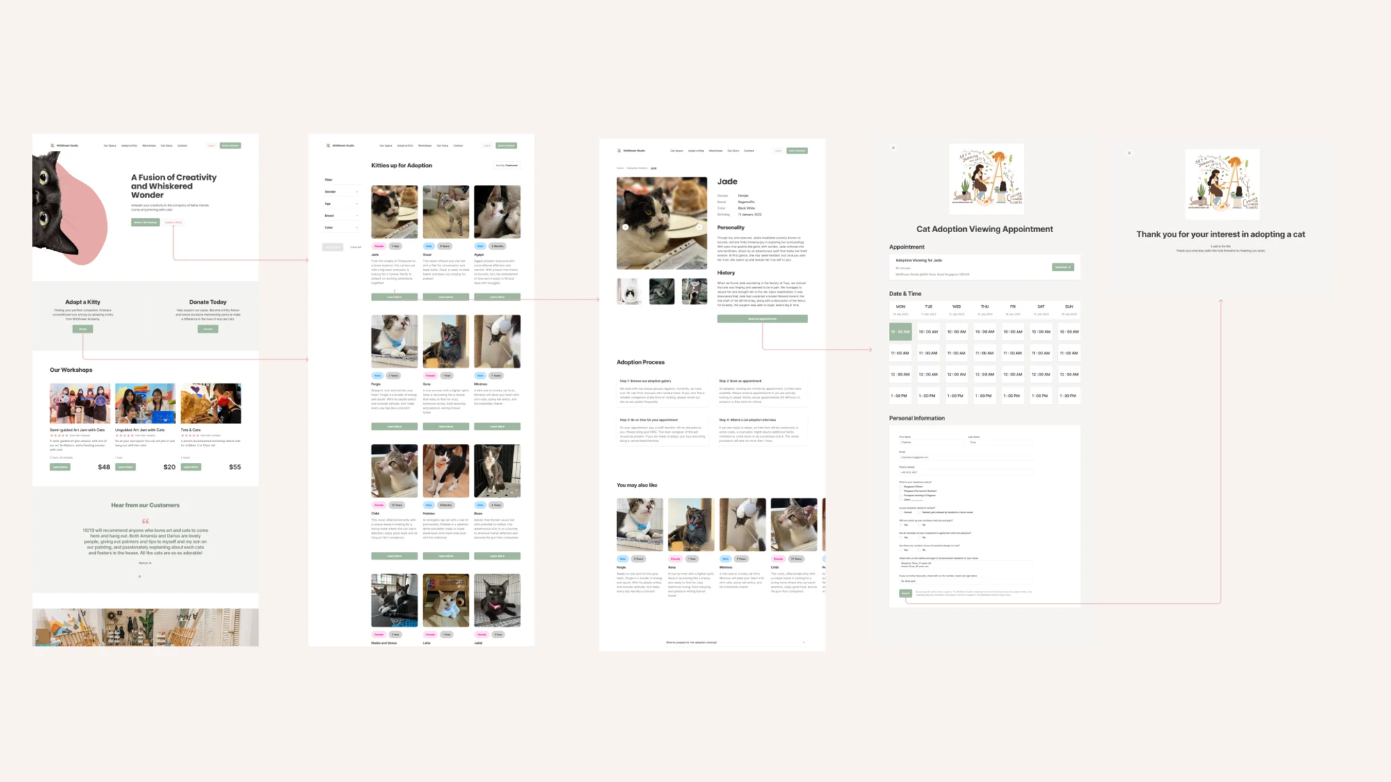
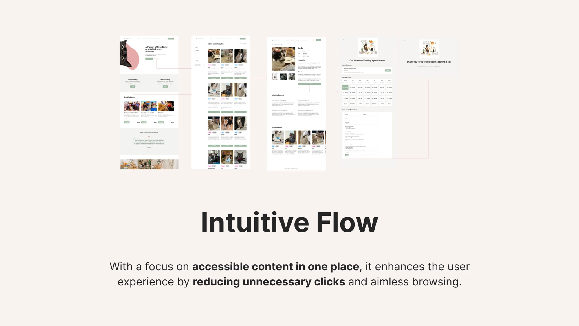
Intuitive flow
The focus on clear categorization and accessible content in one place, enhances the user experience while eliminating the need for excessive clicks and mindless browsing.
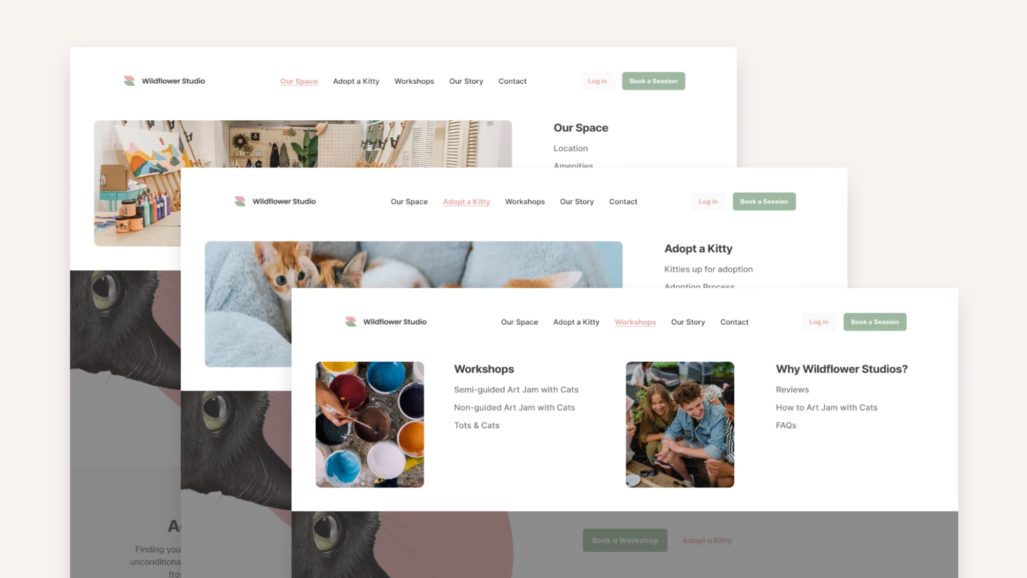
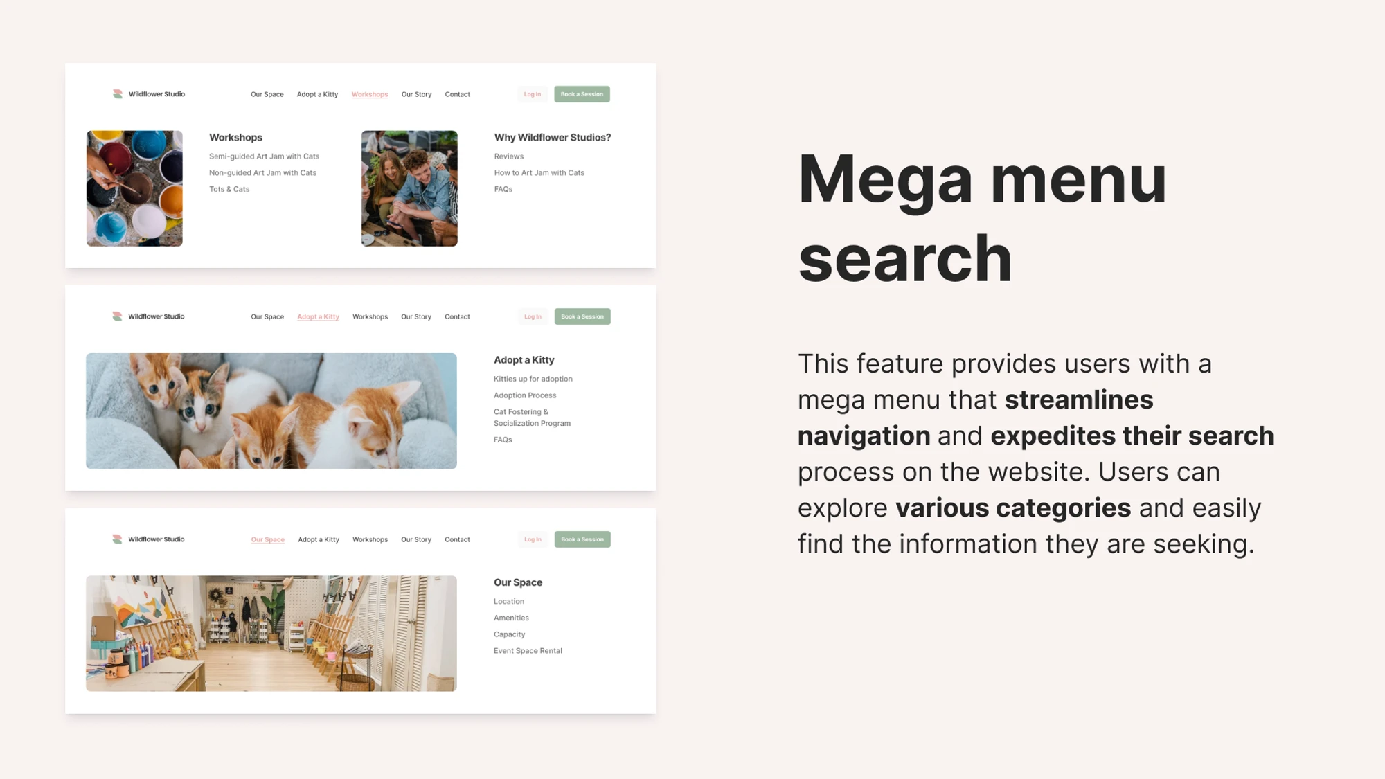
Mega menu navigation
With a large amount of content, a mega menu was created to enable users to see and overview and have access to various categories, expediting the search process.
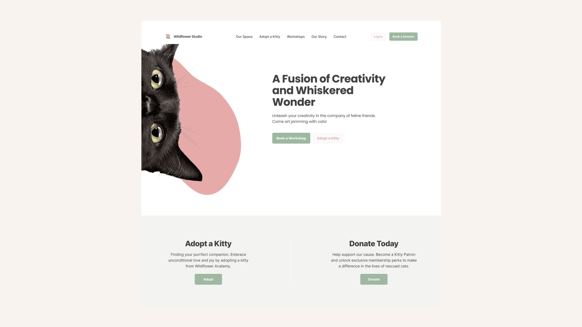
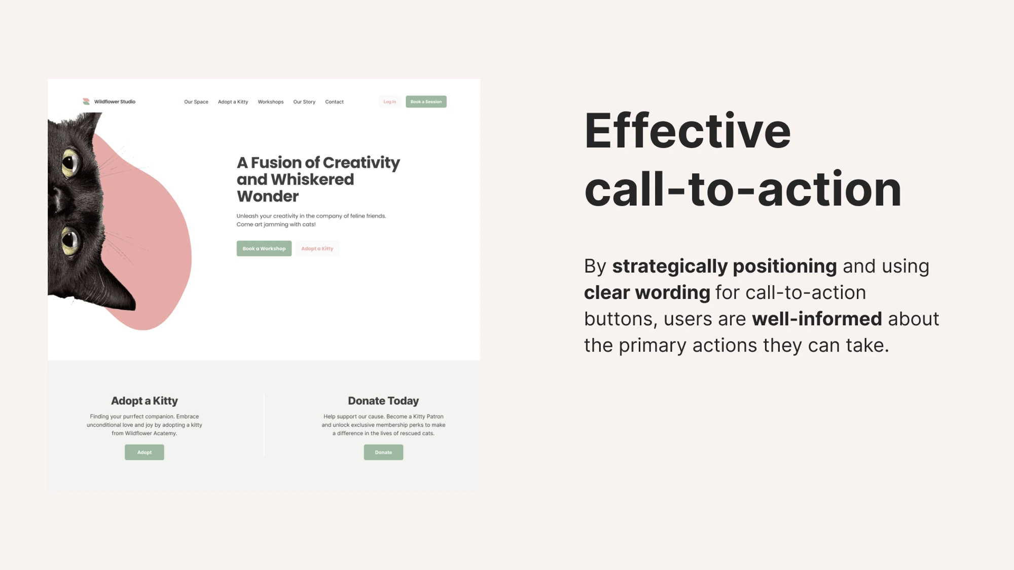
Effective call-to-action (CTAs)
The homepage is optimised to provide discoverable content. A prominent CTA for “Adopt a Kitty” will be strategically placed on the website, encouraging users to support Wildflower Studio’s mission. Other primary actions such as “Book a Workshop” and “Donate” can be seen on the homepage
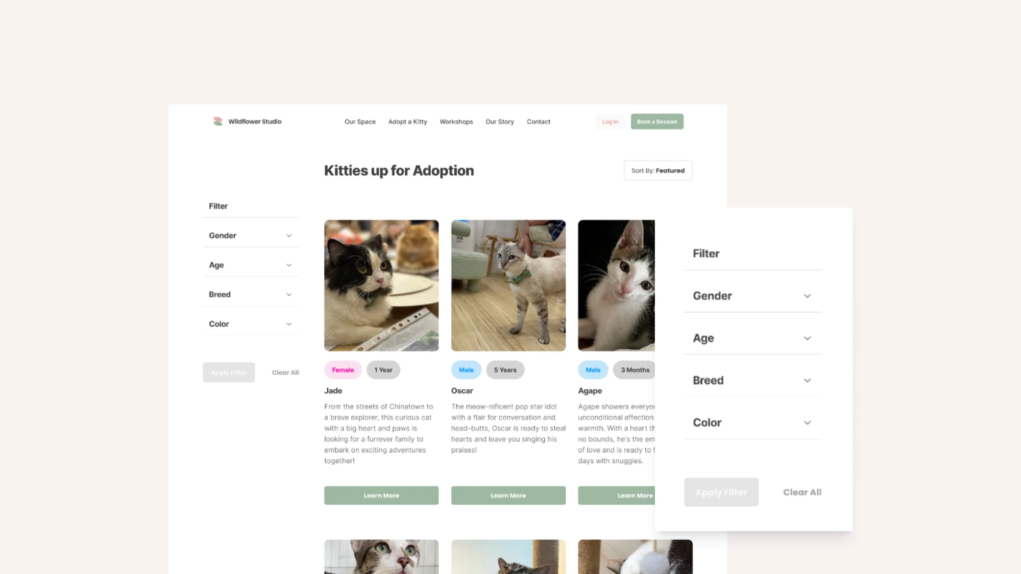
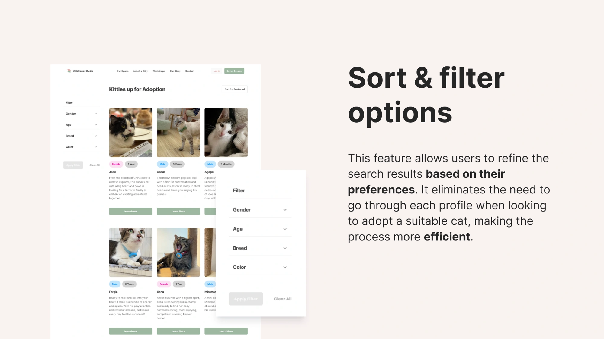
Sort & filter options
this feature allows users to refine their search results based on their preferences. it eliminates the need to go through each profil when looking to adopt, making the process efficient
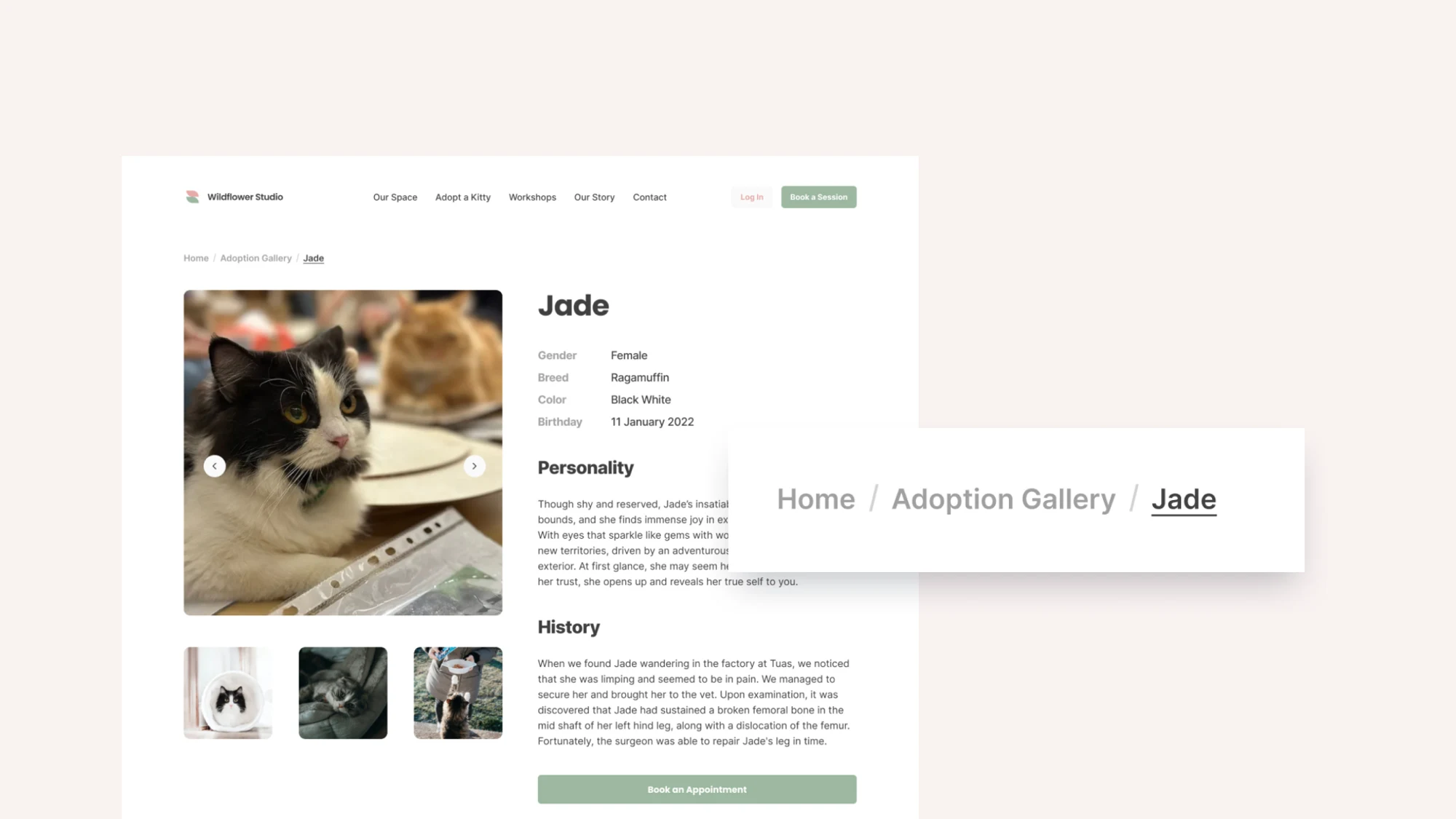
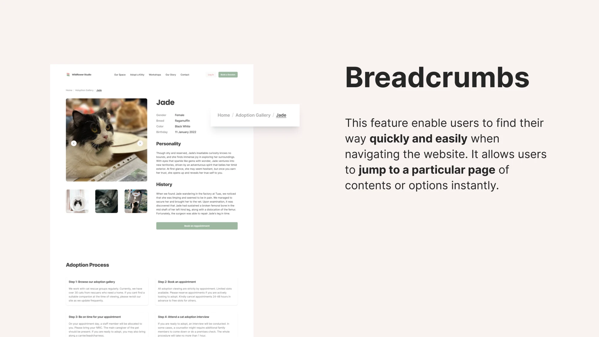
Breadcrumbs
The navigation structure will be simplified, ensuring that users can quickly access the relevant content they need. Breadcrumbs are used as a secondary means of navigating through the website’s content and jumping through their desired pages instantly.

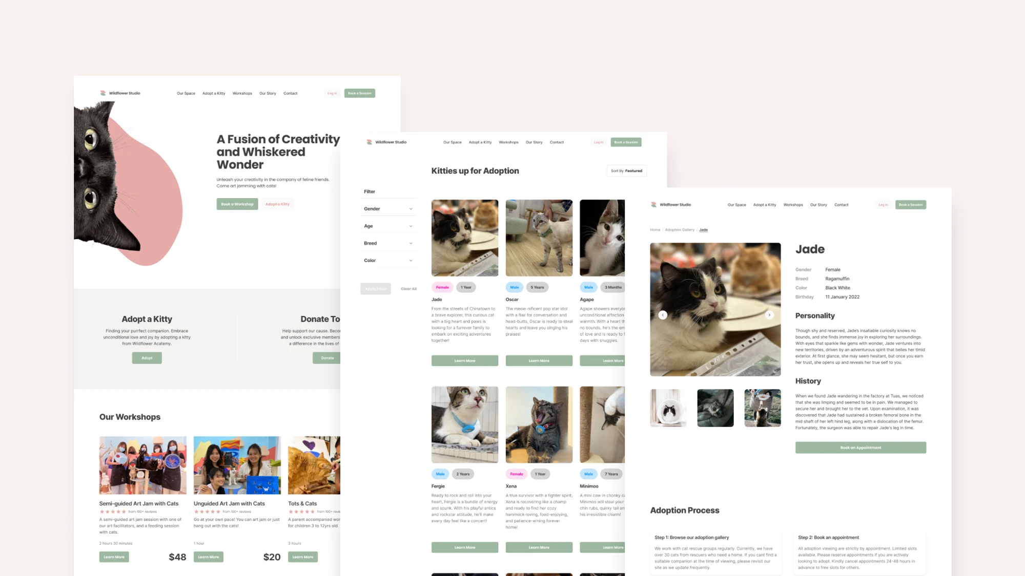
The usability testing for the Wildflower Studio prototype yielded remarkable results. Impressively, many testers rated the tasks with a 5 out of 5 for their ease of completion. This was an improvement from the initial contextual inquiry that was conducted at the beginning with compliments for the simple website navigation and pleasing aesthetics of the prototype. Testers were able to complete the tasks smoothly while encountering minimal to none challenges.
In the upcoming development phase where the prototype would be executed on the Wix platform, the team has strategized to harness Google Analytics to evaluate website performance, garnering invaluable insights. These insights will shape future improvements and refinements, ensuring a continuously enhanced user experience.
A more consistent and distinctive brand identity
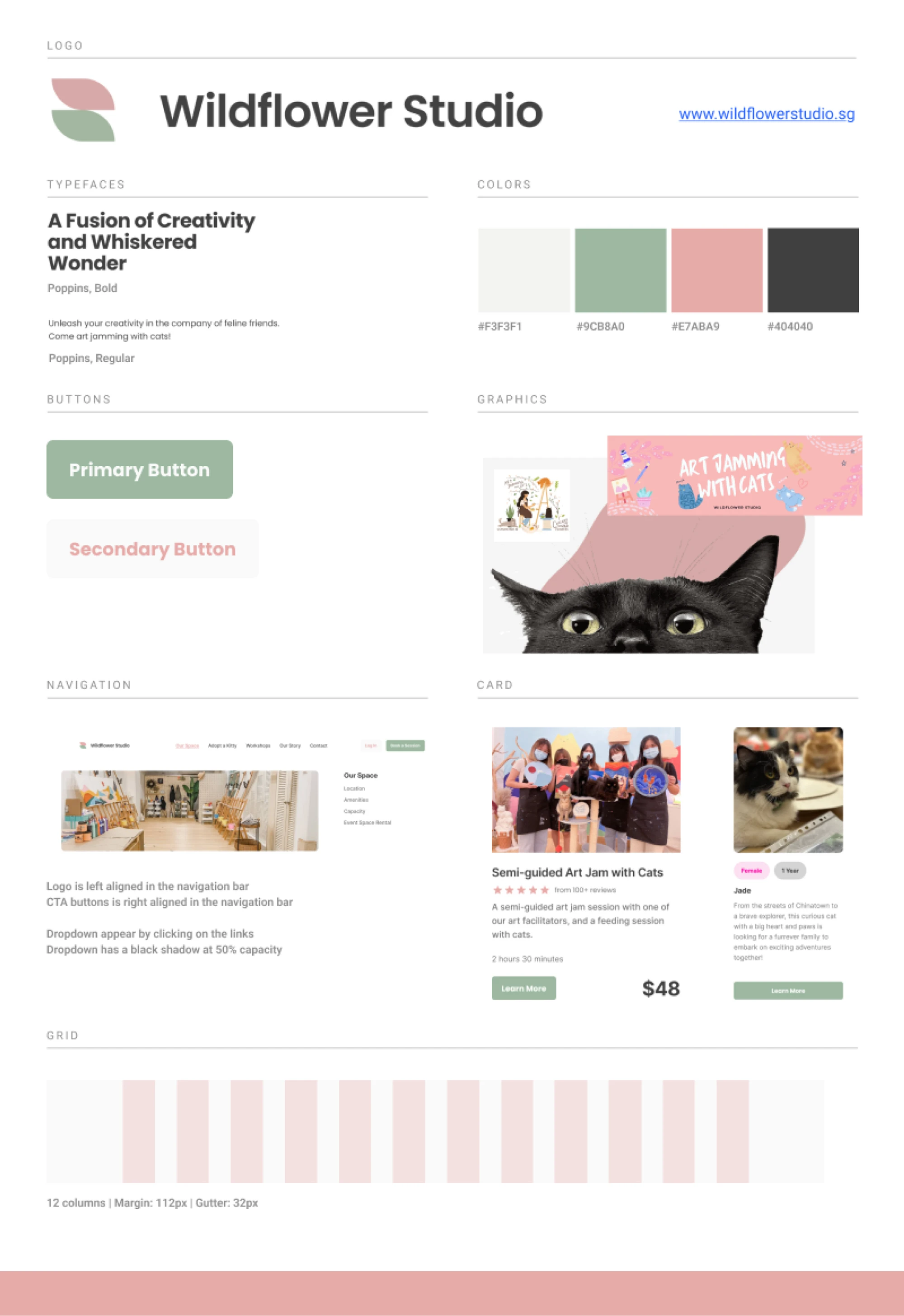
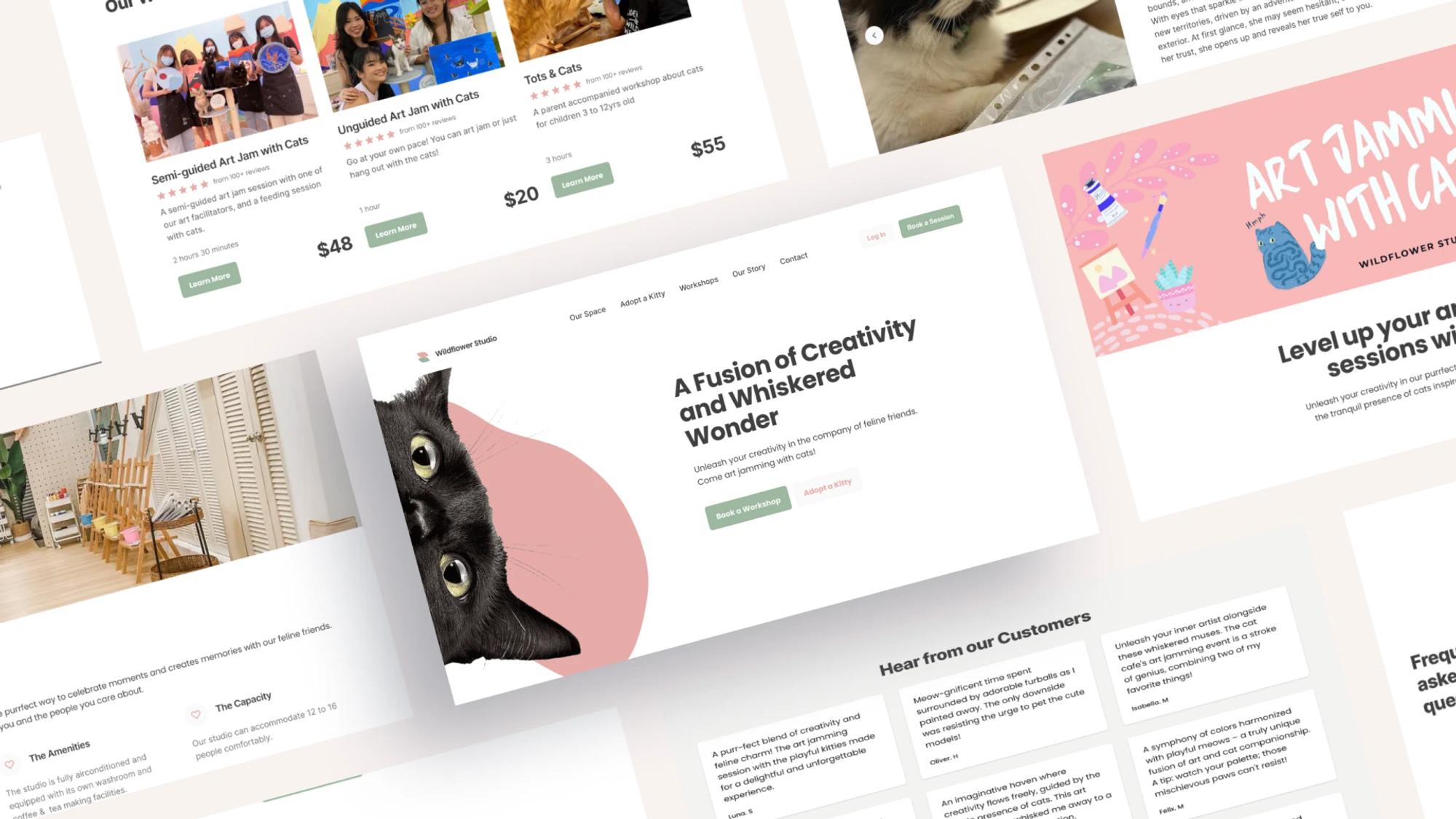
To establish a vibrant and distinctive visual identity, the redesigned website integrates a fresh and minimalistic logo that symbolizes the unique blend of a cat cafe and art jamming studio. The selection of pastel colors evokes a sense of warmth and tranquility, appealing to individuals seeking a relaxing environment. By implementing a comprehensive visual system, the website establishes clear guidelines for design, guaranteeing consistency and delivering an enjoyable user experience across all platforms.
FINAL THOUGHTS
Set clear client expectations This experience has taught me the importance of managing client expectations. In the beginning, the client's requirements included crafting numerous pages of different nature, integrating new payment methods, and linking the booking system into the global distribution system. It was essential to communicate openly about project scope, timelines, and potential challenges from the start. This ensures alignment and minimizes misunderstandings throughout the design process.
Prioritizing the development of a user-centric MVP Given the project’s time constraint, the focus was on creating a smooth cat adoption process. This project highlighted the need to allocate time for the development of other essential page for a seamless user experience. A key learning point from this project was learning to prioritize and craft out high impact pages and features that resolves the most important problems based on user impact, business goals, and feasibility was a key point from this project.
Navigate platform limitations Working on the Wix platform meant dealing with certain limitations. These limitations may include design constraints, integration challenges, or customization options. Adapting to such limitations requires creative problem-solving and finding workarounds to achieve the desired functionality and aesthetics. This experience underscores the significance of platform research and understanding its capabilities before committing to design elements that may not be easily achievable within the chosen platform.
Simplicity and Familiarity in User Experience The project underscored the significance of providing users with familiar solutions that effectively solve their problems. I learnt that simplifying task flows and minimizing steps required for user tasks enhanced the overall user experience. Presenting content straightforwardly and ensuring ease of navigation also contributed to a positive user perception and effective problem-solving.
POTENTIAL NEXT STEPS
The project is currently in the process of implementing the website into Wix and organizing the visual identity system. Following the launch, the team plans to utilize Google Analytics to assess website performance and gather valuable insights, which will inform future enhancements and refinements.
Due to the time constraints, the focus was primarily on creating a seamless flow for the cat adoption process. Going forward, I would like to build out the other pages for Wildflower Studio.
In the future, the objective would be to migrate the website from the Wix platform to a more stable one such as Shopify or Webflow, aiming for a more seamless user experience.
Like this project
