R&O Construction Logo Redesign
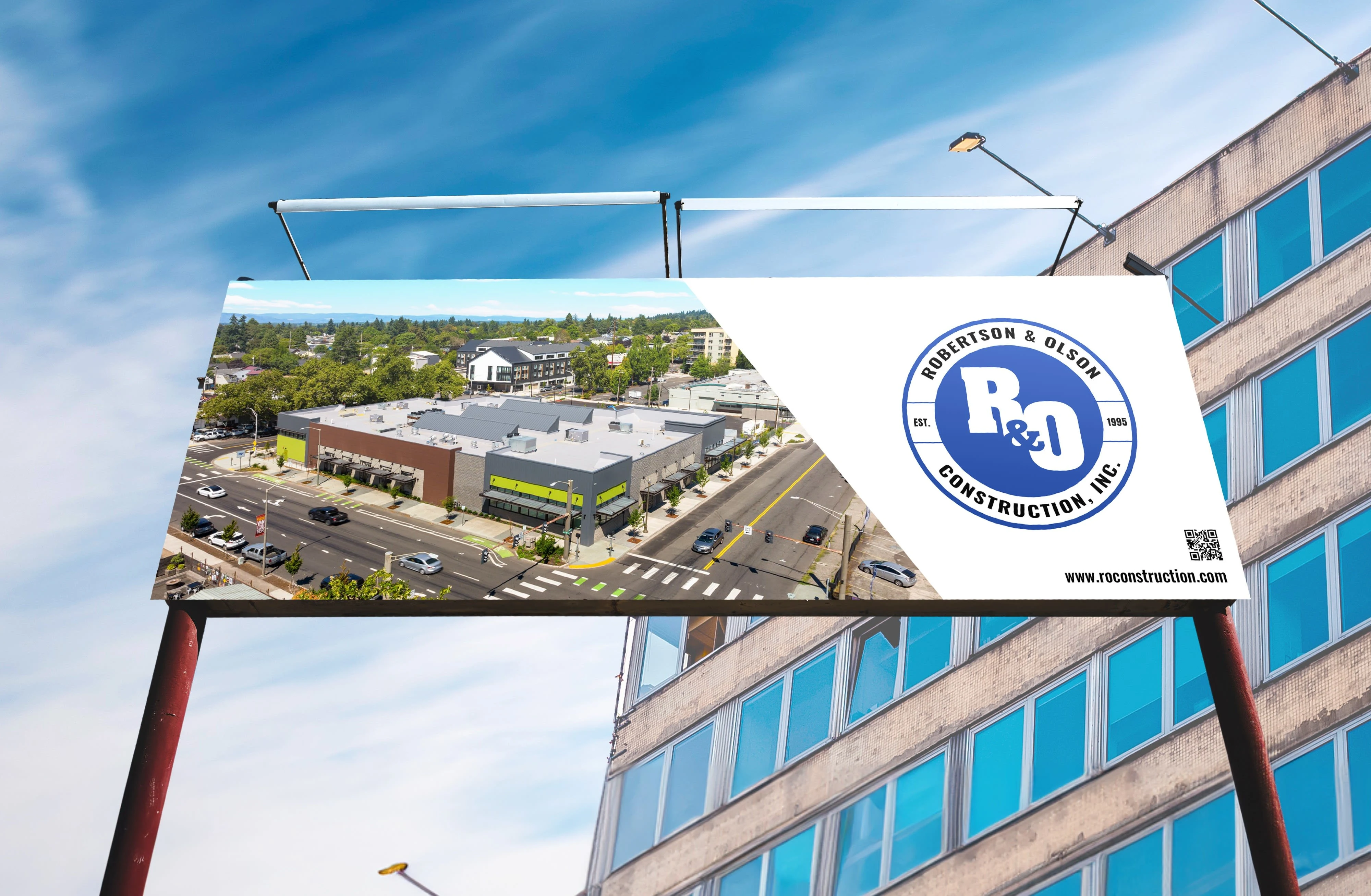
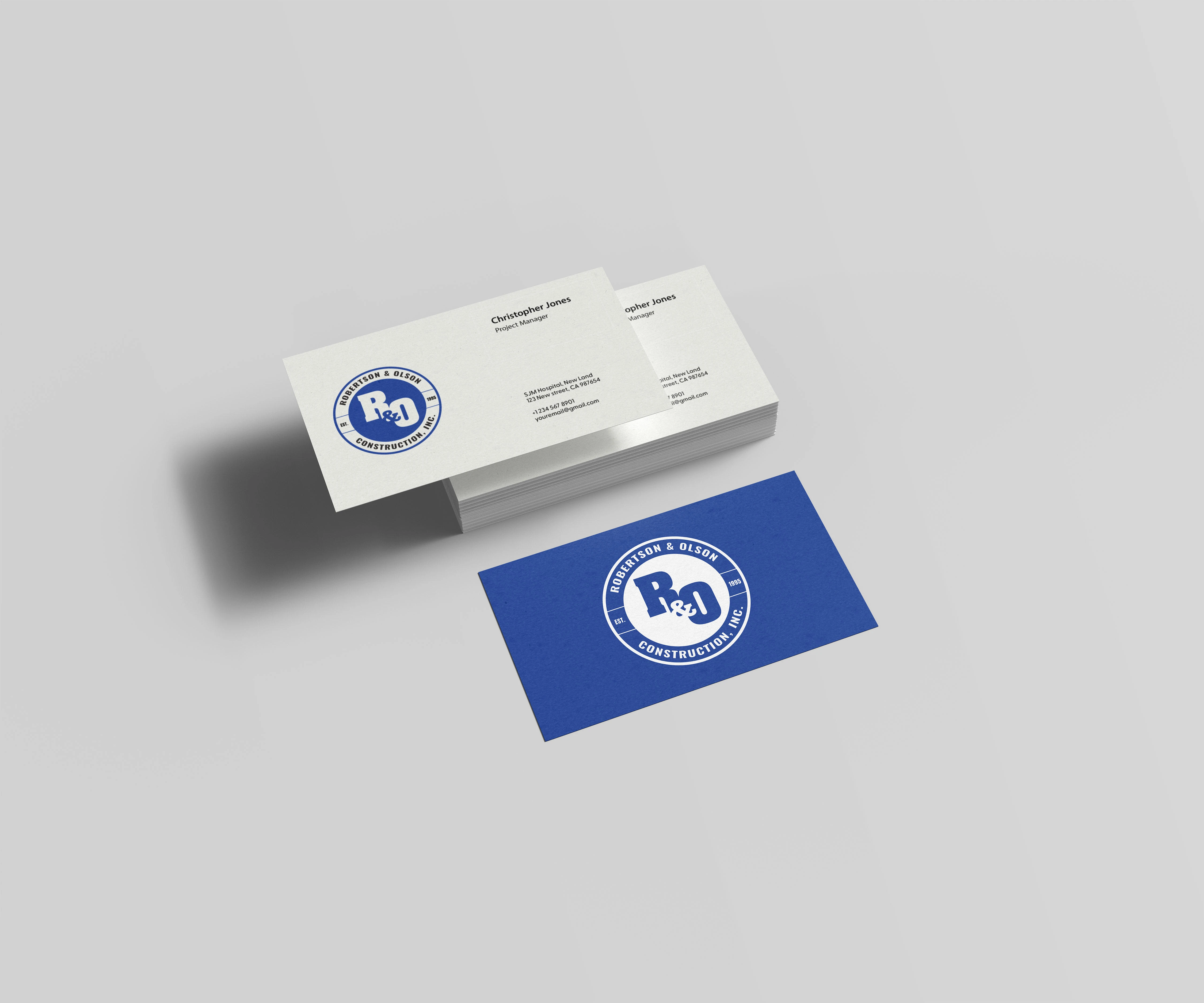
Robertson & Olson Construction, a prominent general contractor, entrusted me to redesign their existing logo. The original was created in 1995, during a time when print collateral was heavily used (stationary, business cards, envelopes), and worked well for those purposes. However, in today’s digital era, it was essential to make the logo responsive and versatile for digital applications.
Distilling the logo down to it’s most locally recognized identity of the “R&O,” my approach was to utilize negative space for the “&” to introduce balance and visual interest. The stamp-style design not only ensured adaptability across both print and digital mediums but also facilitated the integration of the full name and established date.

Like this project
Posted Mar 14, 2024
Robertson & Olson Construction, a prominent general contractor, entrusted me to redesign their existing logo.
Likes
0
Views
0
Clients
Robertson & Olson Construction

