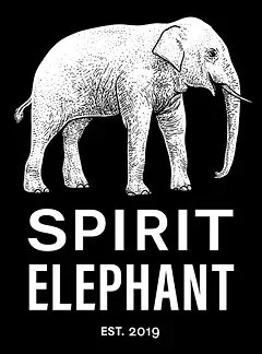
Logo Redesign: Spirit Elephant
Overview
Out of a desire to create and work on my graphic design skills, I decided to take the logo of a company local to me and redesign it.
Spirit Elephant is a vegan restaurant located in Winnetka, Illinois. It is the first strictly vegan business to open in the area, and it is the first of its kind to actually bring in customers that describe themselves as carnivores. It's measurable success since opening in 2019 however, feels marred by the branding overall, as the logo doesn't seem to encapsulate the meaning behind it's name, vibe, or regular diners.

Original logo, pulled from Spirit Elephant's website
For this reason, I decided to take a crack at redesigning the logo to better fit the company's aesthetic and audience.

My final logo redesign for Spirit Elephant after using the contrast checker.
Process
The redesign of this logo needed to help Spirit Elephant become more recognizable as a brand, but also be something that the restaurant could use on server t-shirts, the front of menus, and more.
With this in mind, my process was informed by personal research—where I dined at the restaurant and talked to their customers, and at the same time, informed by research into the restaurant industry.
I developed a couple concept logos on Adobe Illustrator. The first logo was a two-color logo, with the actual elephant icon lacking any shading or real contrast. The second logo included shading on the ears and changed the aura color to yellow, so that the text was more legible for the average customer. And the third logo was an amendment to the second, which reintegrated darker tusks, as my surveyed friends and family preferred the contrast of the tusks.

The first logo, which used only one color besides white!

The second logo, added more dimension and a contrasting aura color.

The third logo, reintegrated the dark tusks from the first design.
After completing the third logo, I wanted to make sure that the colors used passed accessibility contrast checkers online. In my design process, I do this not only because I value accessibility for people with visual impairments, but because I also value the importance of contrast in logo reprints on merchandise, marketing materials, and more.
Personal Research
While making this design, I mentioned that I had frequented this restaurant prior to beginning the design process. My family, friends, and I had always felt this restaurant's logo design was not representative of the business, service, or people that came to eat there. This is part of why I was motivated to redesign.
Beyond personal experience though, I also brought together a group of eight people local to the area to do a survey before beginning my redesign. The survey only asked two questions: 1. What does this logo look like it stands for? 2. Do you think this logo accurately represents a vegan restaurant in the North Shore?
Overwhelmingly, people could not guess that this business was a restaurant, and their responses to being informed that it was a vegan restaurant were astonishment.
Industry Research
Categorically, restaurant often develop their logos with the color red because it is psychologically linked to induce hunger. This is why fast food joints like McDonald's, Wendy's, Arby's, and more have adopted this as their central color over the years.
Acknowledging this, vegan restaurants almost categorically avoid the color red in their logo designs. Local restaurants like Alice and Friends Vegan Kitchen, Native Foods, Amitabul Vegan, Elephant and Vine, and more choose anything but red.
The logo colors were therefore informed by personal feedback I received from my eight-person survey group.
Feedback
Since this process was lacking a direct client, I used my original eight-person group to gather feedback for each draft of the logo.
The first design, people preferred the isolated icon of just the elephant's head. They liked the blue but felt the design was lacking dimension. While I created this design to be simple for the cost reproduction in t-shirts, menus, and more, I agreed that the one-color logo was flat.
In the second production of the logo, I included shading and added a contrast color for the elephant's background aura. I felt the yellow and turquoise were complimentary to the actual concept behind the design and matched the styling of the restaurant itself. After speaking with the group again, I was advised by many people to bring back the turquoise tusks, despite it not being the natural coloring of an elephant.
The third logo was to be the final design, however, after using the contrast checker. I readjusted the actual hex codes to improve the contrast ratio. The original contrast ration was 3.73. The final logo altered the color of the turquoise, brining the ratio up to 4.5, which is the standard for web design.
Takeaways
Mock or trial designing is a good way to improve and sharpen skills
Logo design and branding should always be accessible, even if it alters a pre-conceived aesthetic
Design decisions should always be informed by a diverse group of people, because it yields the best results
Like this project
Posted Jul 10, 2023
Redesigned the logo of a local vegan restaurant.
Likes
0
Views
14


