Logo Design: Dom's Complete Landscaping
Overview
I connected with the owner of Dom's Complete Landscaping through mutual friends and he inquired about a logo design for his landscaping business based out of Connecticut.
The business owner commissioned this logo with a desire to be able to use it for his business cards, employee work uniforms, and as a part of his application for an LLC. He wanted the logo to help make his business look more professional, and help him do some grassroots marketing in surrounding suburbs.
This logo design process took place over two weeks. There was an initial meeting where we talked about the logo's purpose and design colors. The business owner was initially unsure about what imagery he wanted to use, so I drew up three designs that I thought connected to his identity. With some provided feedback, we collaborated on a separate idea entirely while using the same colors and a font from a previous design.
The client was pleased with the final outcome, and pleased with the speed of the process overall. He has since been able to roll out business cards and use the logo to grow his small business.
Process
My approach to this process was unorthodox because the business owner did not have time to brainstorm in the initial meeting. There was no specific vision for the logo, but the business owner stressed the necessity of something professional as soon as possible.
Doing my best to respond to the lack of artistic direction, the first round of logos was informed by research that I did into the business owner's personal interests and background, facilitated through our mutual connection. I also did market and industry research to see examples of other logo designs and get a better sense of included imagery on landscaping websites and marketing campaigns.
The final logo was developed easily after receiving feedback from the business owner because the initial designs helped him better understand what he did and did not like. In our second meeting, he was very clear about wanting the logo to include a weed whacker cutting grass off of his business name.
Combined Survey & Research
My research was largely informed by wanting to better understand the industry's standard for logo design, while also prioritizing a personal connection to the client.
I was fortunate enough to be able to reach out to people who knew the client and inquire more about his personal interests. My impromptu meetings helped me better understand my client on a personal level and create designs that I felt related to him. Learning about my client's interest in vehicle restoration, military background, and Sicilian heritage helped informed my first round of designs.
Outside of personal attachments, I also wanted to ensure that whatever design I provided also related to the landscaping industry. I took the time to research the industry standards for landscaping by combing through the websites, social media, and splash pages that local landscaping businesses had on Google and Yelp. Being that I was working remotely from Chicago, I also took the time to explore my client's competitors in the Hartford area to make sure there was no crossover in design choices.
First Round of Logos
My first round of logos was largely informed by the research that I had done prior. However, I also wanted to ensure that the logos I created were accessible and legible, as business cards and company t-shirts were the main purpose for logo's development.
Understanding the logo's purpose, I chose to only use two colors in each logo. Ultimately I decided to reuse the same green and black combination throughout the first round because I knew the green and black were accessible to those with colorblindness. This choice was informed by an online resources called WebAIM that I had used in the past for social media design.
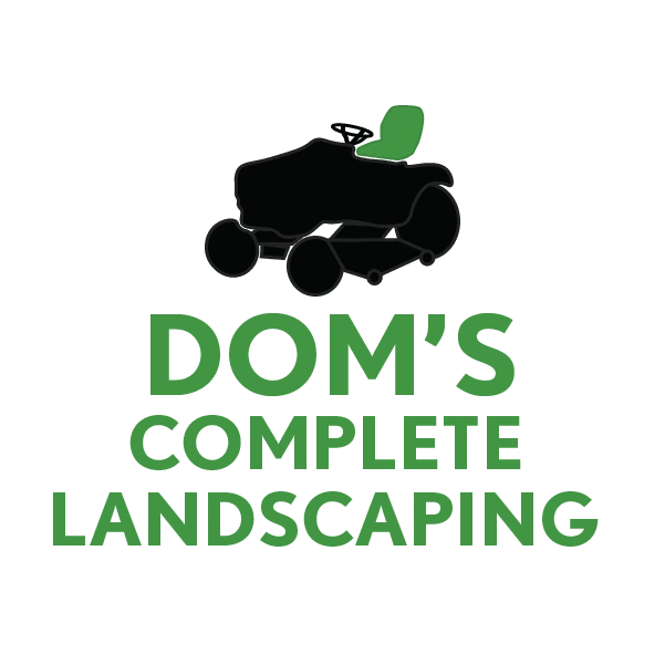
This was the first logo design. It features a seated lawn mower as an obvious nod to landscaping industry.
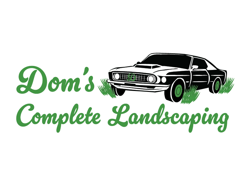
This logo design was inspired by the business owner's hobby of restoring old cars.
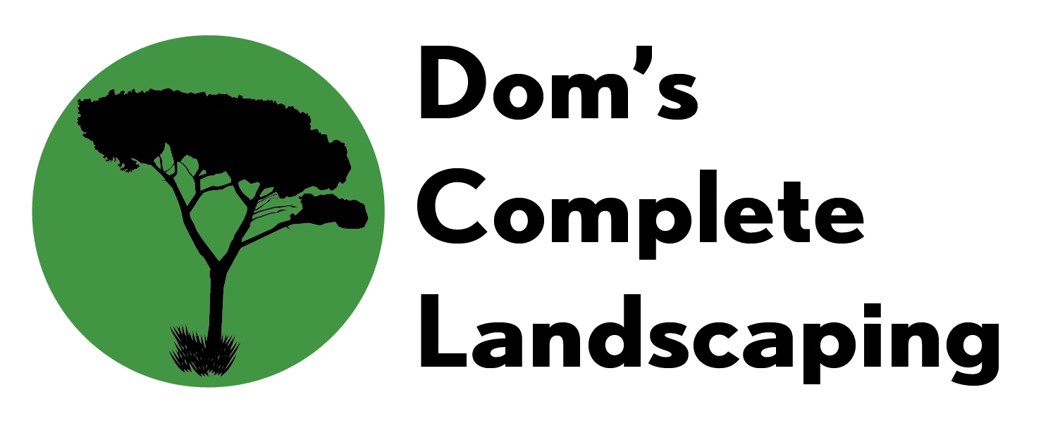
This logo was modeled after a tree that grows on the Amalfi coast, as the business owner identifies as Italian.
Feedback
After the first round of logos were completed, the business owner had a very clear vision of what he wanted the next design to look like.
According to him, he was satisfied with the color choices and liked the logos provided, but had a vision of a weed whacker in his logo. He wanted to try incorporate cutting grass more explicitly in the design, in favor of a "no-nonsense" business model.
With his favorite of the designs being the first logo from the first round of development, I prioritized trying to make the next logo as clean as possible in terms of font, color, and design.
Final Logo
The final logo was developed after I developed a few configurations of the weed whacker iconography.
The bulk of the design edits were dedicated to different color blockings; blacked out text where the grass was the only green part of the logo, as well as different positioning of the grass clippings and weed whacker.
The logo below was the design I felt most confident in and was accepted without any edits from the client. He liked that that the green was only broken up by the icon of the weed whacker I drew. The simplicity was what he wanted for his business cards, employee uniforms, and more.
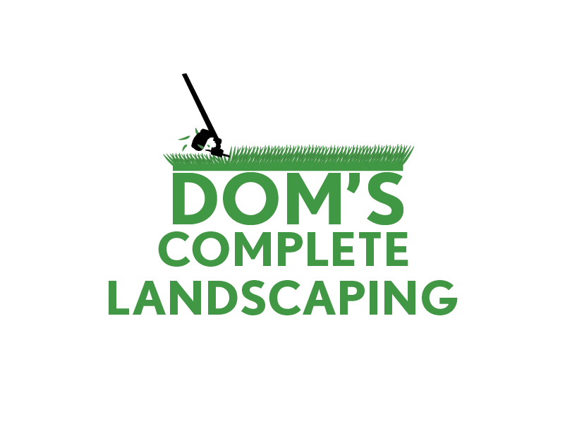
The final logo, following some revisions from the business owner.
Results
Since rolling out the logo design, the business owner has seen increased success in sales. He has been able to establish a loyal following in his local suburbs simply through word-of-mouth and his business cards.
Takeaways
A client without a vision sees more clearly when they see what they don't like!
Accessibility is the future of design
Unorthodox research is not bad research, as long as you're respectful
Like this project
Posted Mar 28, 2023
Developed a logo for a landscaping business in Connecticut.
Likes
0
Views
33


