Winners — Brand Identity Redesign for a Strategic Growth Agency
Kalandula Antonio
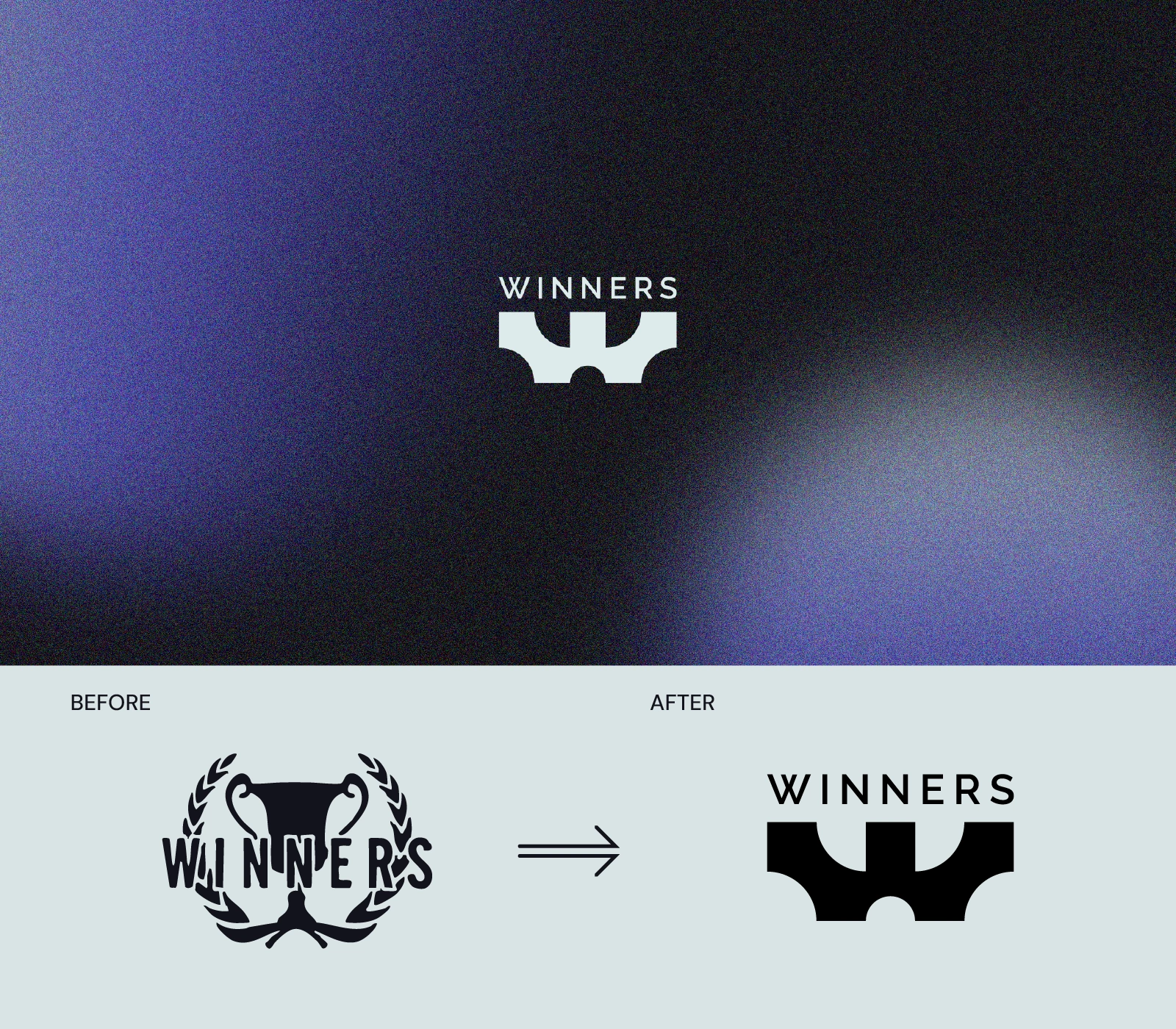
Winners is a growth agency that helps businesses compete smarter and win bigger. The old identity, built around a trophy, communicated achievement but said nothing about how Winners actually works. The rebrand challenge was to create a visual identity that communicates strategy, leadership and long-term thinking from the first glance.
The transformation started with a single question: what does winning really look like? Not a trophy sitting on a shelf, but the intelligence and strategy that gets you there.
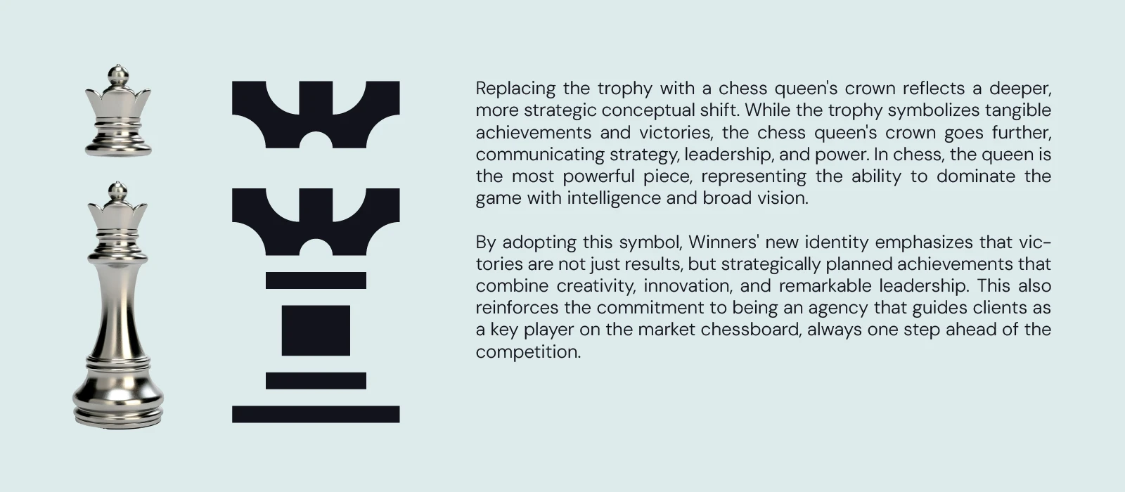
The answer was chess. The queen, the most powerful piece on the board, became the foundation of the new mark. She moves in every direction, dominates with strategy and never relies on luck. That is exactly how Winners guides its clients through the market.
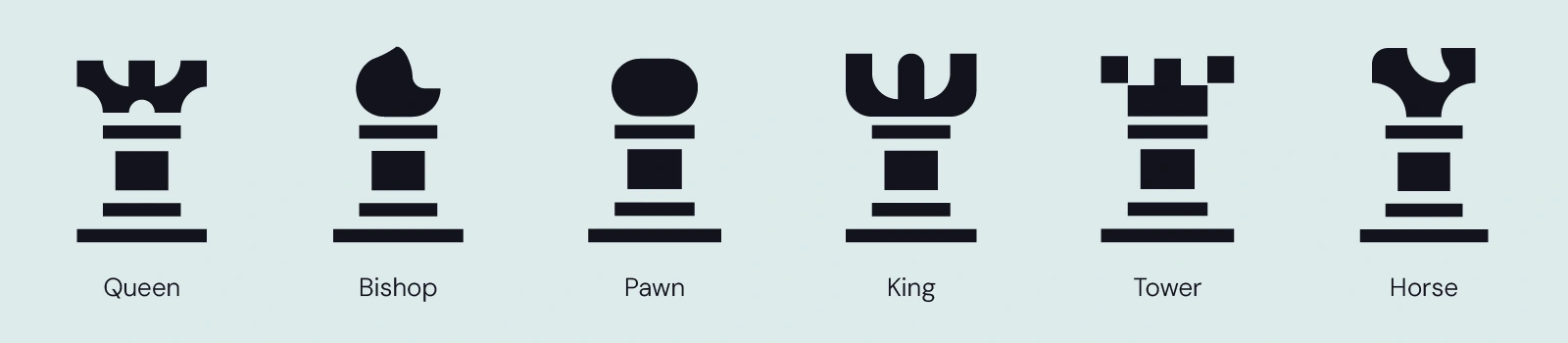
icon system
The symbol was extended into a full icon system based on the six chess pieces, giving the brand a flexible visual language that can be used across every context and communication format.
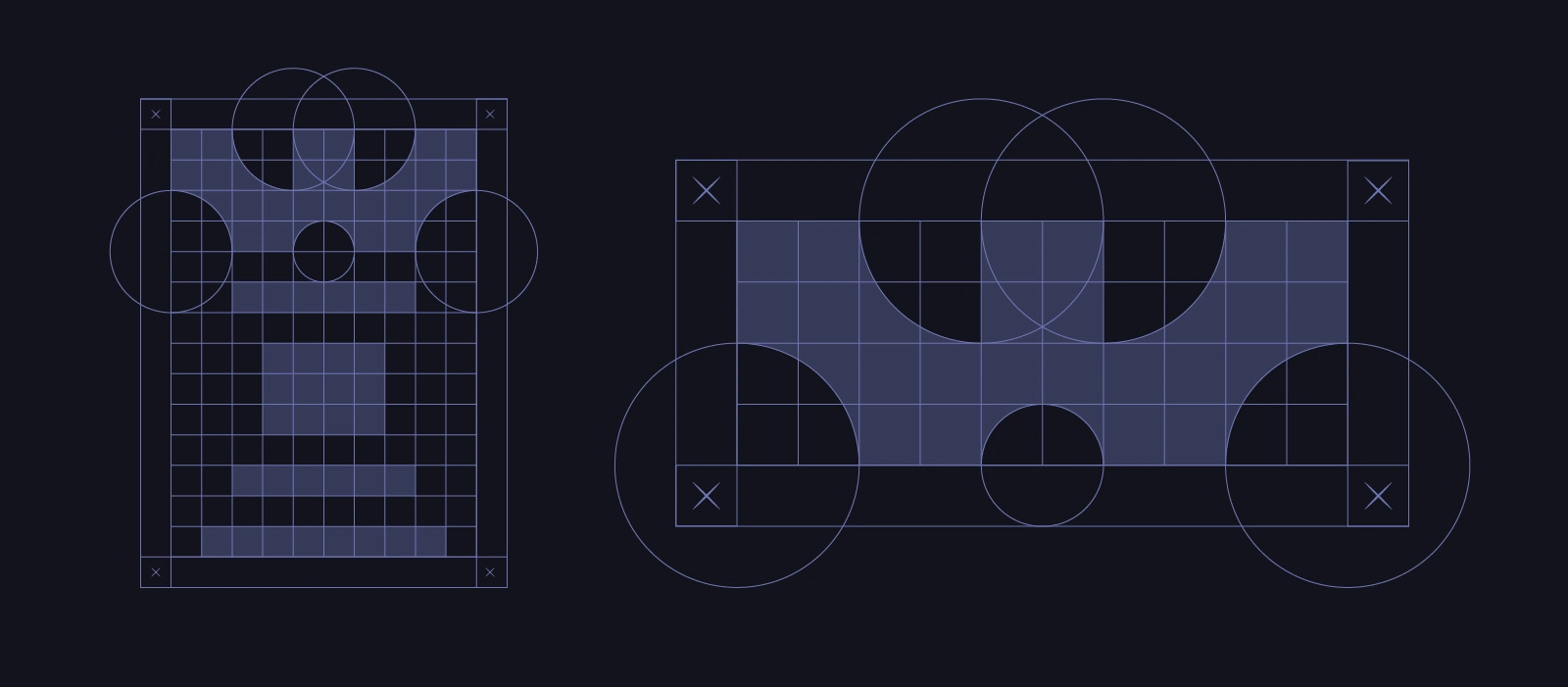
geometric construction
Every element of the mark was built on a precise geometric grid. Nothing is arbitrary. Every curve, corner and proportion is a consequence of the system, giving the identity structural integrity at any scale.

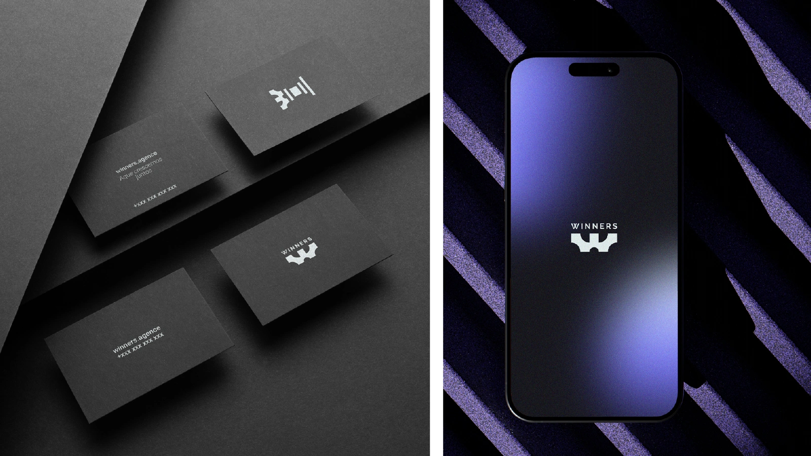
The identity was applied across brand touchpoints from apparel to business cards and digital interfaces. Every application carries the same weight: confident, minimal and built to be recognised.
Like this project
Posted Jun 1, 2026
Winners is a growth agency that helps businesses compete smarter and win bigger.