
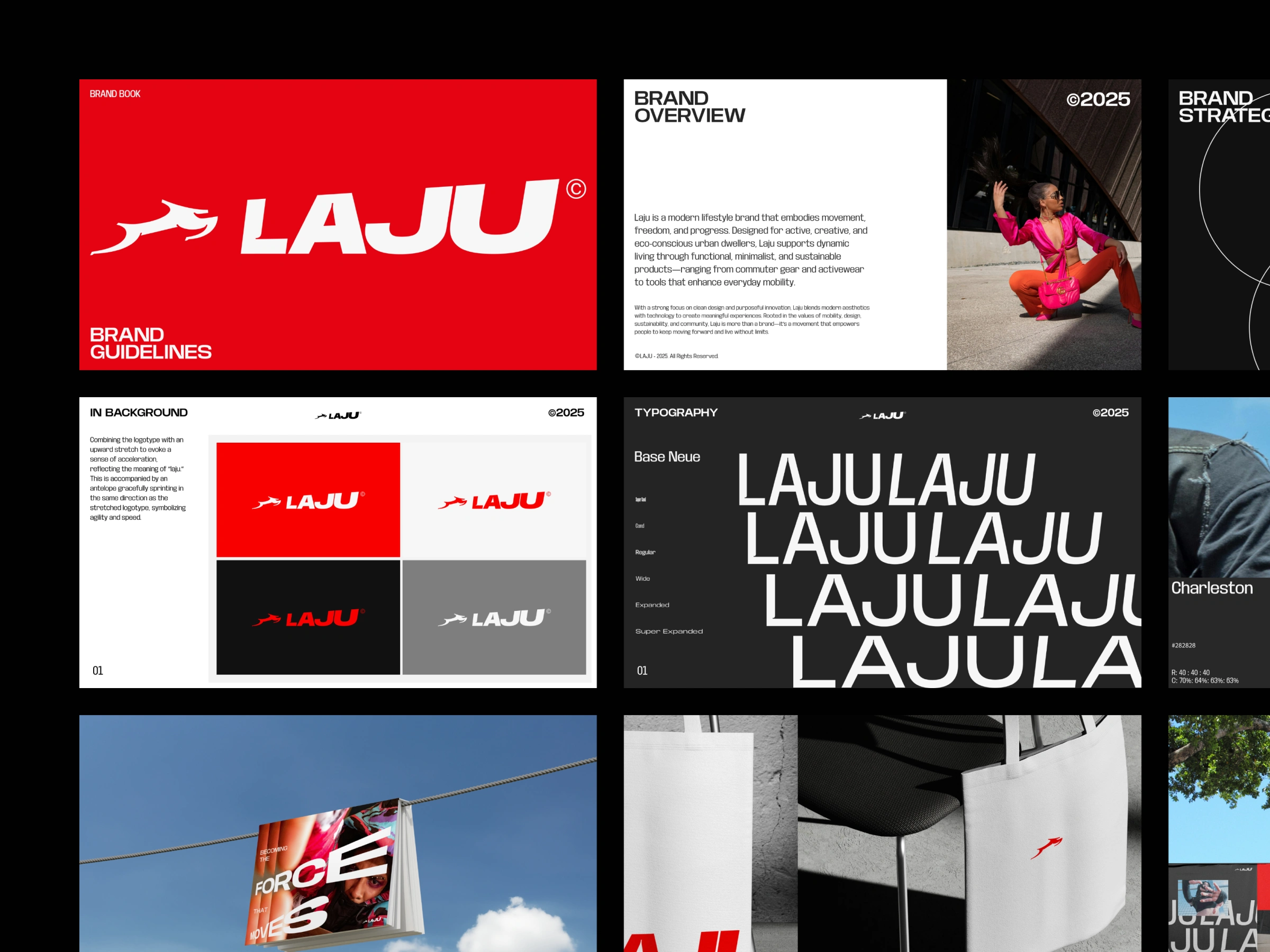
The LAJU — Shoes Brand Guideline is a comprehensive visual identity system curated by Odama Studio. Designed for a modern lifestyle and footwear label, the framework establishes a powerful graphic blueprint engineered to survive and stand out in the highly competitive global sneaker market.
The Branding Challenge
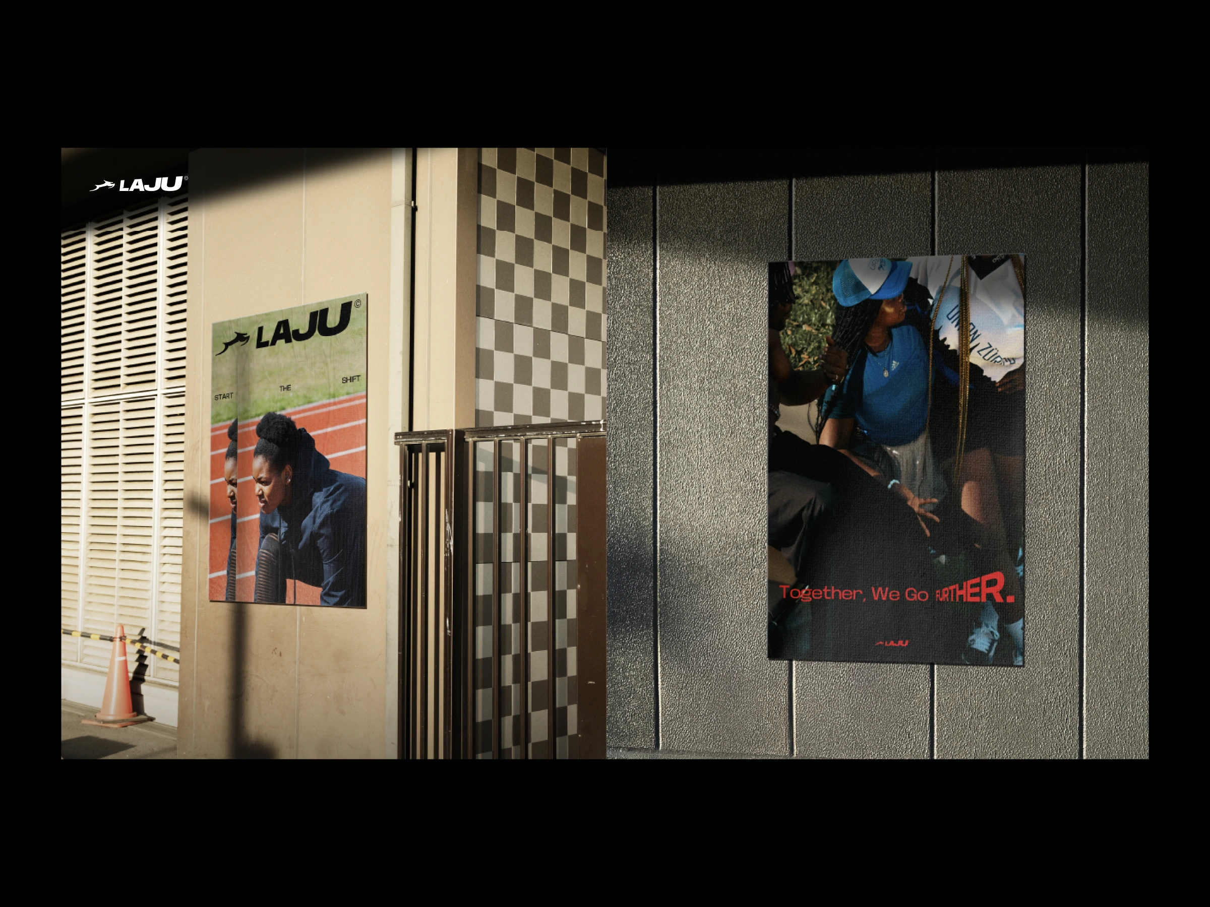
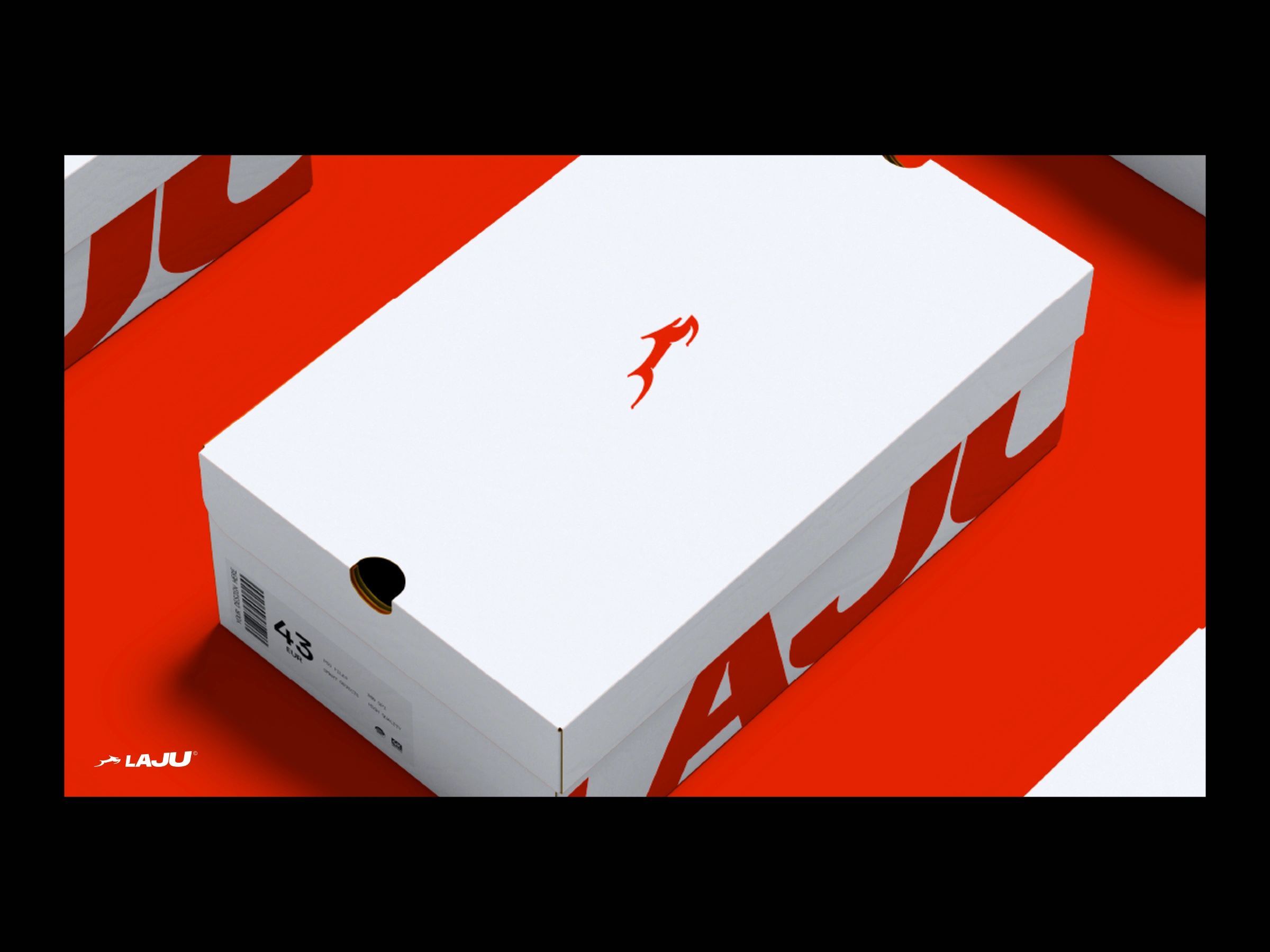
A contemporary footwear brand requires a highly adaptable design language. It must maintain perfect visual fidelity whether it is stamped on a shoe insole, printed on a cardboard box, or displayed digitally on a fast-paced social media advertisement. The challenge was to anchor the brand name "LAJU" (velocity/momentum) into a static yet highly kinetic visual identity.
Design System & Core Elements
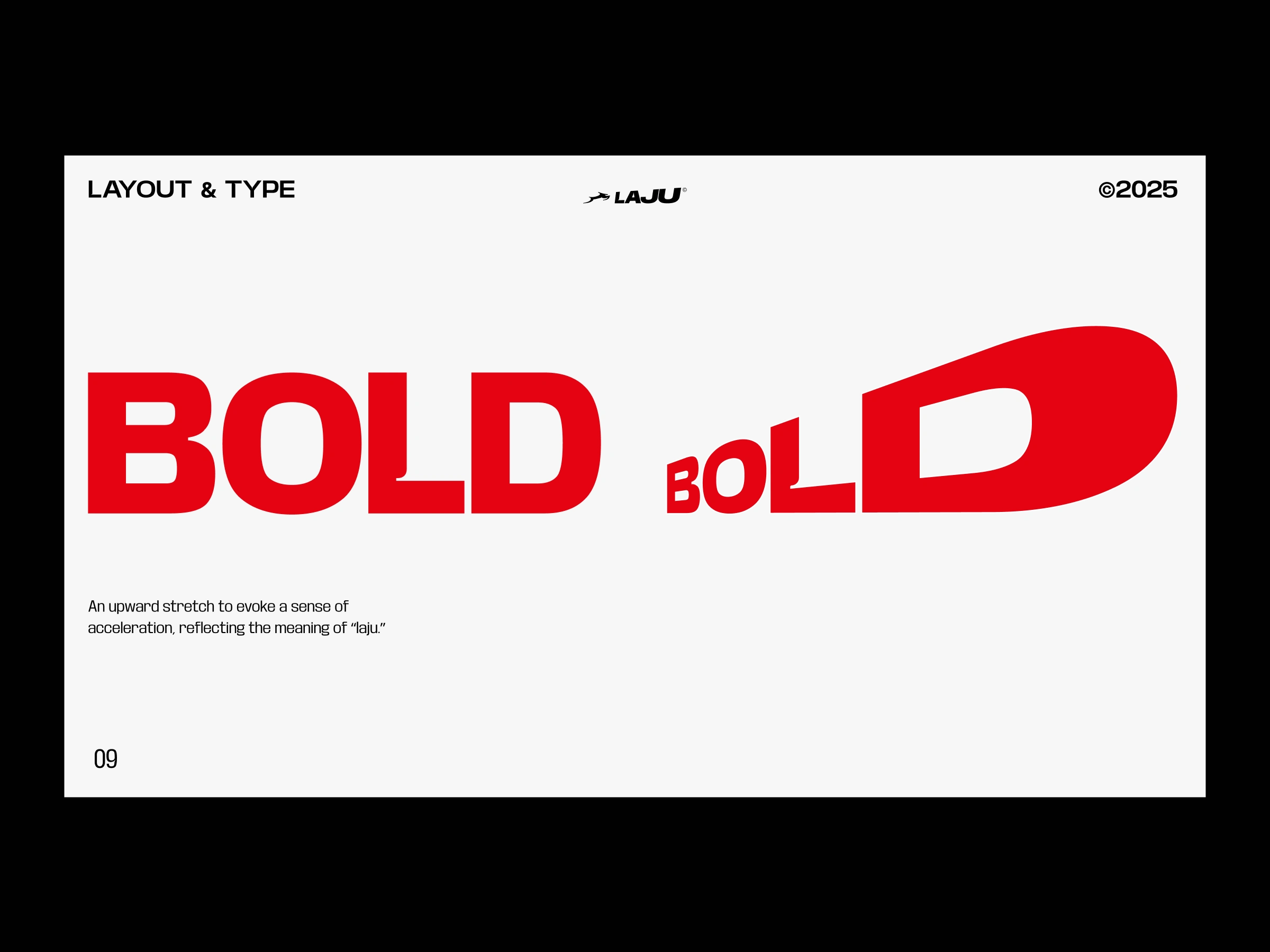
Kinetic Typography: Employs heavy, solid, and structurally rigid typefaces. Slanted and italic geometric forms are utilized to visually communicate acceleration and urban progression.
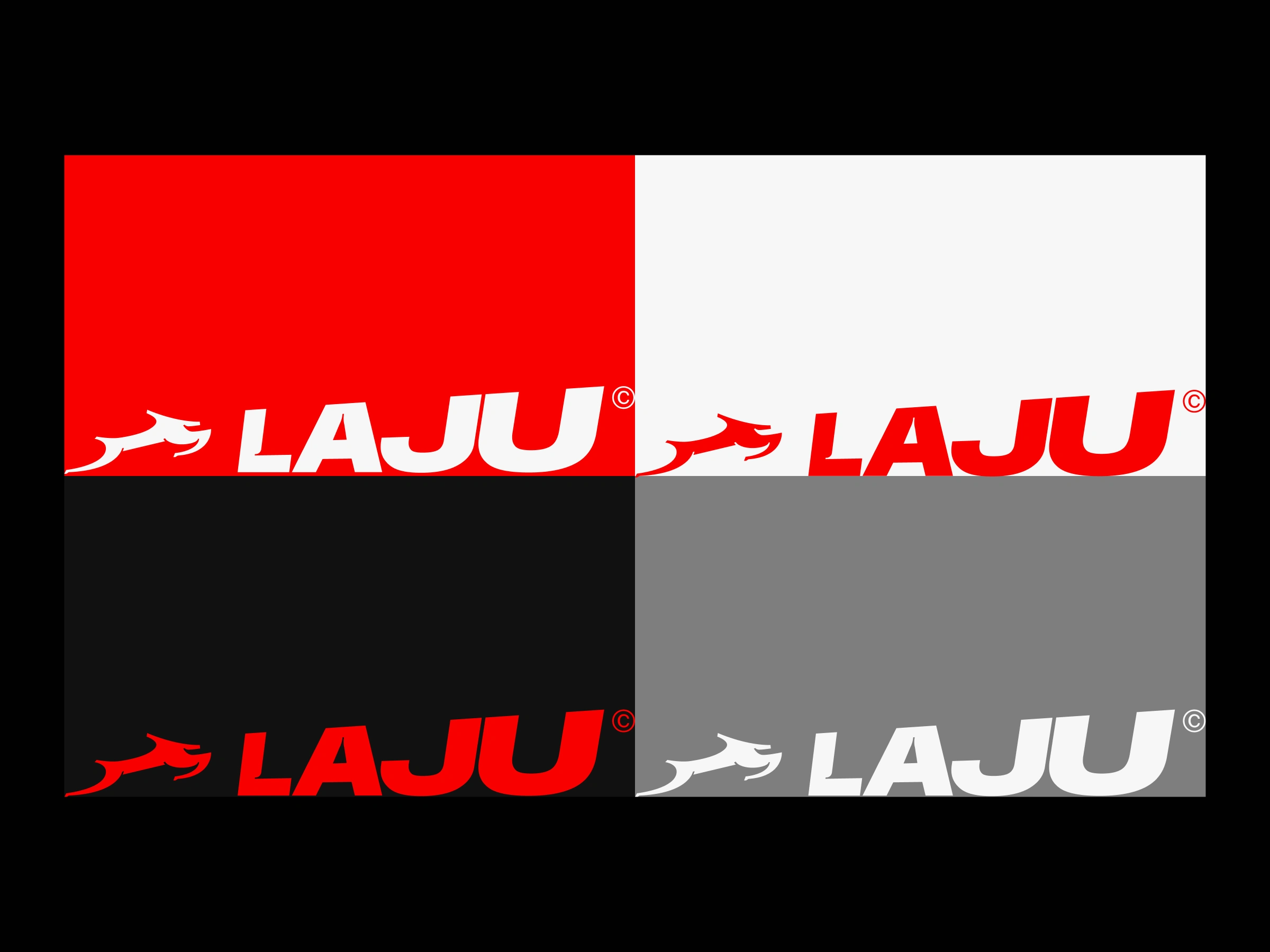
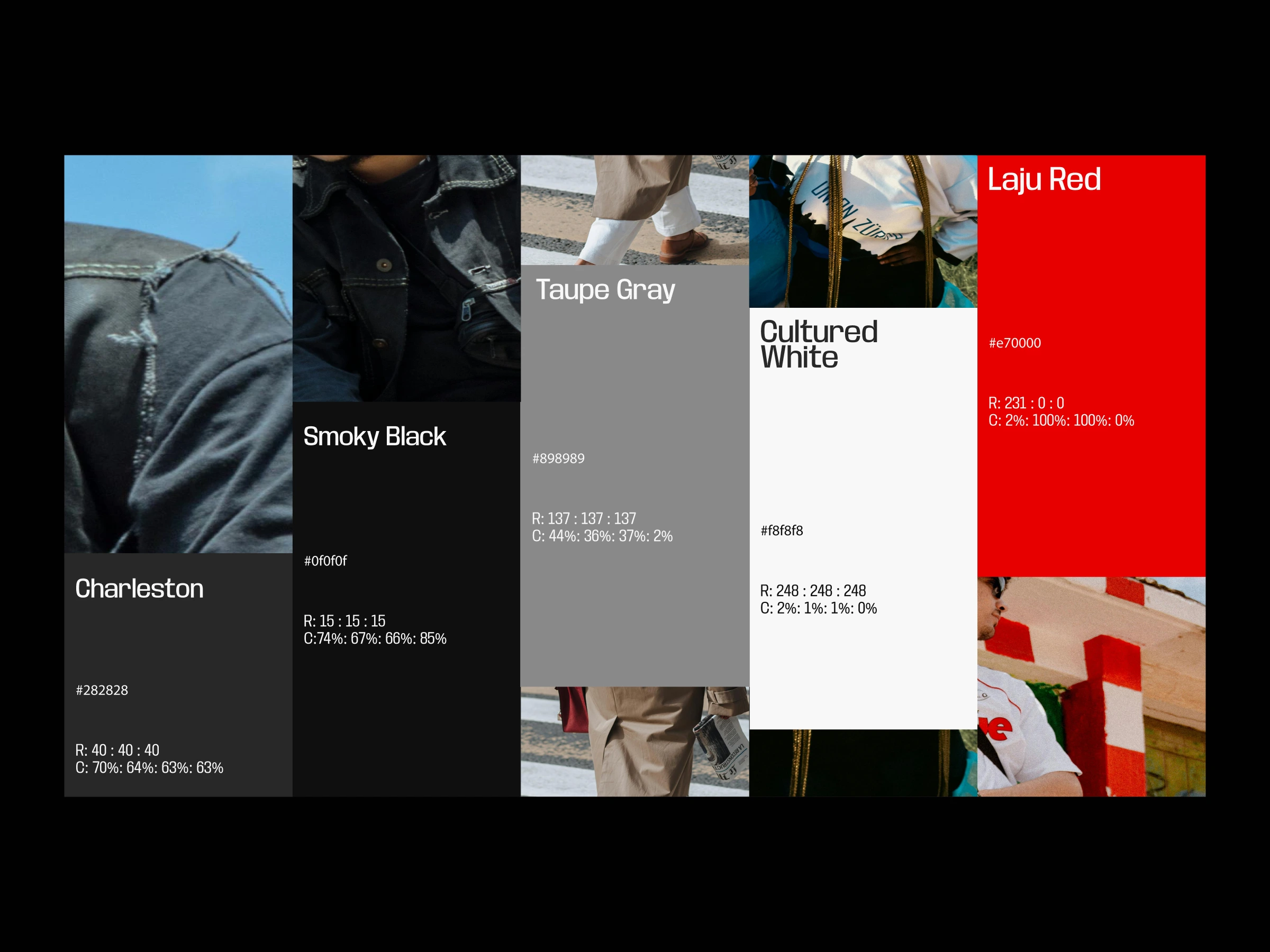
High-Impact Palette: Utilizes deeply saturated tones mixed with high-visibility accents (such as electric orange) to generate immediate brand recall and evoke a youthful, active lifestyle.
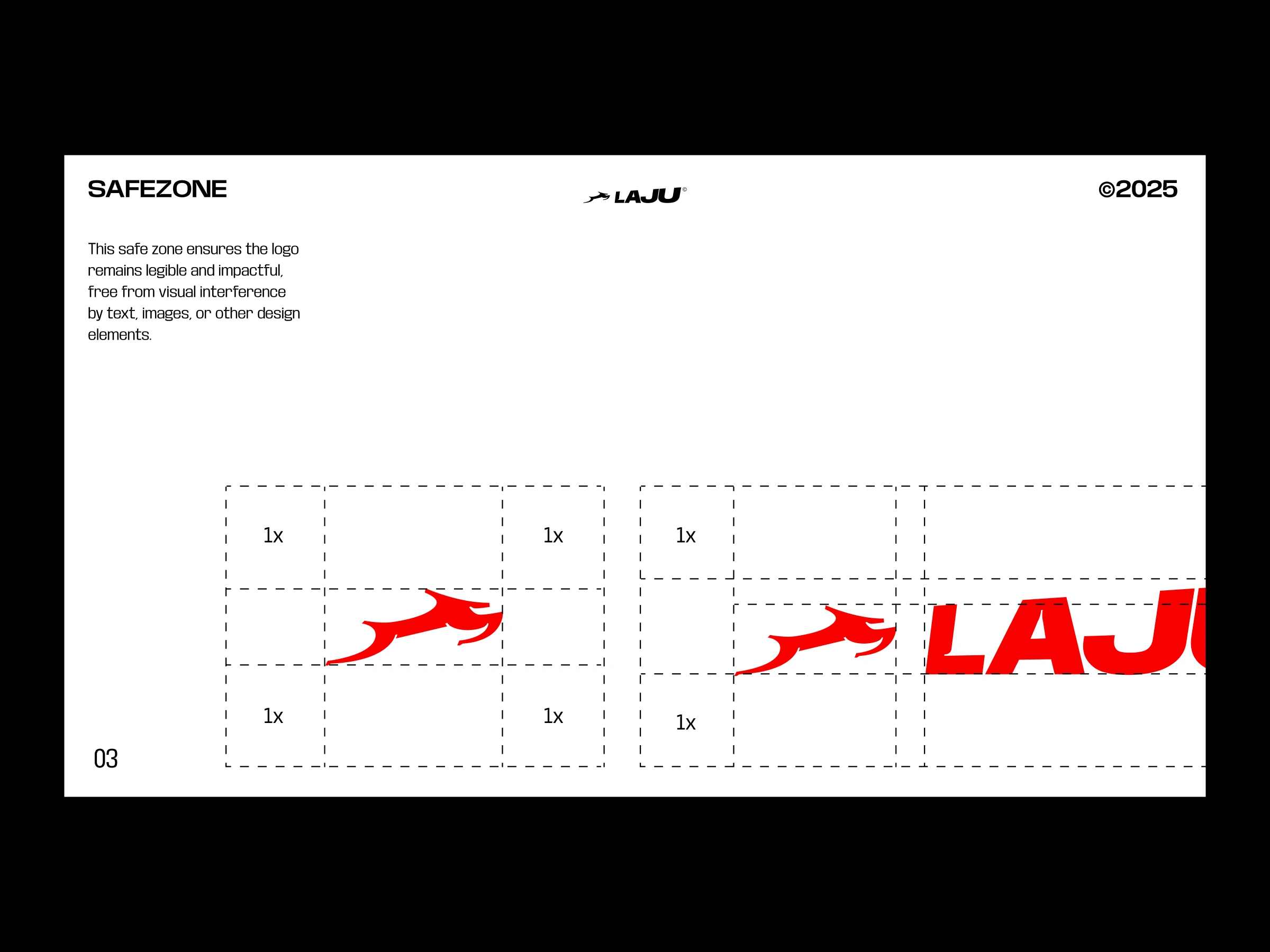
Systematic Rules: Includes explicit grid guidelines for clear space, iconography systems for retail packaging (wrapping tissue, boxes), and textile textures.
0 likes · 8 views · Apr 24, 2026
Built for the active, creative, and eco-conscious, Laju blends functionality, minimalism, and sustainability into every step.
