Finance SaaS Website UI Figma & Webflow

Ahmad S. Afandi


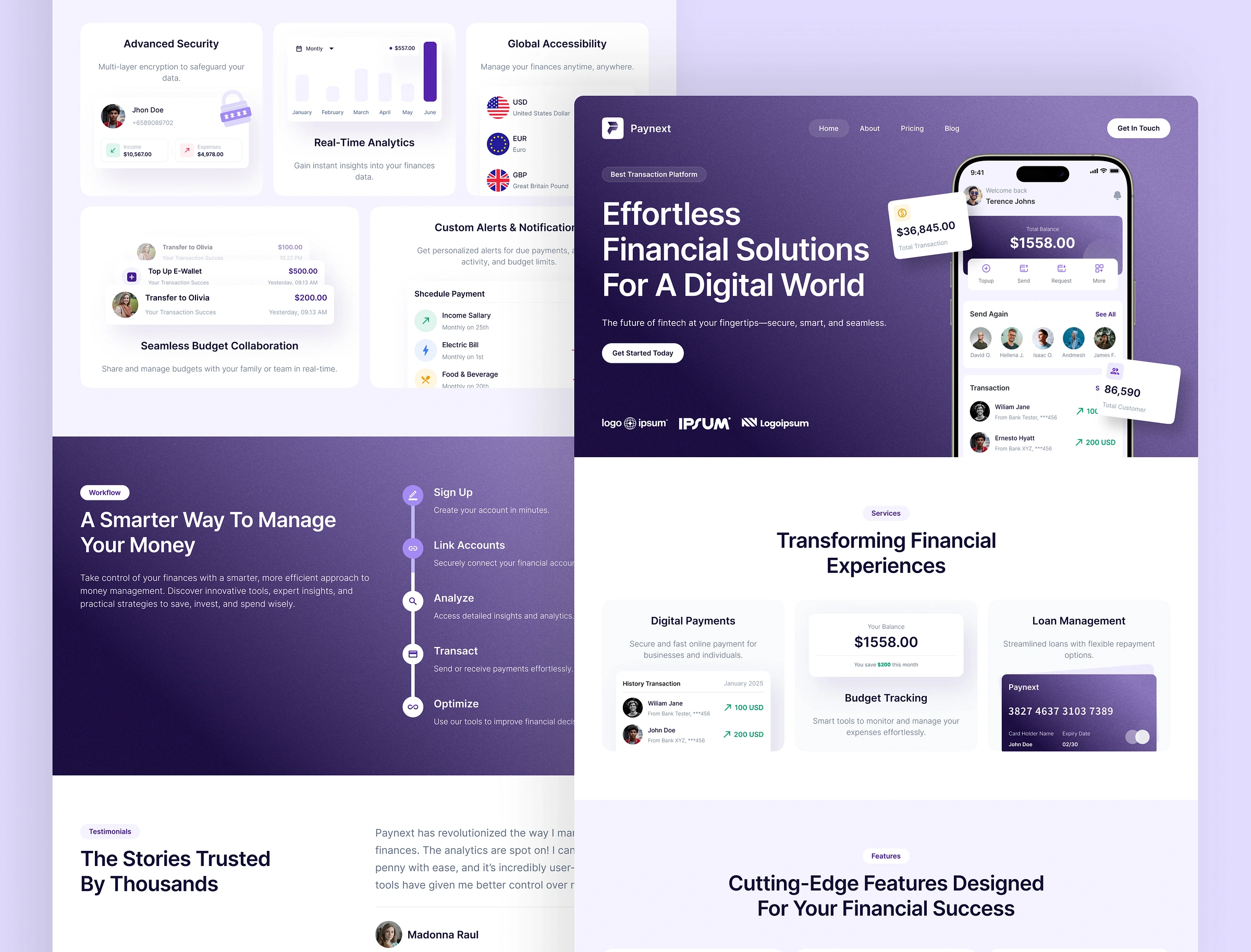
Finance SaaS Website UI Figma & Webflow
Fintech has a trust problem baked into its UI. Most banking and payment platforms are still stuck with cluttered navigation, dated visual language, and interfaces that make people hesitate before they hand over financial information, exactly the opposite of what a platform handling money needs to feel like. Paynext was built to close that gap: a website template that looks and feels as trustworthy as the transactions it's meant to support.
The approach
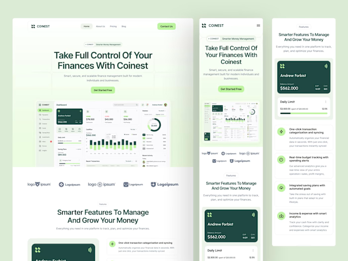
We designed Paynext around clarity first. Clean layouts, clear calls-to-action, and UI elements specifically chosen to signal security and credibility, so visitors feel confident moving from browsing to actually transacting. Every section was built with conversion in mind, but never at the cost of feeling transparent or easy to navigate.
Because fintech spans such a wide range of use cases, from digital banks to payment platforms to investment tools, we designed Paynext to be flexible enough to fit fintech startups, online banking platforms, and digital wallet providers alike, without needing a rebuild for each use case.
What's included
A complete fintech website UI template, built in Figma and shipped to Webflow, covering the core pages and components fintech platforms need to establish a credible online presence.
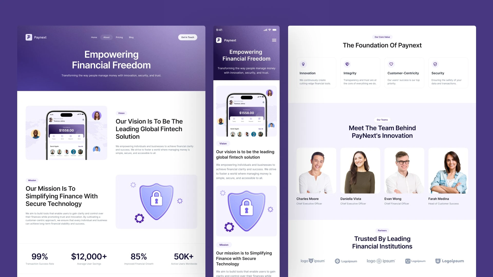
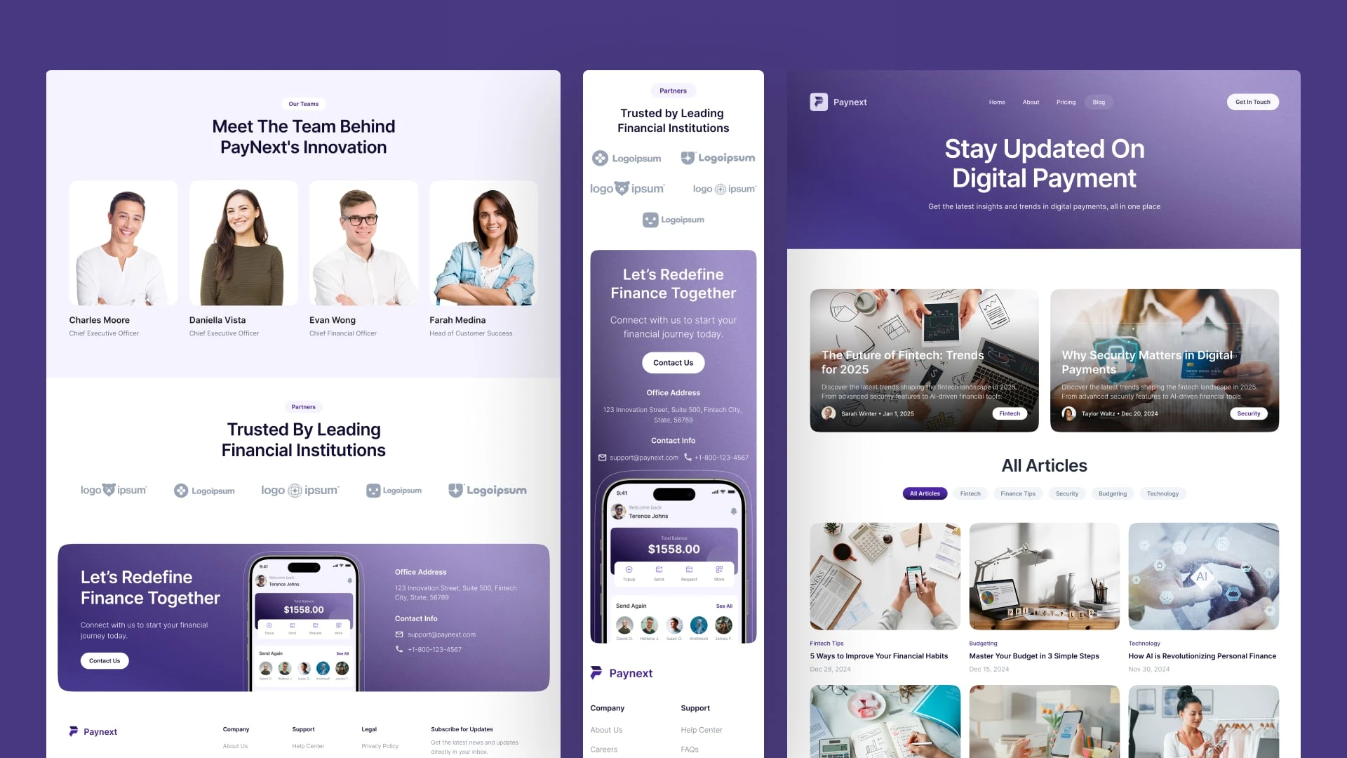
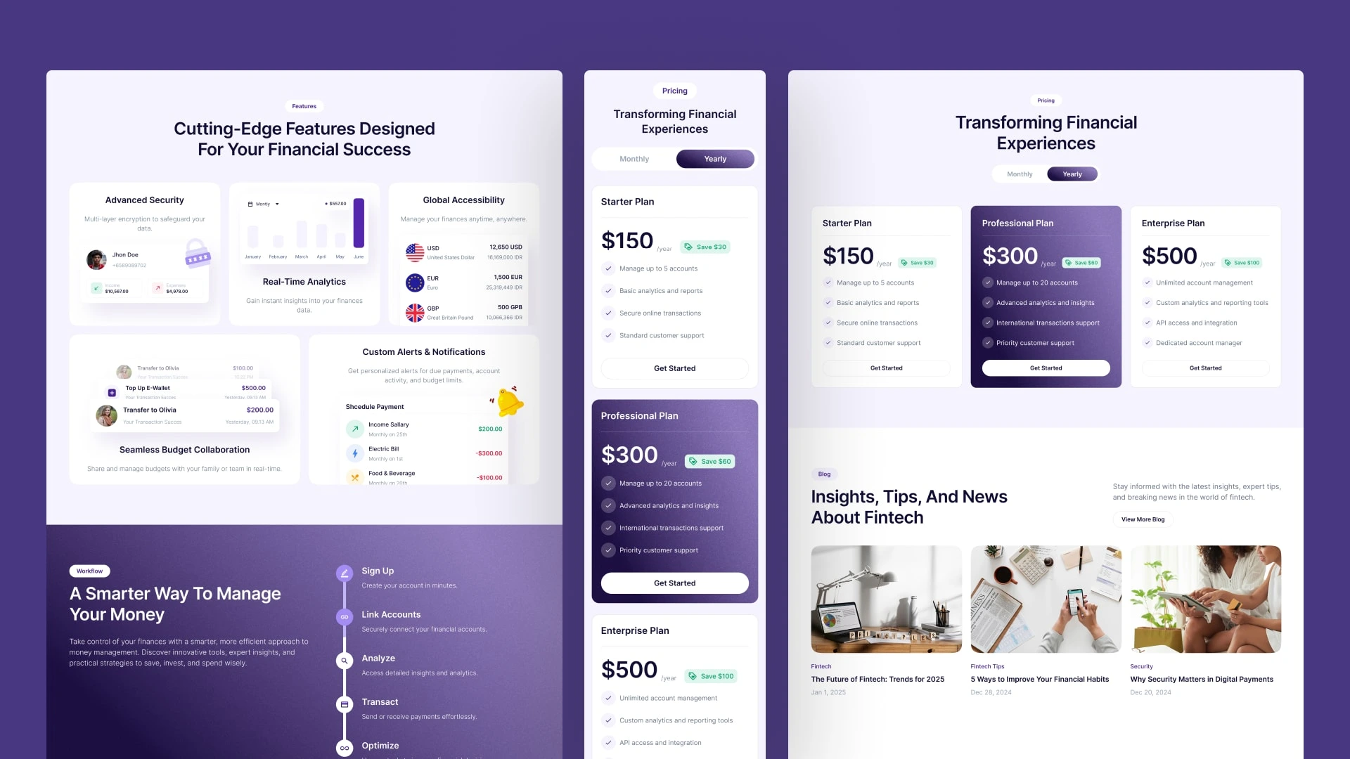
The result
A website system that helps fintech companies do two things at once: look established enough to be trusted with people's money, and stay simple enough that visitors can actually complete what they came to do.
Let's get in touch!
Peterdraw Studio
Bring ideas come alive
UI/UX Design | No-code development | Framer Expert
Yogyakarta, Indonesia
Like this project
Posted Jul 15, 2025
Paynext: a Figma & Webflow fintech website template built for clarity, trust, and conversion across banking and payment platforms.
Likes
2
Views
66