Rael Company Branding
현주 이
Rael Company Branding
Overview
Brand Strategy, Brand Identity & system, Typeface Design,
Art Direction
Esset Guidelines,
Branded Collateral
Timeline
2022 – 2024
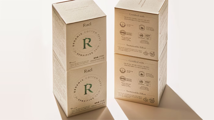
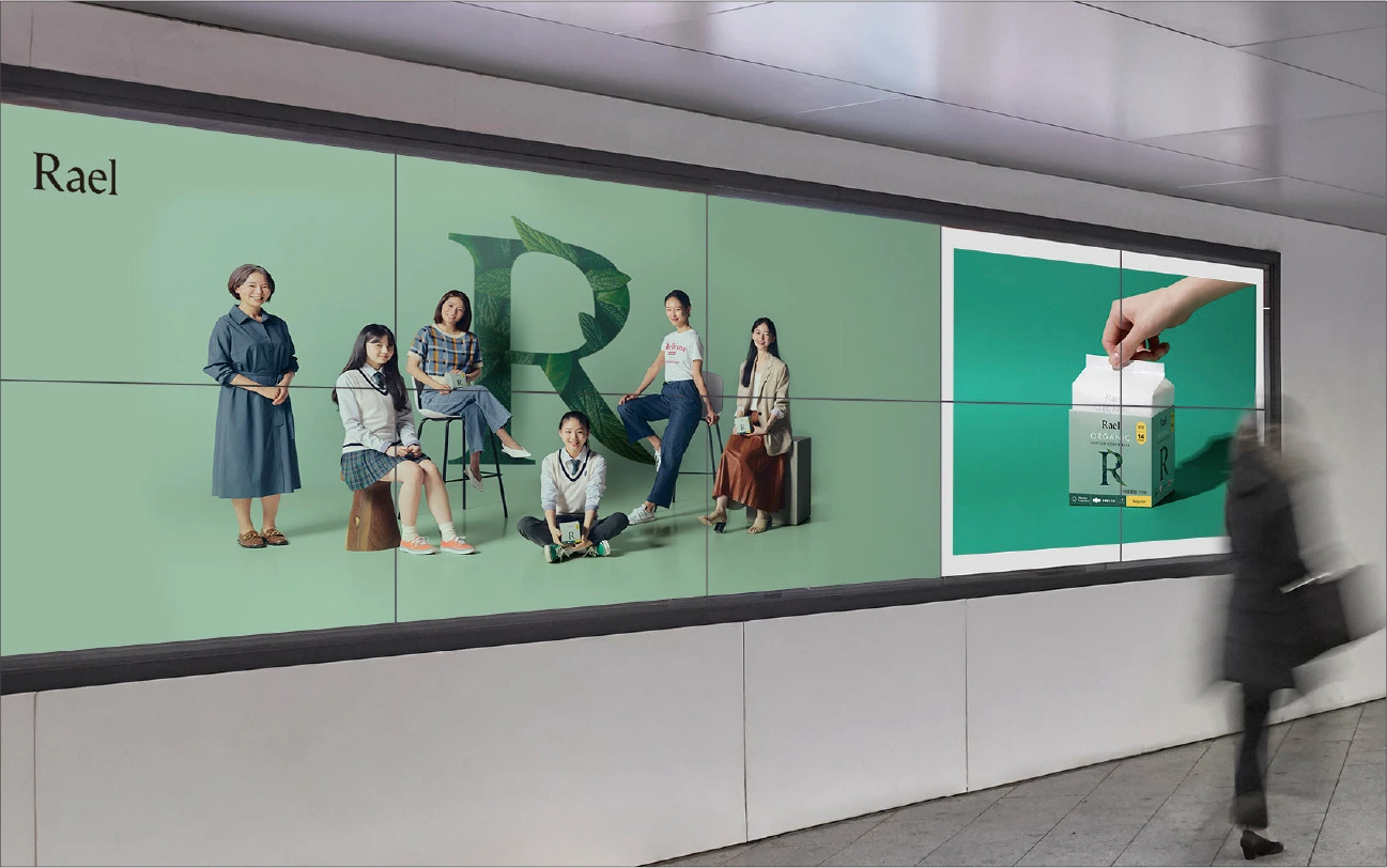
Rael is a total care brand that supports every stage of a woman’s life cycle, with a focus on holistic cycle care.
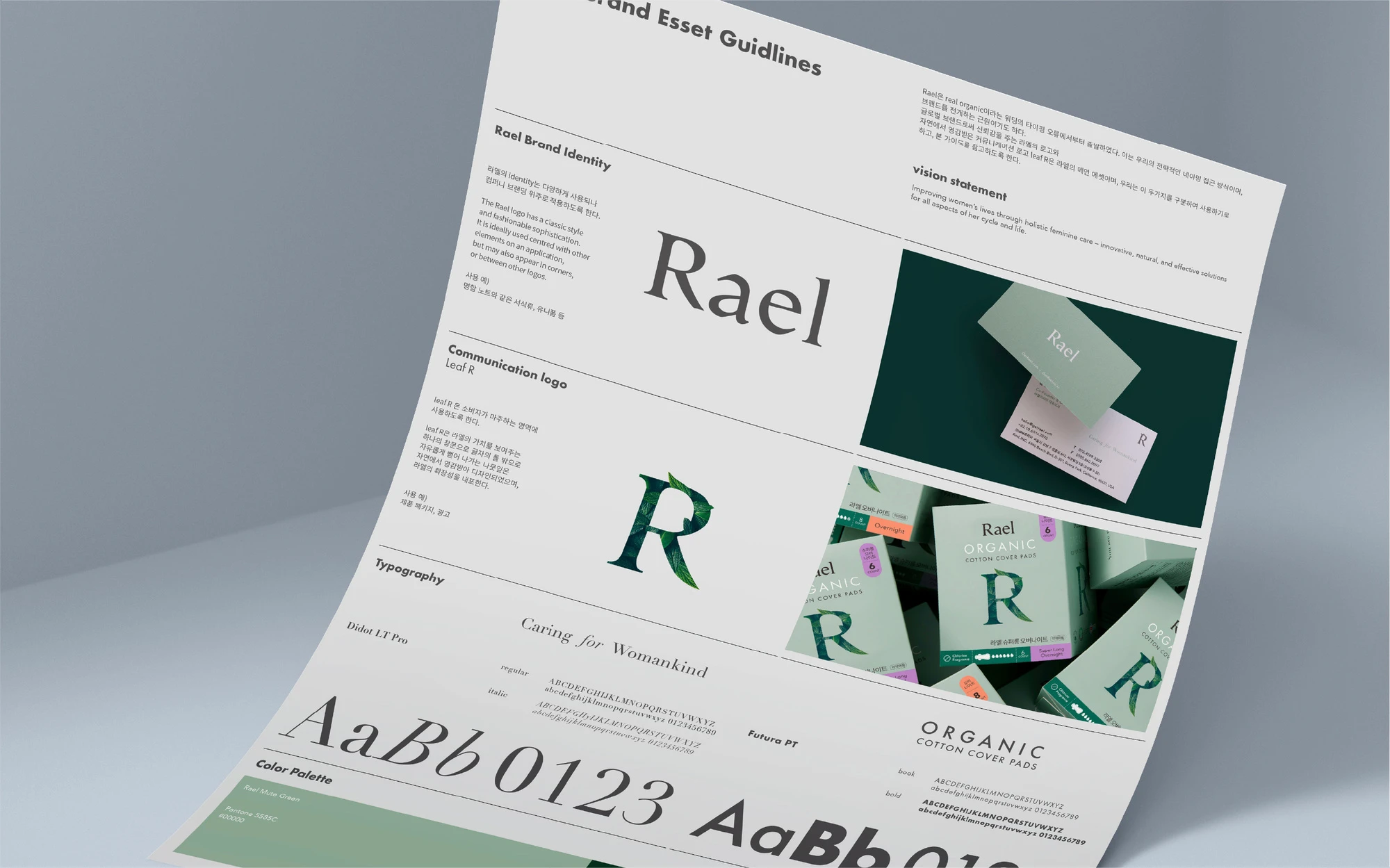
The name ‘Rael’ originated from a typo made while typing ‘real organic,’ which became a strategic approach to naming and the foundation of the brand’s philosophy.
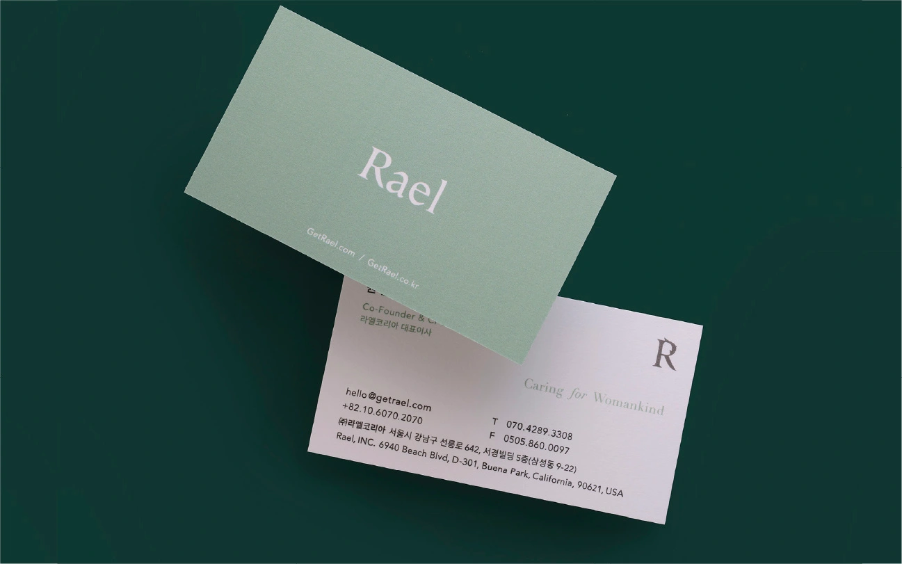
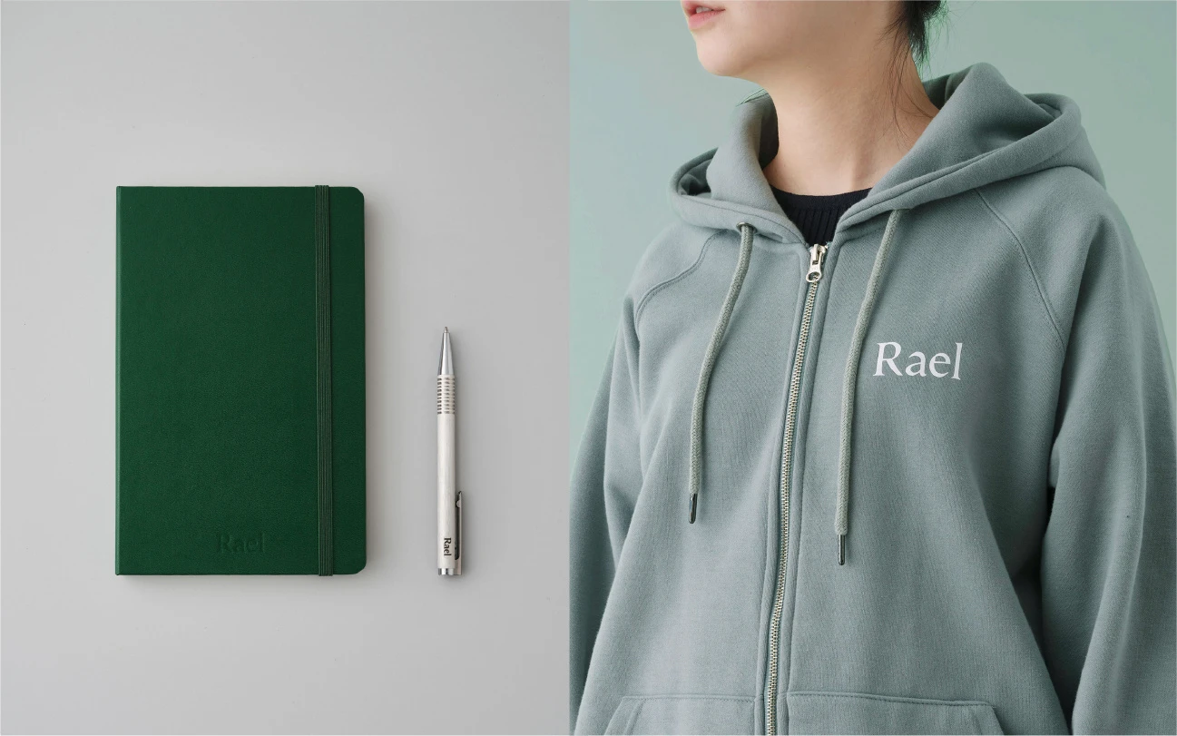
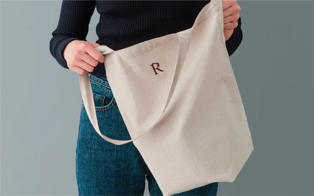
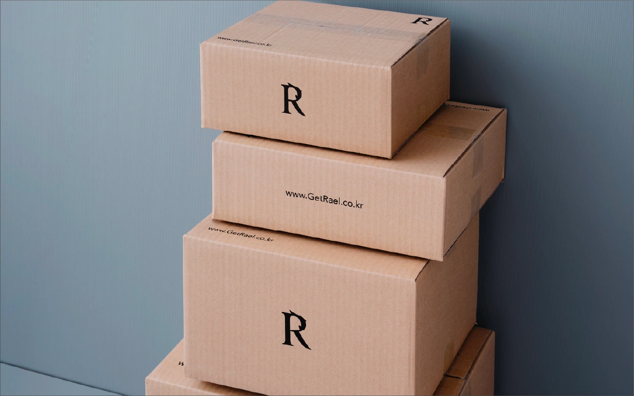
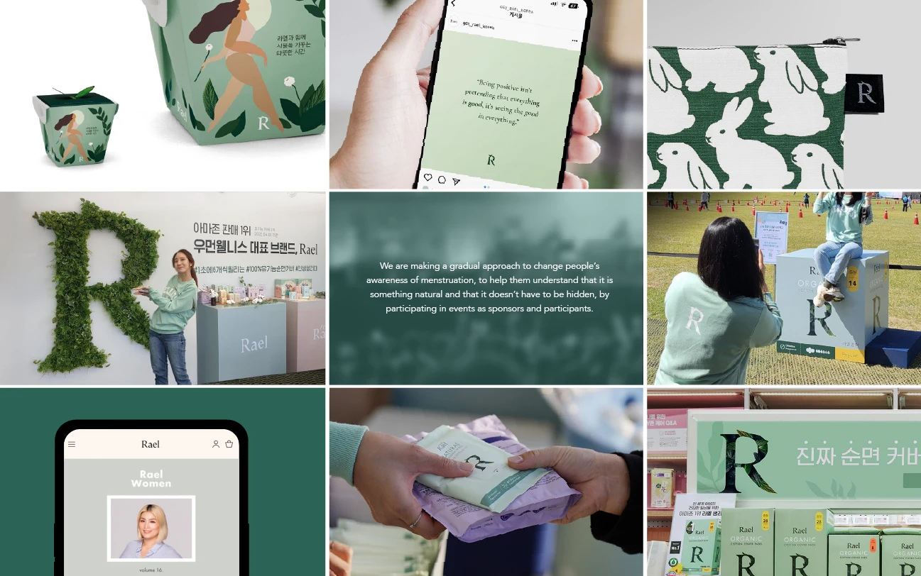
The Rael logo communicates the trust of a global brand, while the nature-inspired communication logo, ‘Leaf R,’ serves as a core brand asset.
These two logos can be used independently or together—
the Rael logo is primarily used for corporate branding, (Business card, Stationary, Hoodie.)
while the Leaf R logo appears across all consumer-facing touchpoints to convey the brand identity. (Delivery box, Package, Cotton bag and Ad.)
Images
Like this project
Posted Apr 3, 2026
Branding project for Rael focusing on strategy and visual identity.