Built with Webflow
Most marketing agency websites don’t
Serhii Yurkovskyi
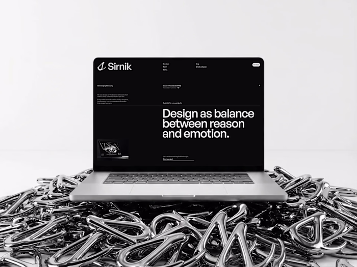
Most marketing agency websites don’t have a design problem.
It’s usually a clarity problem.
Over the past few projects I worked on for agencies, I kept running into the same 3 things that quietly kill performance:
Positioning that sounds nice - but says nothing
“We help brands grow” looks good on a screen.
But as a client, I still don’t understand if you’re actually for me.
Cases that show visuals, not thinking
A lot of sites look polished - but don’t explain what was done, why it worked, or what changed.
Structure that doesn’t lead anywhere
Sections look fine on their own, but there’s no clear path from “this looks interesting” to “I want to work with them”.
And the thing is - none of this is fixed by “better UI”.
In a few recent projects, just reworking the offer and structure already made the whole site feel clearer and more trustworthy - without adding anything complex.
That’s exactly the approach I used in a recent concept I designed for an agency.
If you’re working on a website right now - or feel like yours looks good but underperforms - take a look at these 3 things first.
Or just reach out, I’m always down to take a quick look and share thoughts!
Like this project
Posted Apr 20, 2026
Most marketing agency websites don’t have a design problem. It’s usually a clarity problem. Over the past few projects I worked on for agencies, I kept runni...