Lo Rox Homepage Redesign
Angel Rubio
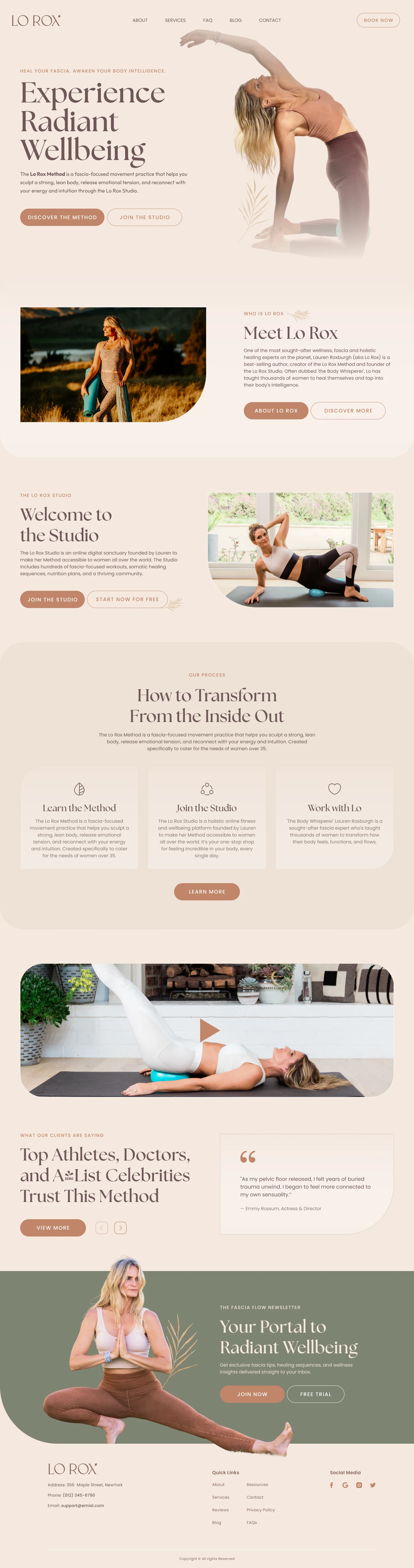
Lo Rox Homepage Redesign
Client: Lo Rox / Lauren Roxburgh
Role: UI/UX Designer
Goal: Translate the Lo Rox Method into an intuitive, emotionally resonant homepage experience for women 35+ seeking healing through fascia-focused movement.
The Challenge
Lo Rox needed a homepage that would do more than just look good—it had to reflect the method’s soul: grounded, feminine, radiant, and transformative. The target audience—women over 35—were emotionally fatigued from traditional fitness culture and needed something that felt safe, nurturing, and aligned with their bodies.
The Strategy
I focused on designing a homepage that guides users gently, without pressure—allowing them to explore, connect, and act on their own terms.
Key UX Goals:
Create a soft, clear layout with visual breathing room
Guide users through an intuitive journey: Discover → Understand → Step In
Build trust through testimonials, familiar faces, and warm, authentic imagery
Reinforce movement and fascia themes through subtle flow in layout and visuals
Design Highlights
✅ Calm color palette and elegant typography to evoke safety and strength
✅ Flexible entry points (Method, Studio, 1:1 Work) for various readiness levels
✅ Subtle credibility through testimonials and recognisable names, without overwhelming the user
✅ Rhythm and flow in sections to mirror movement and energy in the Lo Rox Method
Results & Value
The final homepage creates a warm, intuitive experience that emotionally connects with the target audience. It balances beauty with purpose, guiding users without pushiness and making space for transformation.
It’s a homepage that feels like the practice itself—empowering, graceful, and deeply aligned.
Like this project
Posted Jun 30, 2025
Redesigned Lo Rox homepage for women 35+ seeking fascia-focused movement.
Likes
0
Views
0