Arecibo Aroma - Restaurant | Brand Identity
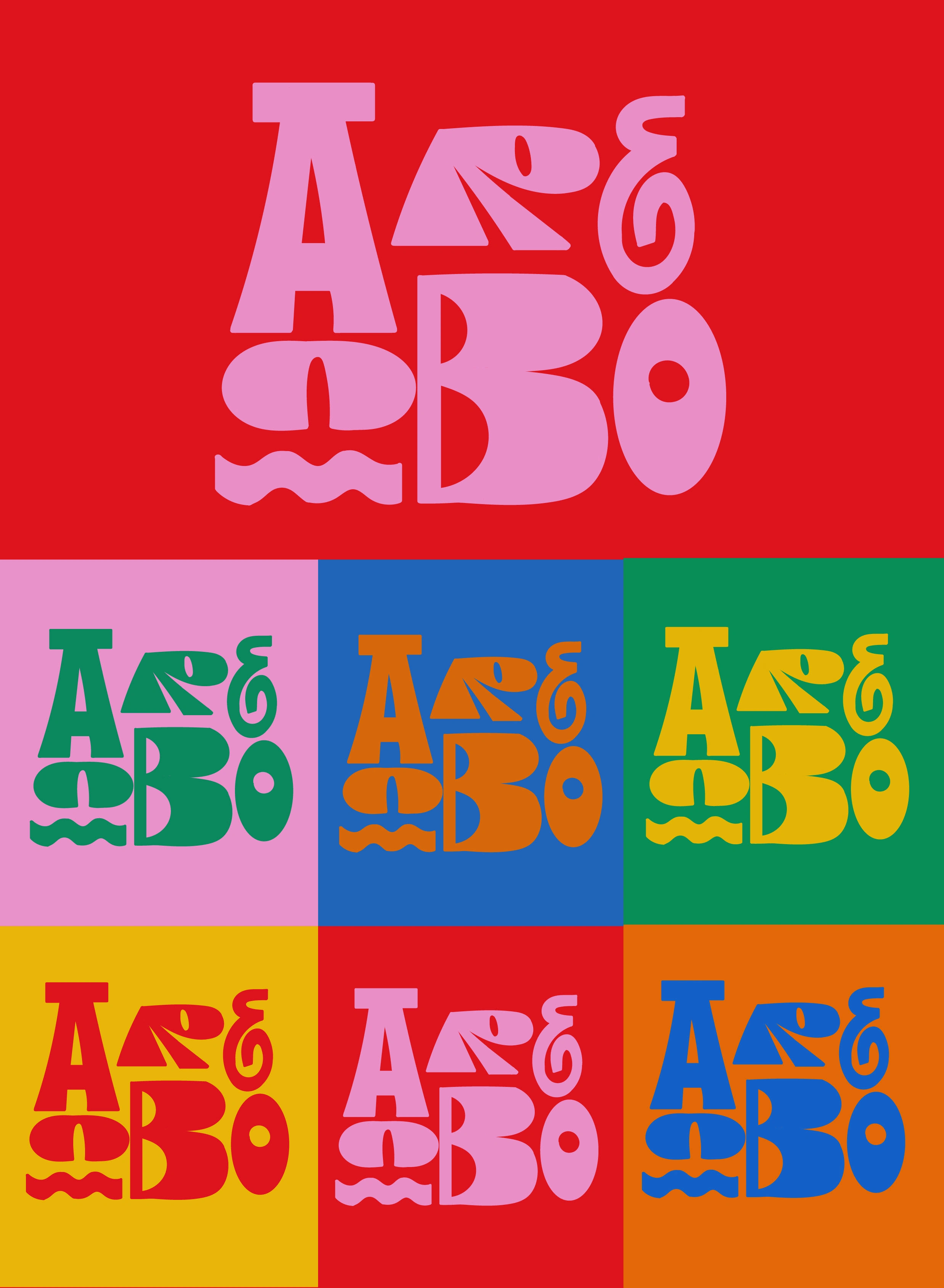
“Arecibo Aroma” is a cozy Puerto Rican restaurant nestled in the heart of Arecibo.This restaurant offers a warm and inviting atmosphere where guests can experience the rich flavors of Puerto Rican cuisine.
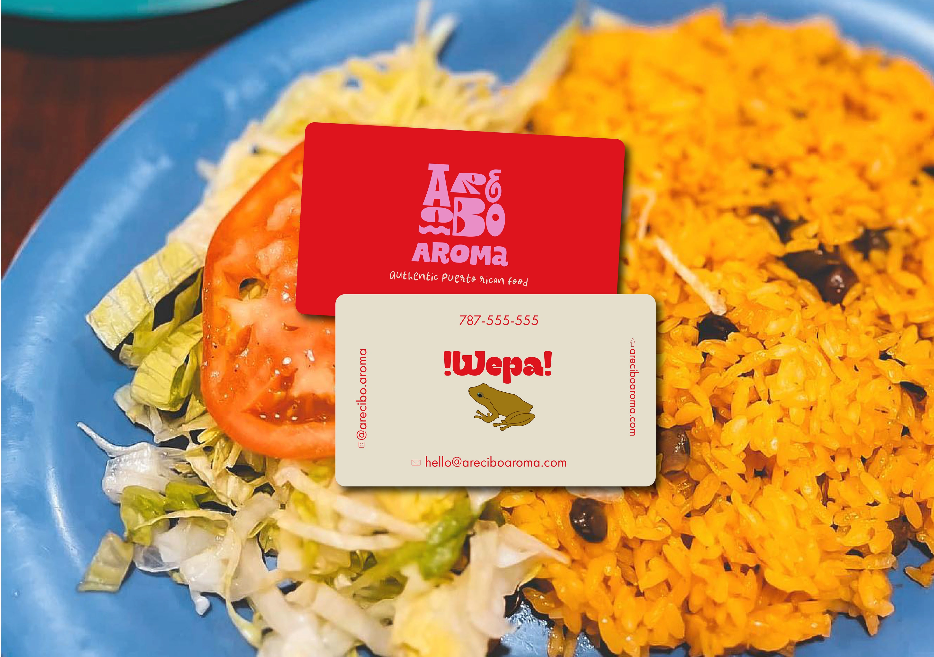
Arecibo Aroma's business cards aim to embody the essence of Puerto Rican culture and the restaurant's warm hospitality. Featuring a design inspired by the iconic Coqui frog, a symbol of Puerto Rico, these business cards serve as a memorable representation of the restaurant's brand identity and commitment to delivering an authentic dining experience.The focal point of the business card is a charming illustration of a Coqui frog, intricately designed to capture the whimsical spirit of Puerto Rico's beloved amphibian. The Coqui symbolizes the restaurant's connection to the island's natural beauty and cultural heritage.
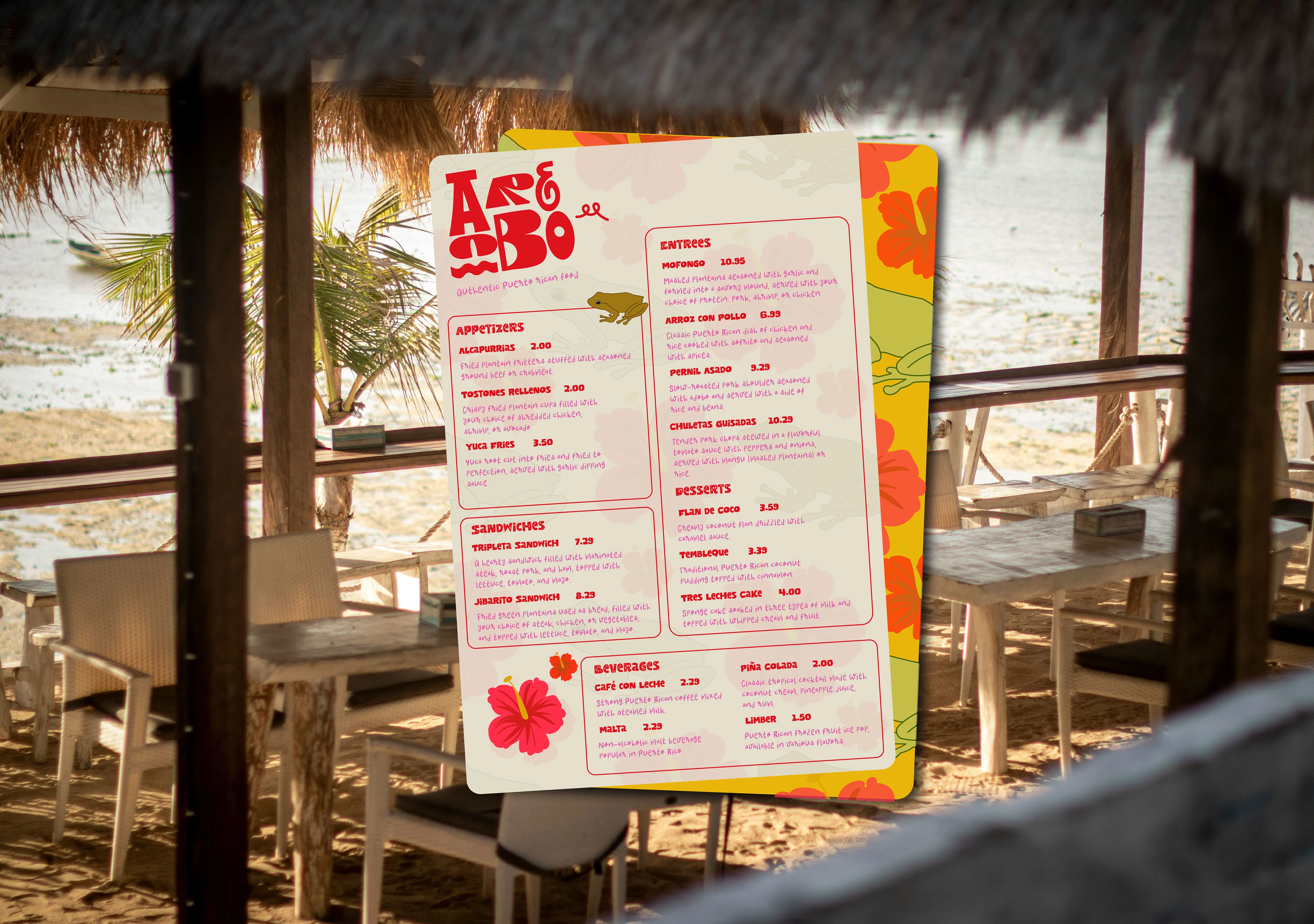
The menu design for Arecibo Aroma embraces bold colors to create a visually striking and energetic dining experience. Inspired by the vibrant hues found in Puerto Rican culture and nature, this design approach aims to captivate customers' attention and evoke a sense of excitement and warmth The color palette features a dynamic mix of bold and vivid tones that reflect the vibrancy of Puerto Rican culture. Rich shades of red, orange, and green are used to infuse the menu with energy and vitality, while hints of yellow and fuchsia add depth and contrast.The Arecibo Aroma logo is prominently featured at the top of the menu, reinforcing brand identity and creating a cohesive visual experience. Brand colors and design elements are seamlessly integrated throughout the menu, from the headers and dividers to the borders and accents, tying the entire design together and reinforcing the restaurant's identity.
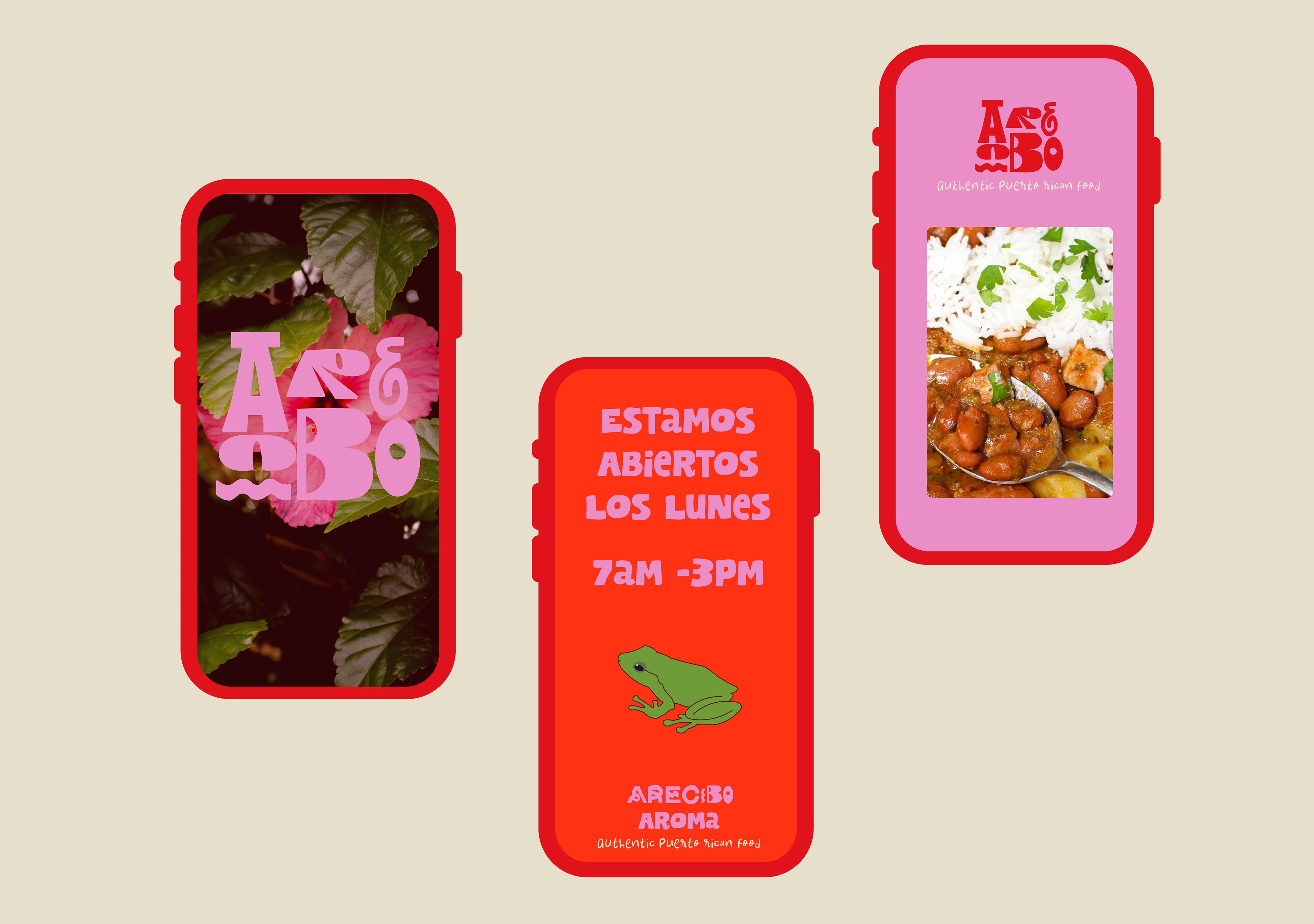
Arecibo Aroma's social media strategy aims to cultivate an engaging online presence that reflects the restaurant's vibrant atmosphere, rich culinary heritage, and commitment to exceptional hospitality. By leveraging various social media platforms, the goal is to connect with both local patrons and tourists, building a loyal community of food enthusiasts and driving foot traffic to the restaurant.
Like this project
Posted Mar 21, 2024
"Arecibo Aroma" is a quaint Puerto Rican restaurant situated in the heart of Arecibo.

