REMARK Brand Identity Project

TLG Studio


CHALLENGE
REMARK is a brand that happened to strive in a very competitive niche, the SaaS services, specially with the rise of Ai, many companies tend to have a need for such a partner to enroll on their digital services, increase the efficiency and the well usage of the artificial intelligence capabilities.
But the struggle was to distinguish the brand’s persona from the other hundreds who provide the same service, and to position the brand in a more subtle flex rather than in-your-face visuals of the internet that feeds of your attention.
Logo Design
Brand Theme
CONCEPT
The concept was to create an identity that represents REMARK as one of the technology-leading names, not just a replica of every SaaS out there, not only in looks, but perceived value as well in content, the subtle messages we craft.
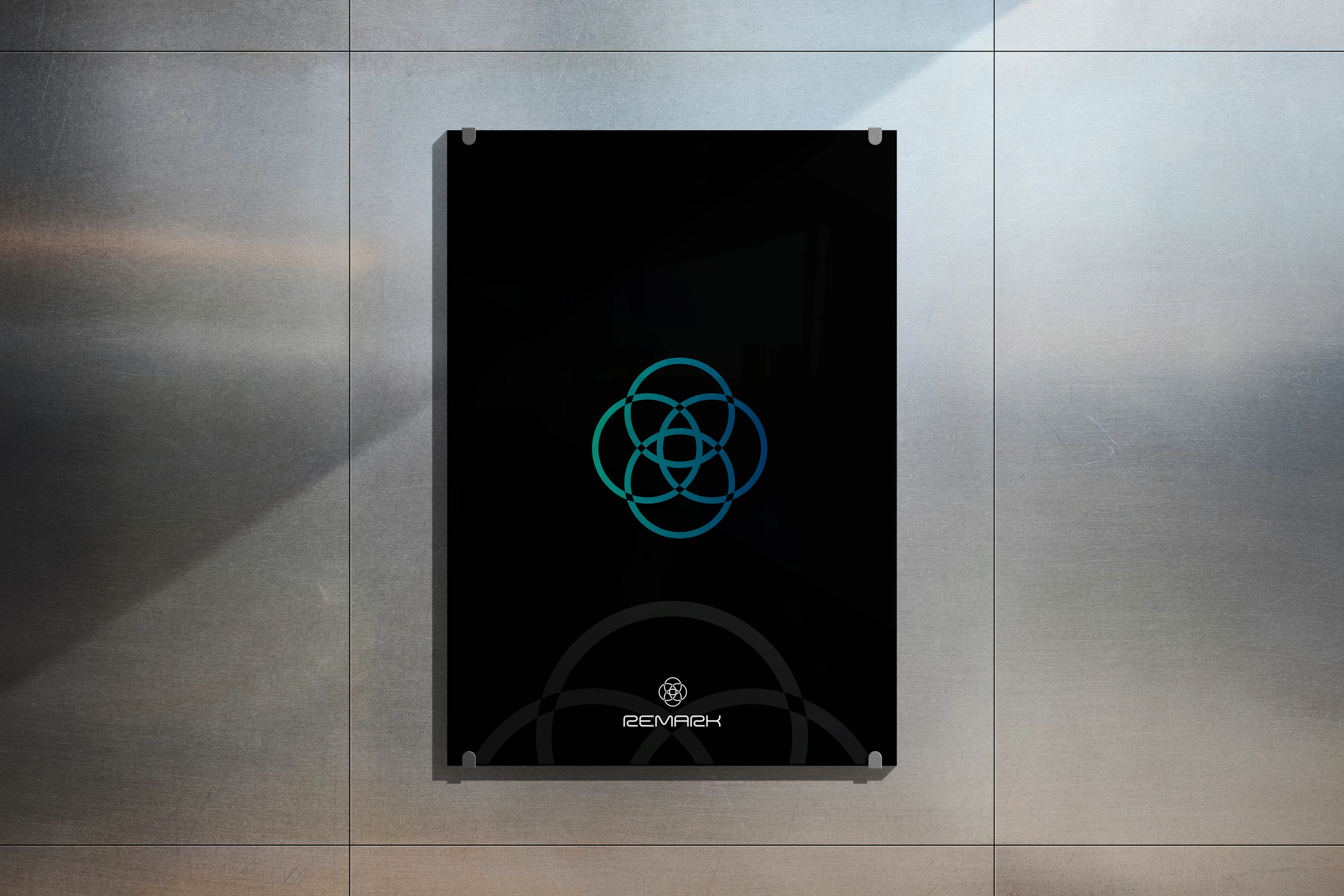
Using the blue-green hue as apposed to how colors of digital services lie around instantly give it a league of its own, with the logo design being bold and respectfully sits as an anchor point, which sparked the design direction of (showing you the way) or the brand that (shows you the direction).
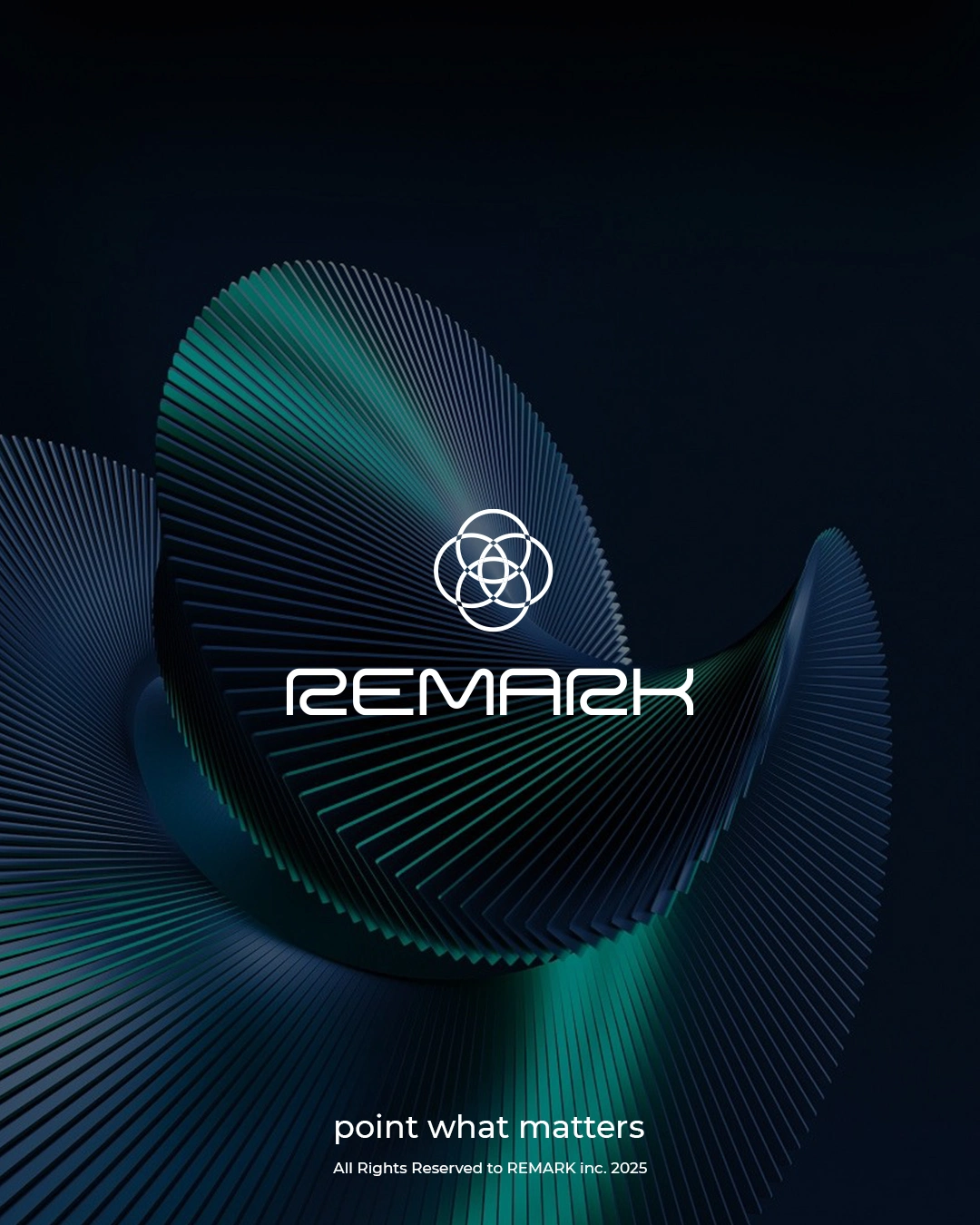
Main Poster Design (Brand Theme & Palette)
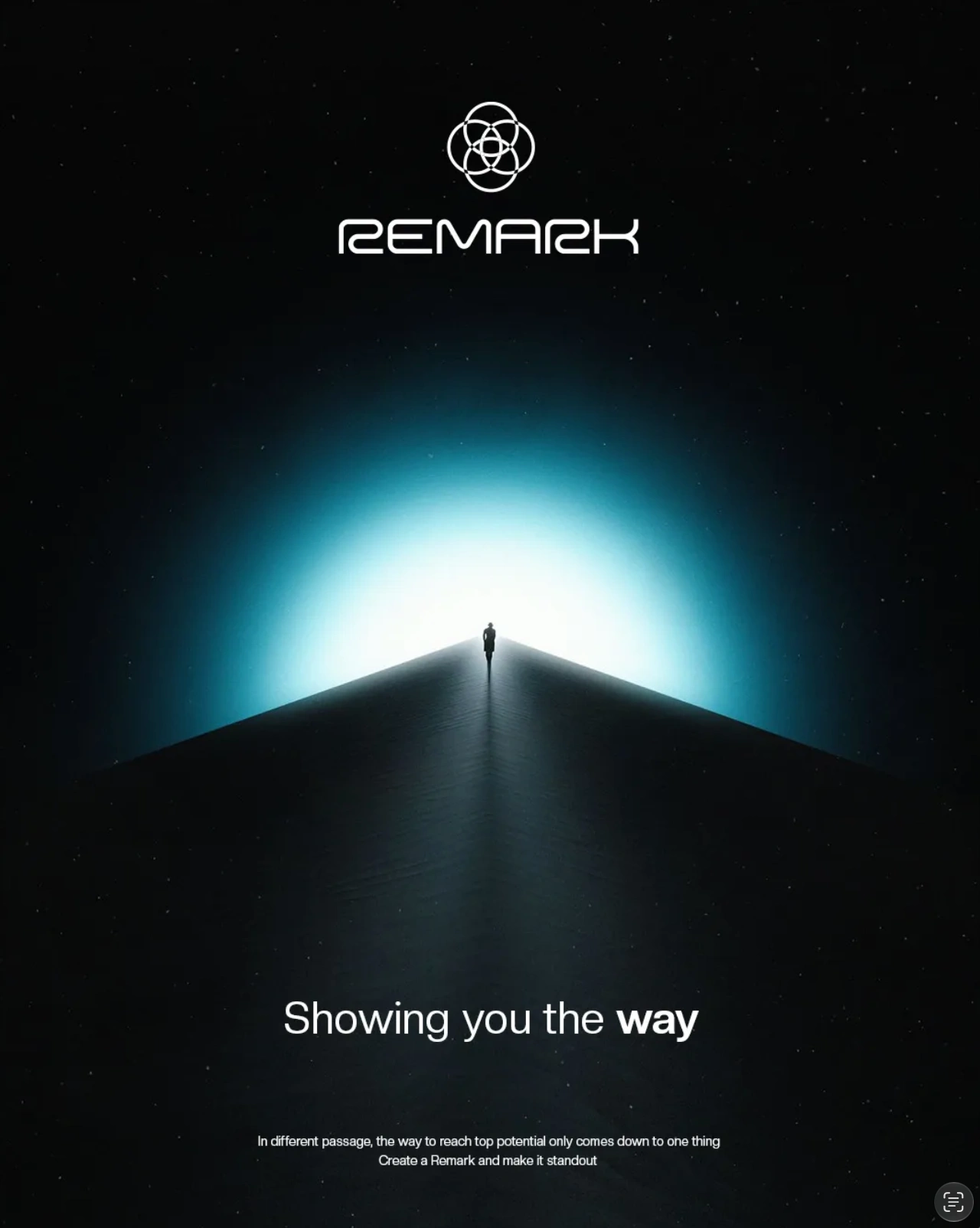
Poster Design
SOLUTION
Given the mentioned elements, the brand now completely authoritative, with content value and visual design, making the messages appear to the B2B targeted segment.
In those types of businesses, showing order, clean system & a known process goes huge miles in anchoring the brand as the face of the industry, being memorable even though just existing in the world of corporates has its pros and cons, but here we redesigned those pros and cons to make it the defining value of the brand, its literally (showing you the way).
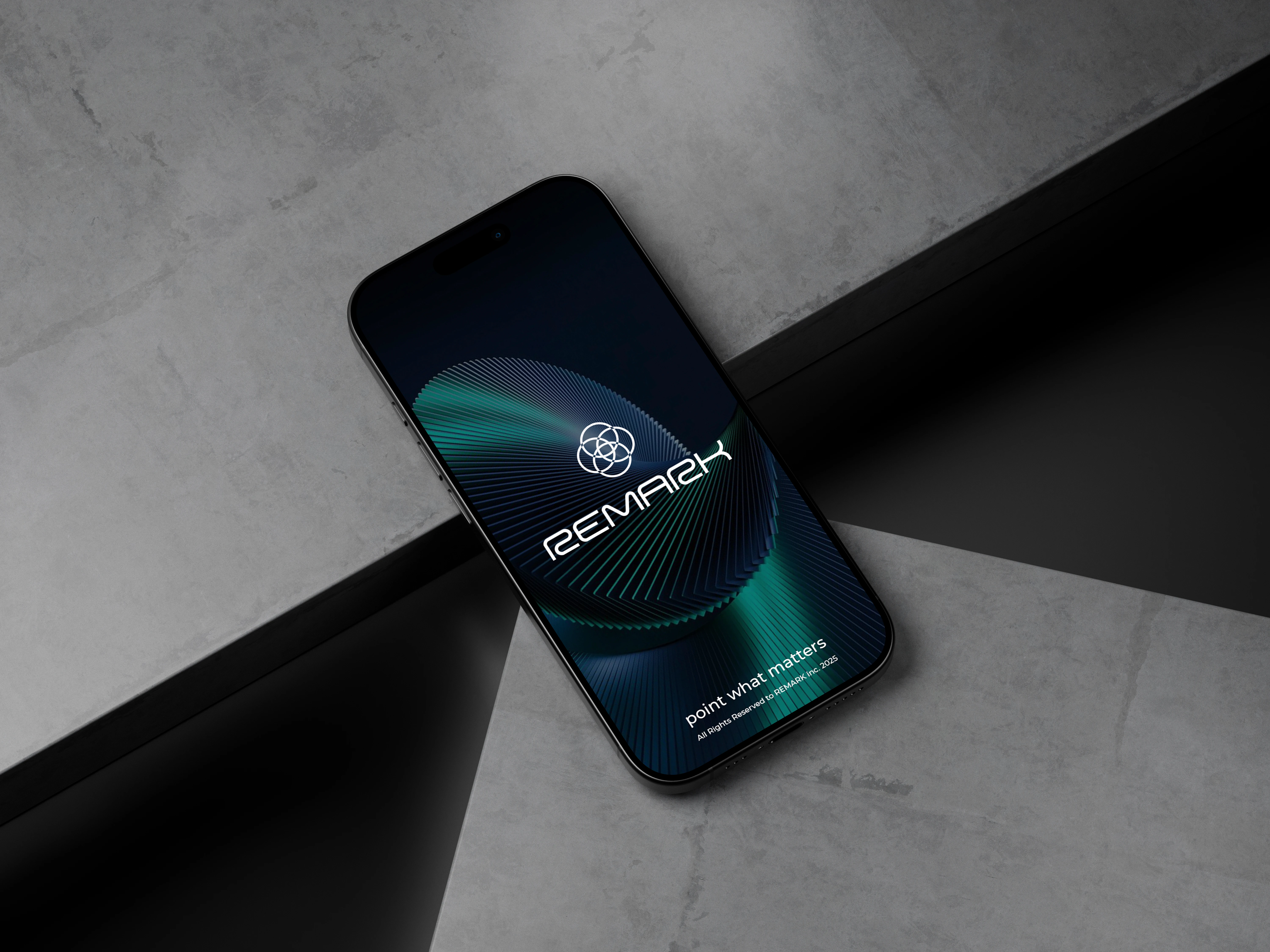
Product Digital usage
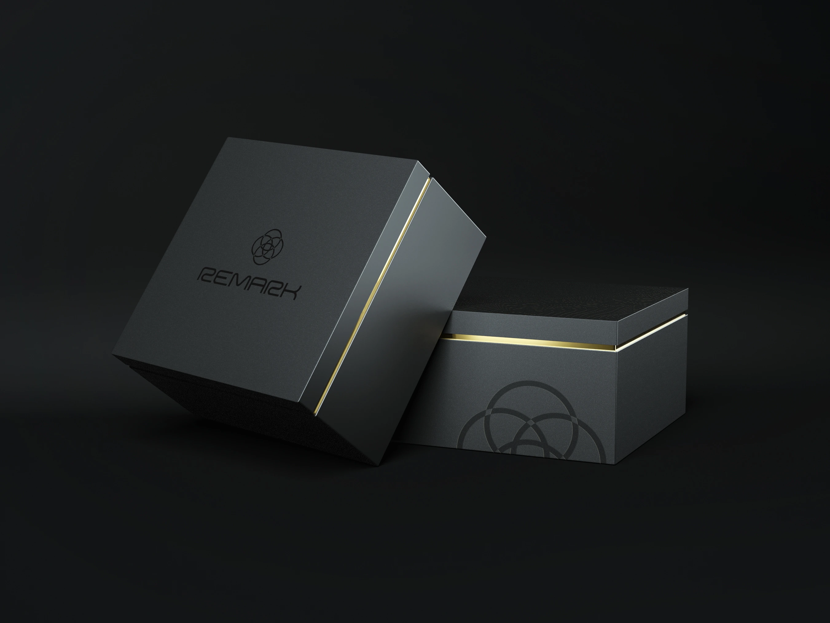
Customer Acquisition Box (Handed physically)
Brand Motion Feel
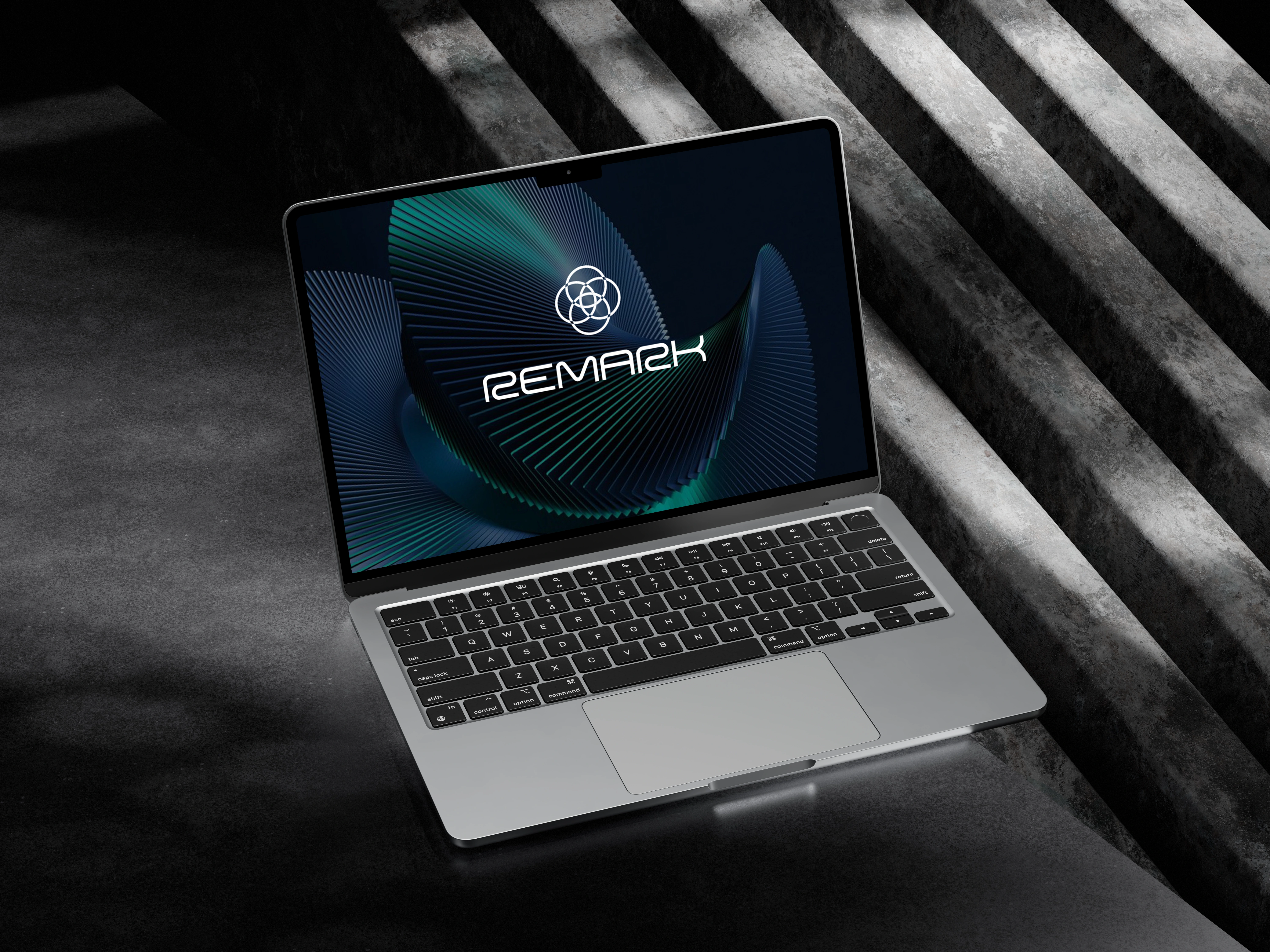
Product Usage (Digital)
Like this project
Posted Aug 20, 2026
Where digital services are offered, not to make life easier, but also faster and more efficient, REMARK is here to even the playground & introduce new magic.
Likes
0
Views
9
Timeline
Mar 30, 2025 - Aug 1, 2025