The Entrepreneur Experiment Rebranding
Konstantin Nikolaev
The Entrepreneur Experiment Rebranding
A premium editorial rebrand for The Entrepreneur Experiment transforming a long-standing podcast identity into a refined, modern-classic brand system built for credibility, recognition, and growth.
After 6–7 years with the same visual identity, The Entrepreneur Experiment needed a brand refresh that better reflected its next chapter. The existing look felt overly geometric and no longer matched the ambition, credibility, and editorial quality of the podcast.
The goal was to create a visual identity that felt premium, intelligent, minimal, and confident — something closer to the restraint of The Financial Times or Monocle than a typical startup podcast brand.
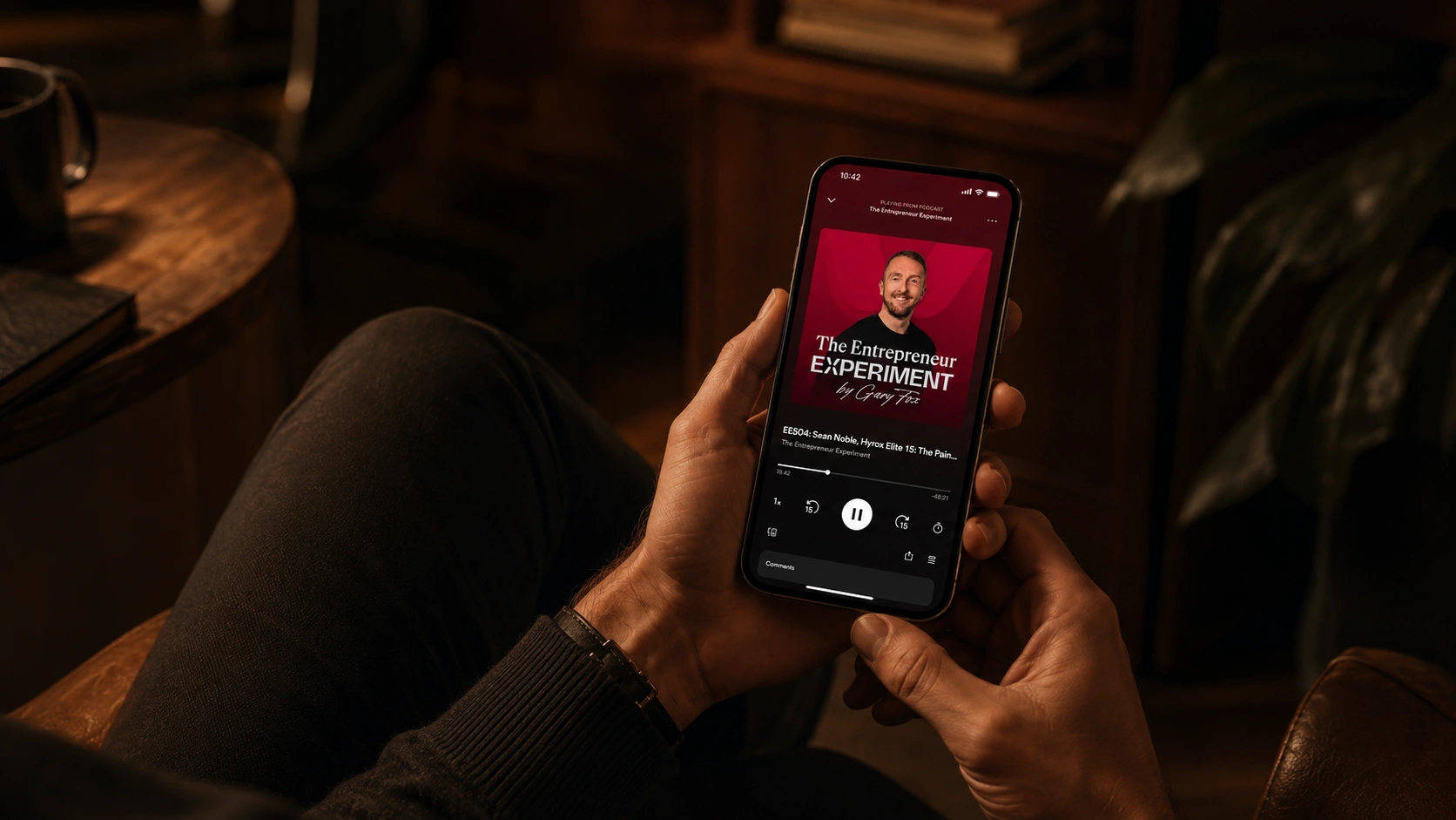
The final system combines timeless typography, flexible logo lockups, a subtle experimental symbol, and platform-ready assets designed for podcast apps, YouTube, social media, web, print, and future brand extensions.
The Challenge
The biggest challenge was balancing two worlds:
Editorial restraint and entrepreneurial energy.
The brand had to feel serious enough for a business audience, but not cold. Premium, but not overdesigned. Experimental, but not literal.
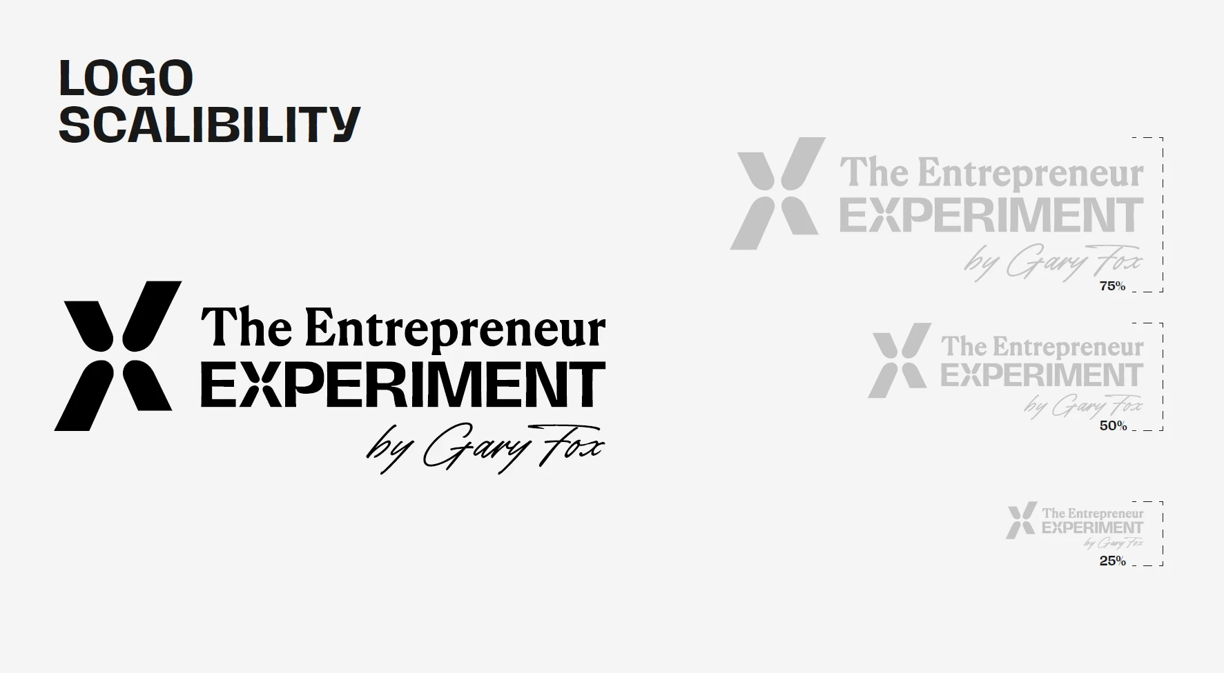
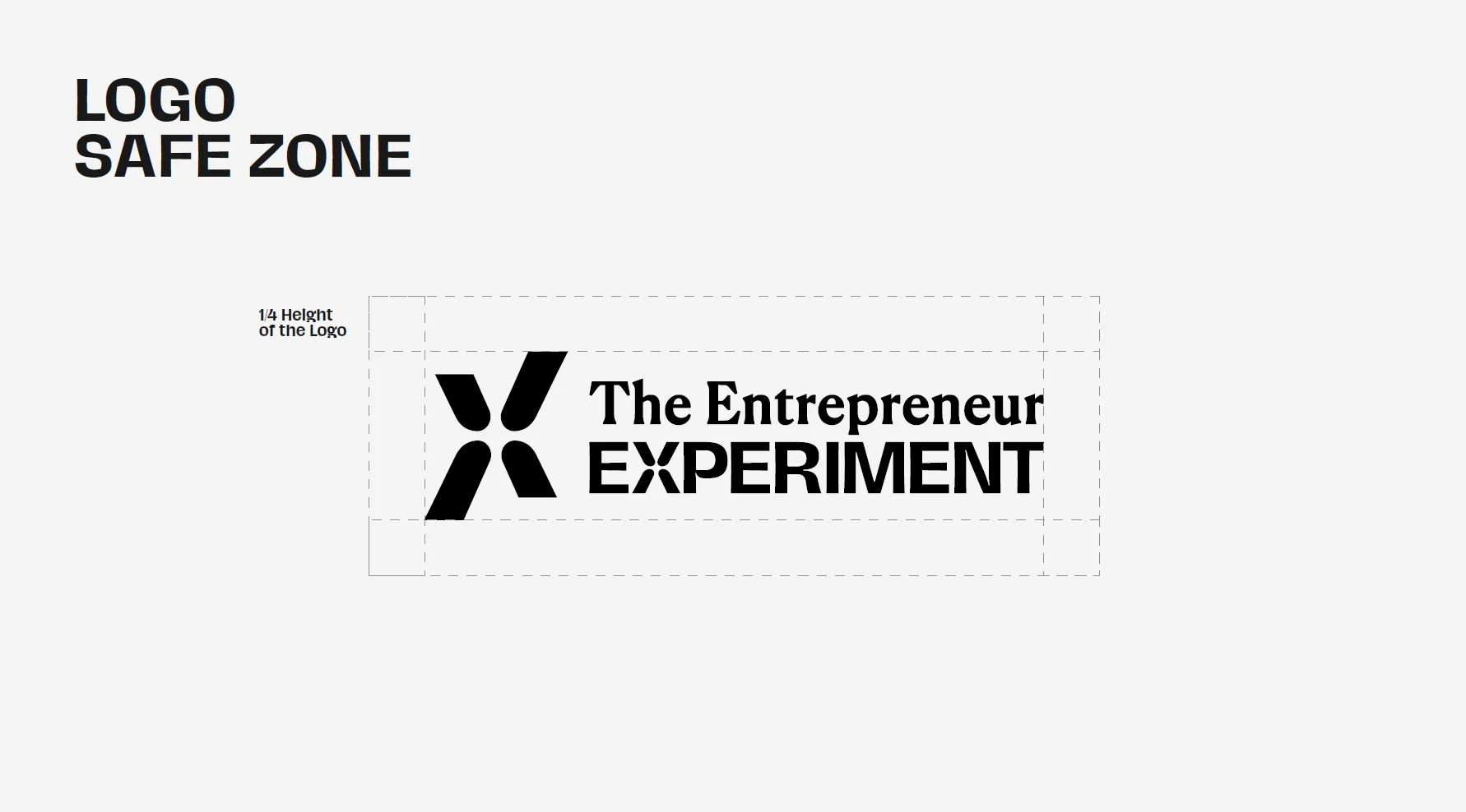
It also had to work in the real conditions of a podcast brand: tiny app icons, YouTube thumbnails, social profile crops, dark backgrounds, light backgrounds, horizontal lockups, stacked lockups, and small-size applications.
This meant the identity could not just look good in a presentation — it had to be clear, flexible, and usable across every touchpoint.
Before
The previous identity had a functional podcast look, built around a geometric fox symbol and a strong red accent. While recognizable, the overall system felt more technical and less aligned with the premium editorial direction the brand was moving toward.
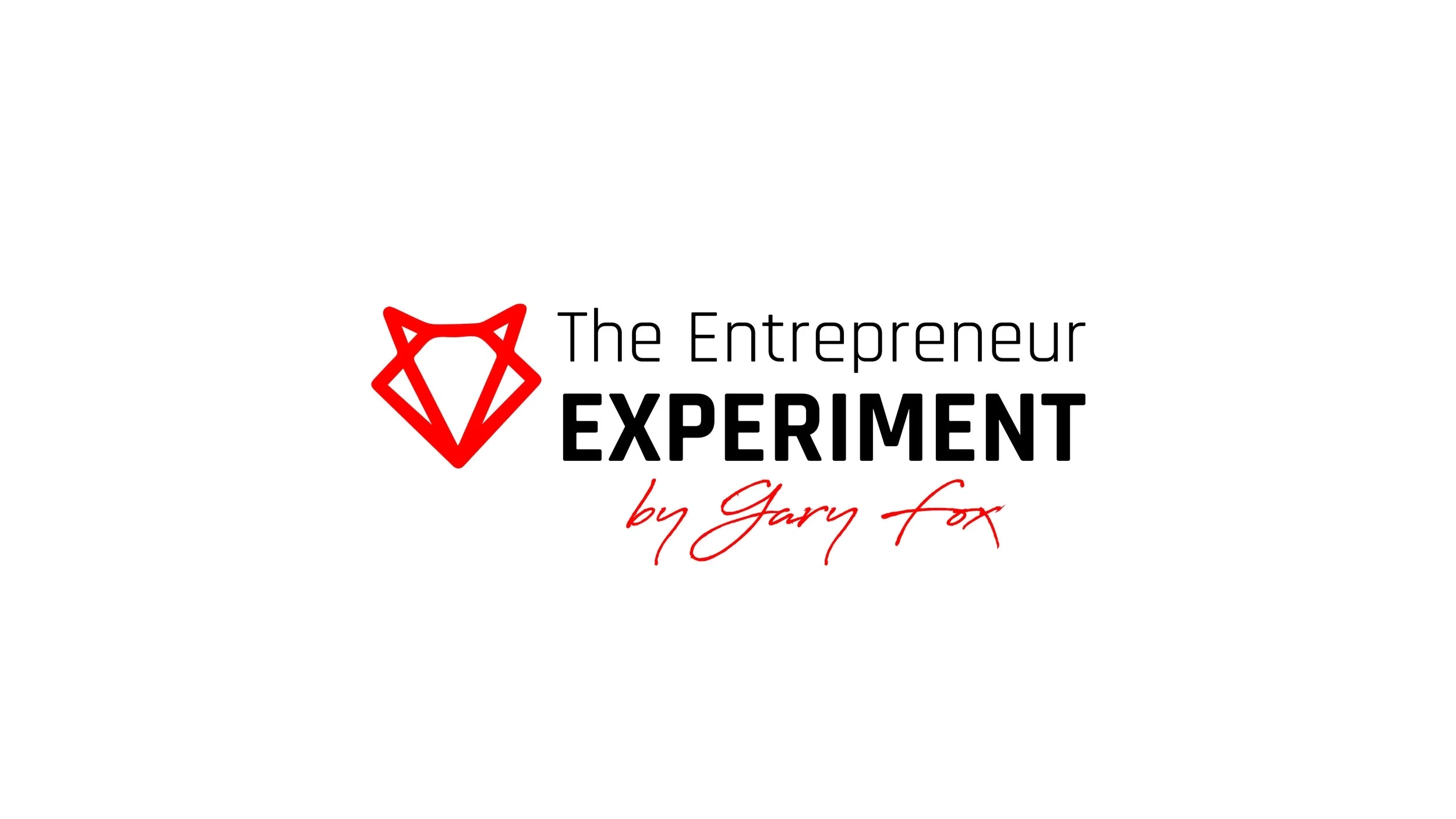
The Entrepreneur Experiment Logo Before
After
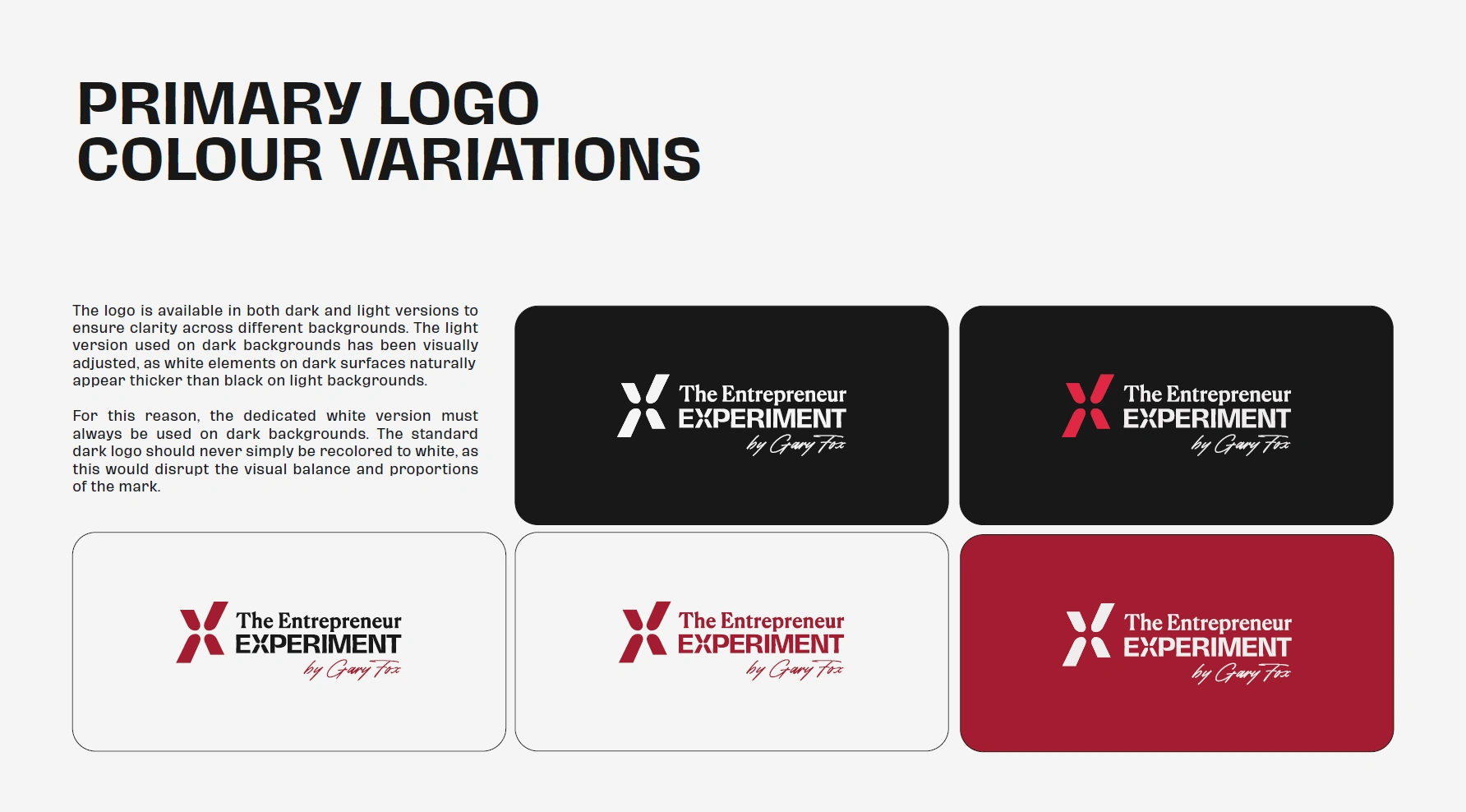
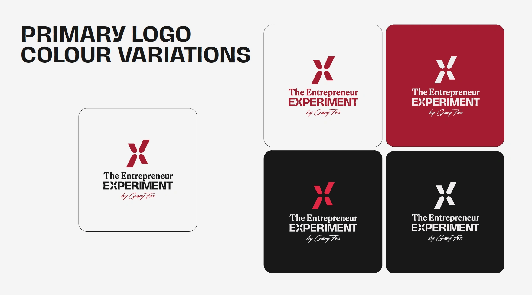
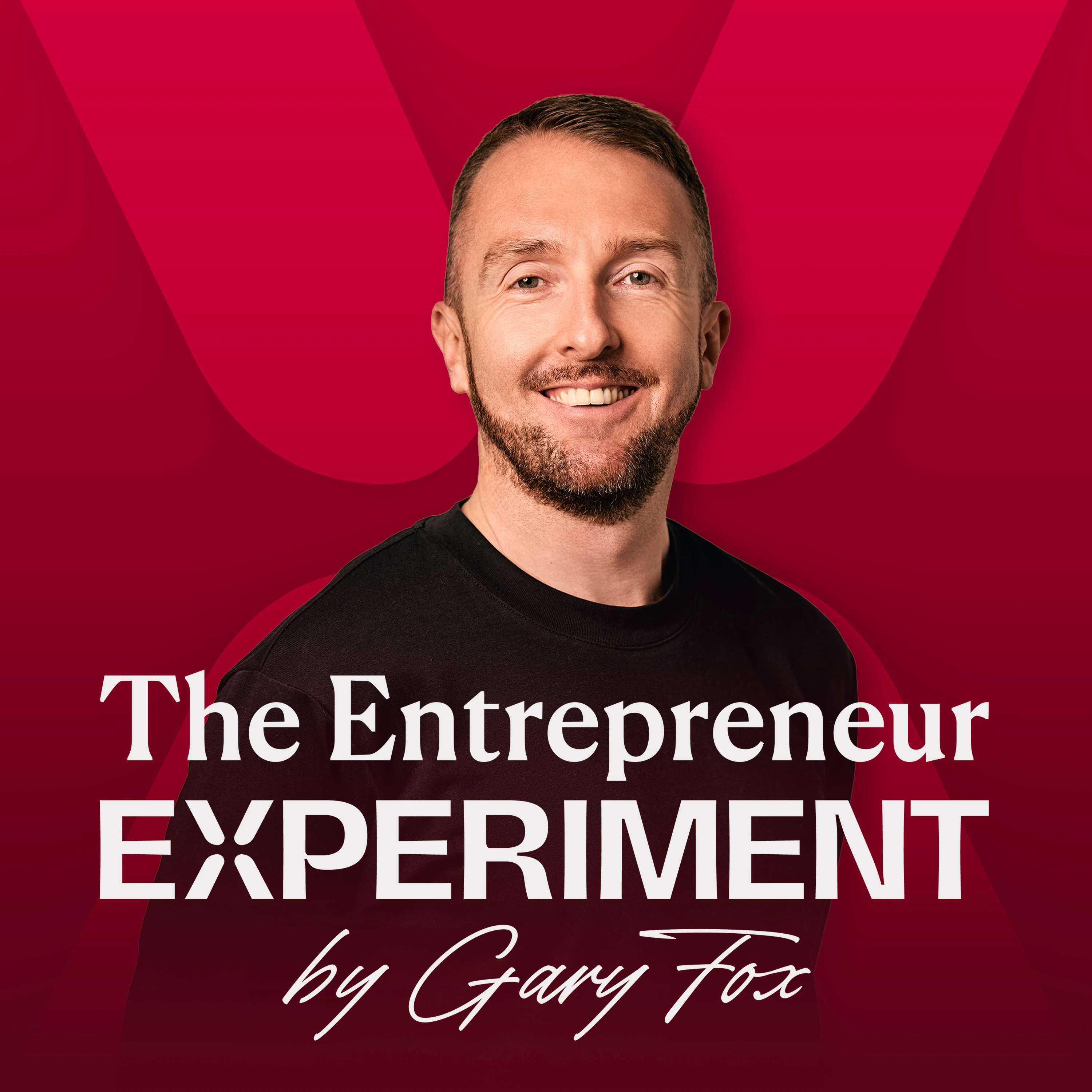
The new identity introduces a more refined, editorial logo system with stronger typography, a deeper red, and a subtle experimental “X” symbol. It feels more confident, timeless, and premium — while still keeping the spirit of experimentation at the center of the brand.
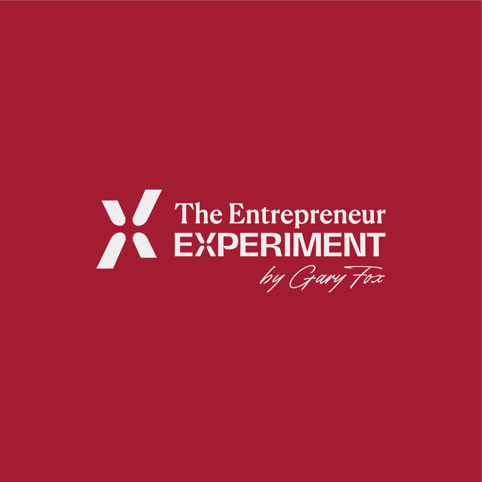
The Entrepreneur Experiment Logo After
Experimental X Symbol
The standalone symbol was extracted from the X in “Experiment” and turned into a minimal mark that represents intersection, testing, and progress.
Each part of the X reflects a different element of entrepreneurial thinking — ideas, strategy, action, and iteration — coming together at one central point. The extended legs create a sense of movement and growth, while also suggesting out-of-the-box thinking and a willingness to push beyond the expected.
Rather than using obvious science-inspired visuals, the symbol translates the idea of experimentation into something more subtle, premium, and iconic.

X Icon
The Wordmark
The wordmark combines Canela, an editorial serif, with Hagrid, a stronger and more expressive typeface, to create a clear contrast between refinement and experimentation.
“The Entrepreneur” feels intelligent, premium, and editorial, while “Experiment” adds weight, confidence, and a more distinctive visual rhythm. Together, both typefaces create a modern-classic identity that feels sophisticated without becoming too playful or losing its experimental edge.
The result is a wordmark that feels timeless, sharp, and built for a premium business podcast.
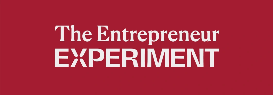
The Entrepreneur Experiment Wordmark
Brand Guidelines
Spotify Cover Art
Like this project
Posted Apr 25, 2026
Premium editorial rebrand for The Entrepreneur Experiment — turning a long-standing podcast identity into a sharper, timeless brand system.