E-commerce design for the ultimate product experience

Dave Omeiza


mishmash was founded upon a profound love for all things office-related, with a core focus on perfectionism and design. After the introduction of new products along with the ambitious goals for conversion, sales and scaling, there came a need to redesign the online store, making it contemporary, sales-focused and uniquely mishmash. That's where we stepped in once again.
Mishmash chapter 2. Creating the base for a bright future.
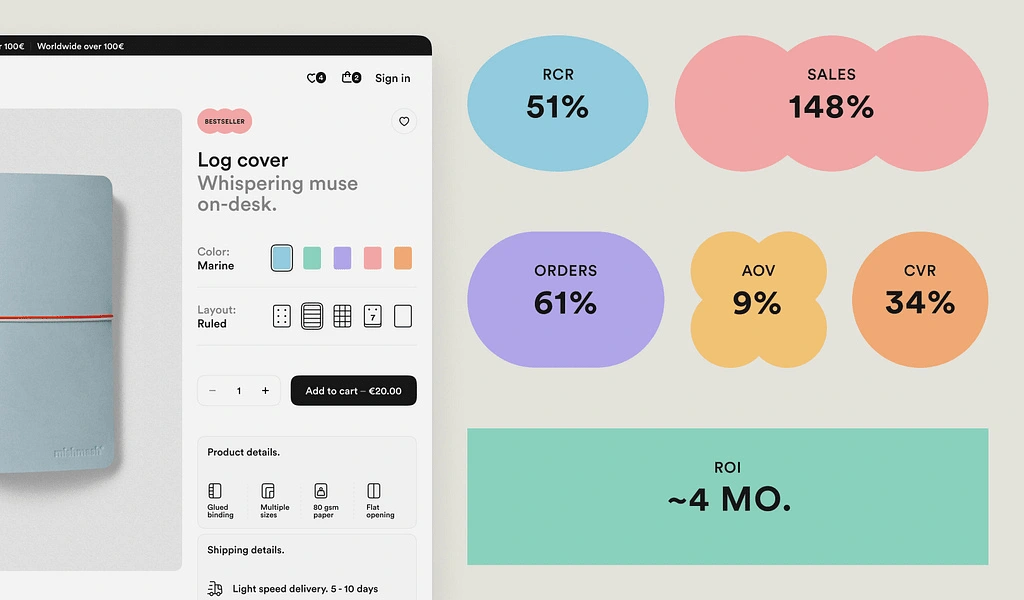
In just a couple of months, we revamped, redesigned, and implemented mishmash's e-commerce platform, both commercially and operationally. The results have been really promising: a 34% increase in conversion rates, a 148% jump in sales compared to the previous year, and a 51% rise in returning customers, along with many other positive indicators.
“You can throw anything at them, their team will make the best out of it.”
Beatriz Barros, CEO at mishmash
New goals, new challenges.
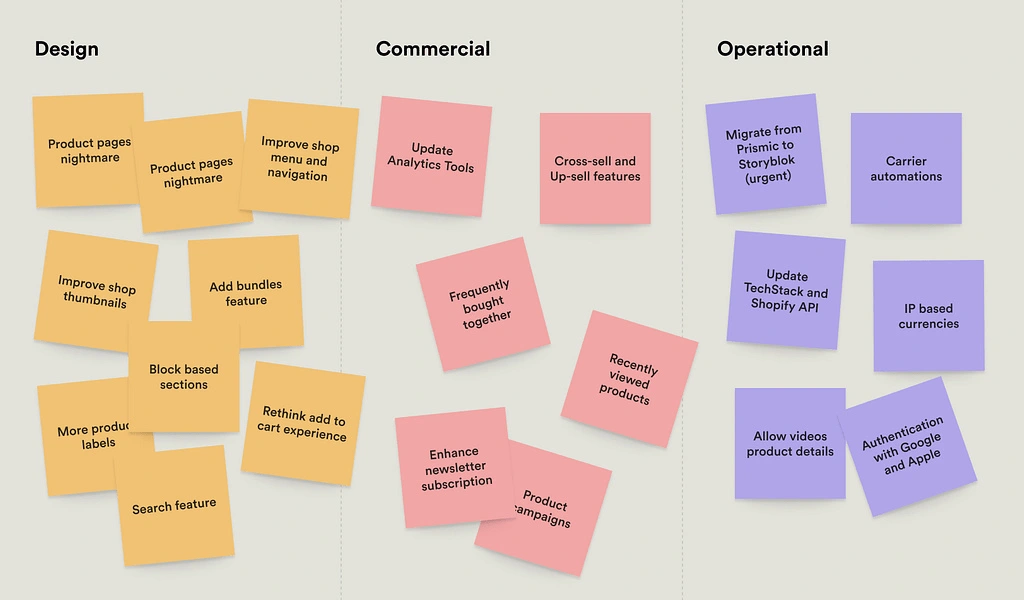
When the mishmash team approached us, the objective was crystal clear: re-iterate the current e-commerce website, making it more capable and tailored to mishmash's present and future needs. As we began analysing the current issues and potential enhancements, we identified three key areas for improvement: design and overall store experience, commercial and conversion (which were almost non-existent), and operational efficiency.
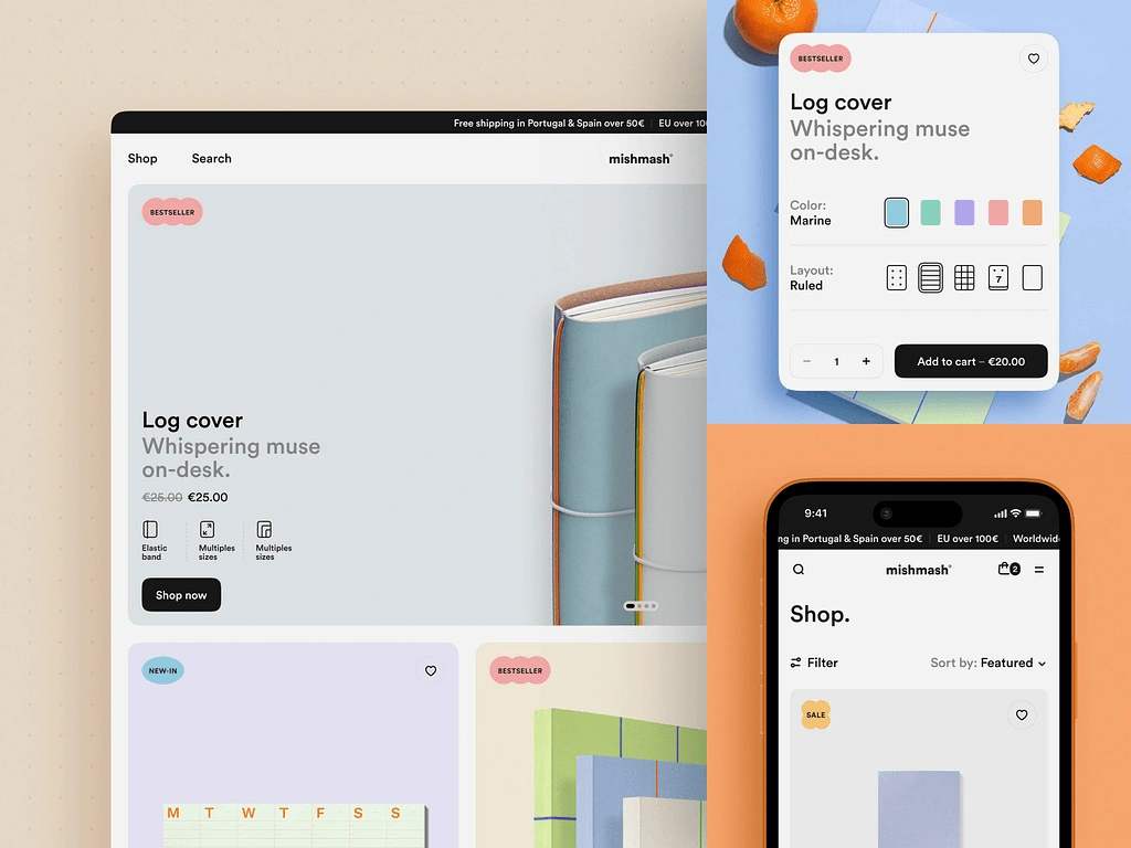
Design.
Bringing a unique mishmash feel throughout the website.
At mishmash, design isn't just a feature – it's the heart and soul of every carefully crafted product they offer. We felt the store should embody this level of detail, elegance, and simplicity, reflecting the mishmash's unique identity. We did that by drawing inspiration from the actual mishmash product details – colours, shapes, layouts, typography – and translating this rich visual language into the website, keeping it simple but making it unique.
Defining standards that support growth.
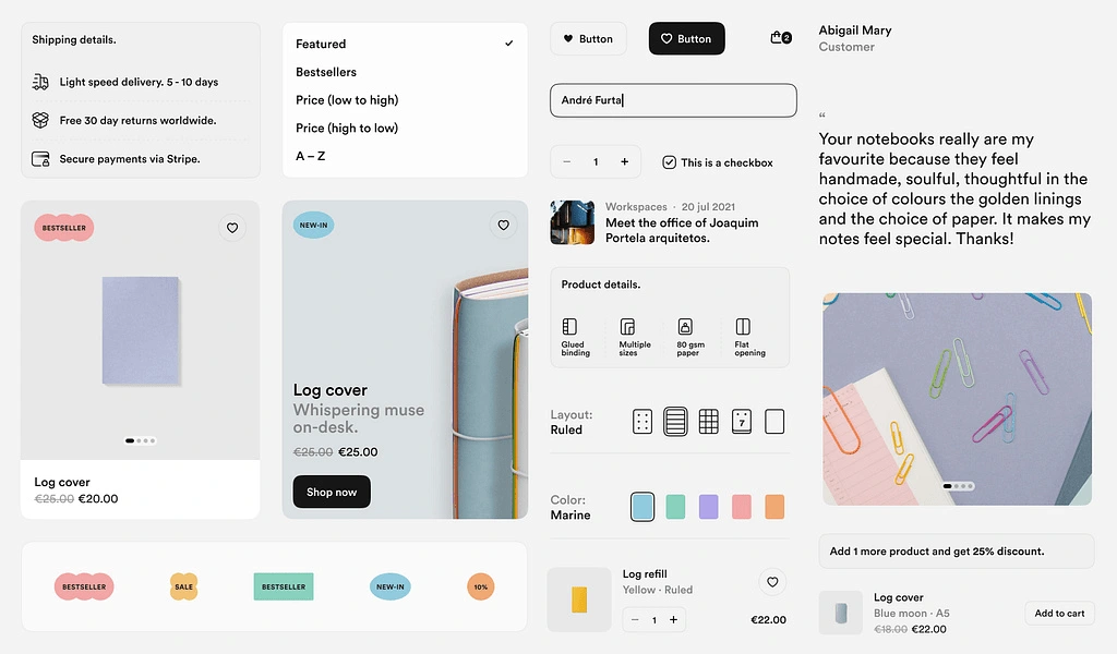
We revamped and redesigned all UI elements, from buttons to card sections, sections to pages and even the micro-interactions – which were almost nonexistent previously – elevating the level of detail and emotion in every interaction available. This solid foundation supports growth while maintaining coherence without compromising quality.
Block-based design. Providing freedom and autonomy to create.
At Significa, we follow the concept of block page design because it's the most effective approach for scaling products while granting autonomy to those who create pages without compromising quality. Mishmash's e-commerce content pages are now highly flexible and modular, incorporating a block-based design concept. We've collaborated closely with the mishmash team to design these blocks, which serve as the foundation for every page, seamlessly adapting to each specific use case or content requirement.
Rethinking user experience details for better.
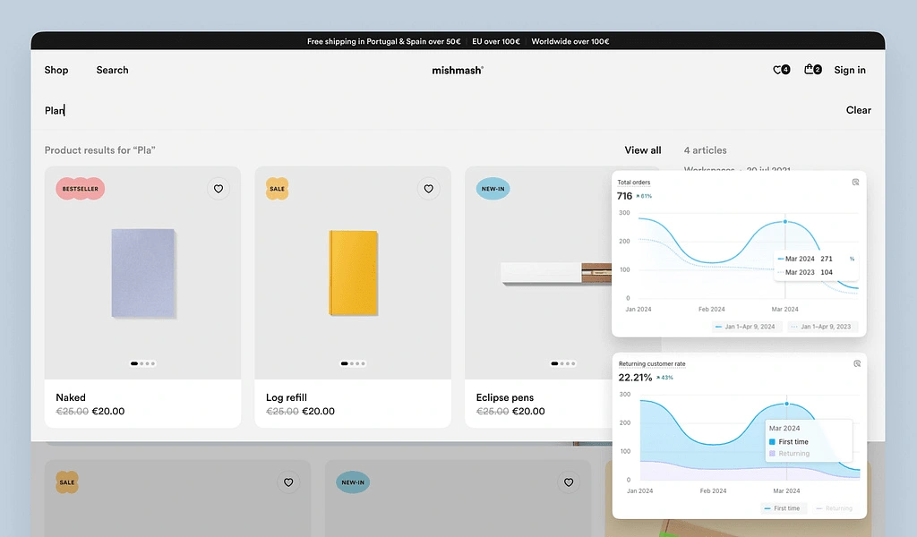
Clear user flows and information architecture are just as crucial as visual appeal. We meticulously detected and addressed all the pain points causing friction and frustration, such as unclear CTAs, redundant flows, pages and components hierarchy and organisation, simplifying interactions and creating a user-friendly environment where every click feels intuitive, and every piece of information is valuable. The results speak for themselves, with a 61% increase in total orders, validating the significance of these decisions.
Like this project
Posted Apr 6, 2025
mishmash was founded upon a profound love for all things office-related.
Likes
1
Views
1
Timeline
Feb 14, 2025 - Apr 2, 2025


TodayLife - Finance Banking Solution website design

Rasm – Beauty Spa Care & Nail E03
E-Commerce Website - Electronic Gadget Store
Fashion Ecommerce Web Design