🌉Naija Design System: Design Documentation
A design system is a set of standards, guidelines, and tools that help teams design and build digital products more efficiently and consistently. It serves as a single source of truth for the visual and interactive elements of a product, including typography, color, layout, and functionality.
The Job
The federal government of Nigeria operates numerous websites and digital applications, each with its own design language and user experience. This results in a lack of consistency which causes confusion for citizens trying to access government services online. The Druids Alpha team was tasked with creating a design system that provides a shared set of reusable visual design principles, styles, UI components, and patterns for use across all federal government digital products.
Note: This was a collaborative team project conducted by the Druids Alpha team. The team consisted of a product manager, brand designers, product designers, UX writers, and illustrators.
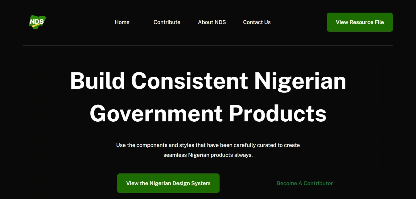
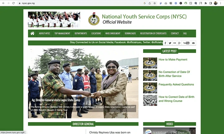
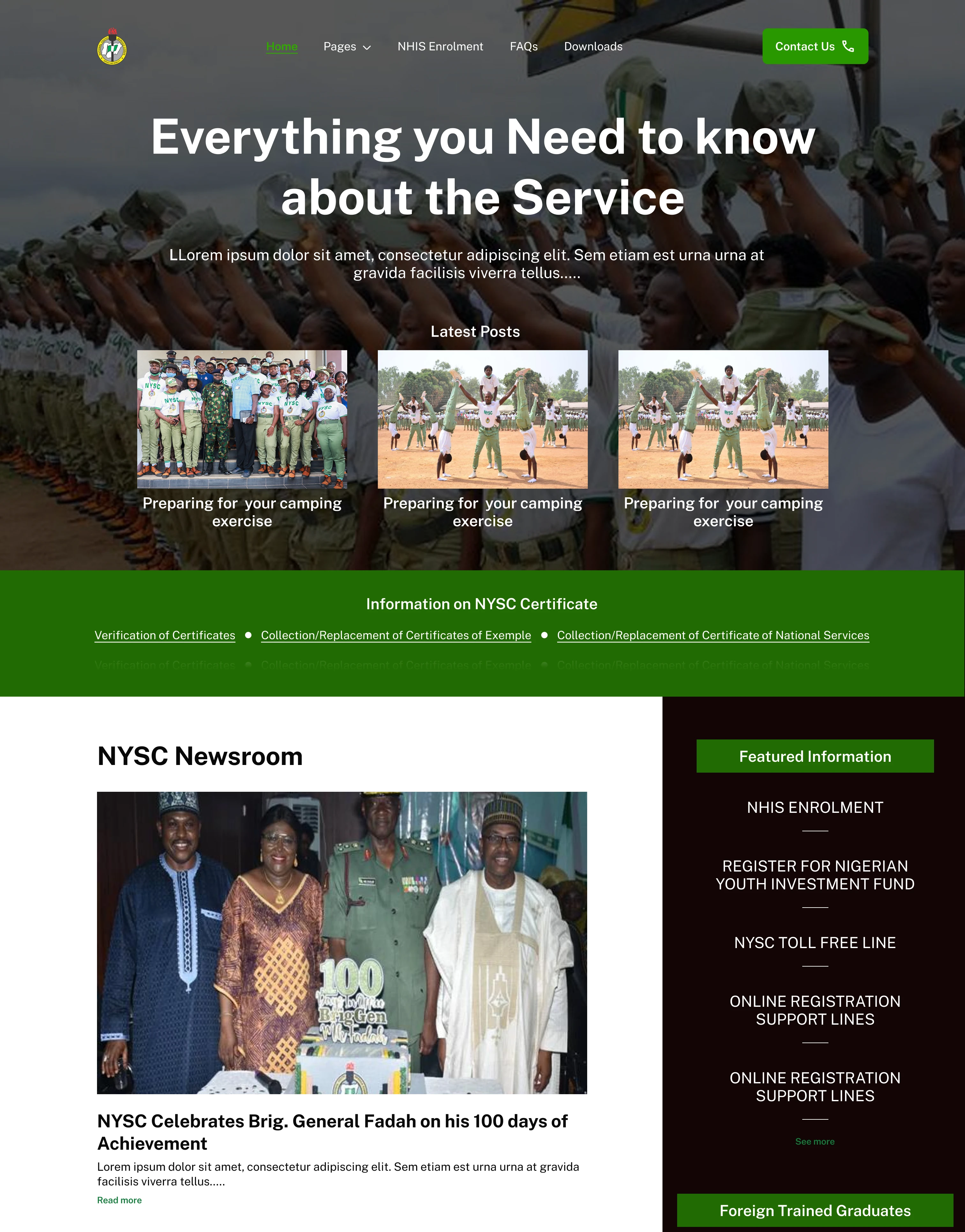
Before and after redesigning the National Youth Service Corps(NYSC) website with Naija Design System(NDS) components
Before the design system
2. After the design system
Research and insights
We conducted user research to understand the common pain points and needs across our products. We also surveyed the design teams to gather their input and perspectives.
We defined the scope of our design system as follows:
A shared set of visual design principles and styles
A library of reusable UI components and patterns
A design process and documentation to guide teams in using the design system
Actionable insights from research
Promote consistency in the user experience
Reduce design and development time by providing reusable components
Enable teams to iterate on designs while maintaining brand consistency quickly.
Design
We began by creating and defining the foundation for the overall look and feel of our design system, which includes colors, typography, grid and space, and icons.
Next, we identified the most commonly used UI components and patterns across the federal government platform and created a library of these elements.
Documentation (Checkout the documentation)
After designing these reusable UI components. The UX writing team collaborated with the design team to create usage guidelines and documentation using ZeroHeights. This ensured that the teams could easily find and use the design system resources.
The documentation also included contribution guidelines for submitting new components or requests for changes to the design system.
Results
Since the launch of the Naija Design System (NDS), its socials have seen:
15,000+ impressions
200+ profile visits
1000+ engagements
All of these metrics are strong indicators of the wide acceptance of the design system by Nigerian designers.
Like this project
Posted Jul 13, 2023
I created and maintained user-friendly documentation for the design system, including guidelines, and best practices for the design community.

