Dialrr – Brand Identity for a VST Plugin Controller

Baron DiAdio


Project Overview
Dialrr is a brand identity and creative direction study exploring the relationship between physical controls and digital music production. Drawing from industrial design, precision instruments, and the tactile language of audio hardware, the project develops a connected visual system across identity, interface design, and product visualization.
Project Introduction
Creative Direction
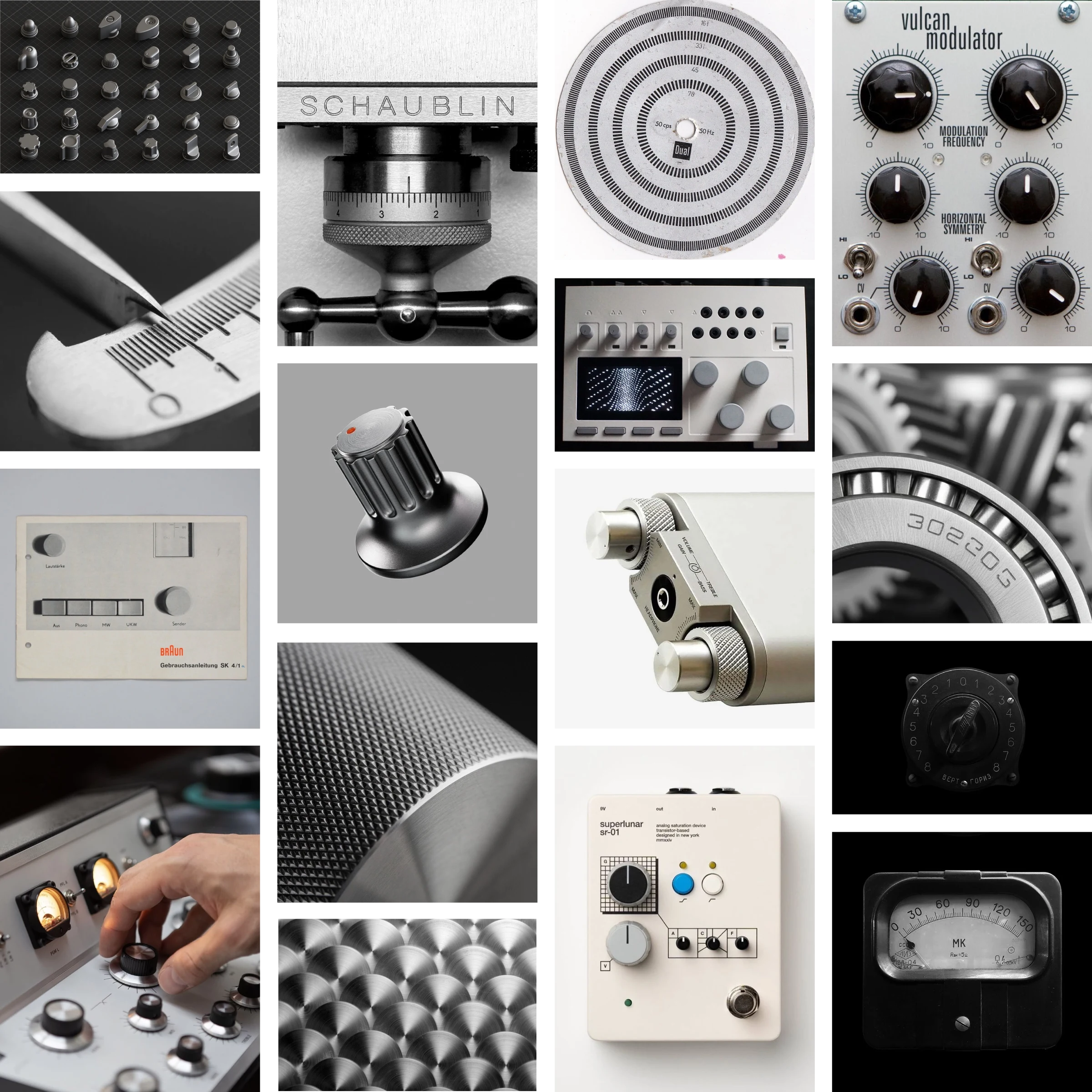
The visual direction for Dialrr draws from analog equipment, industrial materials, and precision-engineered instruments. Rotary controls, brushed aluminum, tactile surfaces, and technical geometry establish an aesthetic defined by function and restraint.
At the center of this exploration is the relationship between circular form and directional movement. This principle connects the physical reference material to the development of the Dialrr symbol and the wider visual identity.
Industrial Precision Moodboard
Logo Development
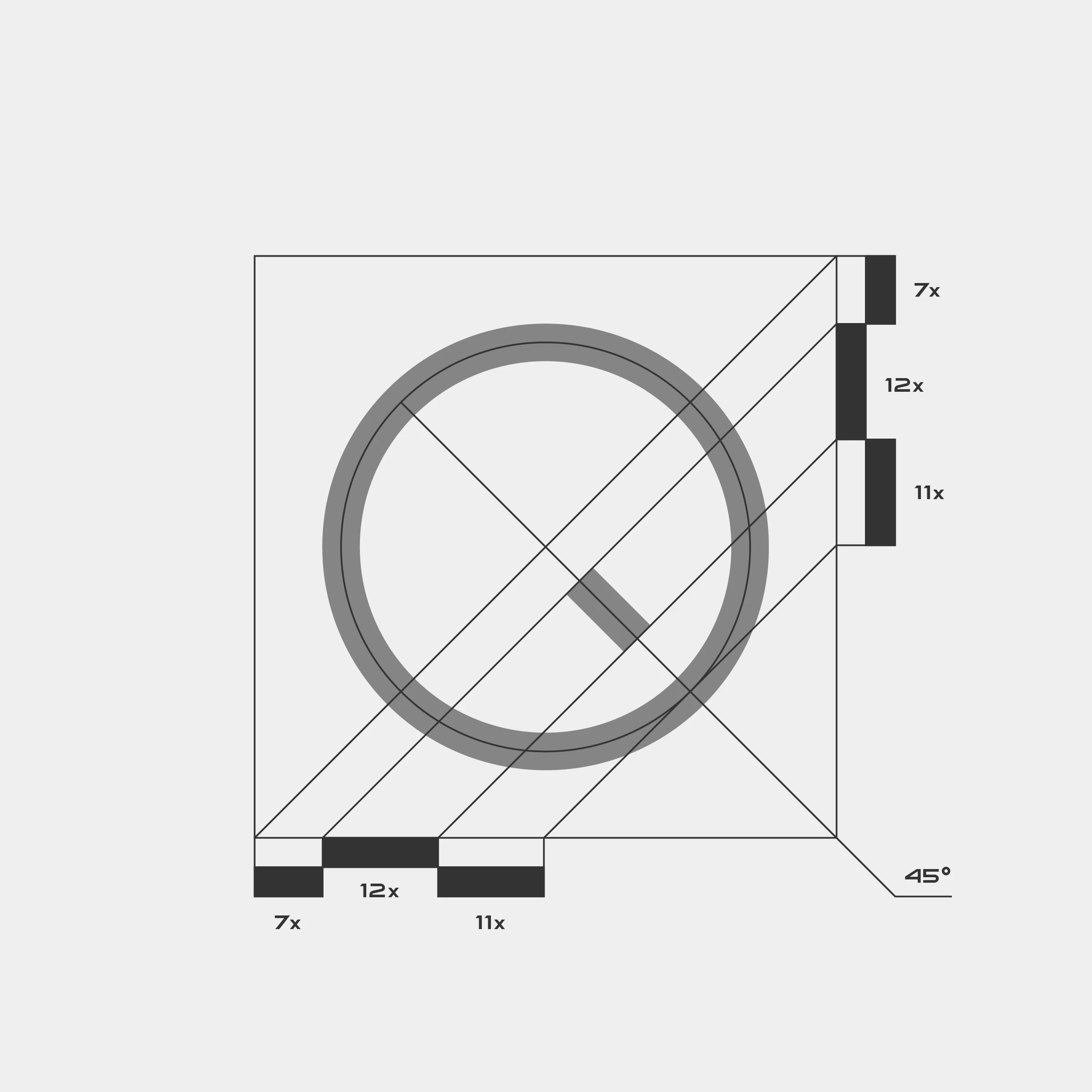
The Dialrr symbol takes inspiration from the rotary potentiometer, reducing a familiar physical control into two essential elements: a circle and a directional indicator. Its construction follows a proportional geometric system, with defined relationships between line thickness, negative space, and a 45-degree angle.
The circular form references rotation, while the diagonal mark introduces direction and adjustment. Together, they establish a minimal symbol that can function independently or alongside the custom wordmark.
Symbol Construction
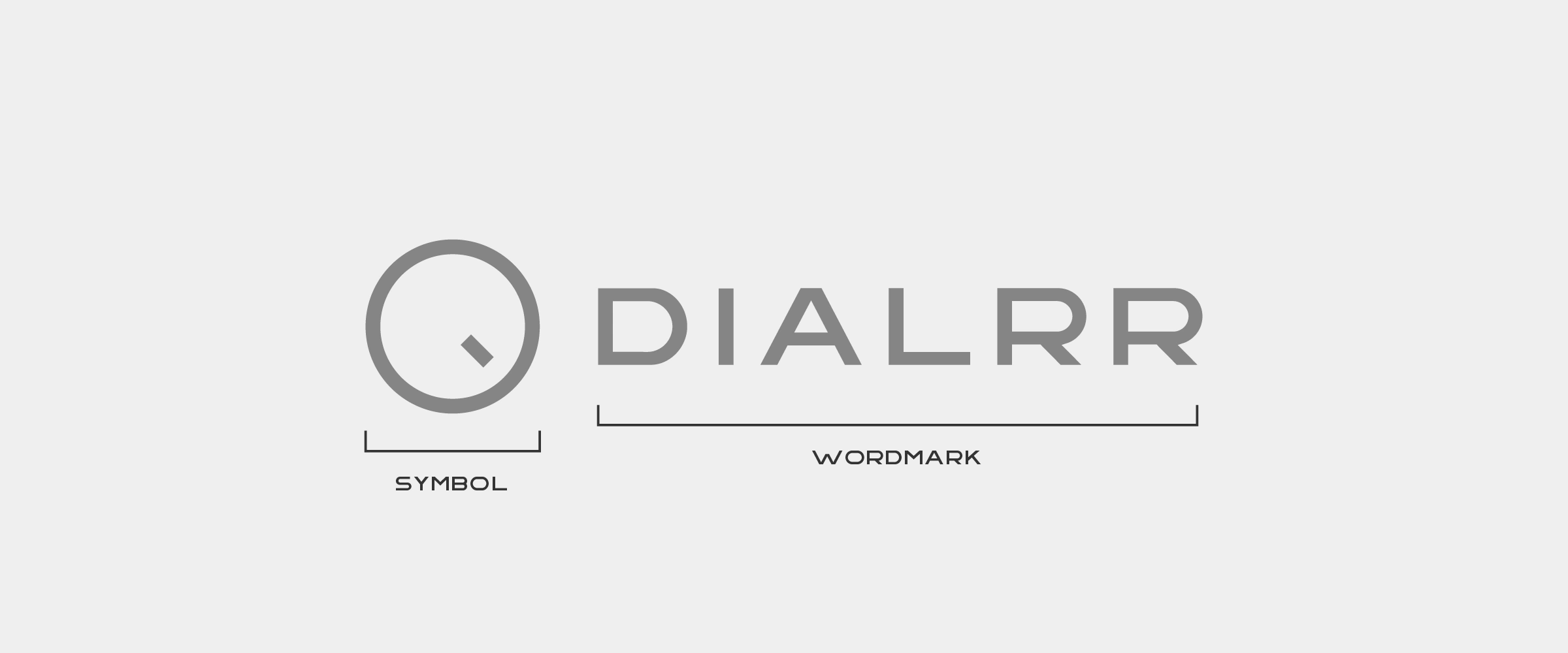
Logo Anatomy
Color Scheme
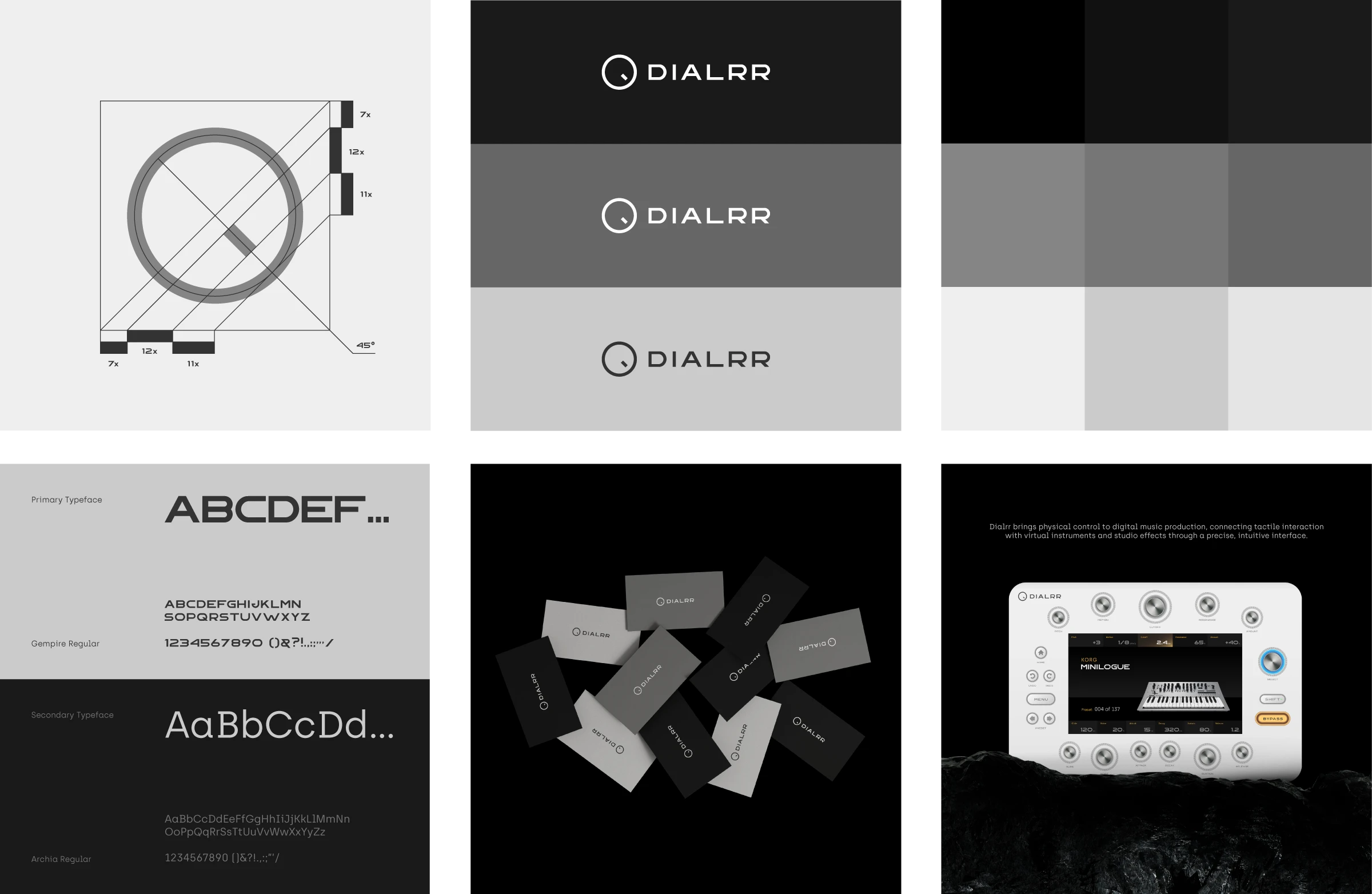
The Dialrr color system is built around nine monochromatic shades, ranging from deep black to soft silver and off-white. Inspired by industrial materials and precision hardware, the palette provides tonal depth while maintaining a controlled visual appearance.
Darker shades establish contrast and structure, while lighter tones reference the physical surfaces and metallic details of the controller. Functional illuminated accents remain part of the interface rather than the primary brand palette.
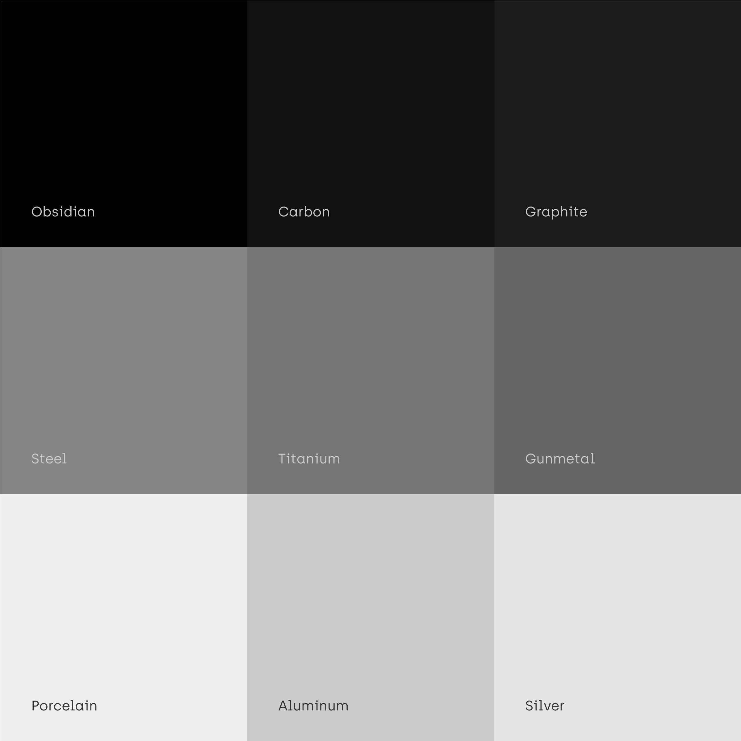
Color Palette
Logo Variations
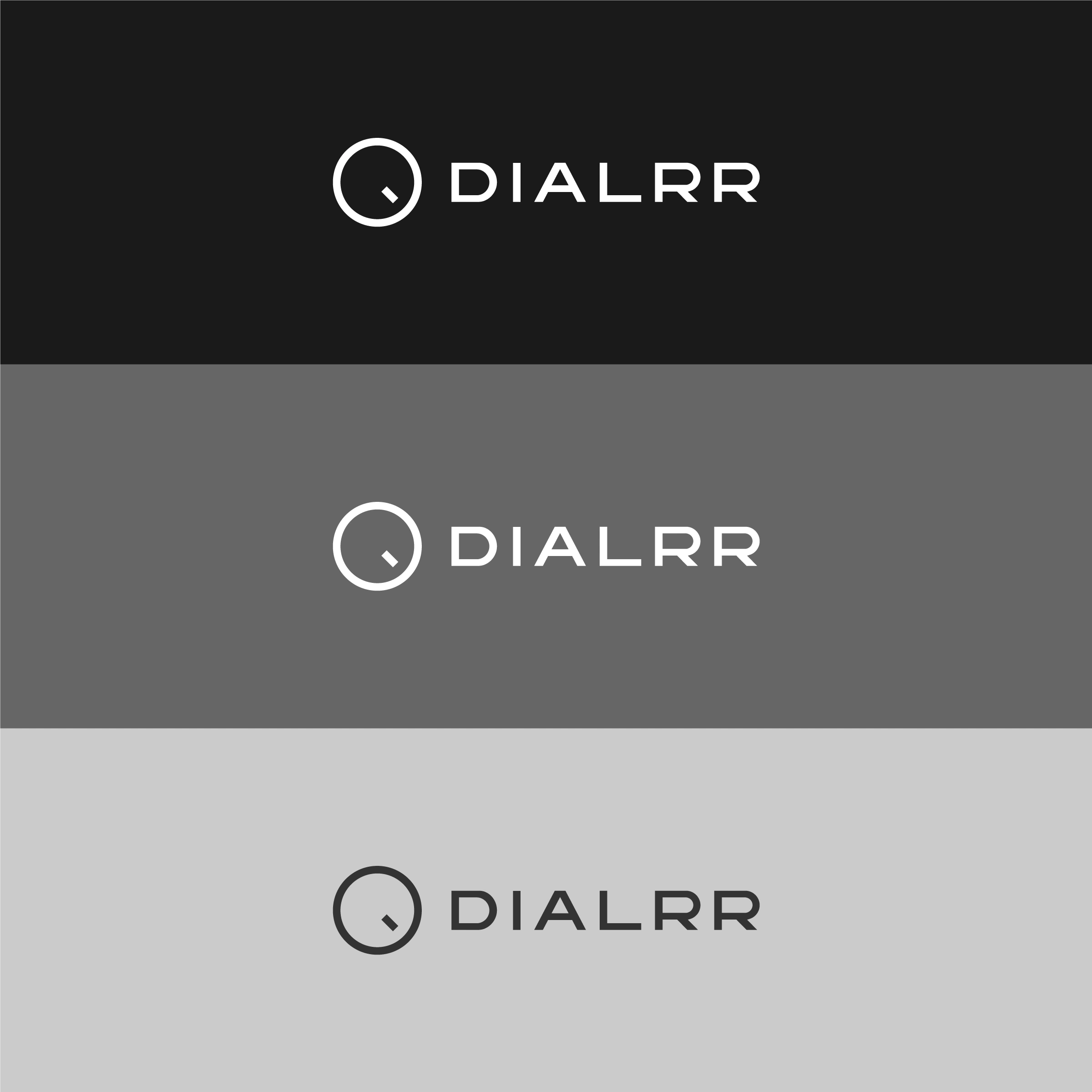
The Dialrr logo is presented across dark, mid-tone, and light backgrounds to demonstrate its flexibility within the monochrome identity. The symbol and wordmark maintain their original proportions, while contrast is adjusted to preserve clarity across different applications.
This restrained approach allows the identity to remain consistent without relying on additional graphic elements.
Typography System
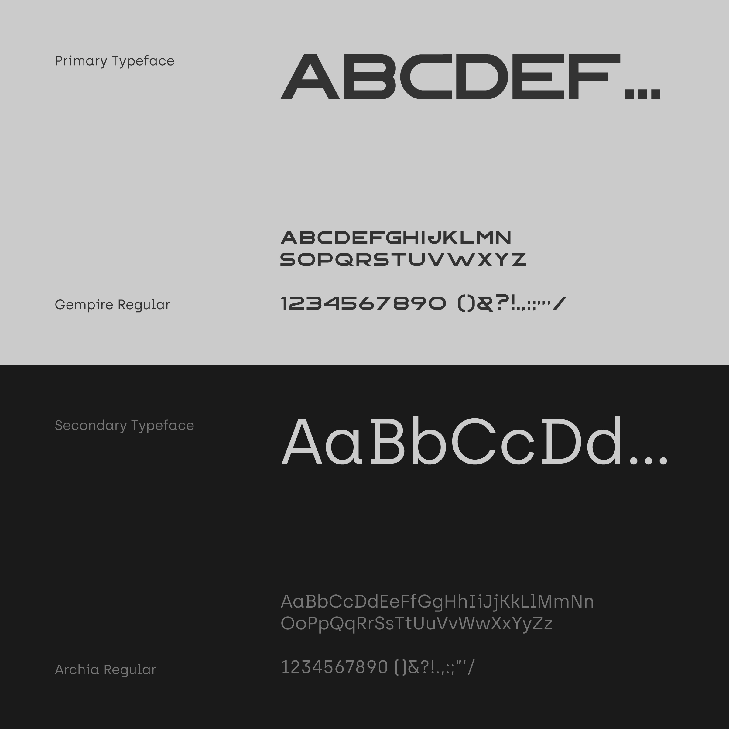
Typography combines two distinct typefaces to balance geometric expression with functional readability. Gempire (Regular) establishes the primary visual language through its wide proportions and technical character. It is used for display typography, headings, and selected technical elements. Archia (Regular) introduces a more neutral counterpart for body copy, navigation, buttons, and supporting information.
Together, the two typefaces create a hierarchy that connects the identity's industrial character with the practical needs of digital communication.
Brand Applications
The Dialrr identity extends beyond the controller through a series of conceptual brand applications. Business cards, apparel, studio imagery, and digital compositions demonstrate how the logo, typography, and monochromatic palette maintain a consistent character across different contexts.
Each application follows the same visual principles, allowing the identity to adapt without losing its structure.
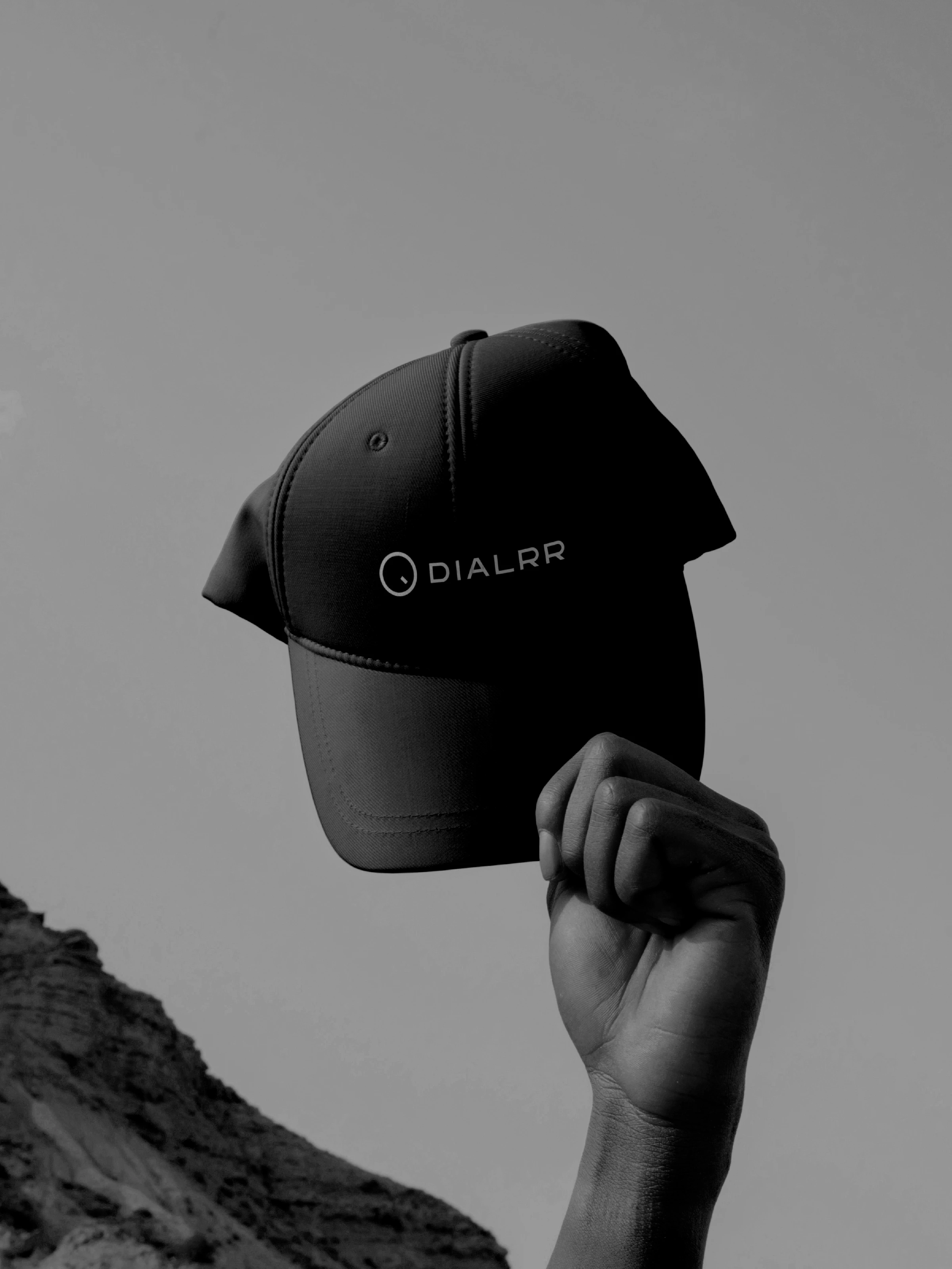
Branded Cap
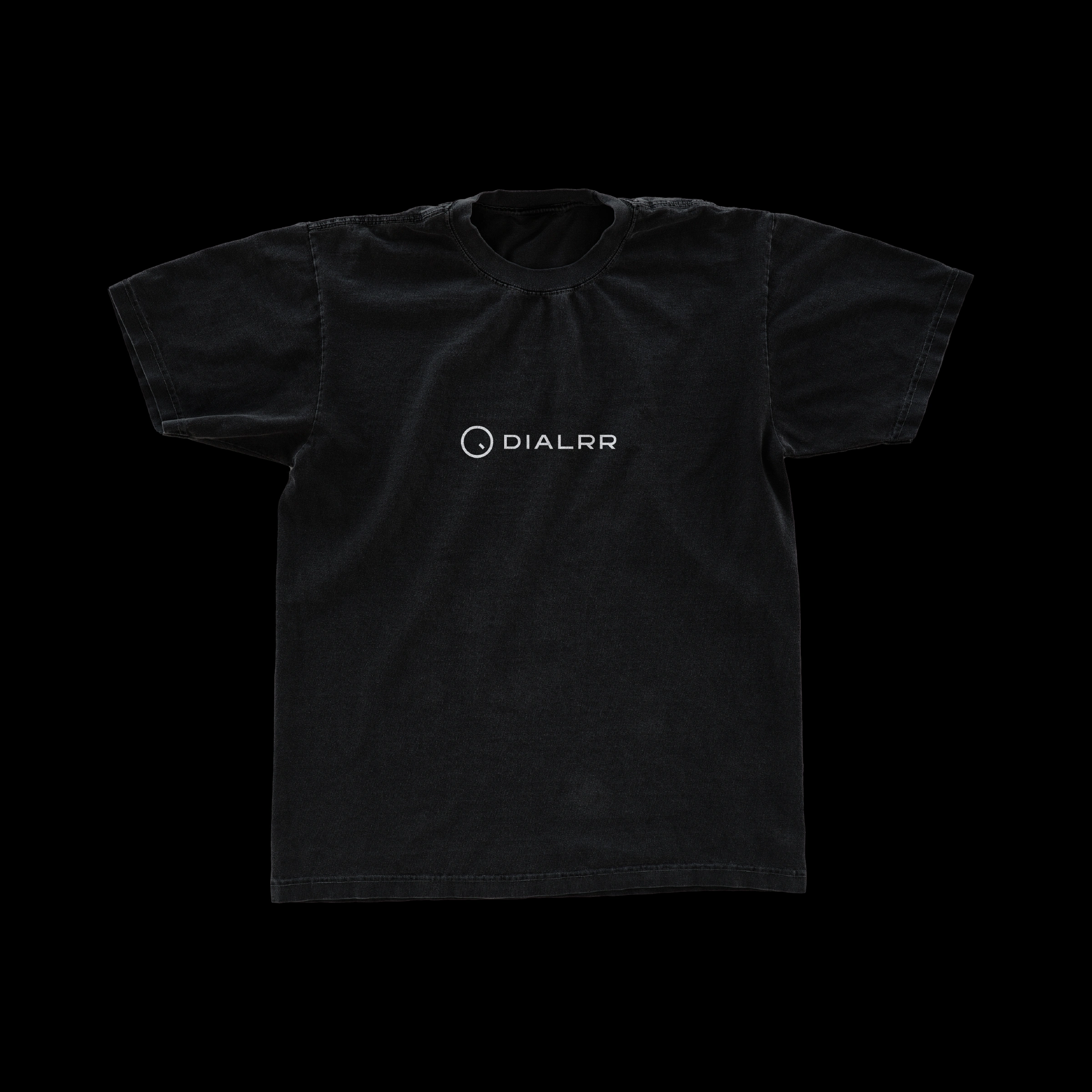
Branded T-Shirt
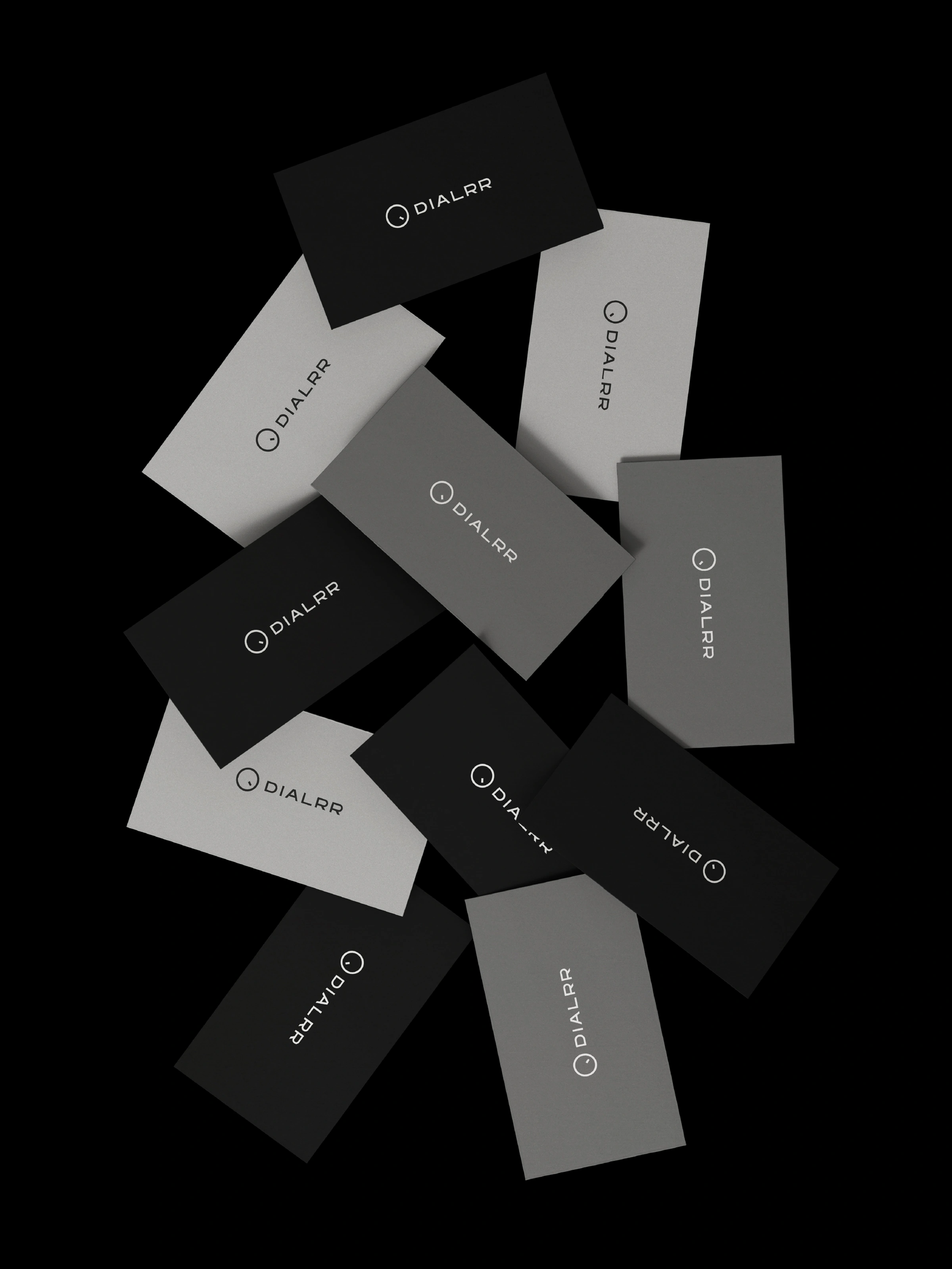
Business Cards
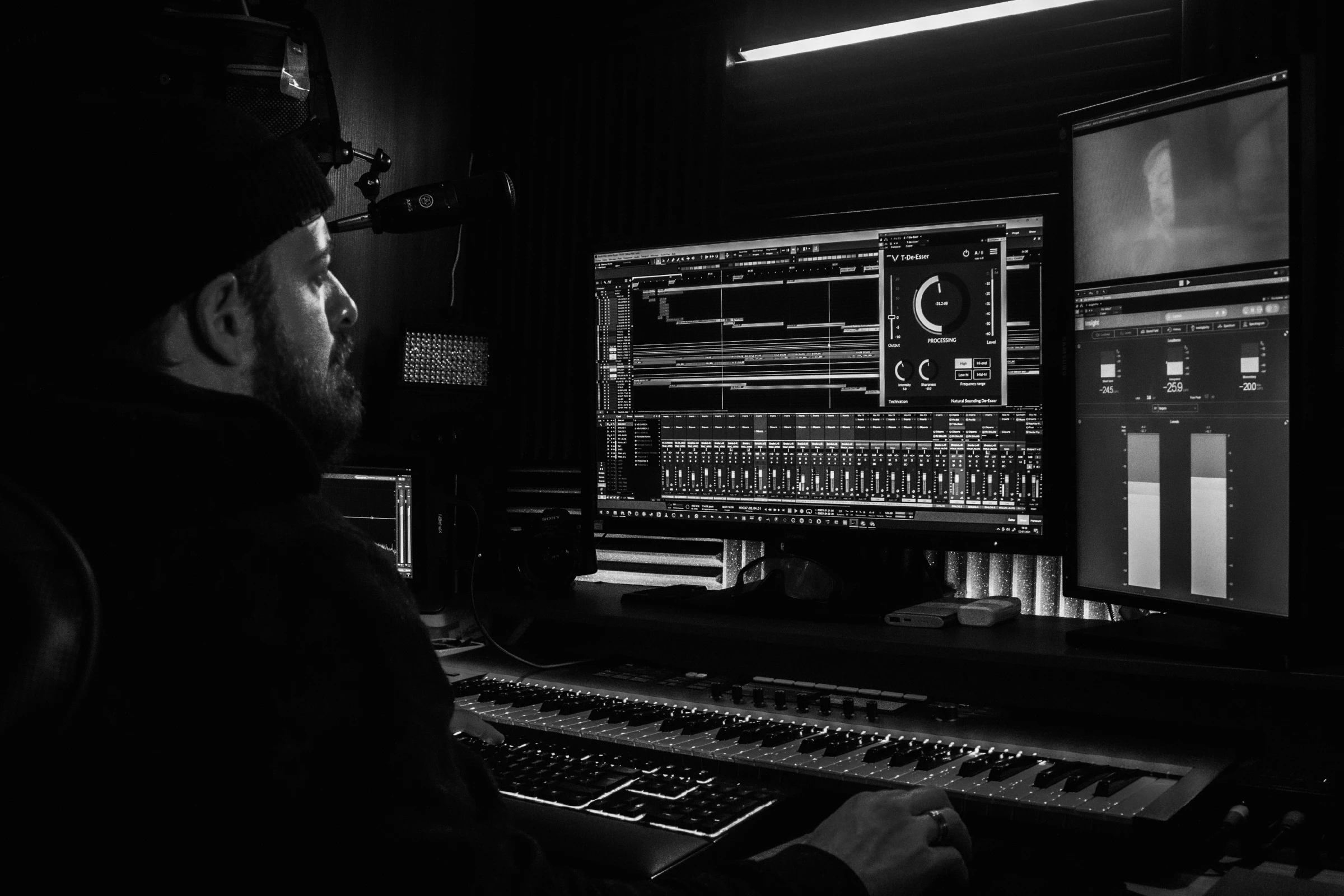
Studio Environment
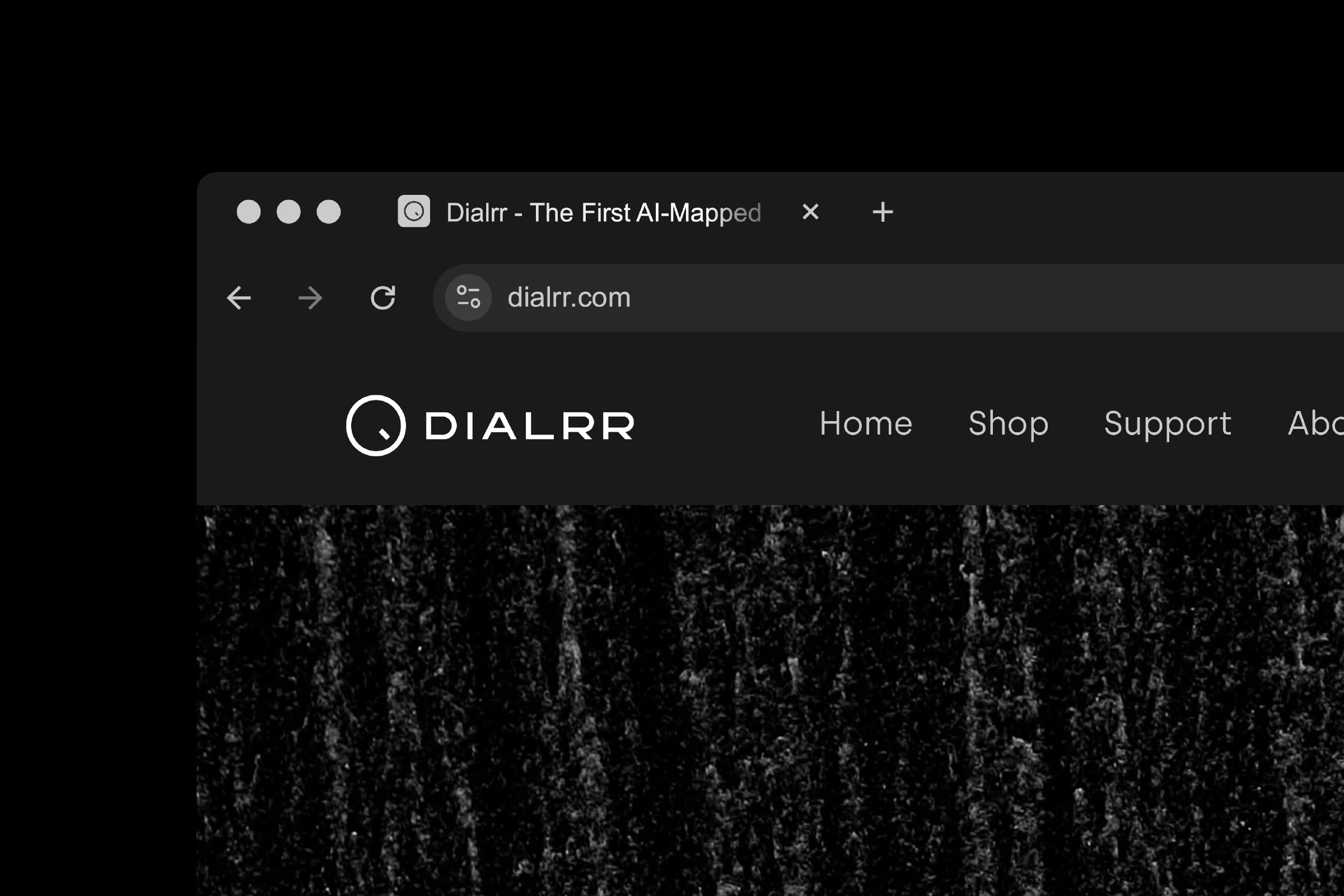
Website Navigation
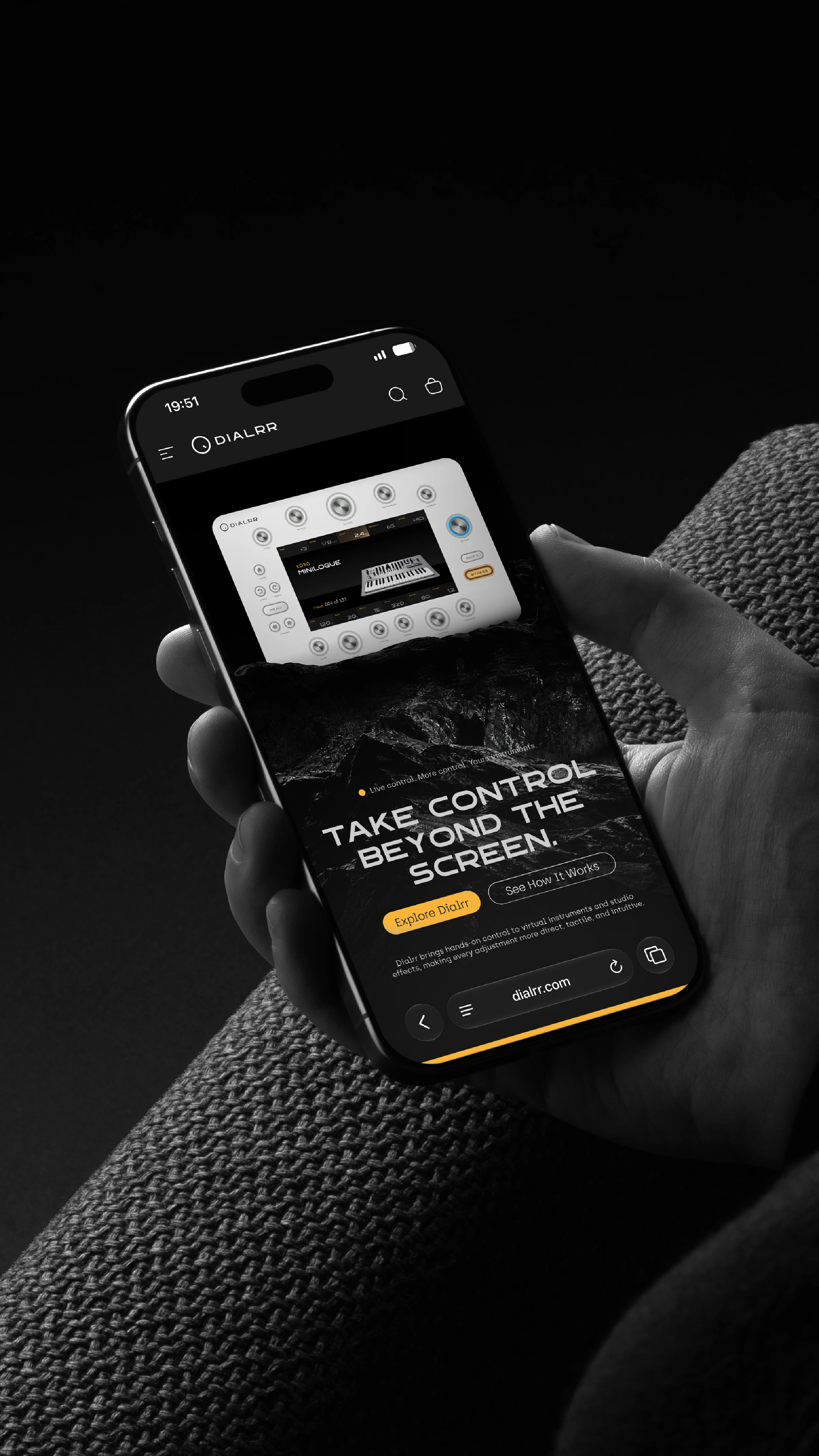
Mobile Website
Product Design & Visualization
Product visualizations bring the identity and interface concepts together around the controller's existing hardware form. A matte light-colored surface, brushed metal controls, and restrained illuminated details establish a material contrast against dark editorial environments.
The resulting compositions emphasize the relationship between physical form, tactile interaction, and on-screen information.
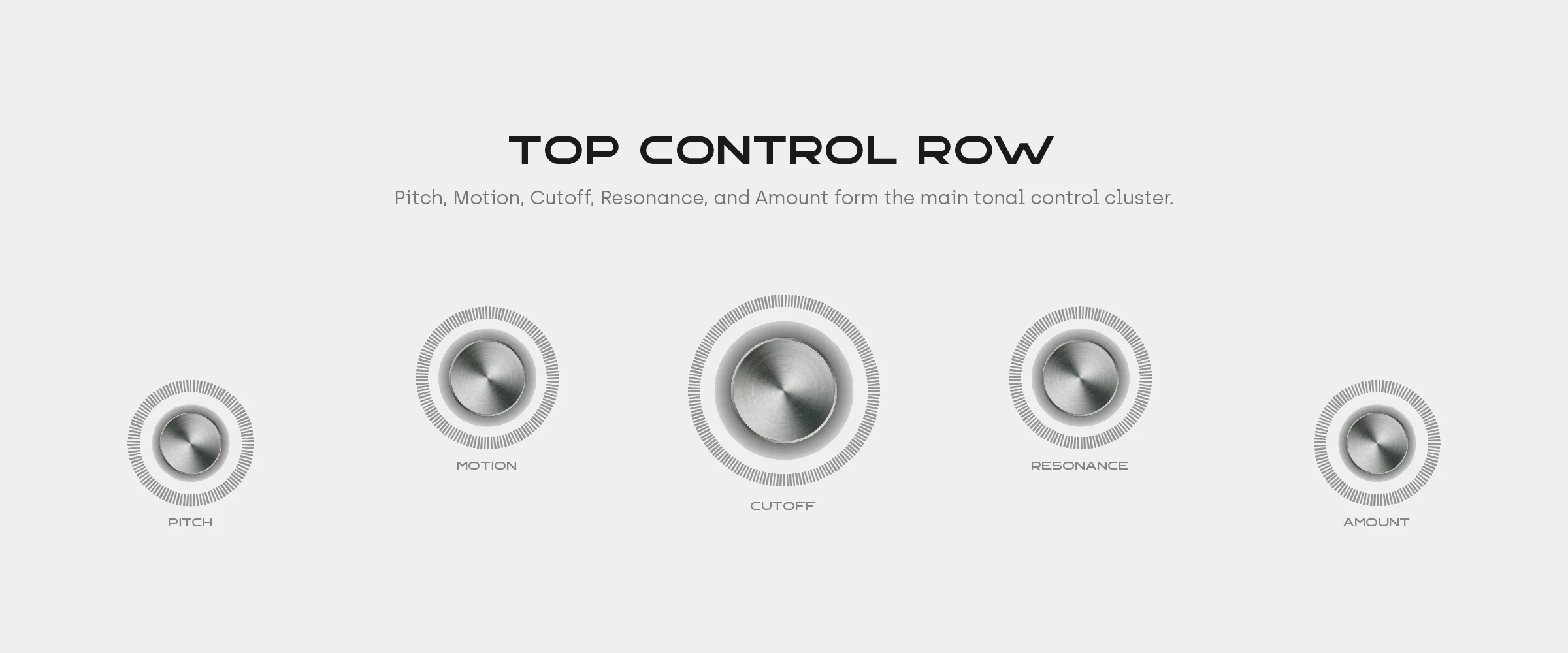
Top Control Row
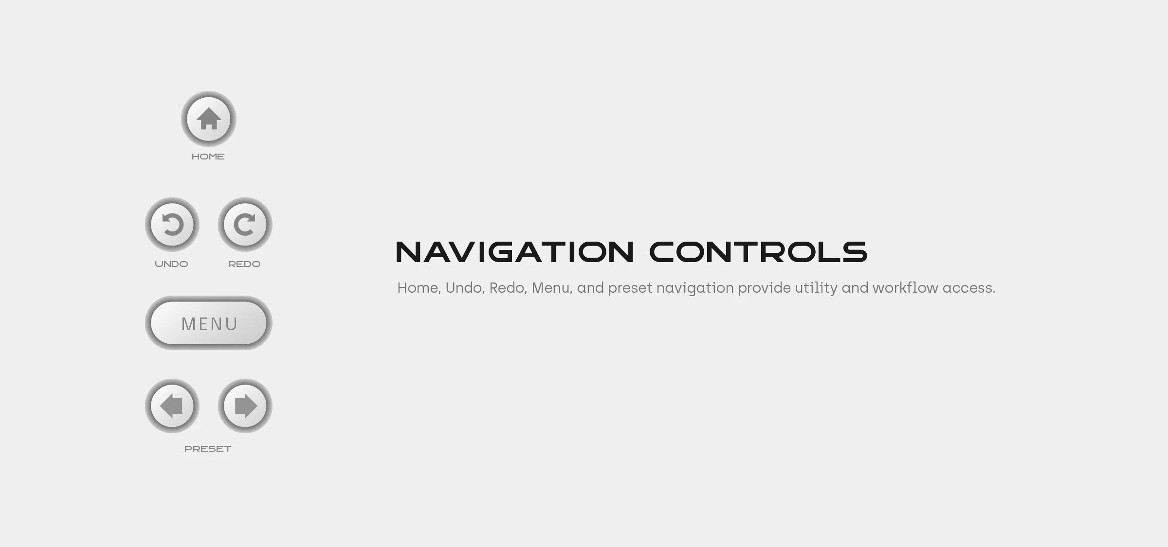
Navigation Controls
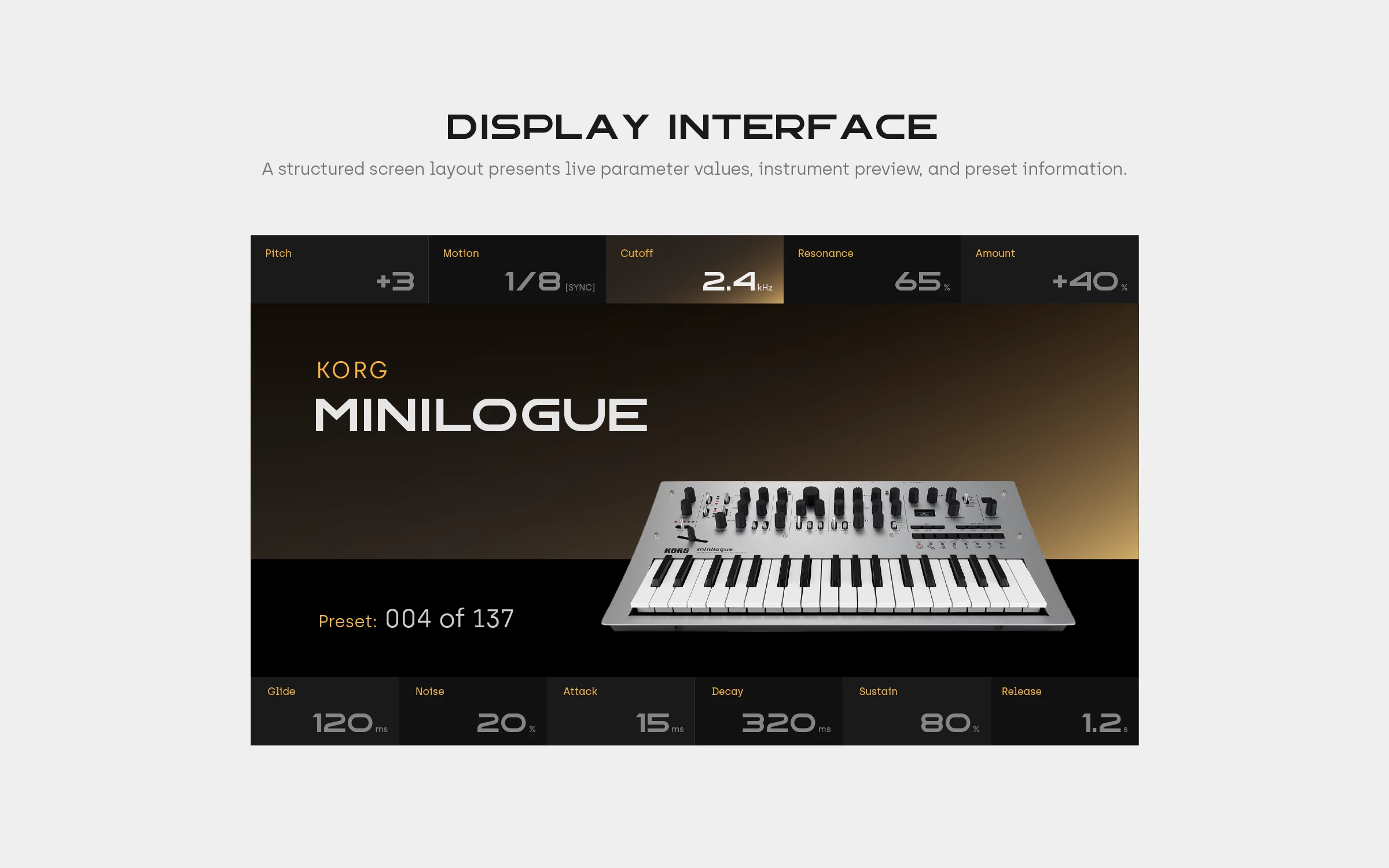
Display Interface

Select Encoder
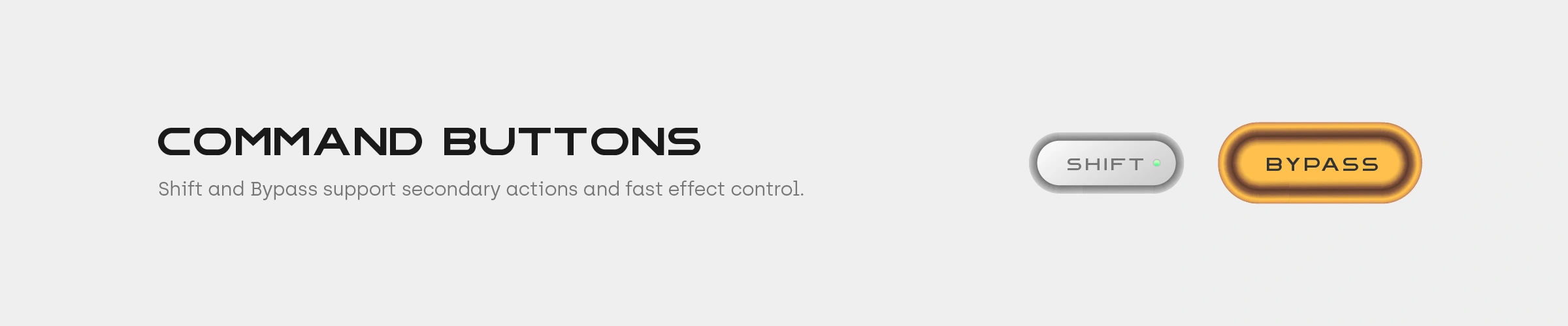
Command Buttons
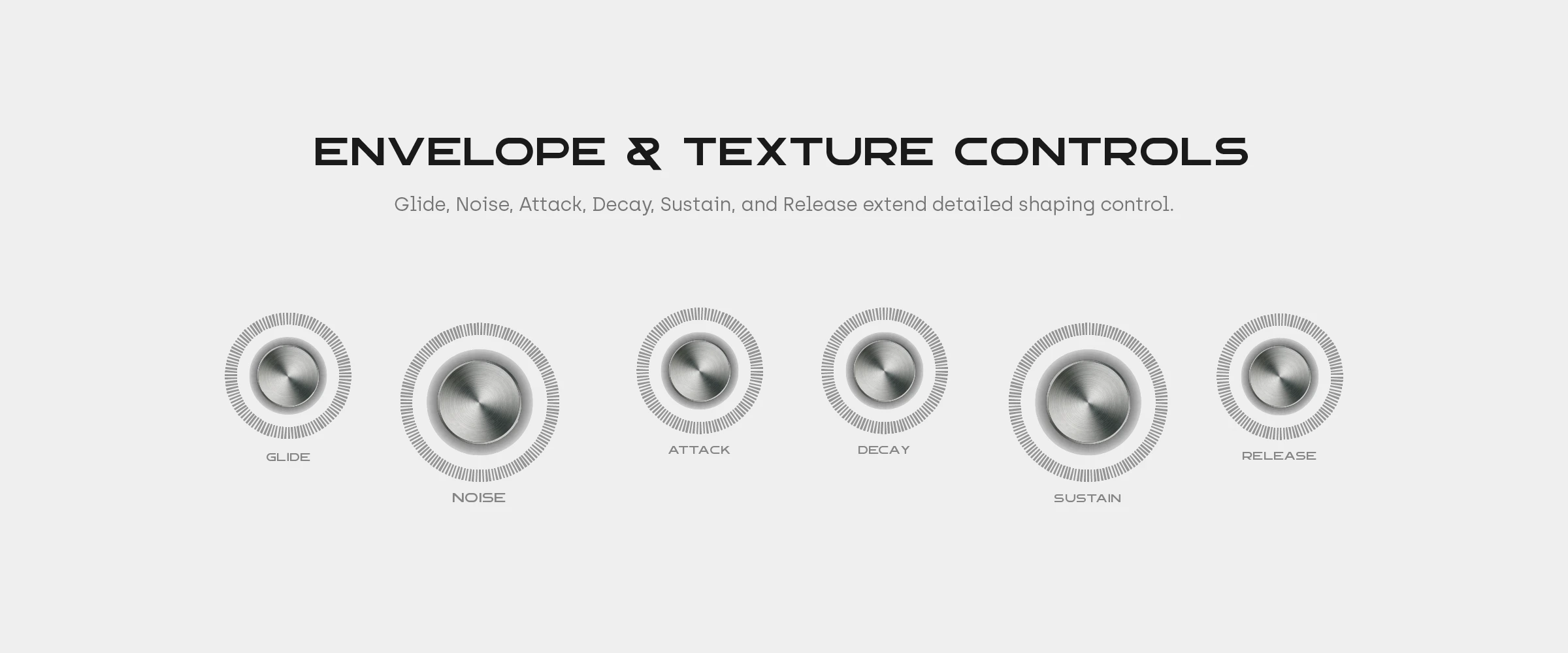
Envelope & Texture Controls
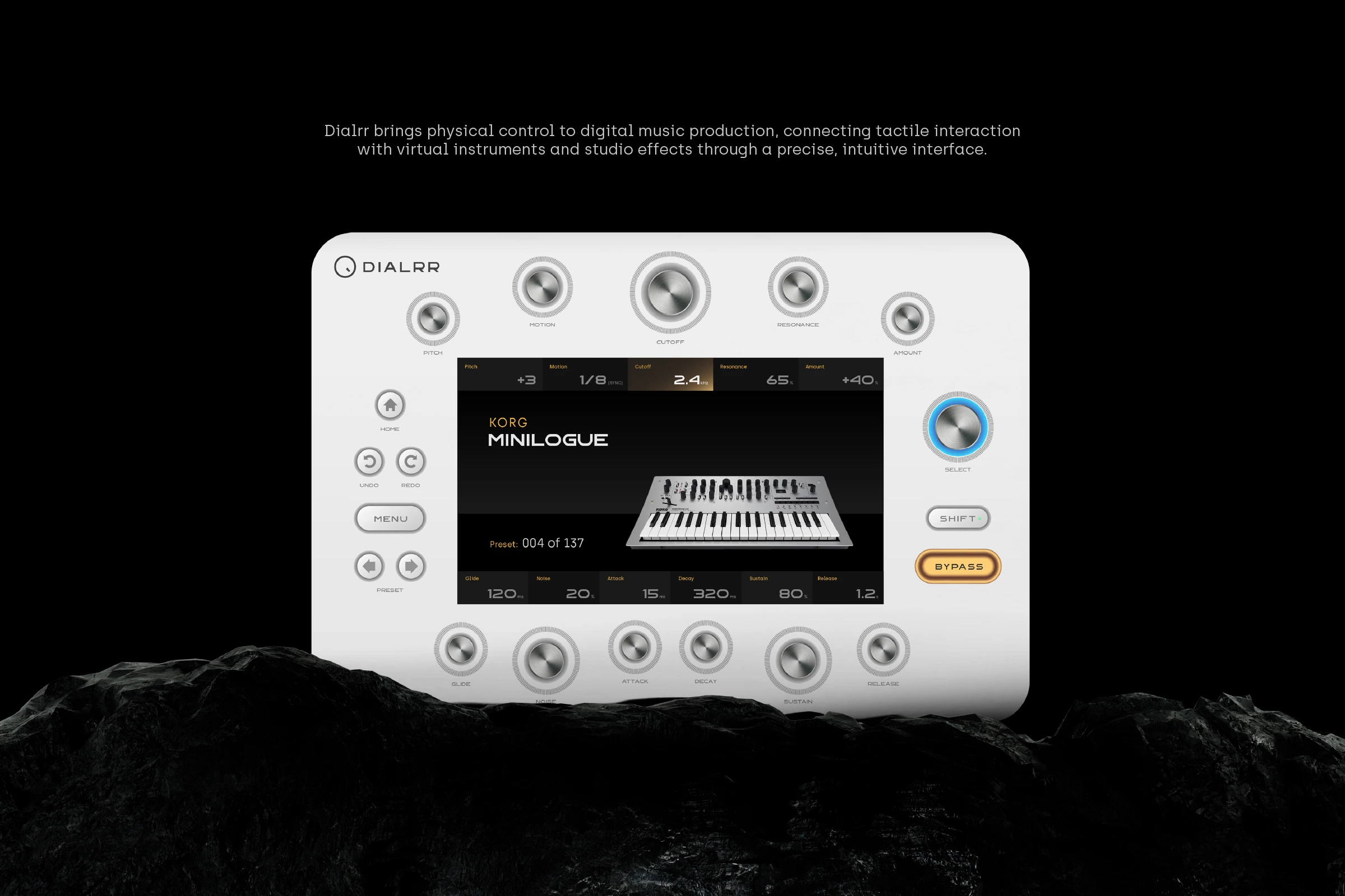
Final Product Showcase
Like this project
Posted Aug 16, 2024
A brand identity for a VST plugin controller, combining industrial precision, geometric design, and digital music production.


