
ABOUT
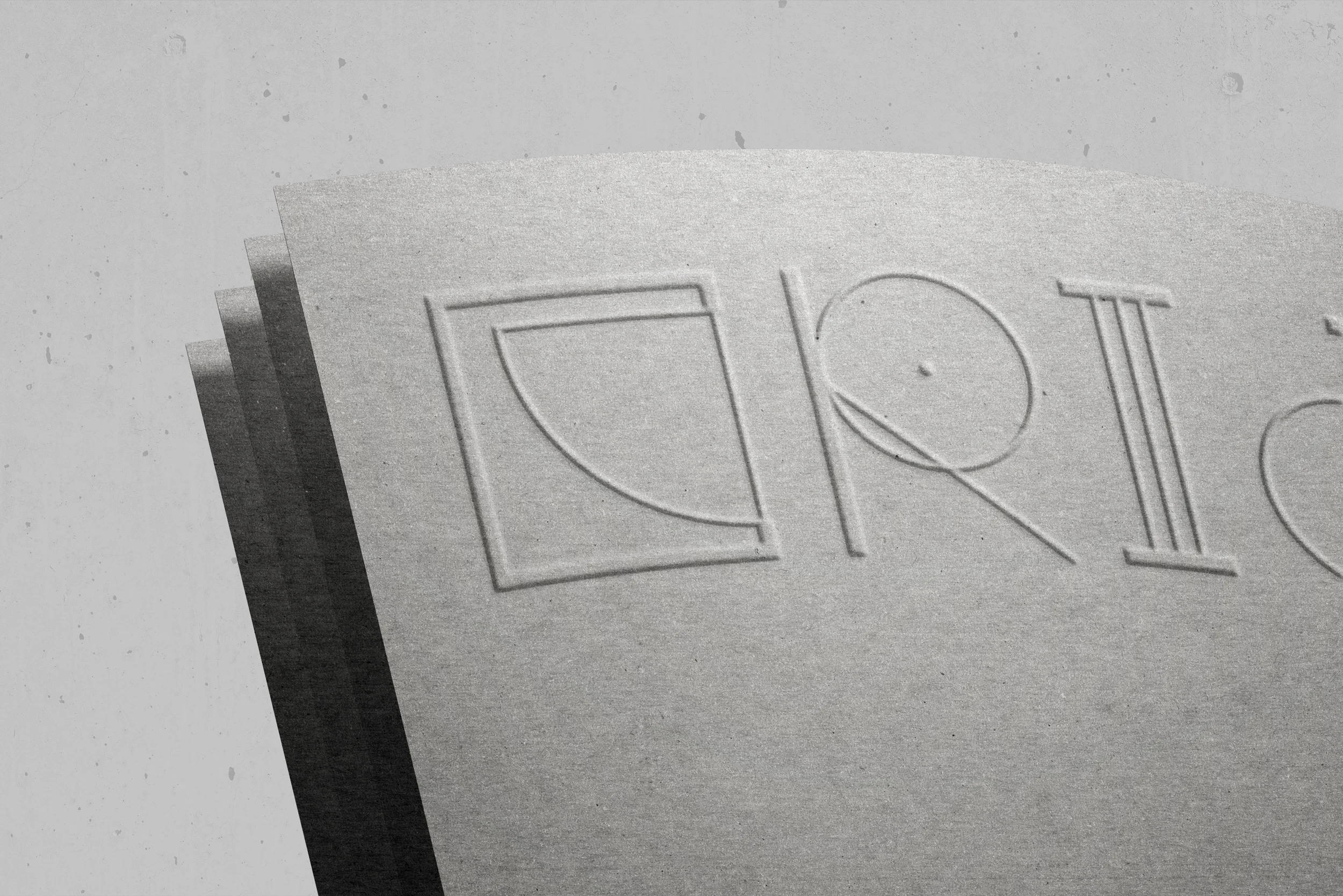
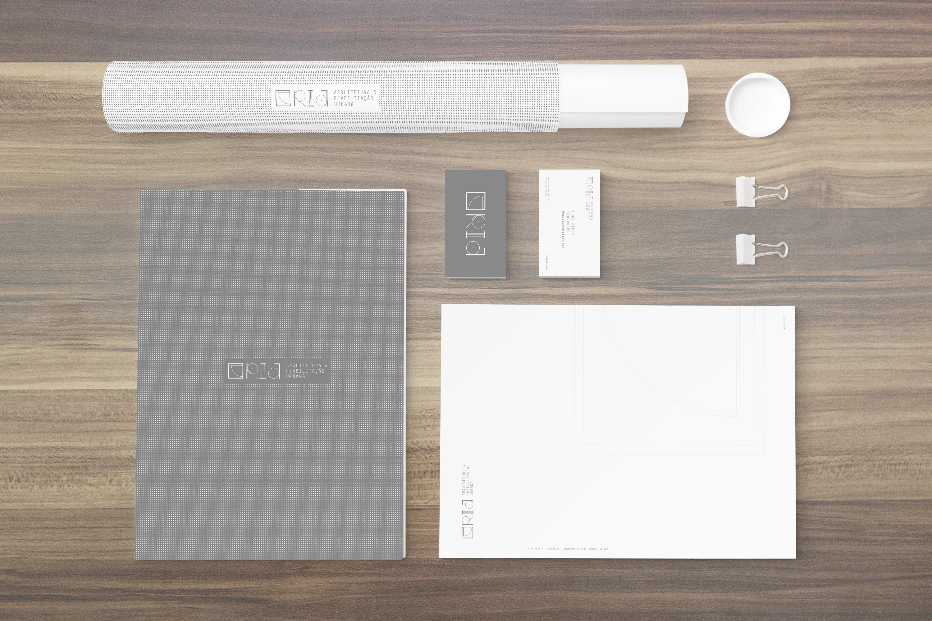
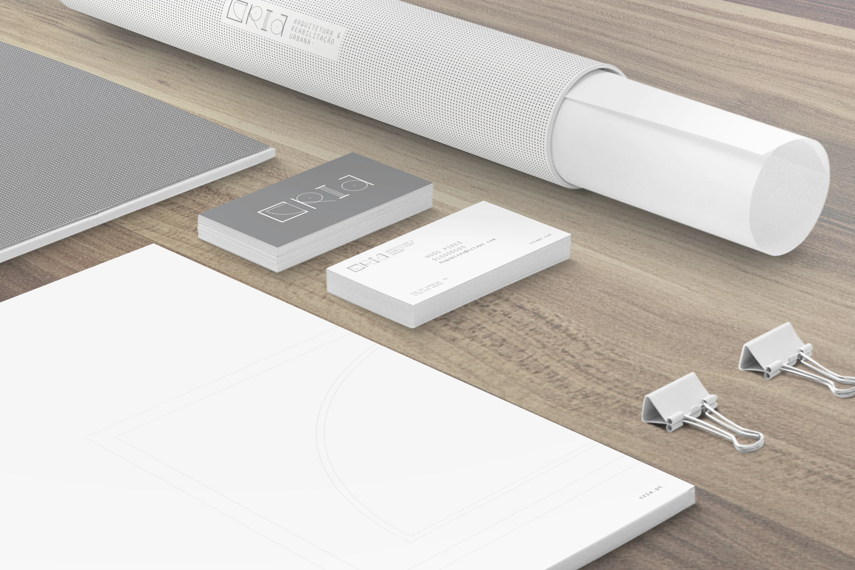
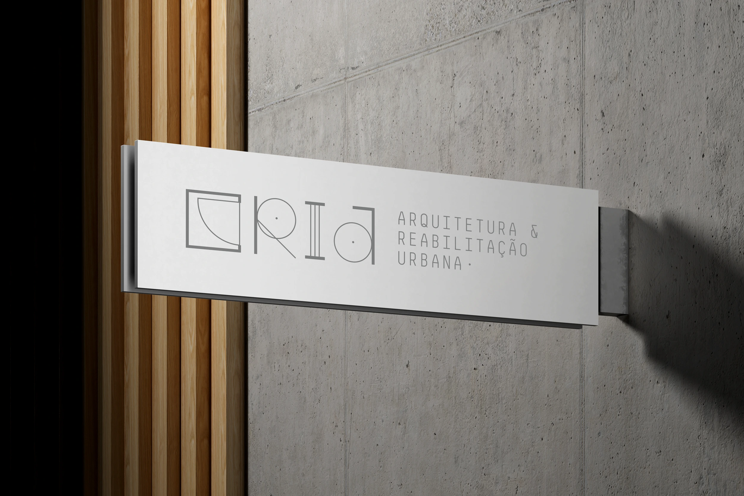
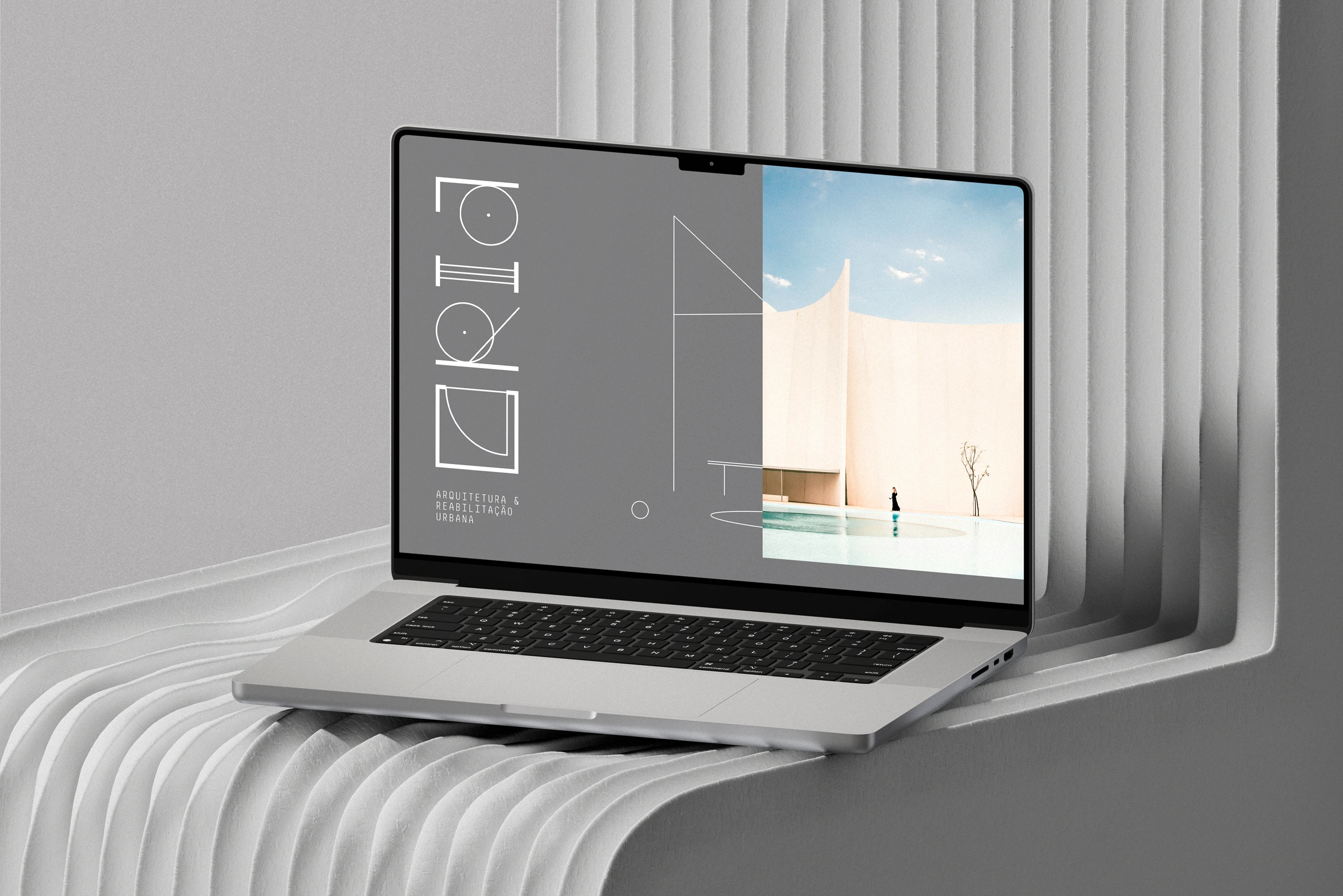
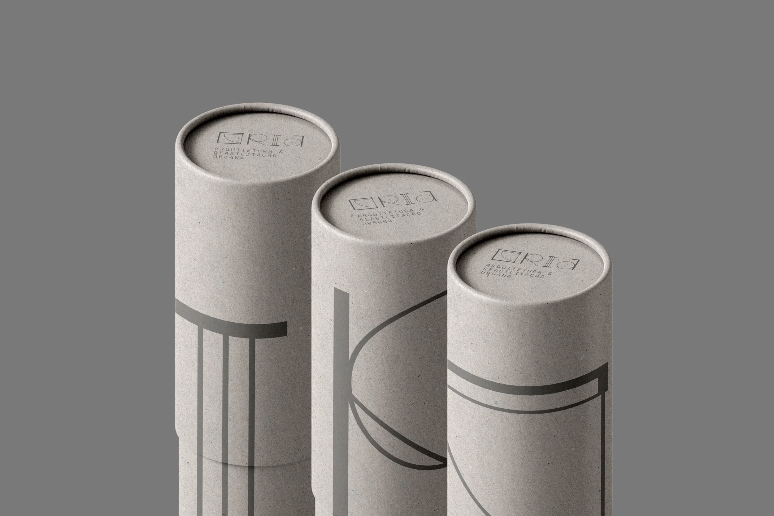
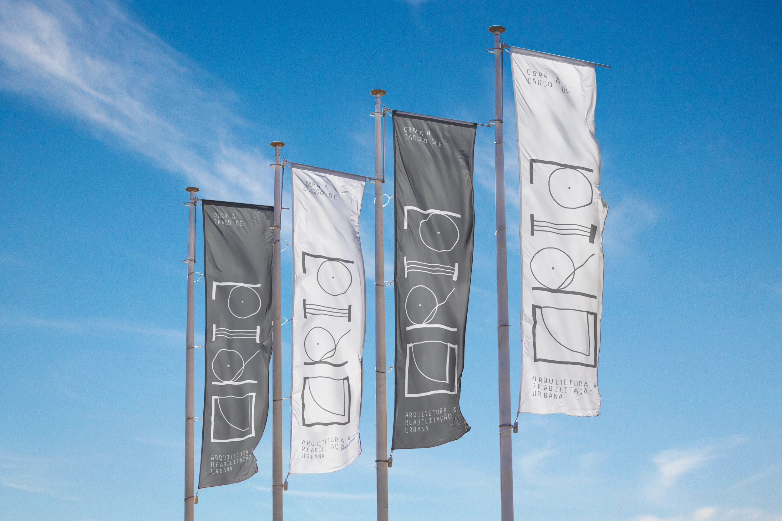
CRIA is an architecture and urban rehabilitation studio that sees design as an act of creation — technical, sensitive, and intentional. Every line, every trace, every space is born from the balance between precision and creative freedom. For this identity, we immersed ourselves in the visual language of architectural drawings — measurements, cuts, doors, axes — to craft a system that lives through structure, but breathes expression. A brand that is clean, structural, and timeless — just like the spaces CRIA designs for its clients.

IDENTITY
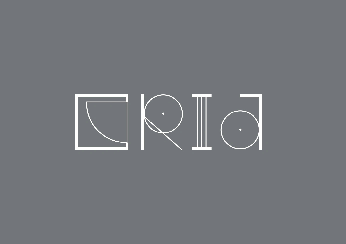
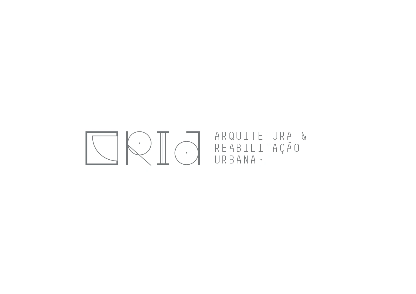
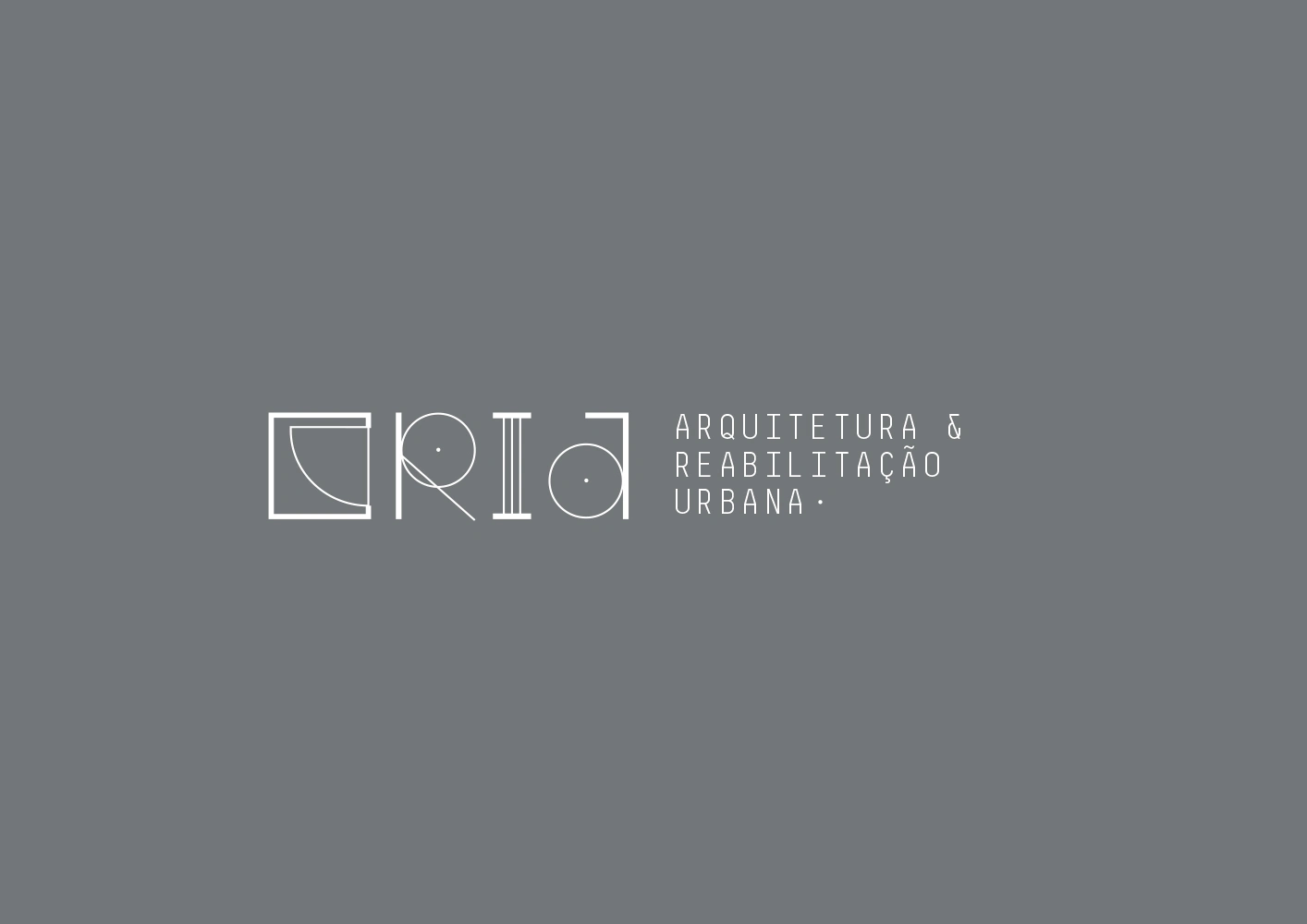
Each letter was designed from scratch, inspired by technical forms and graphic elements found in architectural drawings. Door arcs, measurement lines, grids and constructive geometries all merge into a custom typographic signature — precise, distinctive, and alive. CRIA’s identity doesn’t shout — it inscribes itself into the space with clarity and purpose. Just as architecture should.
More than a logo — a system built with intent.
THANK YOU
Client: CRIA
Year: 2014
Design & Art Direction: João Loureiro
1 like · 55 views · Jan 29, 2026
Brand identity for CRIA, an Portuguese architecture studio. Built from the visual language of architectural drawing: grids, dimension lines and plan geometry.
Timeline
Jul 29, 2014 - Aug 29, 2014


