Brand Identity and Print Material
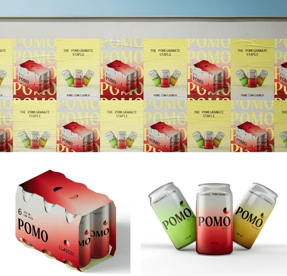
Brand: Pomo
Industry: Food & Beverage
This pomegranate-centered seltzer concept brand offers a tantalizing fusion of vibrant flavour, capturing the essence of the exotic fruit in every sip. With the deep crimson gradient and playful typography, this drink beckons with its rich aroma and tantalizing taste.
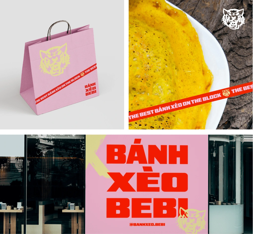
Brand: Bánh Xèo Bebi
Industry: Food & Beverage
Bringing authentic Vietnamese pancakes (bánh xèo) to Melbourne in a fusion between street food and street culture.
This concept project was inspired by a fresh take with a bold pink and blood orange, pairing the yellow dish. The contrast of the tiger with the word ‘bebi’ and pastels is memorable for hungry customers.
Brand: Kion Coaching
Industry: Education
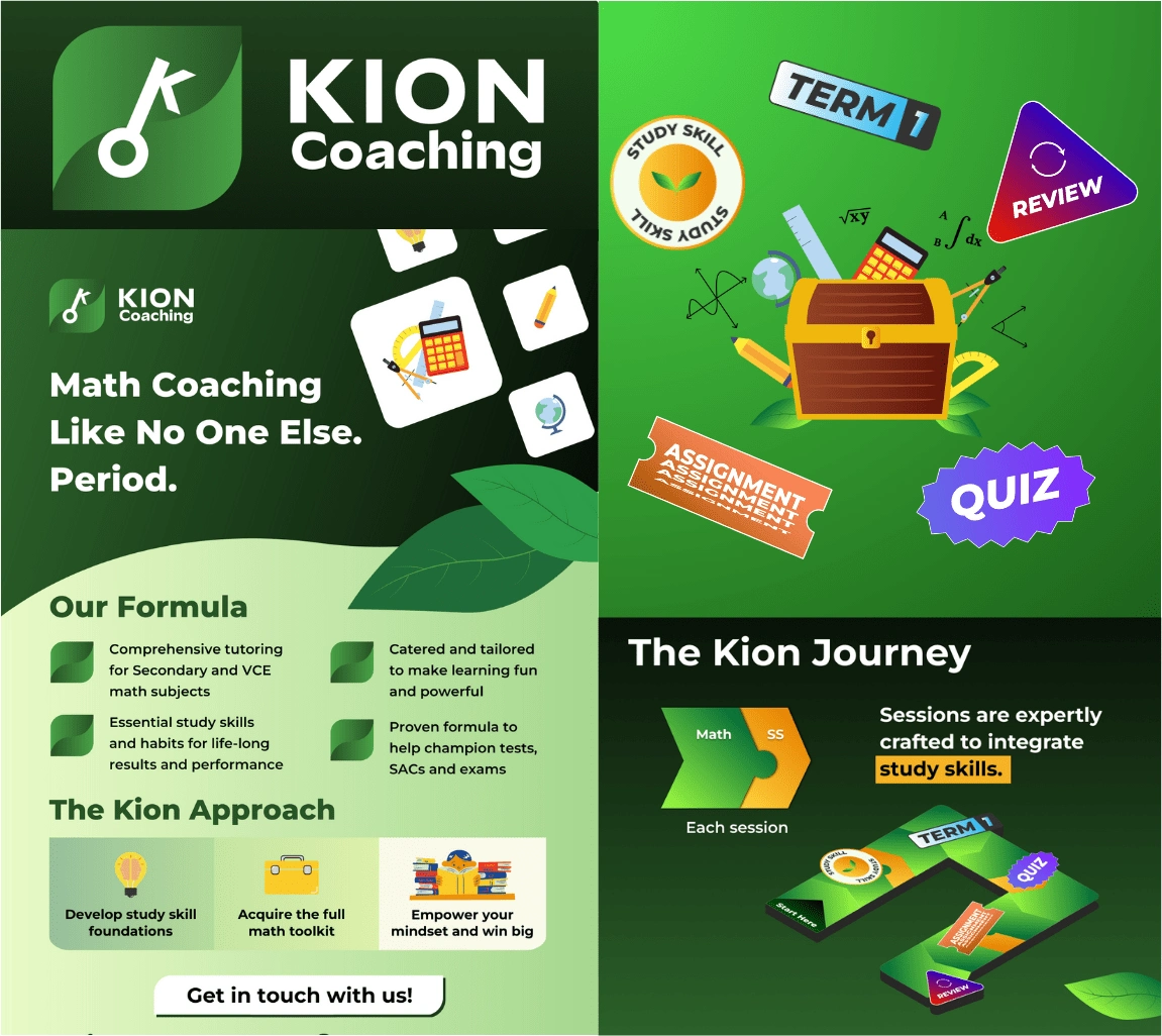
A vibrant branding for a math tutoring company that aims to reframe the learning experiences for students. The brand name was inspired by the Japanese word for ‘fundamentals’ (kihon) and to conceptualise this idea, a key using the typography’s ‘K’ and ‘O’ was the perfect way to represent the meaning of the brand utilised vibrant colours and illustrations to have a friendly, yet clean approach for a young demographic illustrated custom stickers and educational tools to showcase milestones in the tutoring company’s program.
Brand: Cove Restaurant
Industry: Food & Beverage
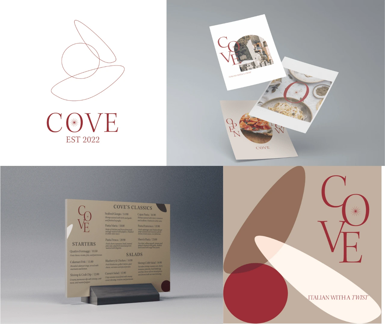
A new Italian restaurant arrived in town and they needed a modern branding that was outside of the box. For this concept project, to reflect the characteristics of a cove, the symbols are shaped like stones and the colours are neutral - aside from the red which represents Italian culture.
Brand: Knit Cafe
Industry: Food & Beverage
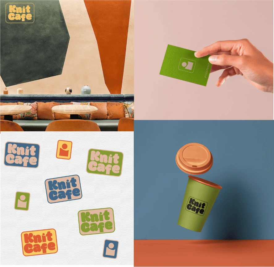
A clean and comfortable cafe for all people to gather and connect, promoting inclusivity.
To enhance the brand experience of this concept project for customers, I designed stickers featuring various colour combinations were created.
Brand: Silk Velvet
Industry: Skincare & Beauty
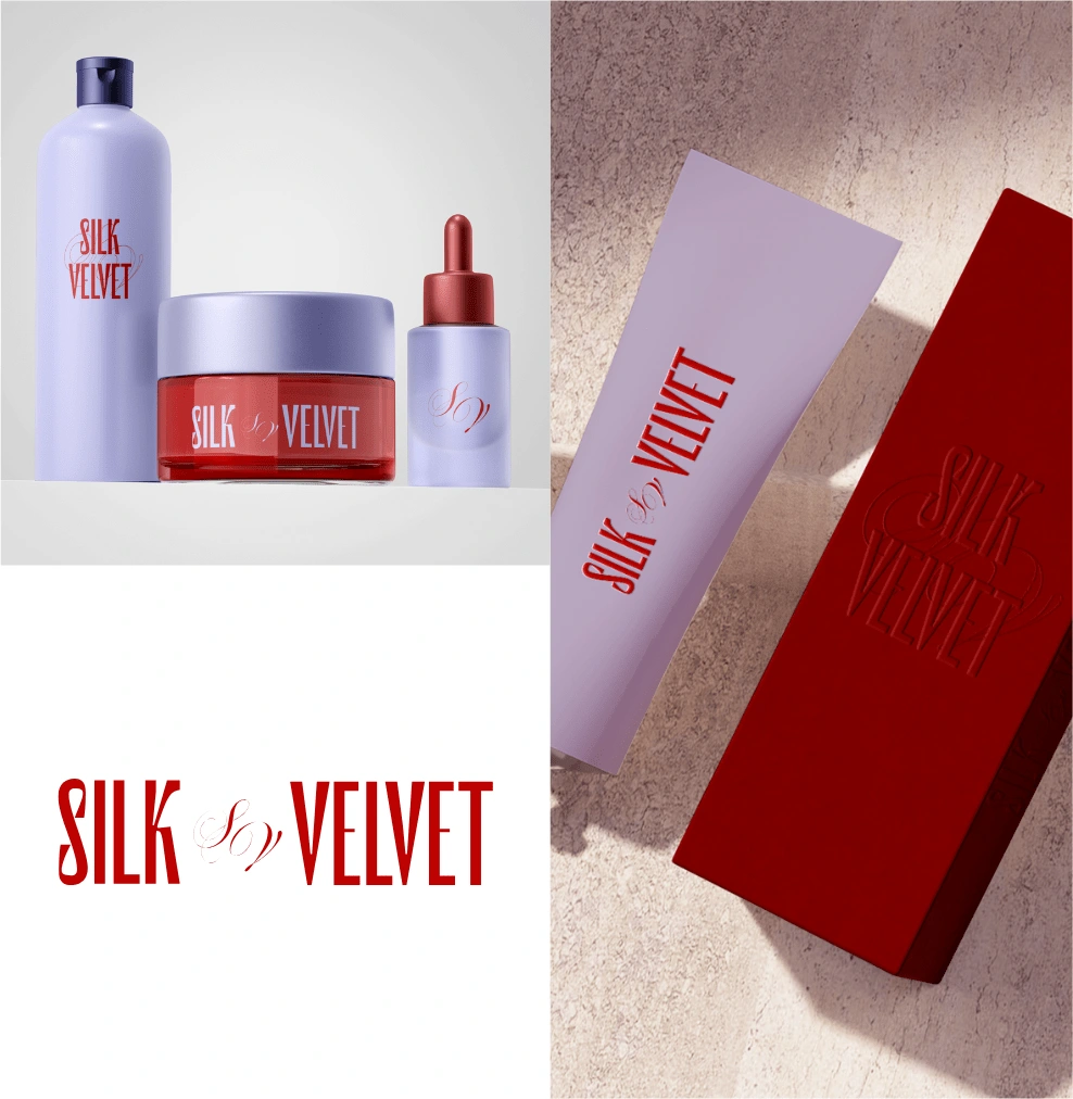
A refreshed take on beauty for the cool and unapologetic consumer. For this concept project, the direction involves a strong type and embossed packaging for an elevated brand. The strong red paired with the cool tones of purple, attracts women who mean business.
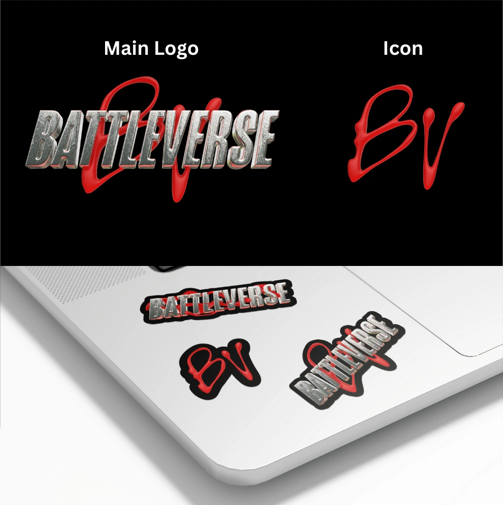
Event: ‘Battleverse’ Dance Event
Industry: Entertainment
To design 3D logos inspired by Tekken and horror themes. The main 3D logo is bold with silver chrome and a red detail which emulates the “battle” theme through custom scratches and red lighting shining from below. The icon was inspired by gore and handwritten elements, so I first created it physically then enhanced it using 3D software.
Like this project
Posted Feb 20, 2024
Vibrant Branding for Bold Brands
Likes
0
Views
30


