The Blood Project Fundraising Prospectus
AHJ George
The Problem
The Blood Project (TBP) is a nonprofit provider of free medical humanities and hematology educational resources for medical students and practitioners. Its wide global audience is drawn to the high quality of its content, convenient eLearning materials, and focus on interesting humanities topics.
TBP needed a new prospectus to court and attract donors. I broke the problem down to create a complete-package solution that works in any fundraising situation.
Exploration
To start, I consulted with TBP's chairman to pin down the fundamentals — the donor persona, beneficiary audience, success measures, and existing mission accomplishments, using a simple Google form to gather the necessary info.
It can be tempting to jump straight into content creation, especially when granted lots of creative control, but that isn't always the best move. By putting exploration first, I was able to zero in on what made the client special, and, more importantly, funding-worthy.
Copywriting and Layout
Once the chairman approved the game plan, it was off to the races...or at least the warm-up round.
I chose to start by creating fresh copy for the entire prospectus. Doing so let me keep the TBP team in the loop and ensure I was on the right track before diving into the design. This strategy also helped us get the language and voice down pat.
Now it was time for the layout. I used a streamlined aesthetic to keep the focus on TBP's story, starting with a refreshed mission statement and eye-catching cover that incorporated artwork and educational imagery commissioned by the nonprofit:
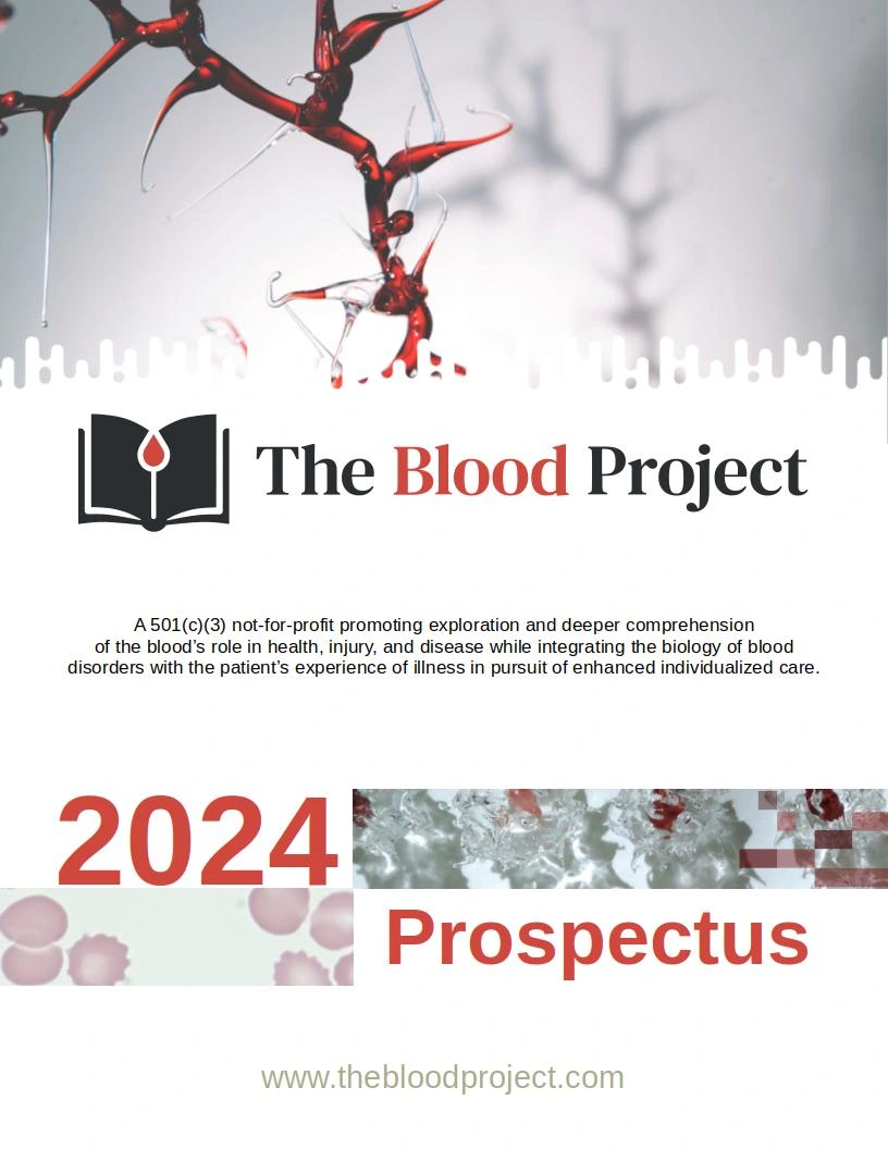
I designed this cover prospectus to match the TBP website and evoke a clinical theme.
From here, I split the layout into clear sections that were easy to browse and take in — you never know when potential donors might view the document, so it's best to keep it digestible!
By leading with the big numbers on the Our Vitals page, I was able to keep the mission and vision front and center.
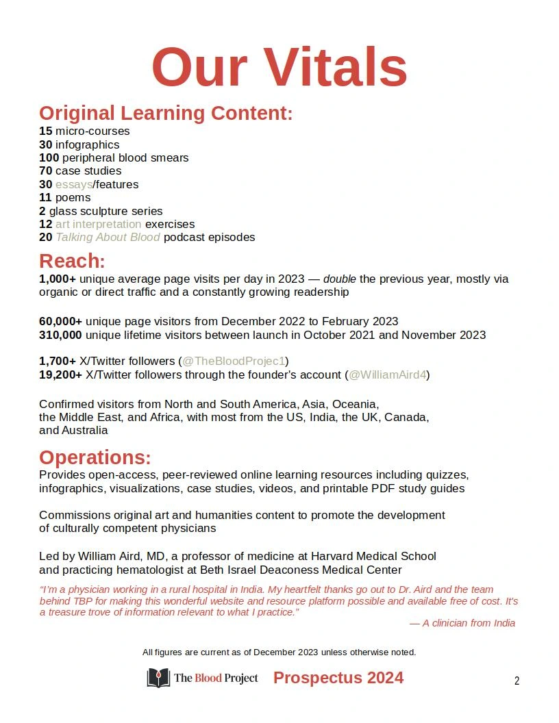
This straightforward layout hits readers with critical facts right off the bat and shows past progress at a glance.
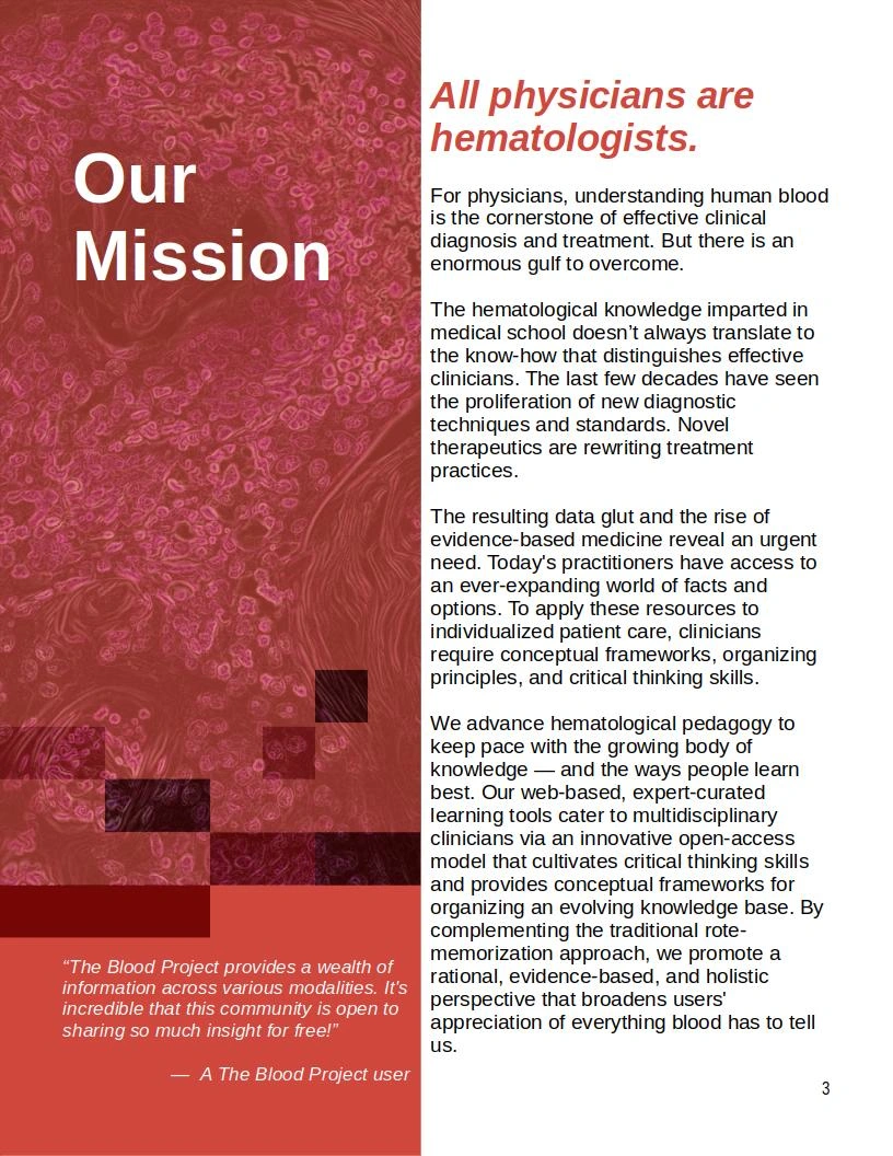
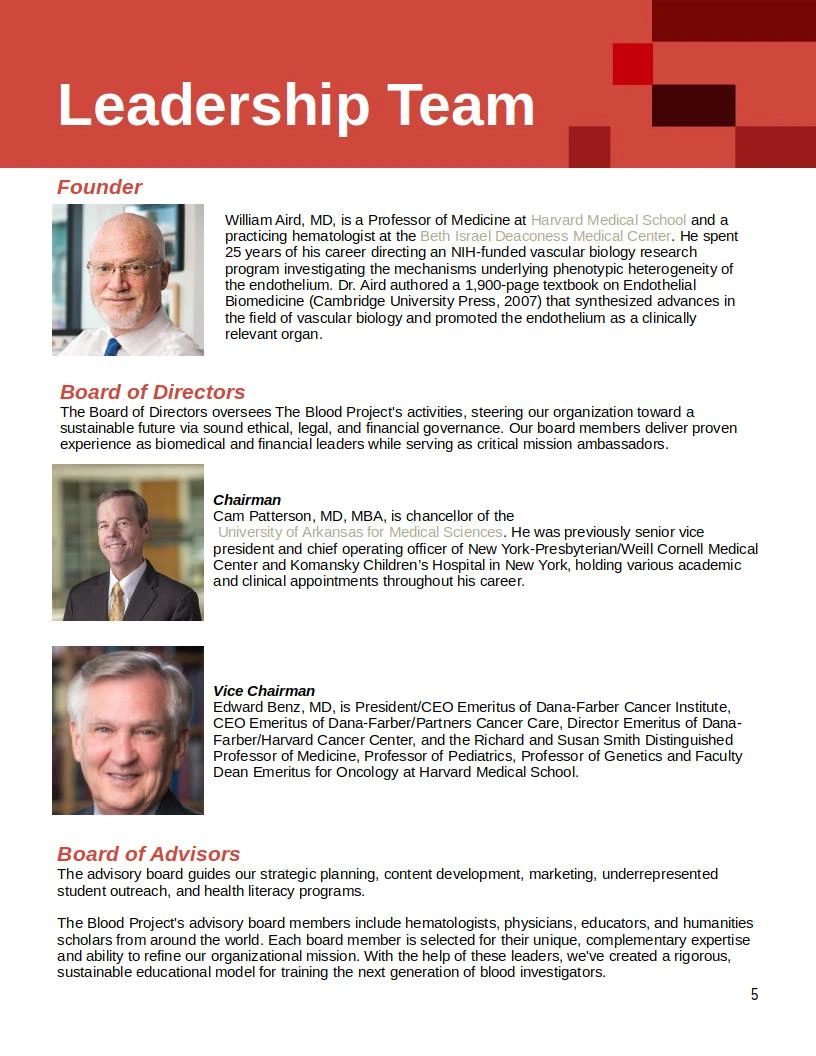
Breaking up the visual layout kept things interesting while leaving room to showcase beneficiary quotes.
The pervasive red theme evoked the hematological focus and reinforced the brand logo.
Some sections not shown here included a fiscal breakdown, past supporter recognition, an impact showcase, and a preview of what's planned next.
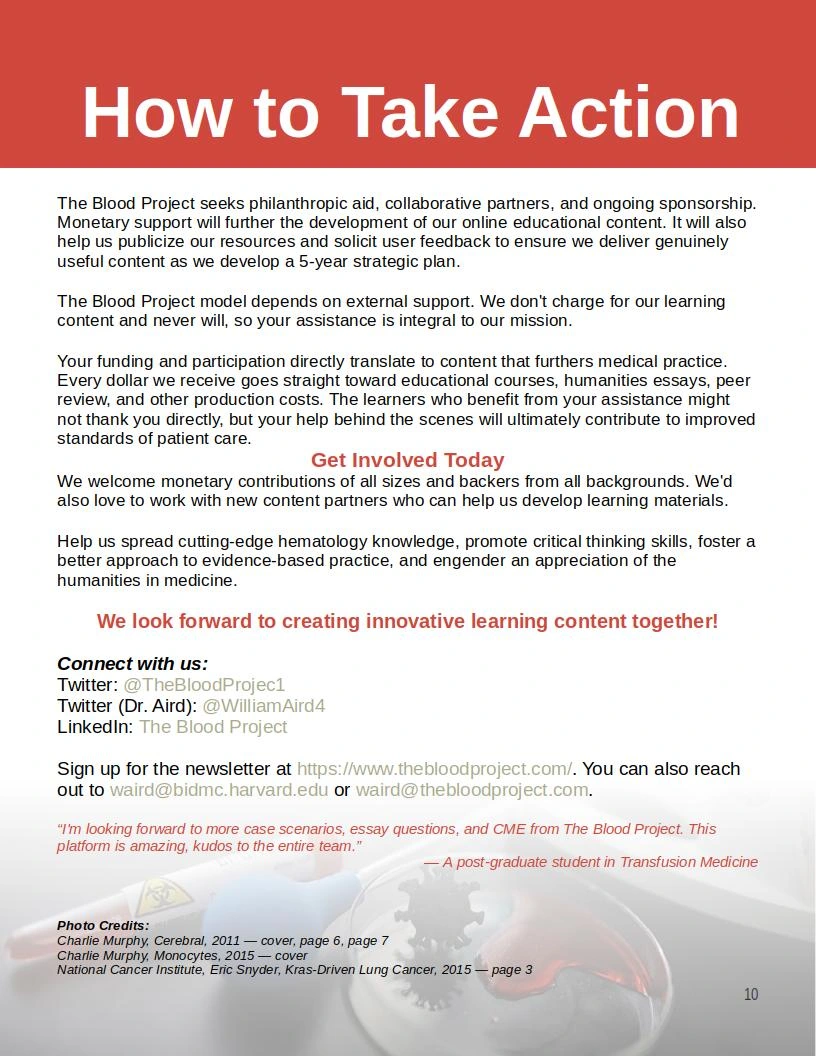
For the final page, I created a direct appeal to readers including contact information and updated social media links. By featuring this information last and closing with a congratulatory quote from a user looking forward to more content, I made it clear how prospective funders could get involved and who their support would help.
Wrap Up
This wasn't the first project I've done for nonprofits, but it was one of the most rewarding — and the TBP team has already started using their new prospectus to attract backers. This was a fun project, and I'm proud to know my work supports free hematological and medical humanities education for global audiences!
Work with me!
Want to enhance your nonprofit/startup fundraising approach with a more impactful prospectus? Check out my services to book a consultation, or reach out directly!
Like this project
Posted Jan 11, 2024
I created a complete fundraising prospectus, including topical ideation, writing, and design.