Timo Labs — Brand Identity

Timo Labs


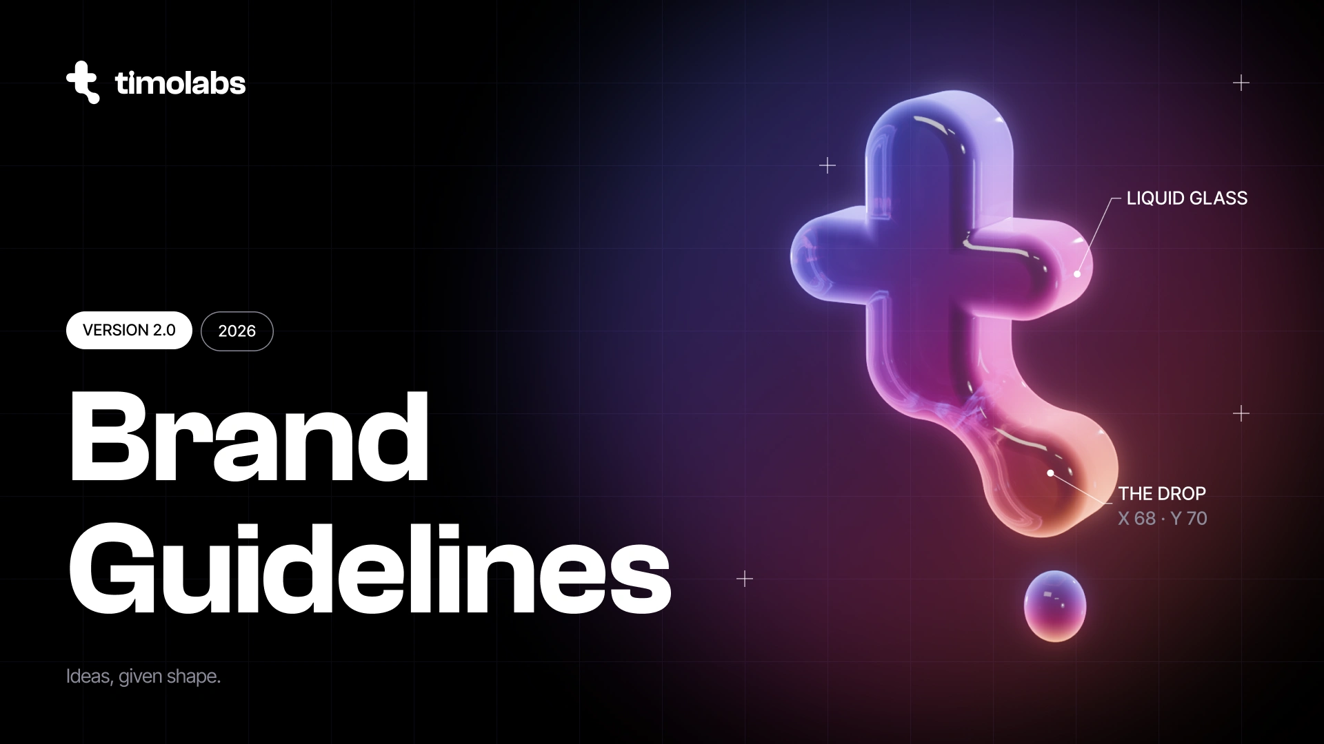
A new look for Timo Labs. Every idea starts out fluid, so our mark is a t that becomes a drop.
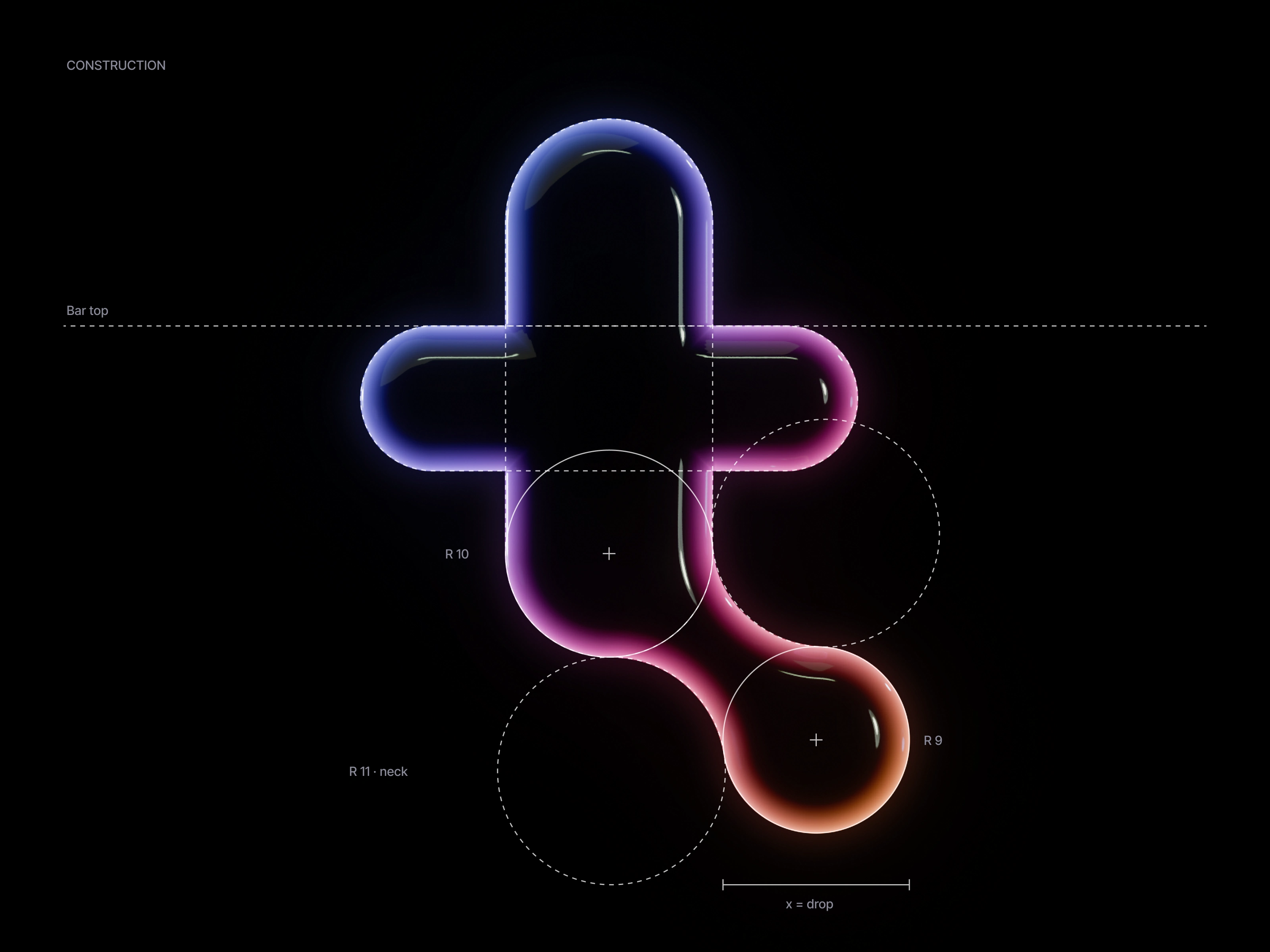
It started as a lens, then turned liquid, until the t and its drop became one shape.
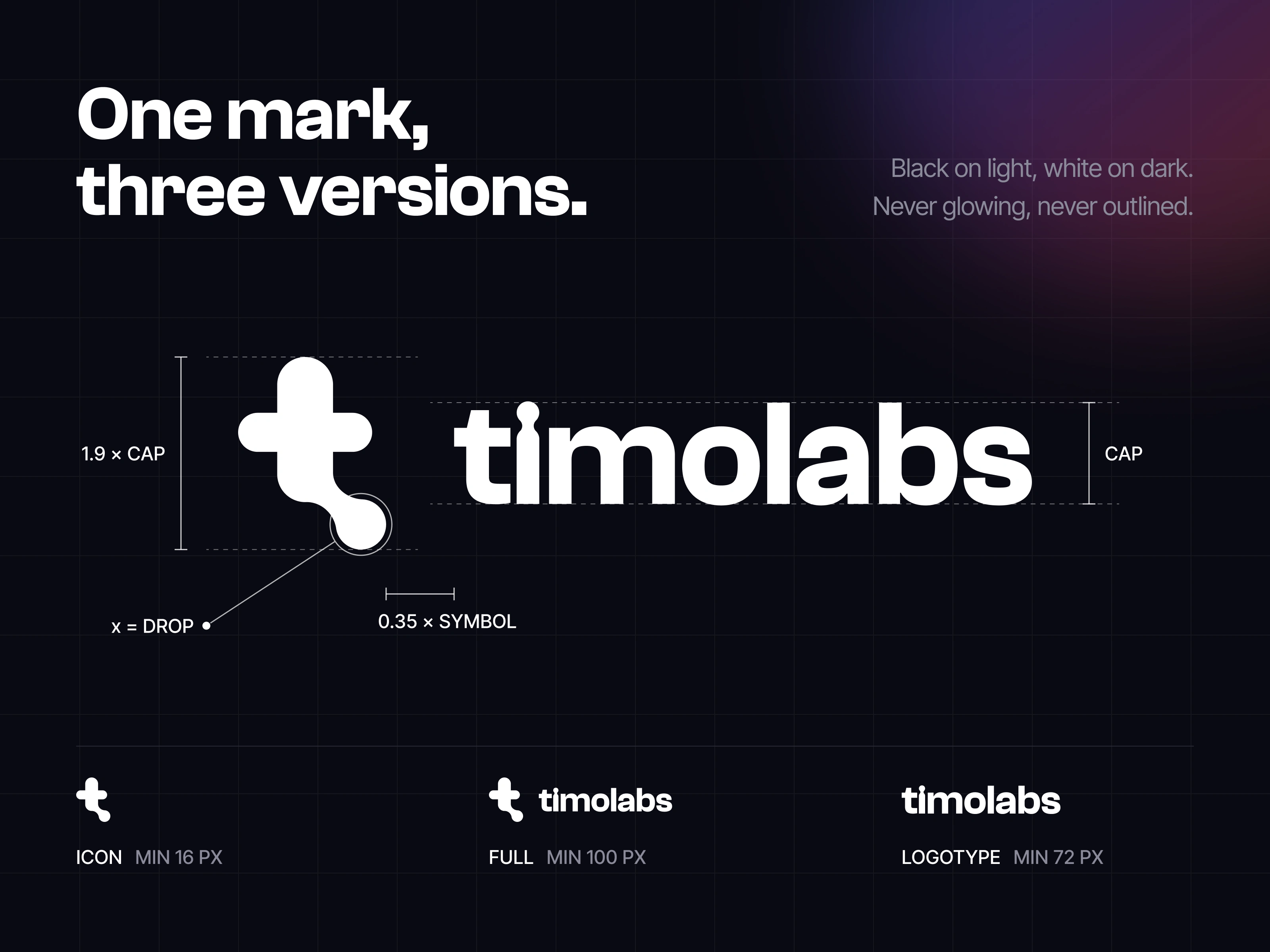
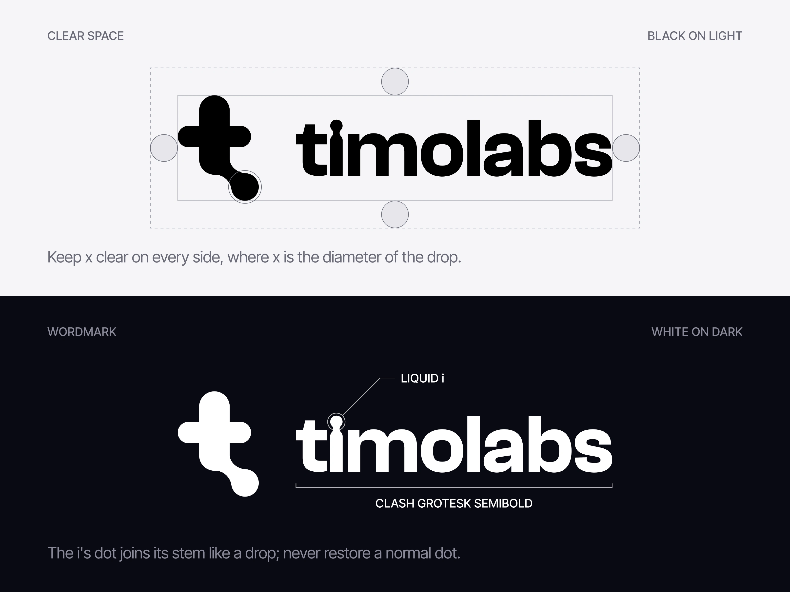
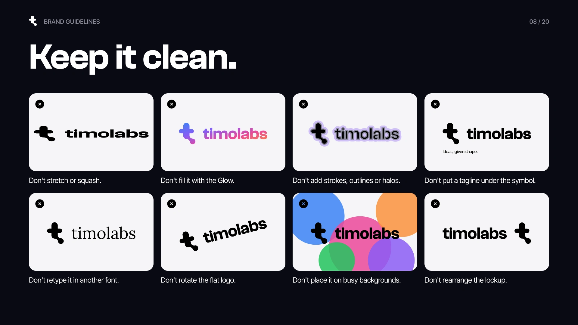
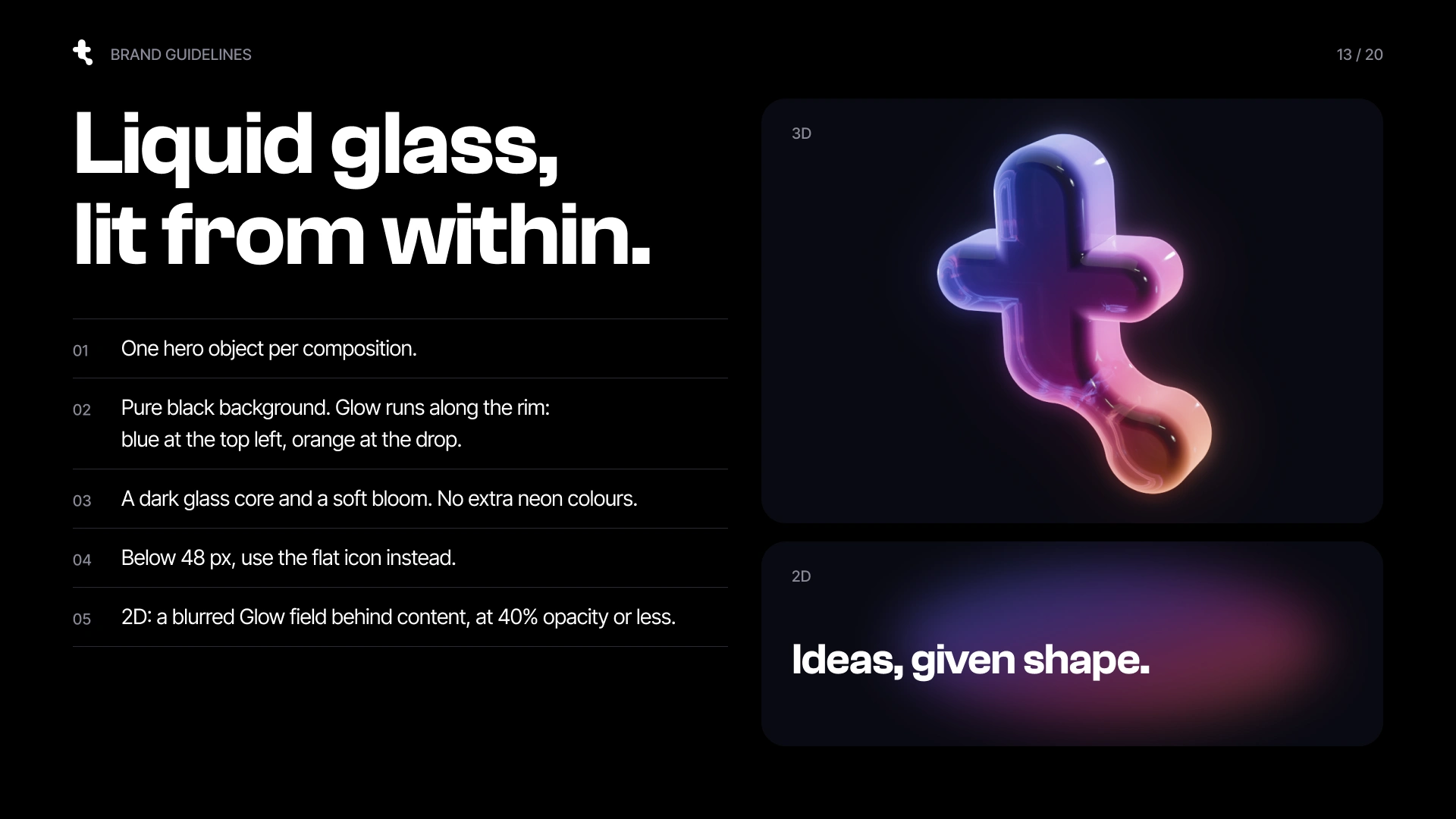
The logo stays simple, black or white. Its hero side is liquid glass, lit from within.
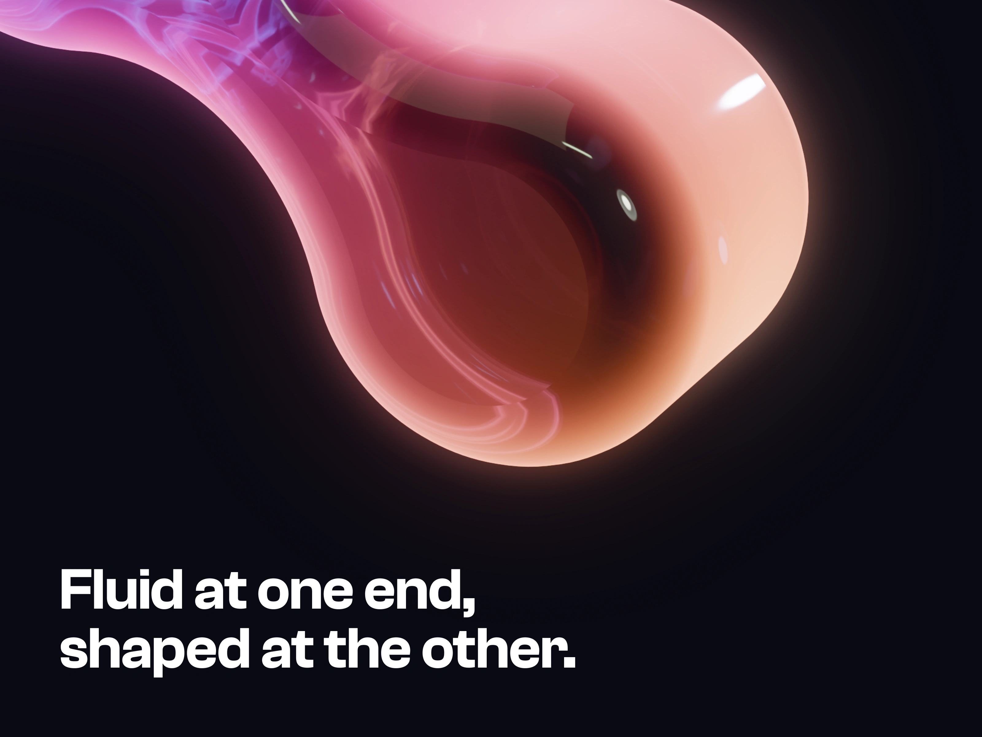
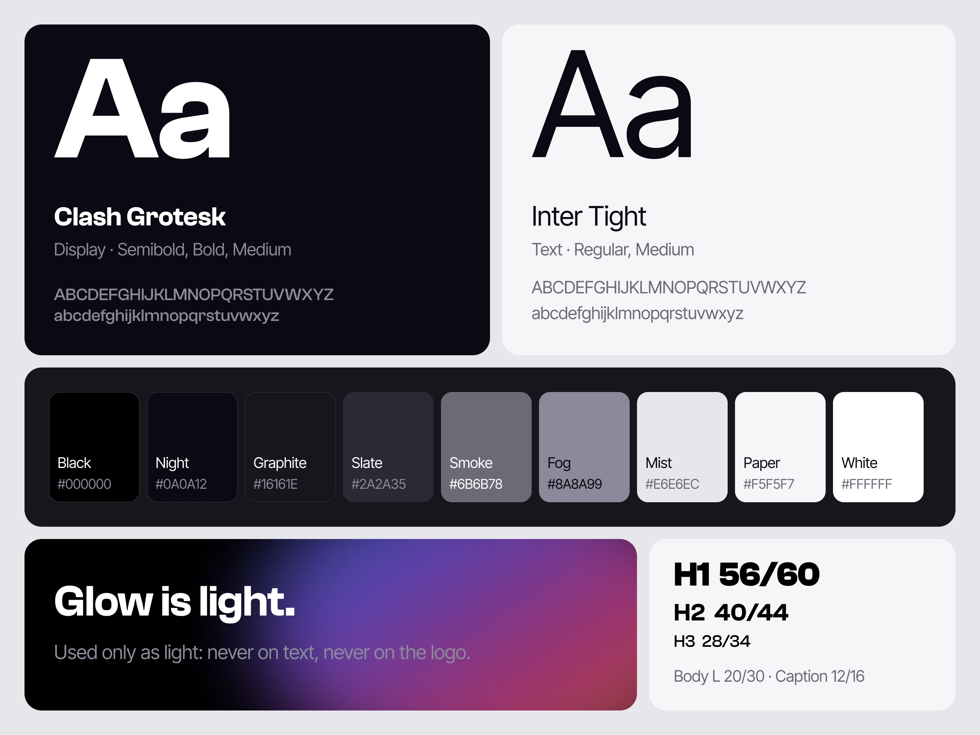
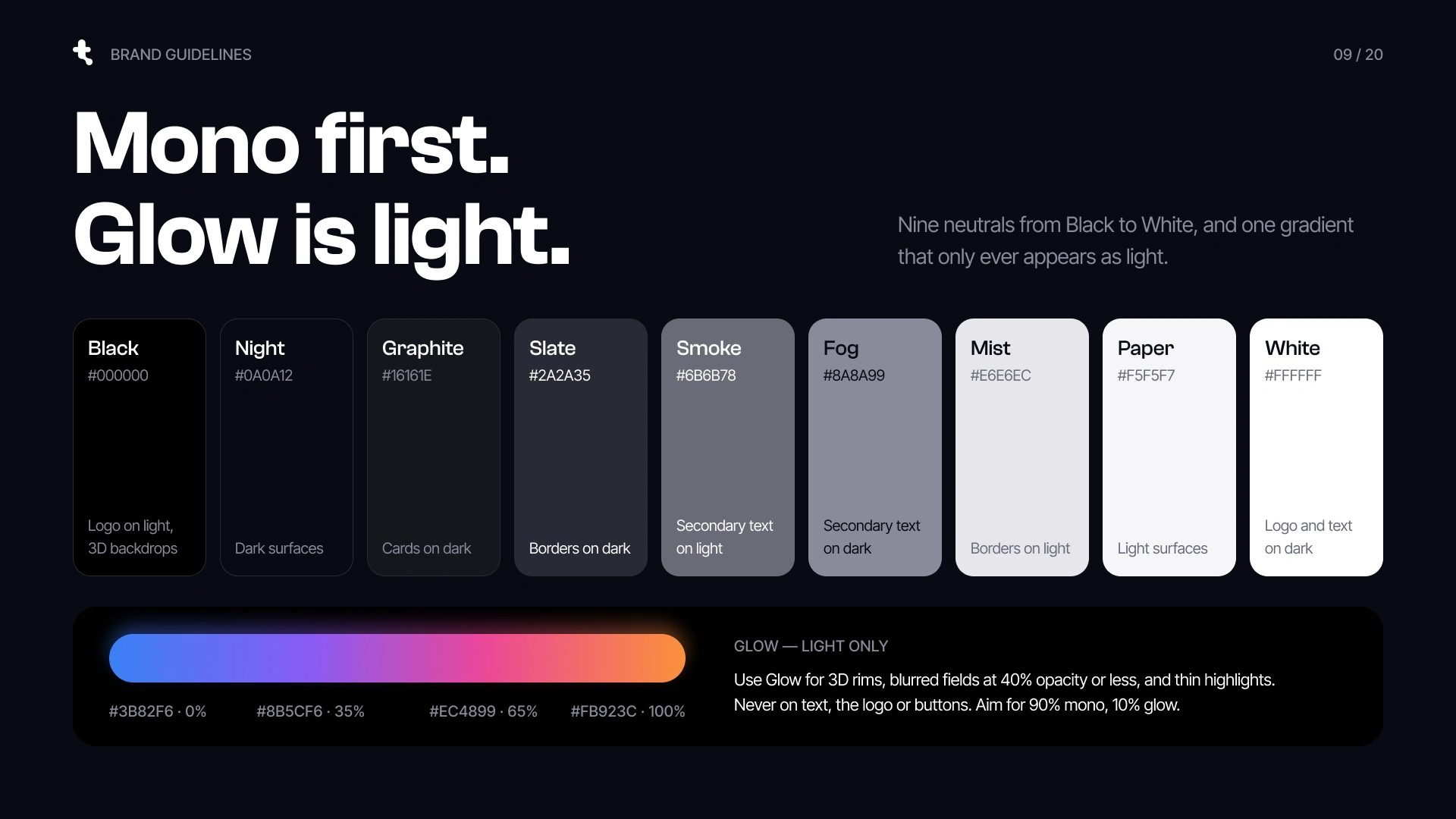
Mono first, Glow is light. Almost everything is black and white, and the colour only ever shows up as light.
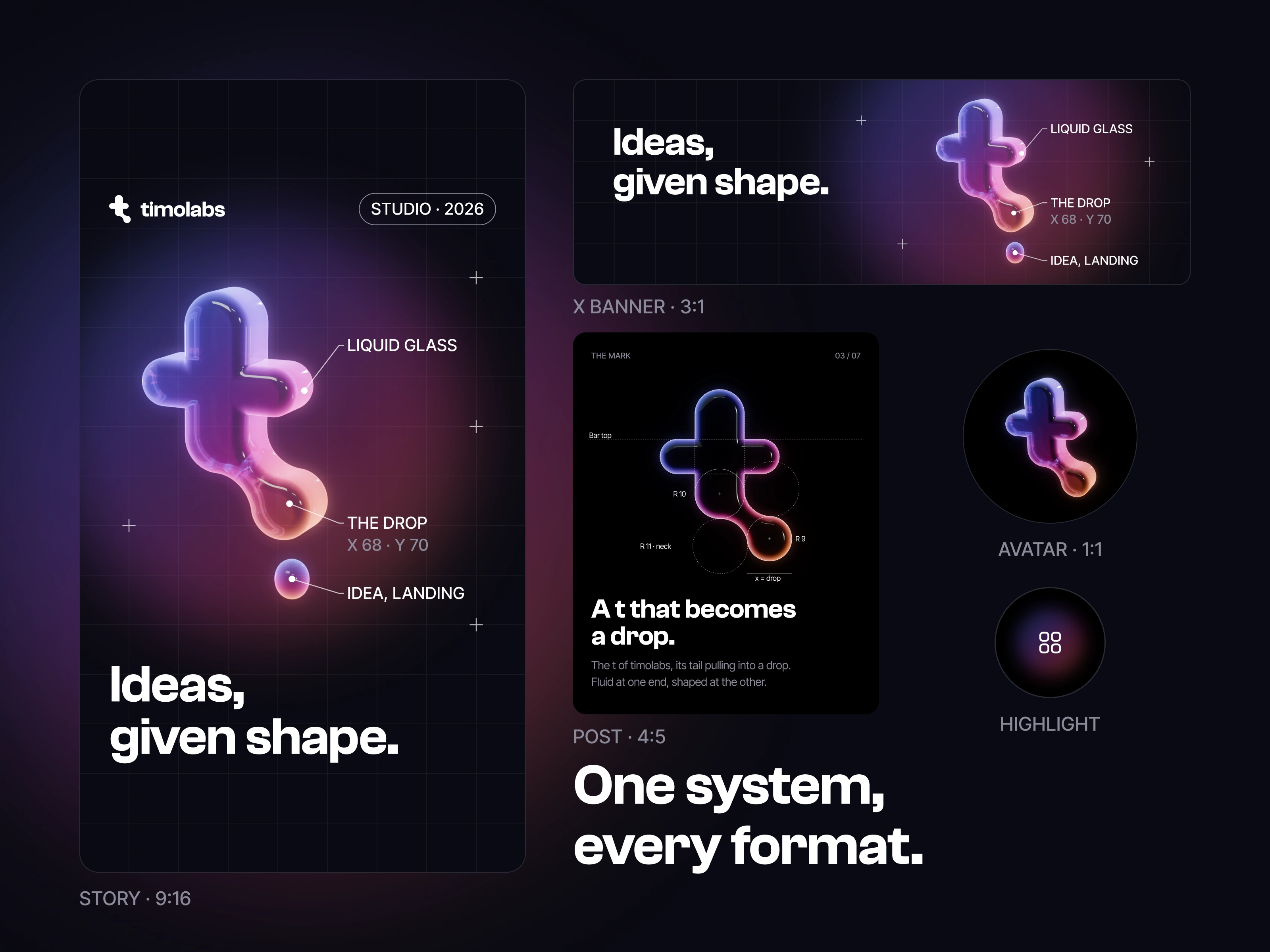
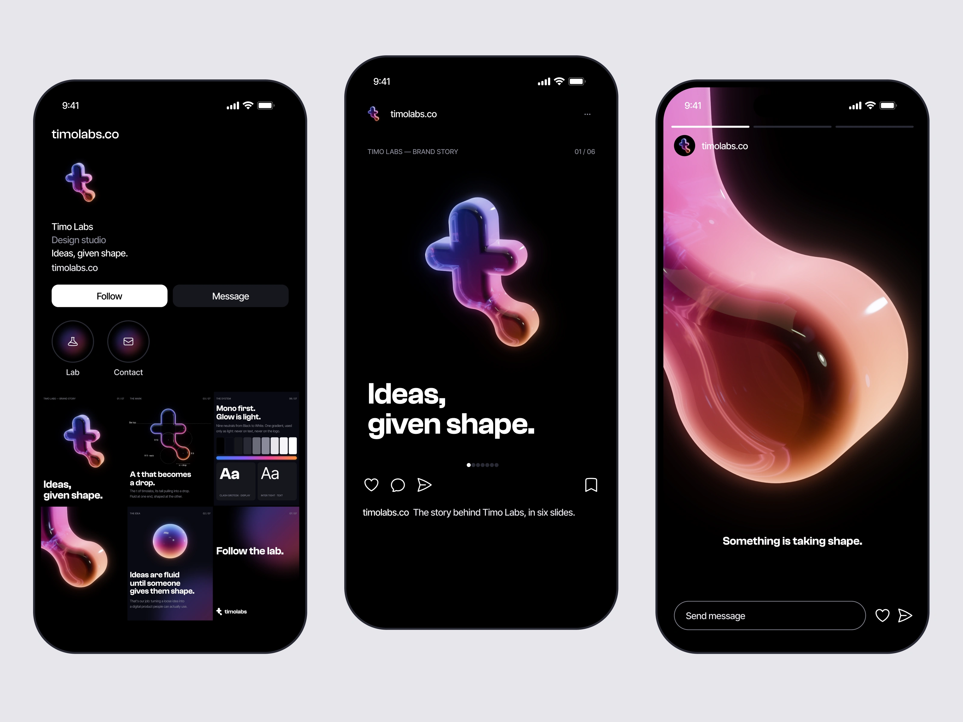
One system, every format. Every post, story and banner is built from the same styles.
One scroll, one drop: from a loose idea to a product people can actually use.
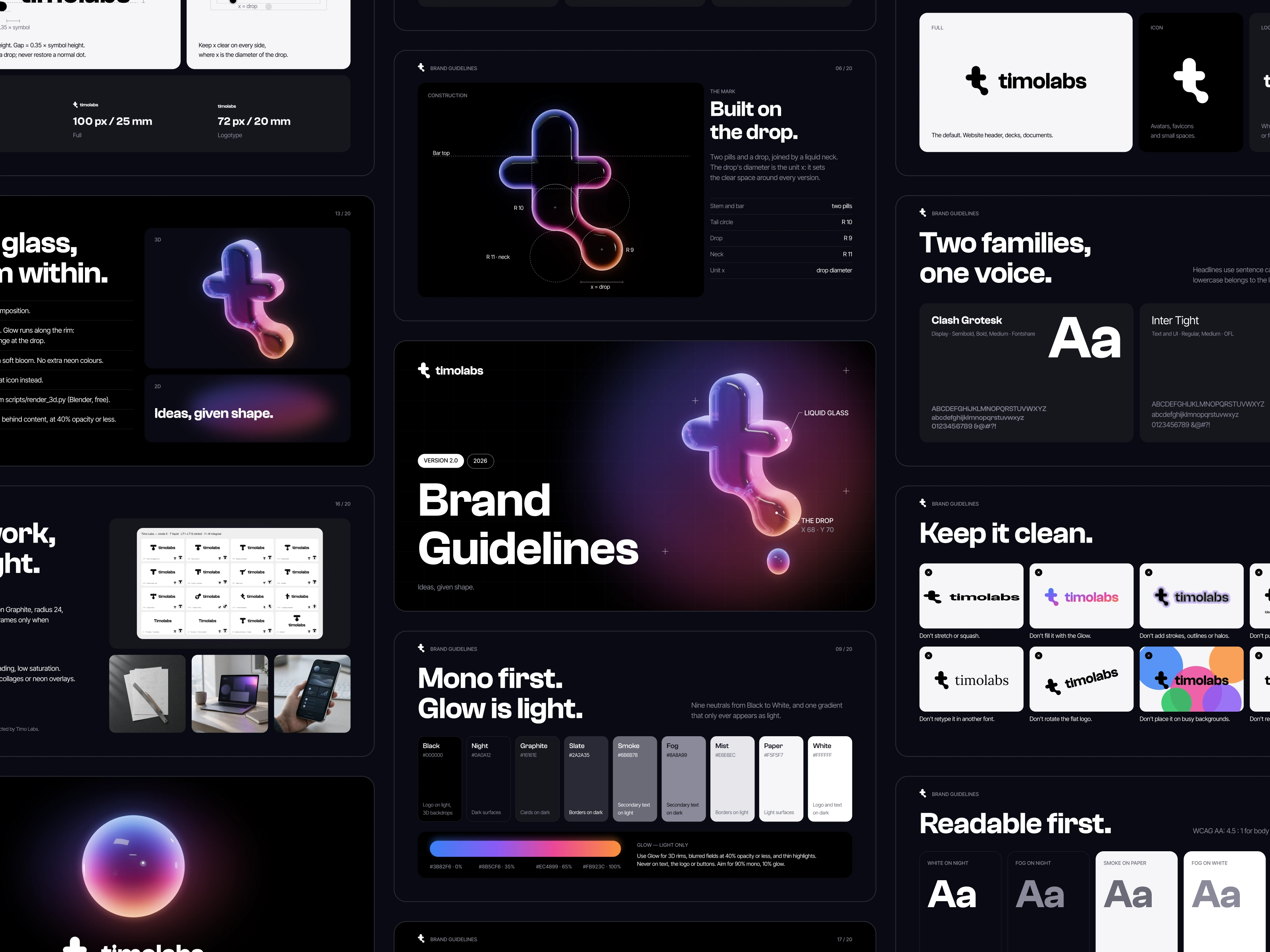
The whole brand in one place, so everything we make looks and sounds like us.
The launch film. Sound on.
Like this project
Posted Sep 30, 2026
Timo Labs is a design studio for digital products. This is the identity we made for our own launch.
Likes
0
Views
2