Partnership Pitch Deck: Veyra Energy
Mansi Chauhan

This project was approached with a clear intention, to translate complexity into clarity without losing depth. The goal wasn’t just to design slides, but to build a narrative that feels structured, confident, and easy to follow.
Understanding the Problem
Before moving into design, I focused on understanding the core message behind the deck, what needed to be communicated, what could be simplified, and what deserved emphasis. This helped in shaping a clear hierarchy of information early on.
Structuring the Narrative
Instead of treating slides as individual pieces, I approached the deck as a continuous flow. Each section was designed to transition seamlessly into the next, ensuring the story builds progressively rather than feeling fragmented.
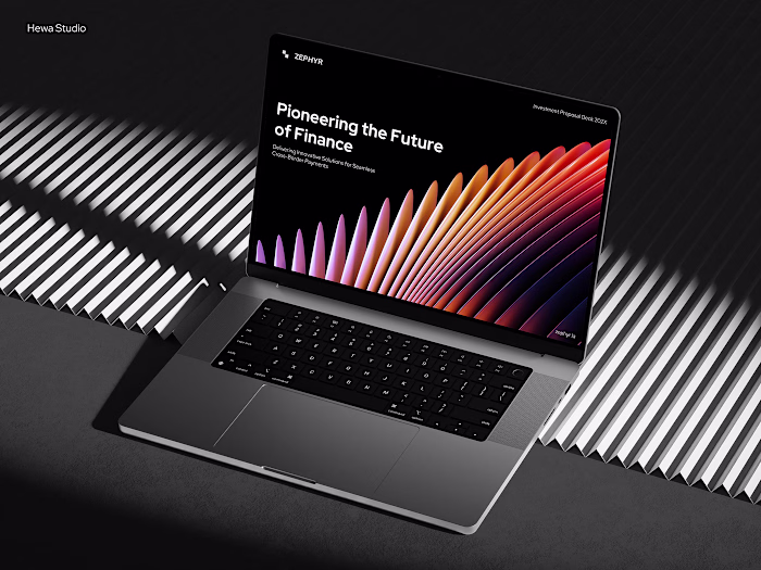
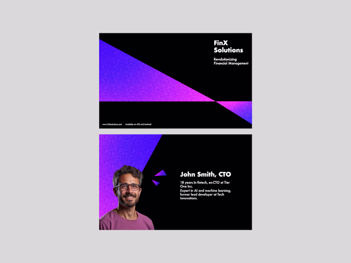
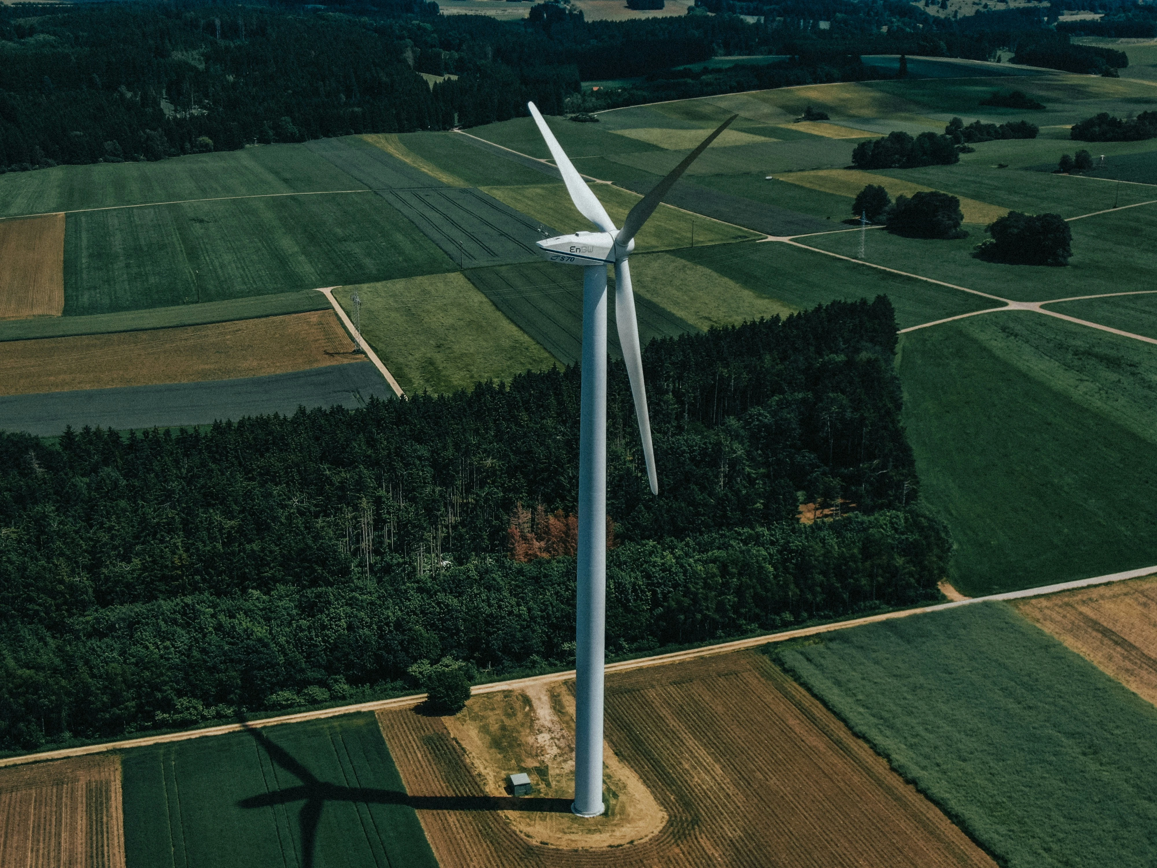
Visual Direction
The visual language was kept intentional and restrained. Clean layouts, controlled use of color, and consistent spacing were used to maintain a premium and professional feel while keeping the content at the center.
Balancing Content & Design
A key focus throughout the process was balance, making sure the design enhances the content, not overpowers it. Every visual element was added with purpose, whether to guide attention, improve readability, or reinforce key ideas.
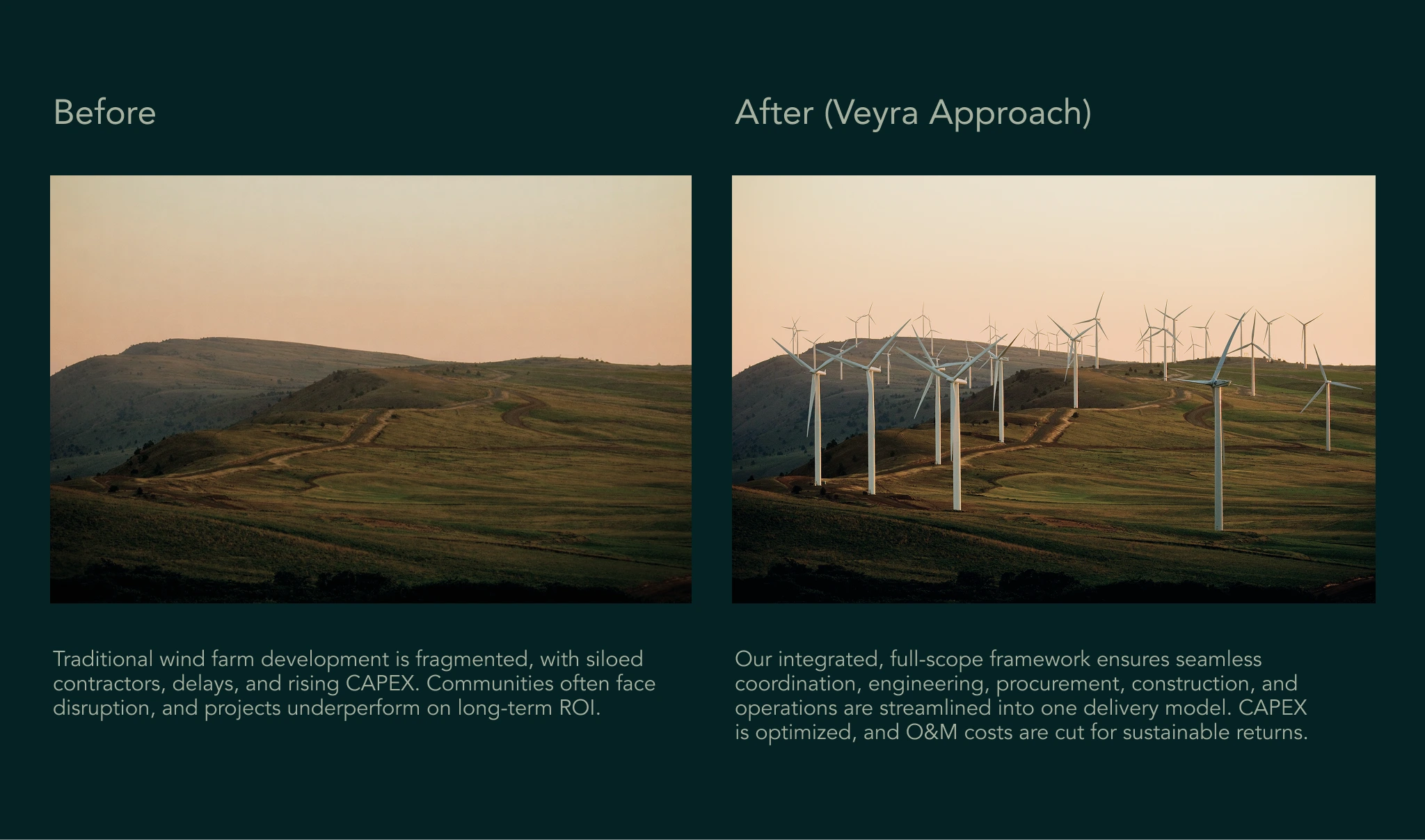
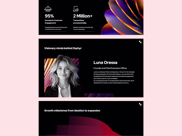
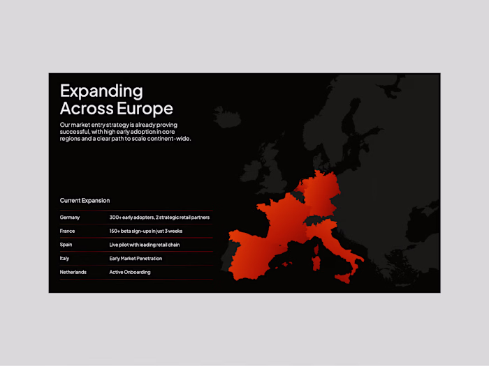
Data & Clarity
For slides involving data or key insights, the goal was clarity over decoration. Information was broken down into digestible formats, allowing viewers to quickly grasp the message without cognitive overload.
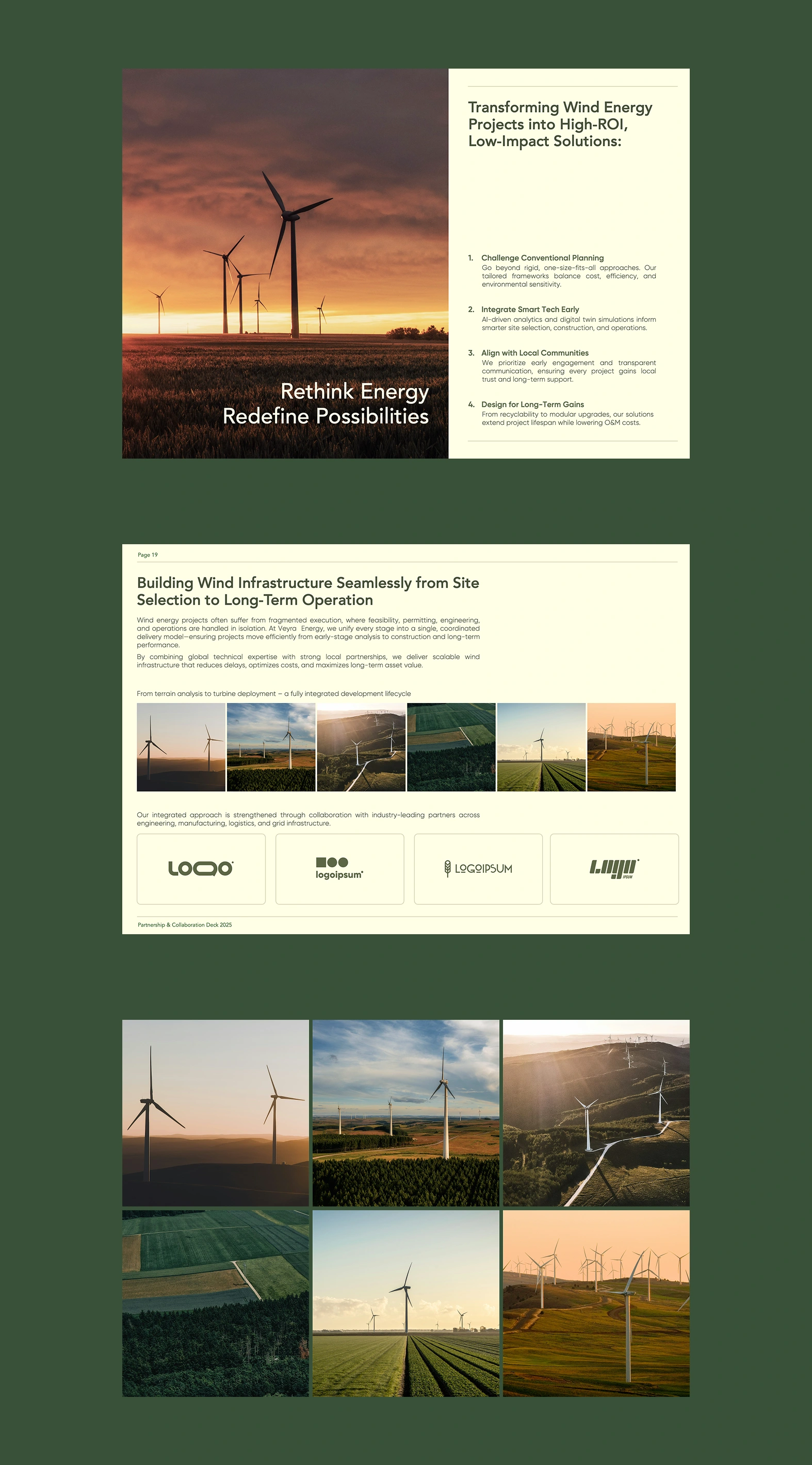
Consistency Across Slides
Consistency played a major role in making the deck feel cohesive. Typography, spacing, and layout patterns were standardized to create a unified visual system across all slides.
Final Outcome
The final result is a deck that communicates with precision and confidence, visually refined, strategically structured, and designed to hold attention from start to finish.

Like this project
Posted Mar 26, 2026
A refined presentation built around structure and storytelling, turning complex information into a clear, engaging, and visually cohesive experience.