Vitadent Visual Identity and Communication Redesign

Vlade Dimovski



Context
Vitadent is dedicated to gentle, long term oral health, and a traditional philosophy centered on natural tooth preservation. Despite years of reliable dental practice, the clinic operated without a recognizable visual identity, a formal logo, or cohesive printed materials. Patient facing items relied on basic print shop business cards, while clinic paperwork depended on generic text processor documents.
Challenge
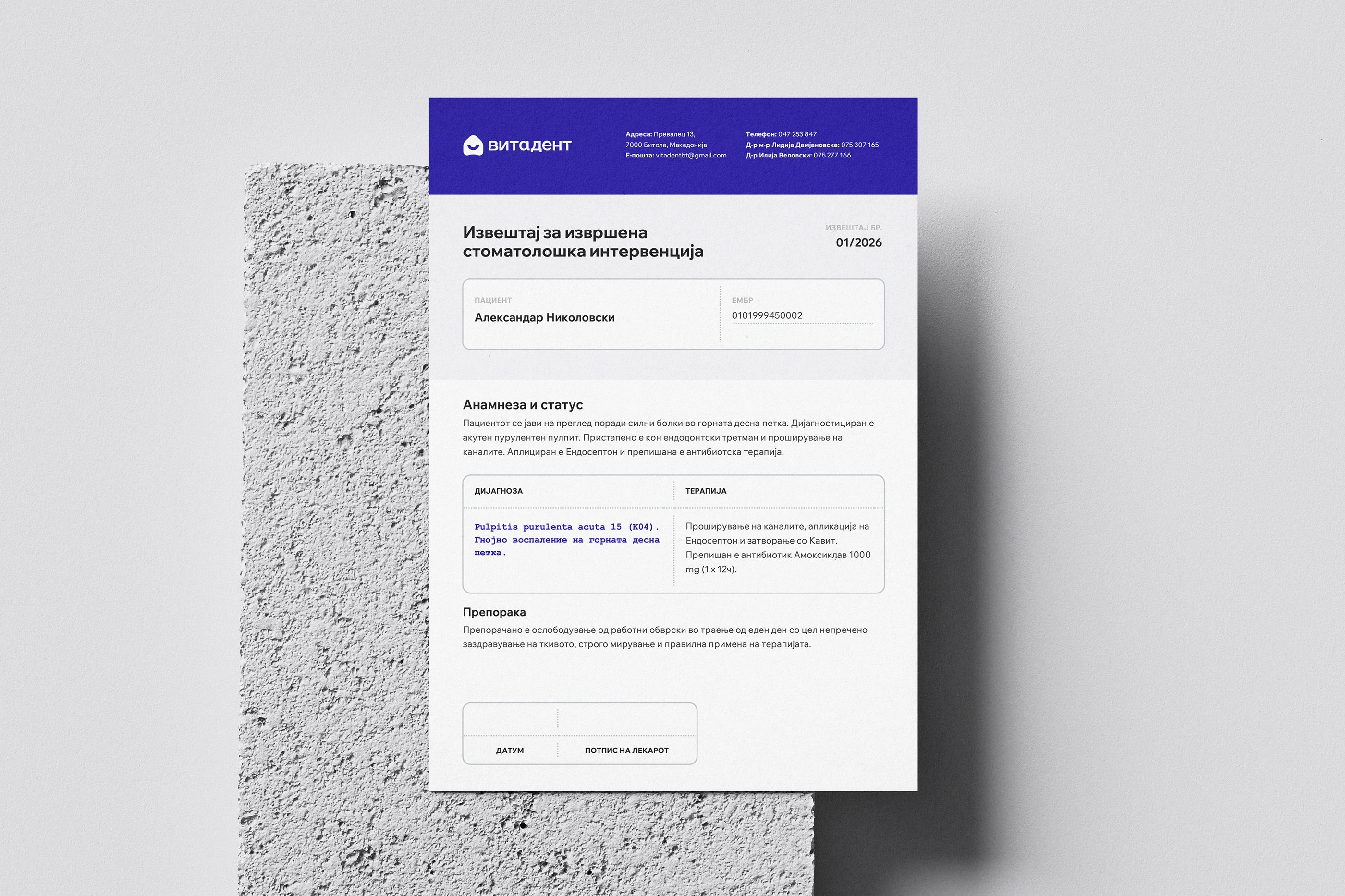
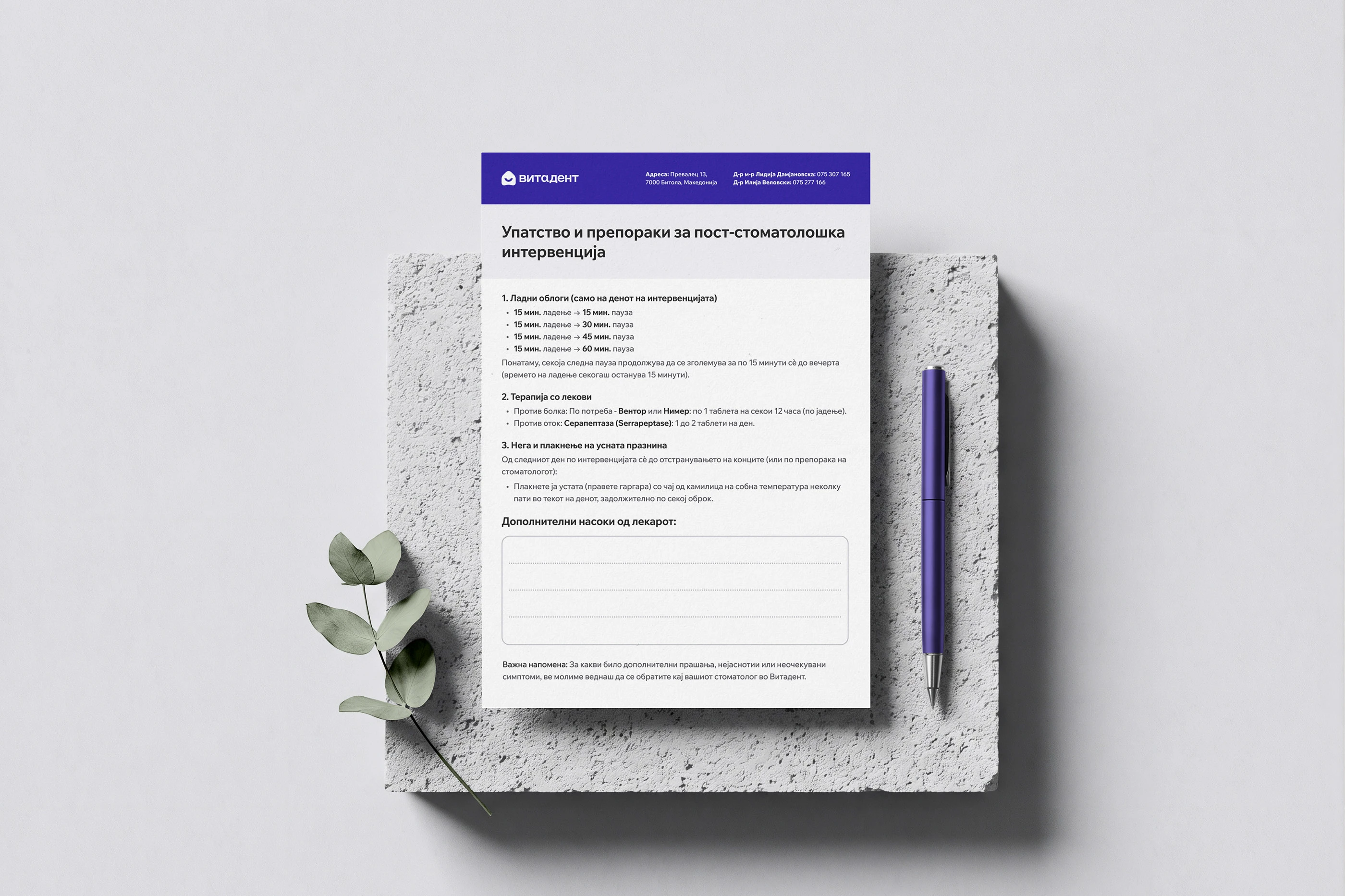
The absence of a unified brand presence failed to reflect the clinic’s genuine medical expertise and traditional approach to patient care. Daily practice suffered from fragmented communication: routine post procedure care directions were written out entirely by hand on blank pads for every intervention, taking up valuable clinical time. Furthermore, standard dental reports lacked clear structure, blending in with others and falling short of the polished standard expected by patients and health insurance institutions.
Objectives
The goal was to establish a distinctive, welcoming identity alongside practical materials that bring lasting visual order to daily routines:
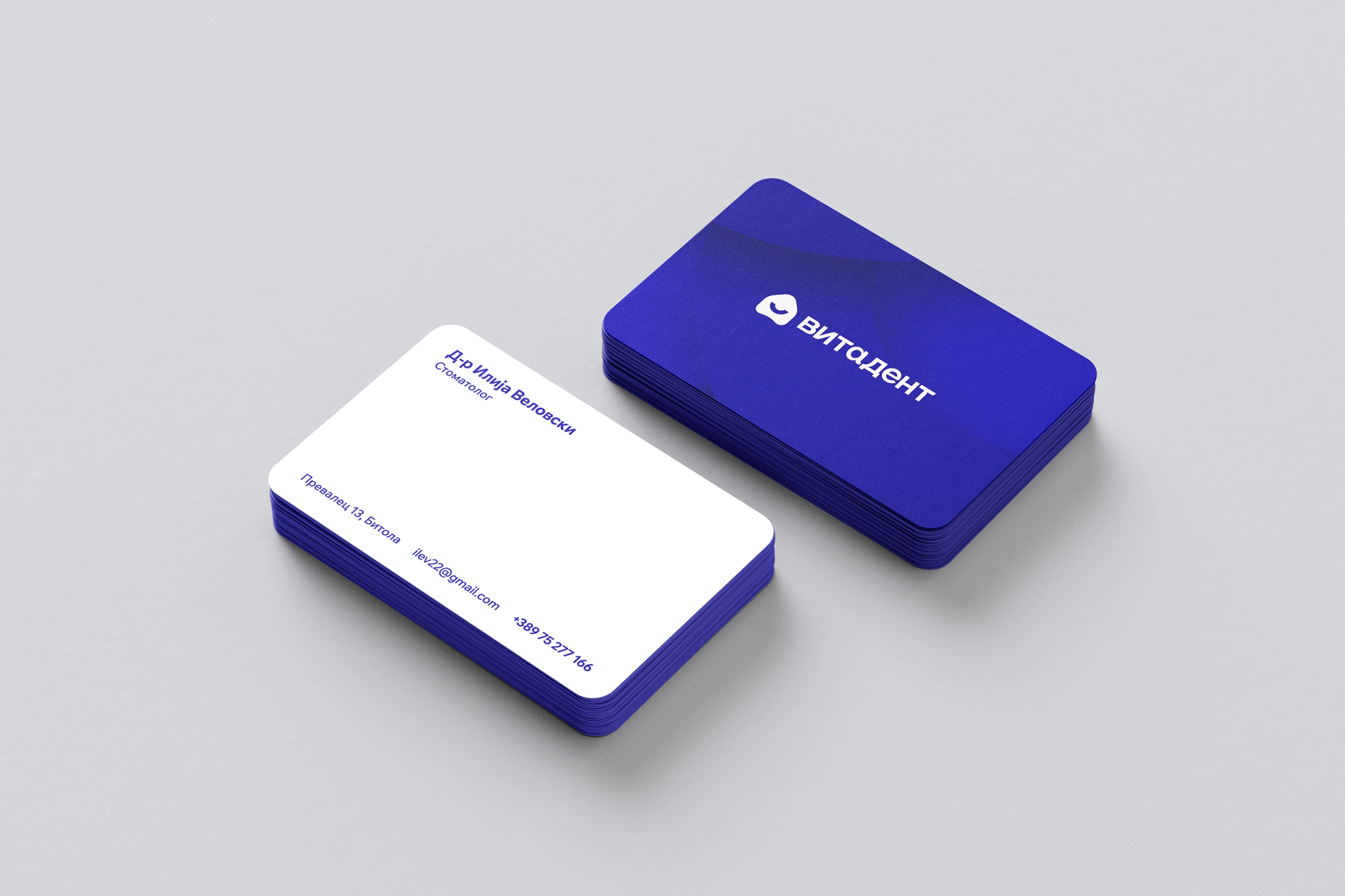
Design an approachable geometric logo and cohesive visual system that embodies traditional care, warmth, and clinical reliability.
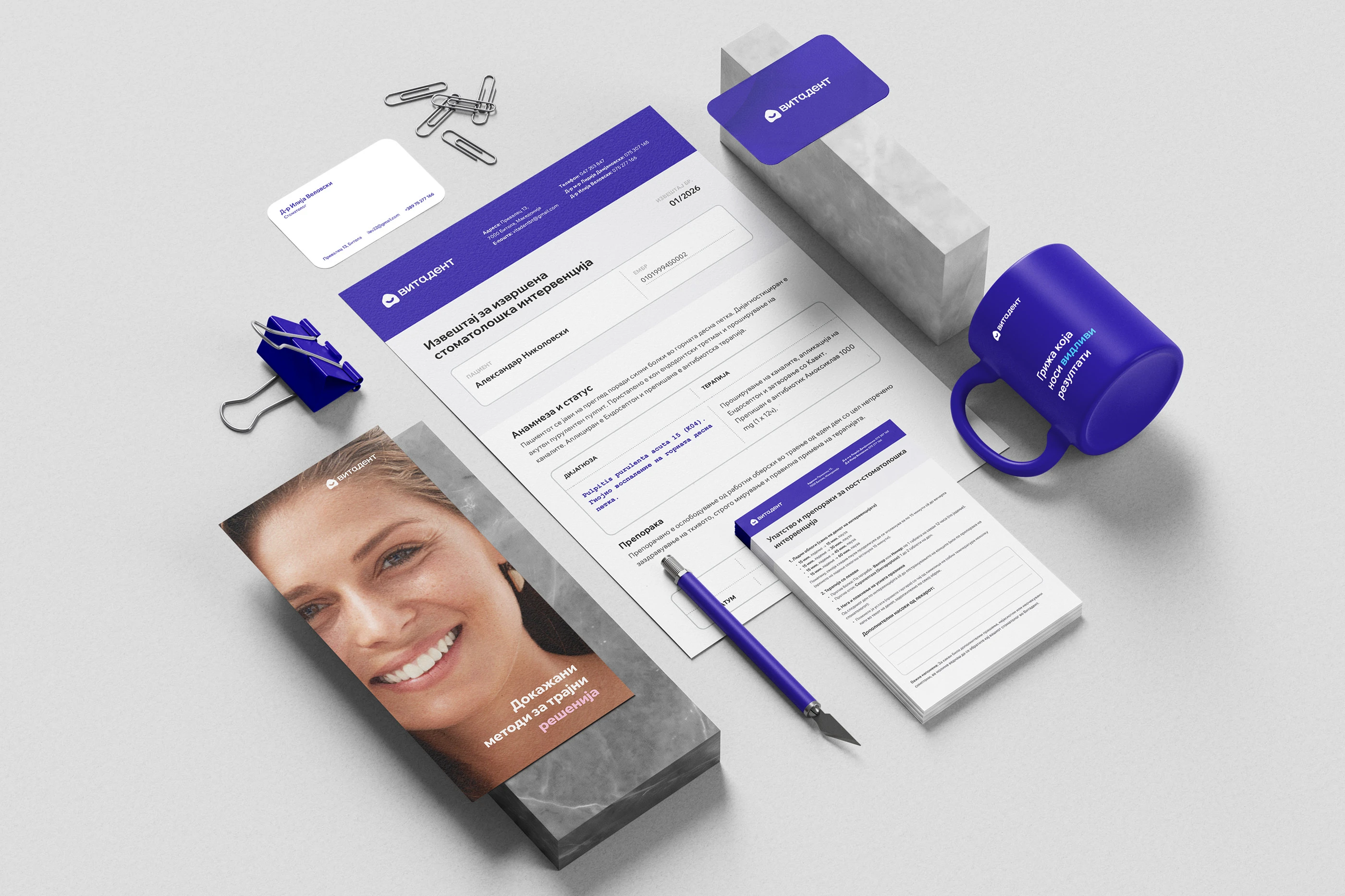
Redesign the dental report with an intuitive, structured layout that simplifies clinical records and presents an organized image to health insurance institutions.
Introduce a dedicated post intervention prescription pad with clear, pre printed recovery guidance, eliminating repetitive handwriting while ensuring patient safety.
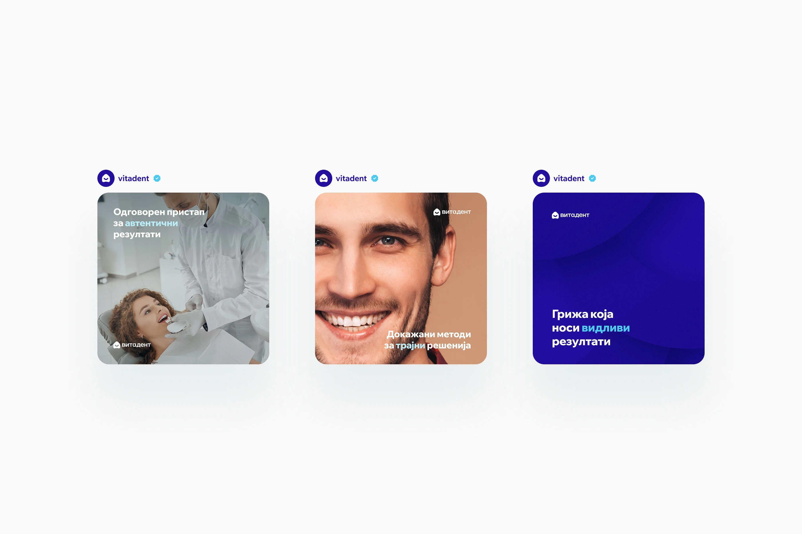
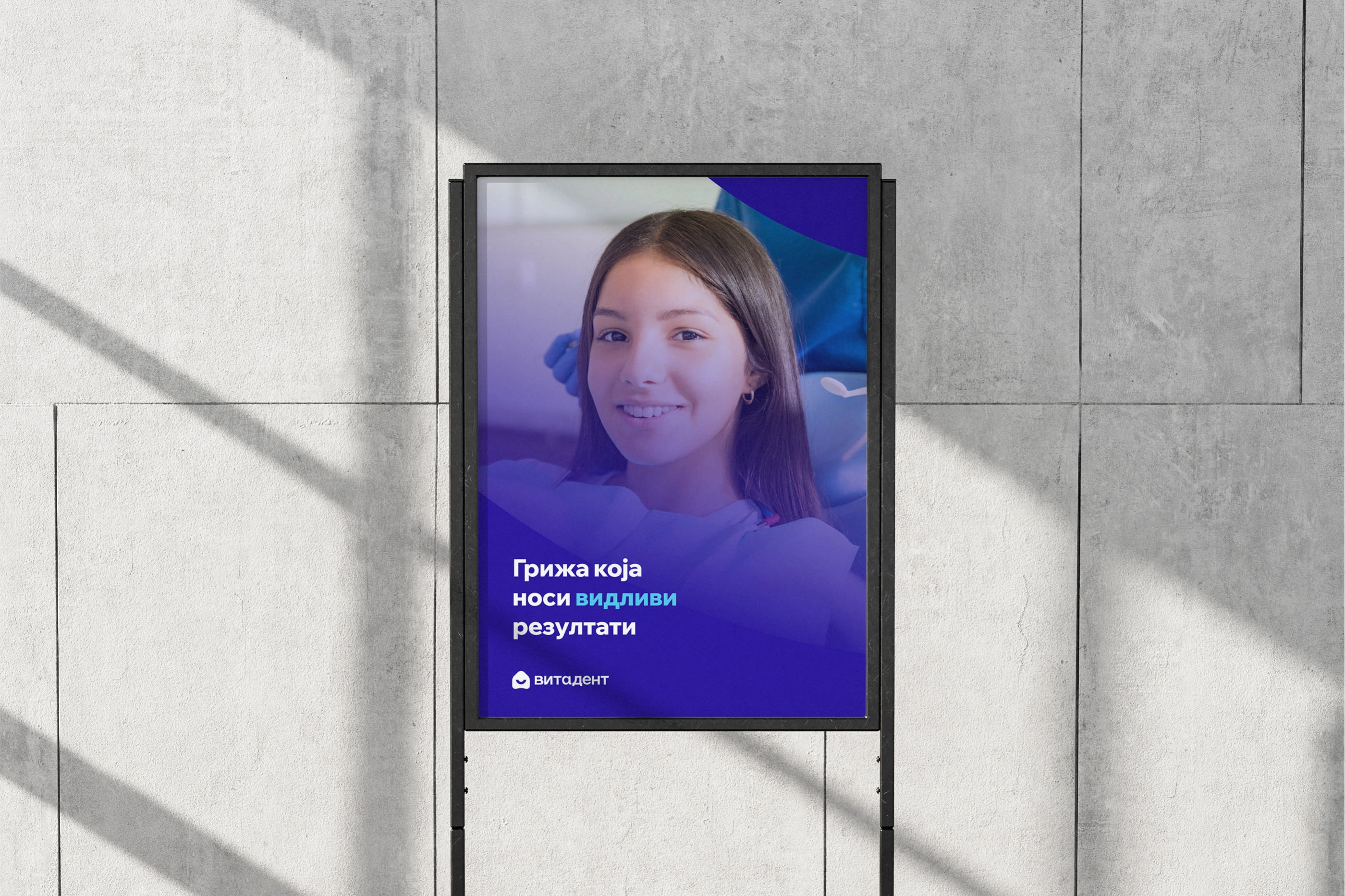
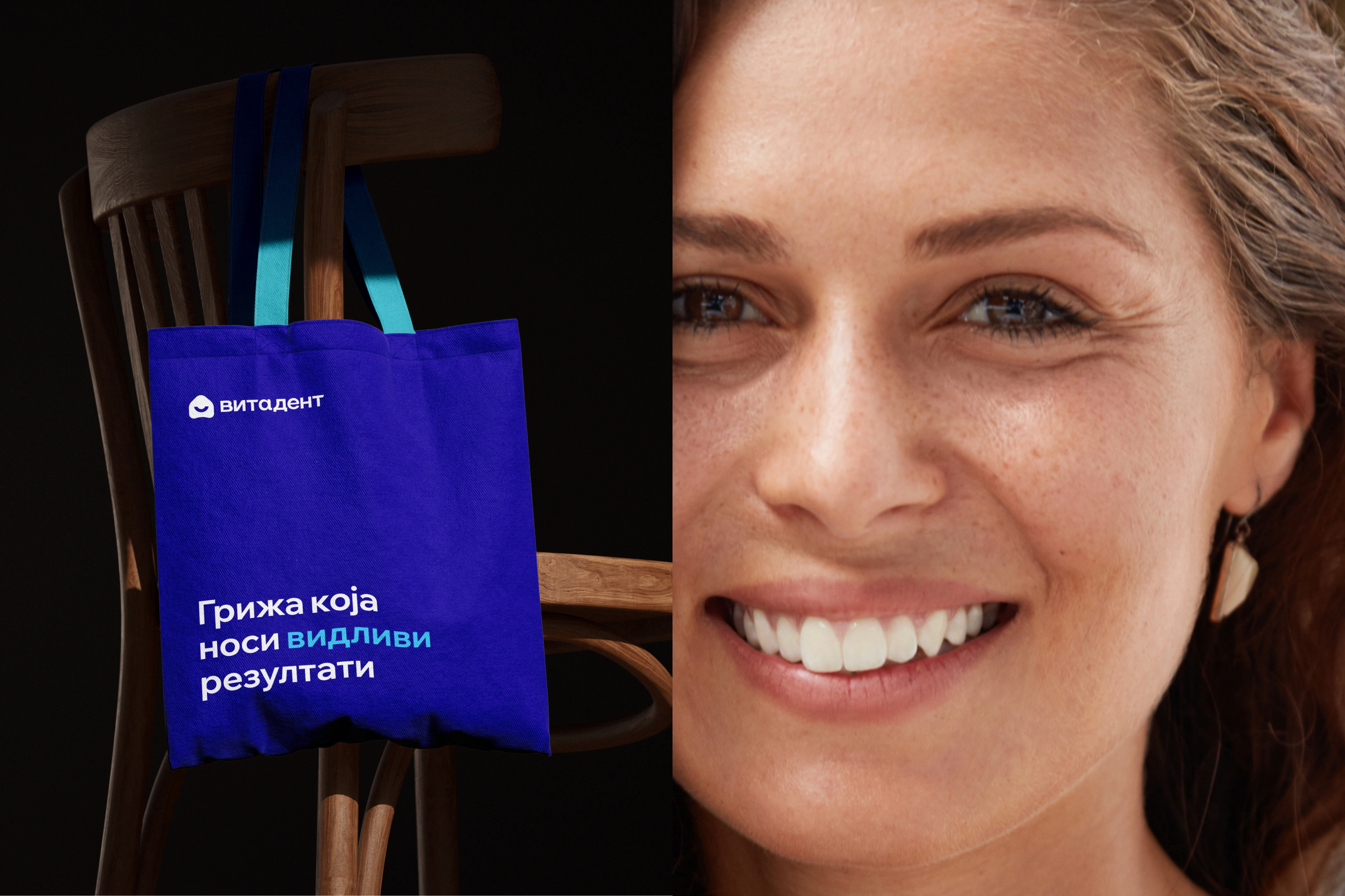
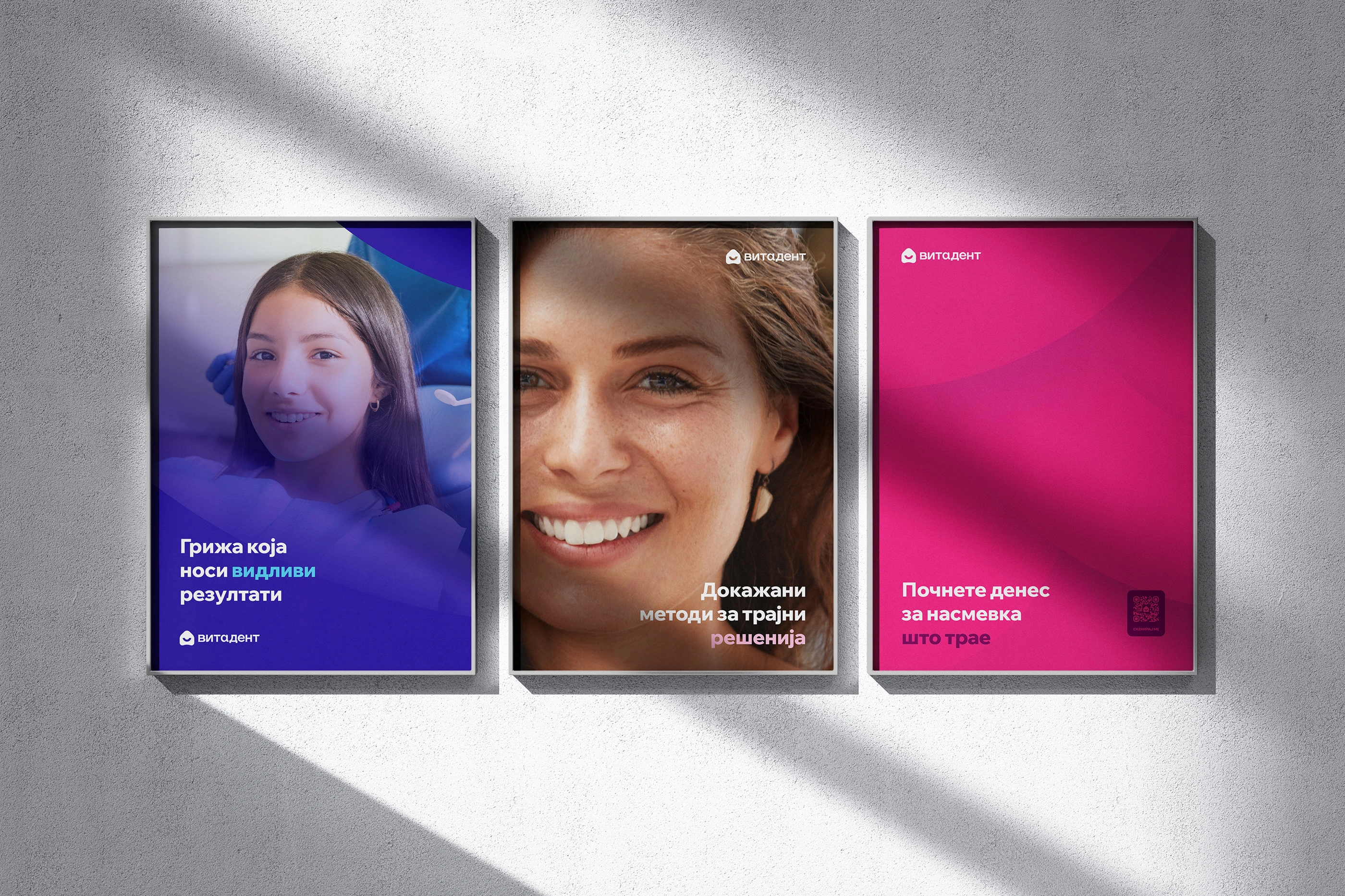
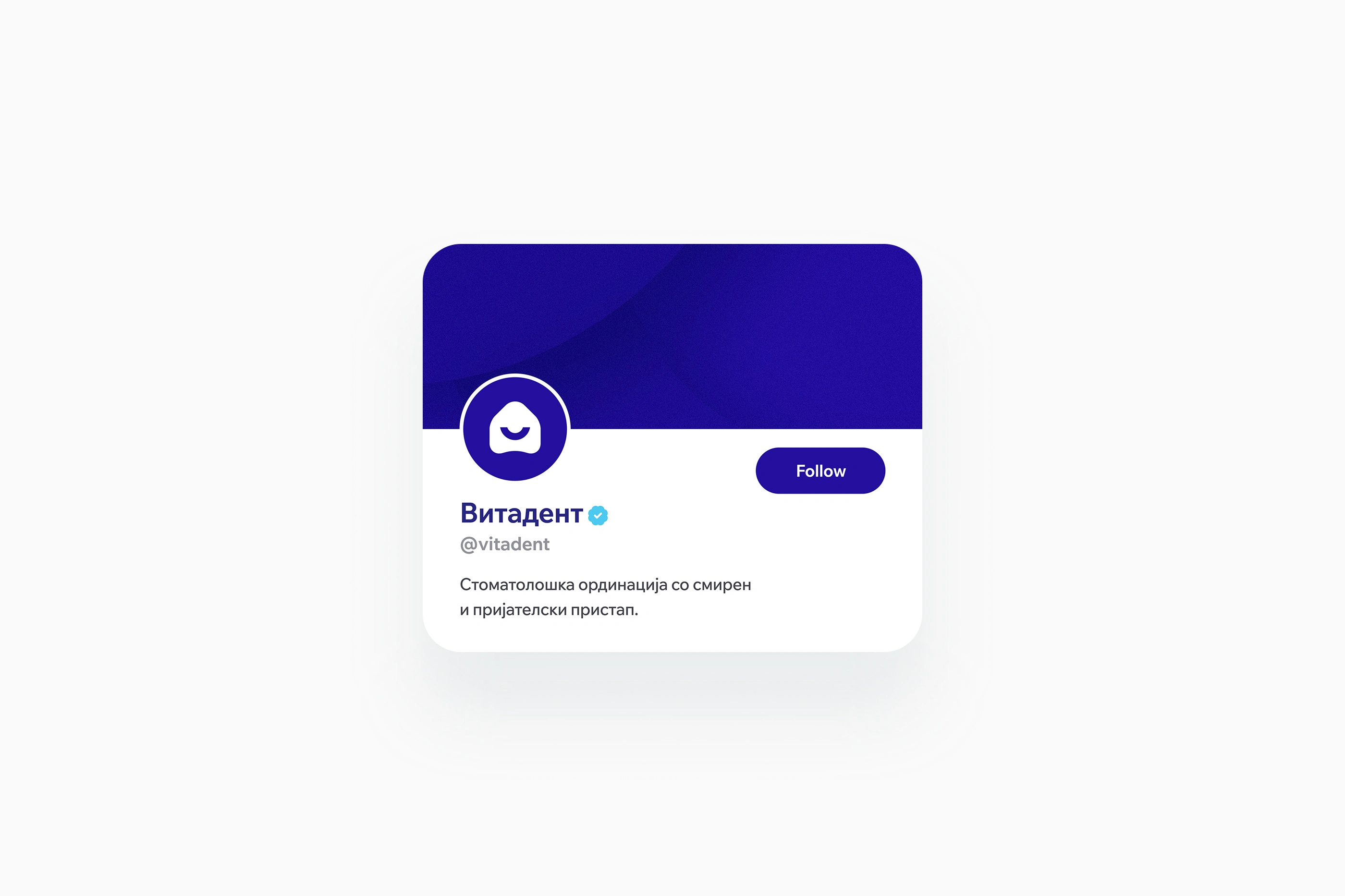
Deliver refined business cards, promotional print materials, and marketing media to attract new patients and enrich the complete clinical experience.

Typography
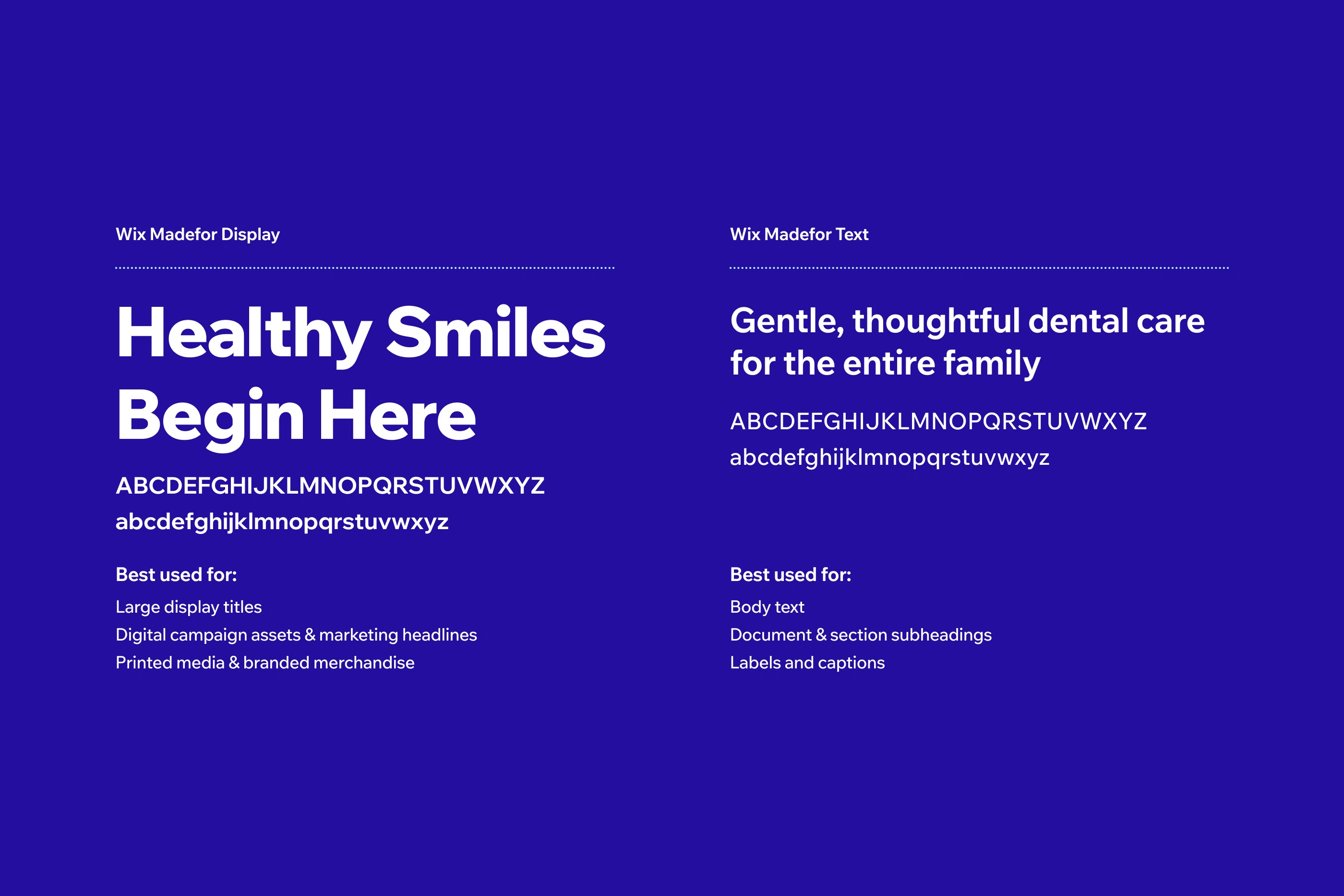
The Wix Madefor family blends clean geometry with humanist warmth. Pairing expressive display cuts with functional text weights, it establishes a coherent typographic identity across digital and print touchpoints.
Primary colors
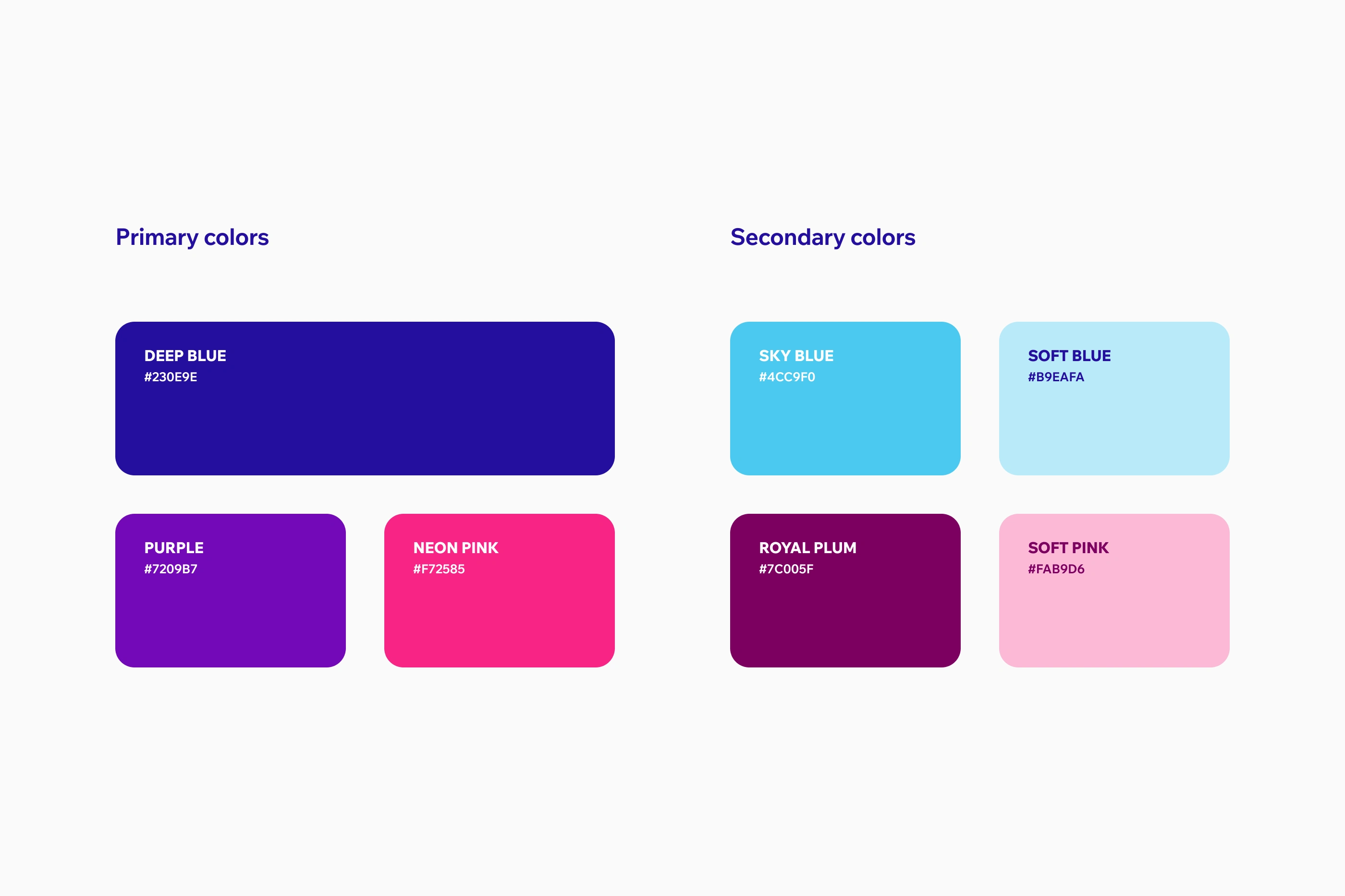
Grounding the entire visual system, Deep Blue serves as the primary visual foundation of the identity, anchoring the brand in calm, trustworthy care and enduring stability. Rich Purple introduces subtle clinical depth, while vibrant Neon Pink adds an energetic spark to highlight key messages with optimism.
Secondary colors
Designed for subtle contrast and typographic detailing, the secondary tones soften the overall composition. Calming blues and gentle pinks support the primary foundation, adding depth to text highlights, badges, and small details without overwhelming the patient.
Logomark
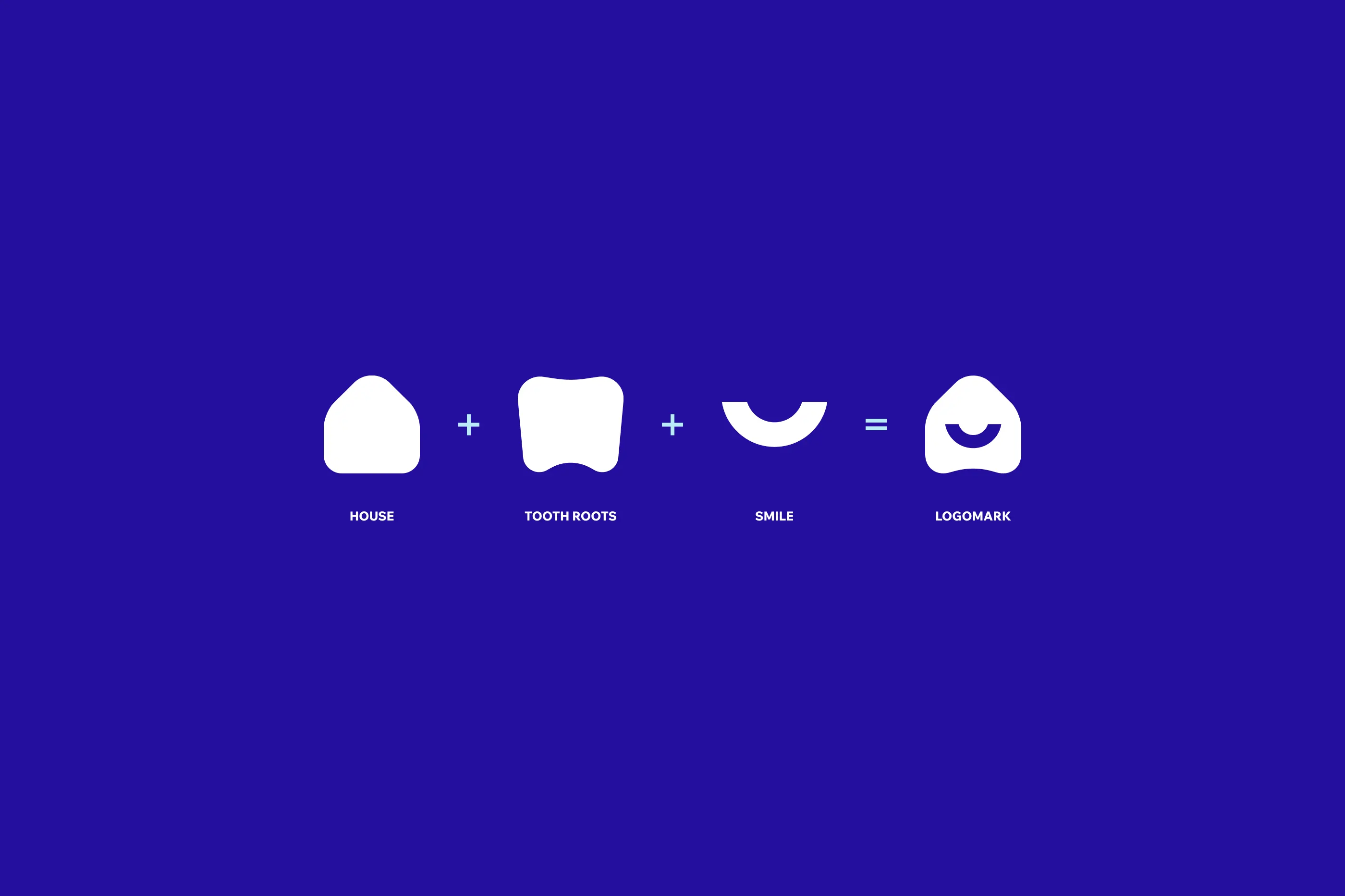
The Vitadent logomark combines a house, tooth roots, and a smile into a simple geometric form reflecting warm, traditional care. A protective roofline conveys safety, the dual root base ensures stability, and the inner curve forms an open smile.
Logo
Completing the identity, the Sato logotype introduces a confident, modern presence. Its sharp internal ink traps create a distinctive visual rhythm that subtly echoes the anatomical grooves, surfaces, and natural contours of a healthy molar tooth.


Like this project
Posted Sep 29, 2026
Brand identity and design system for the dental clinic Vitadent, replacing unbranded clinic materials with structured print and marketing media.