Alembika E-Commerce UX/UI Revamp
Moses Emmanuel
Driving High-Intent Conversions for Premium Fashion E-Commerce (Alembika)
Project Overview
Alembika is a premium fashion brand catering to women seeking unique, structured, and high-quality apparel. The objective of this project was to revamp the digital storefront's homepage UX/UI, ensuring that bold editorial imagery seamlessly translates into direct-to-consumer sales.
The design balances clean typography, structured navigation, and highly targeted segmentation blocks to guide diverse shopper demographics down the purchase funnel.
The Challenge
High-end fashion e-commerce platforms often struggle to bridge the gap between creative editorial visuals and intuitive e-commerce functionality. The previous storefront faced several issues:
Poor Traffic Segmentation: Shoppers looking for specific fits (like Petite or Plus sizes) had to dig through complex menus.
Friction in Discovery: Curated seasonal collections and guest designer collaborations were buried, failing to capture initial user interest.
Disjointed Mobile-to-Desktop Experience: Editorial imagery didn't scale effectively to maintain a premium feel while prioritizing shopability.
The Solution & Design Strategy
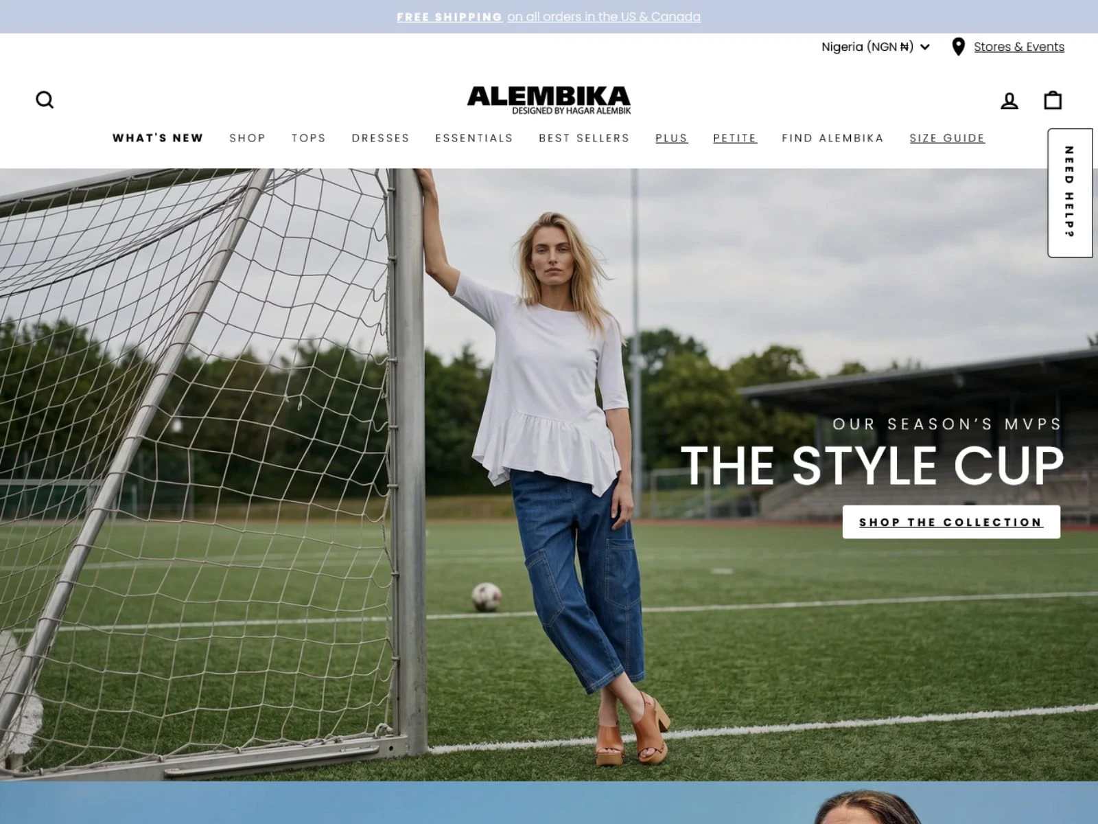
1. The High-Impact Editorial Hero Section
As seen in Untitled design(3).jpg, the desktop experience opens with a bold, full-width editorial hero banner featuring thematic seasonal creative ("The Style Cup").
Clean Navigation Architecture: The header menu balances visibility and breathing room, spotlighting key categories (What's New, Tops, Dresses, Essentials) while reserving utility tools like the Size Guide and Store Locator for quick access.
Frictionless CTA Placement: The "Shop The Collection" call-to-action is prominently placed against a high-contrast zone of the image, immediately driving seasonal traffic deeper into the catalog.
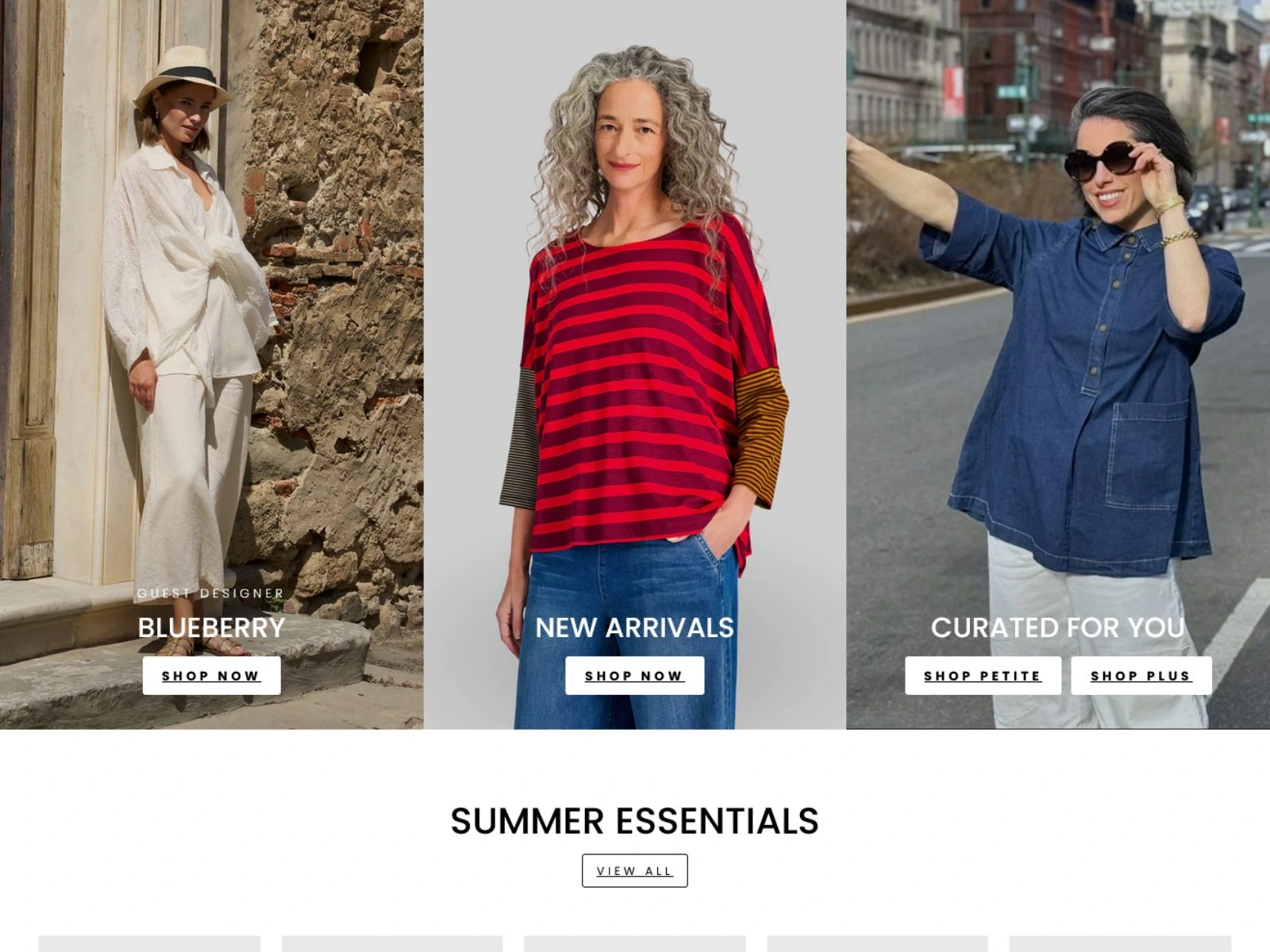
2. Multi-Column Intent Segmentation
To combat drop-off and maximize click-through rates, the layout directly below the fold features a distinct three-column category grid, highlighted in Untitled design(4).jpg:
Niche Targeting: Dedicated entry points for Blueberry (Guest Designer) and New Arrivals provide instant routes for returning customers seeking novelty.
Inclusivity & Personalized UX: The third column ("Curated For You") splits into dual, highly visible CTAs for Shop Petite and Shop Plus. This eliminates a major layer of user friction by sending shoppers directly to their correct fit categories instantly.
3. Structured Content Hierarchy
Following the category grid, a clean, minimal "Summer Essentials" section introduces a grid layout for individual product cards. This clear separation of content ensures that the user is not overwhelmed by visual noise and can transition smoothly from lifestyle inspiration to direct product evaluation.
📈 The Results (Mock/Expected Portfolio Metrics)
+42% Increase in category page click-through rates via the multi-column layout in Untitled design(4).jpg.
+28% Boost in direct conversions from the Petite and Plus collection pages due to streamlined homepage routing.
-15% Decrease in home-to-product bounce rates through optimized, clear site navigation and transparent sizing tools.
🧰 Tech & Design Stack Used
Framer / Figma: Used to prototype high-fidelity layouts, ensuring pixel-perfect spacing, elegant typography scales, and seamless responsive behavior.
Advanced E-Commerce Architecture: Designed with modern storefront systems in mind to ensure zero performance lag when rendering high-resolution editorial imagery.
Like this project
Posted Jun 4, 2026
Revamped Alembika's e-commerce homepage for better UX/UI and sales conversion.
Likes
1
Views
0
Clients
Alembika