Juva "Vibes" Packaging Design
Greg Cooper
Juva Vibe Packaging & Brand Design Project
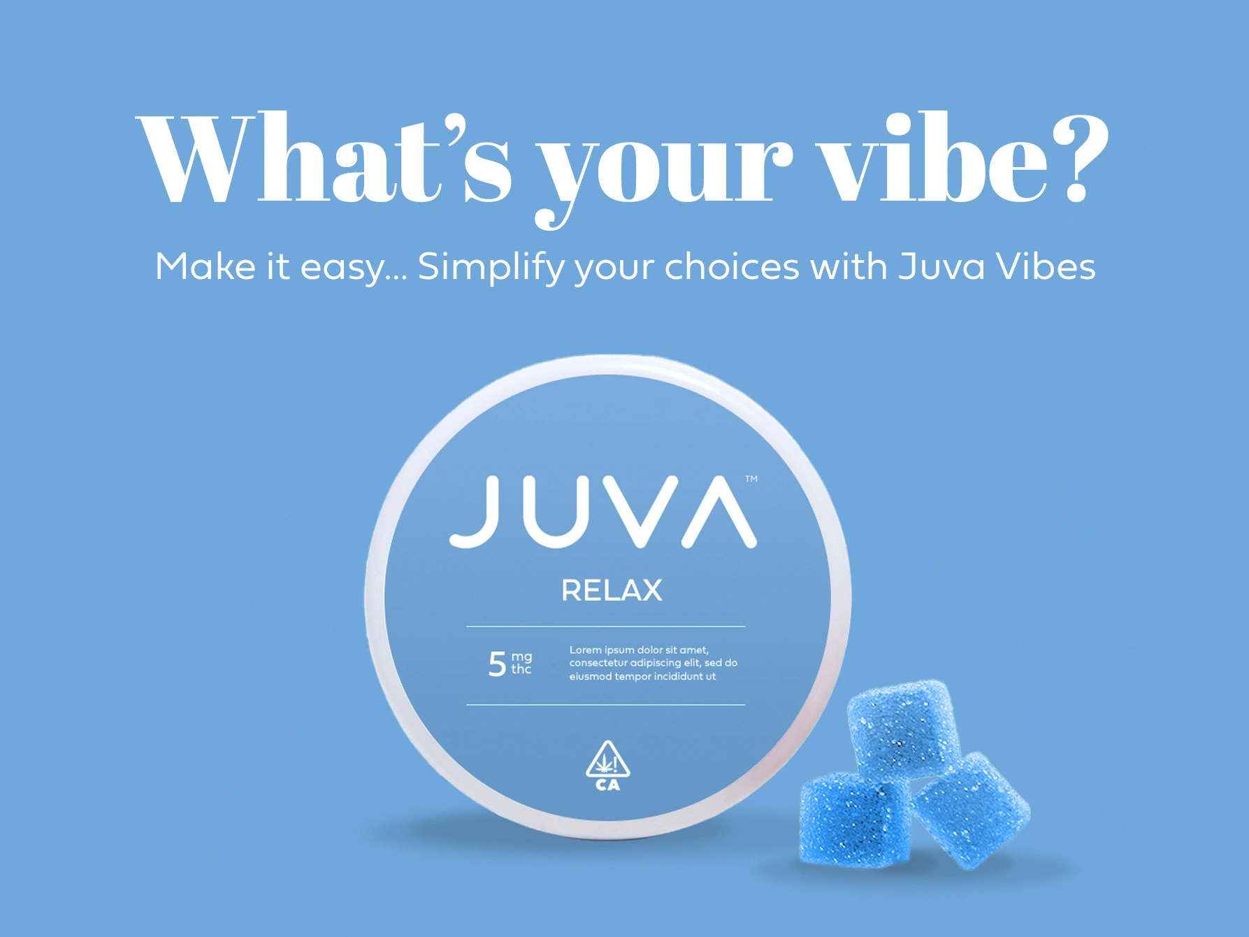
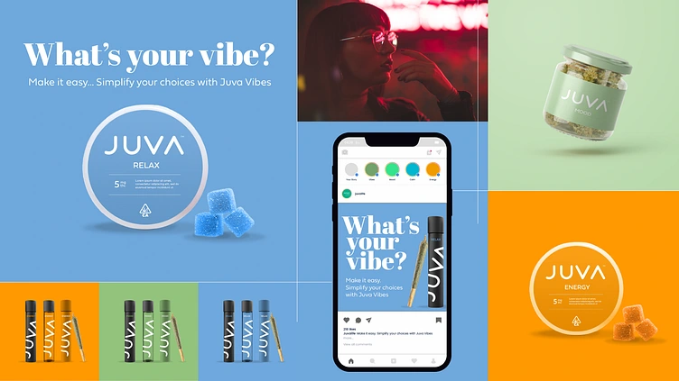
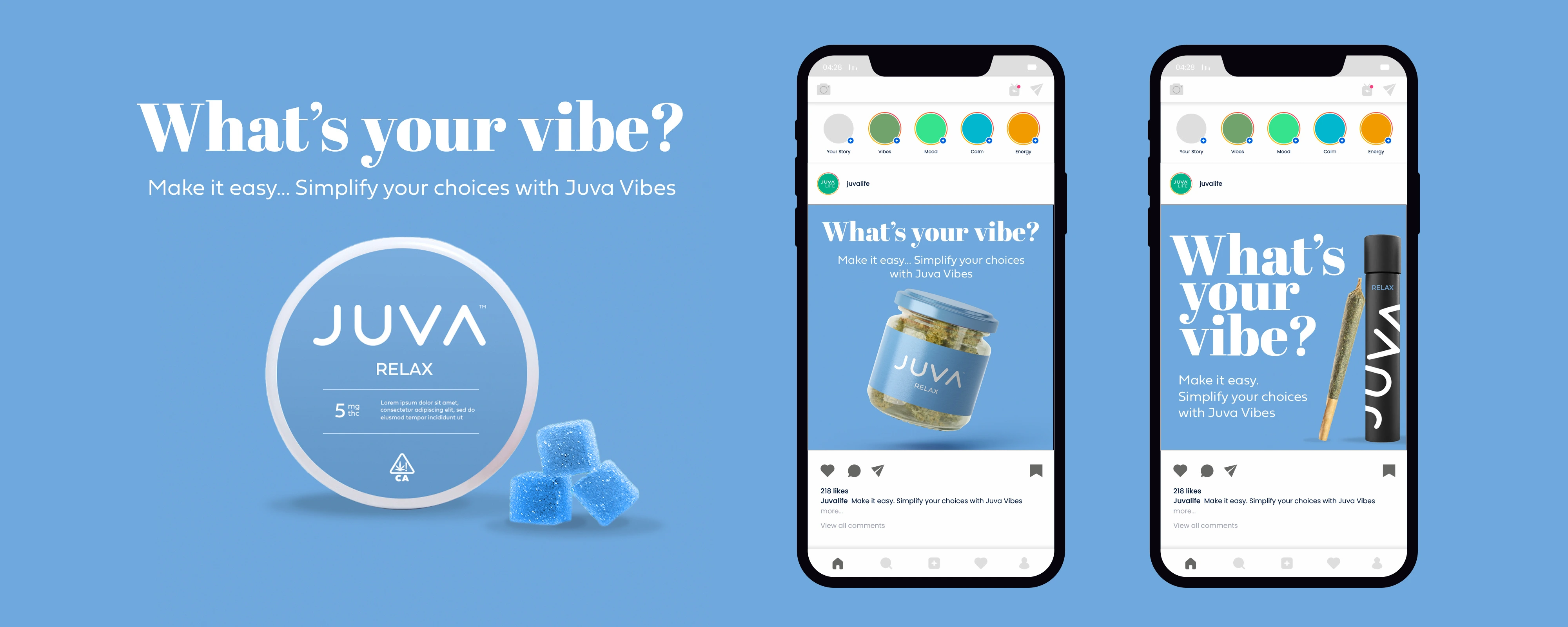
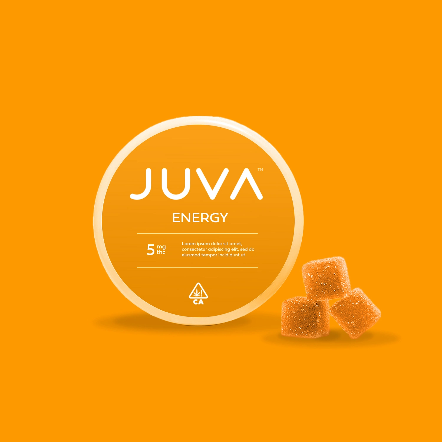
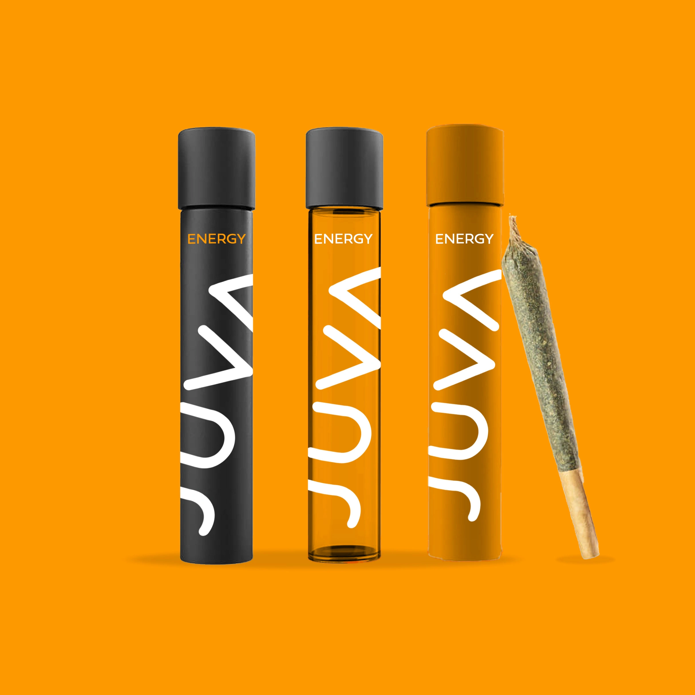
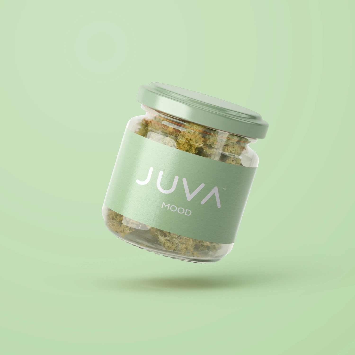
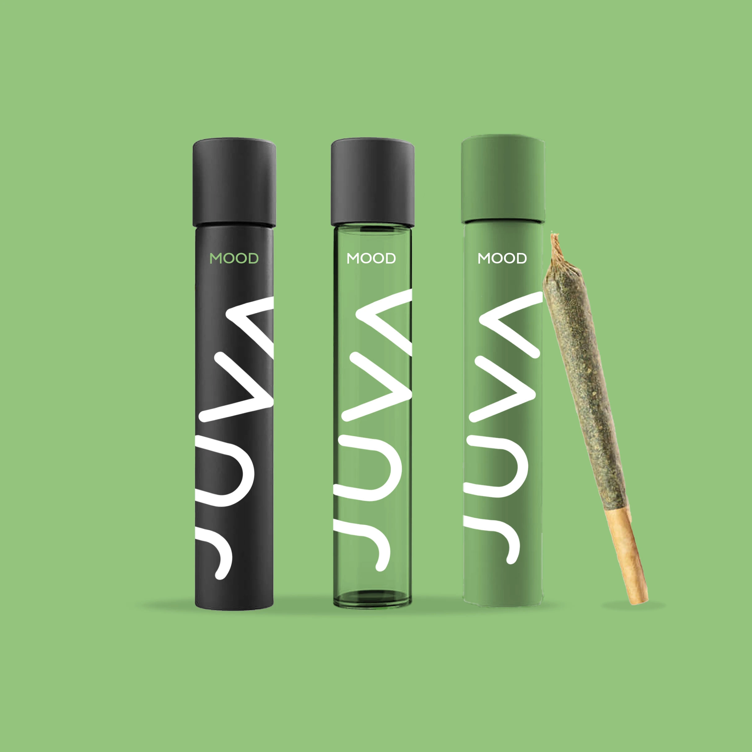
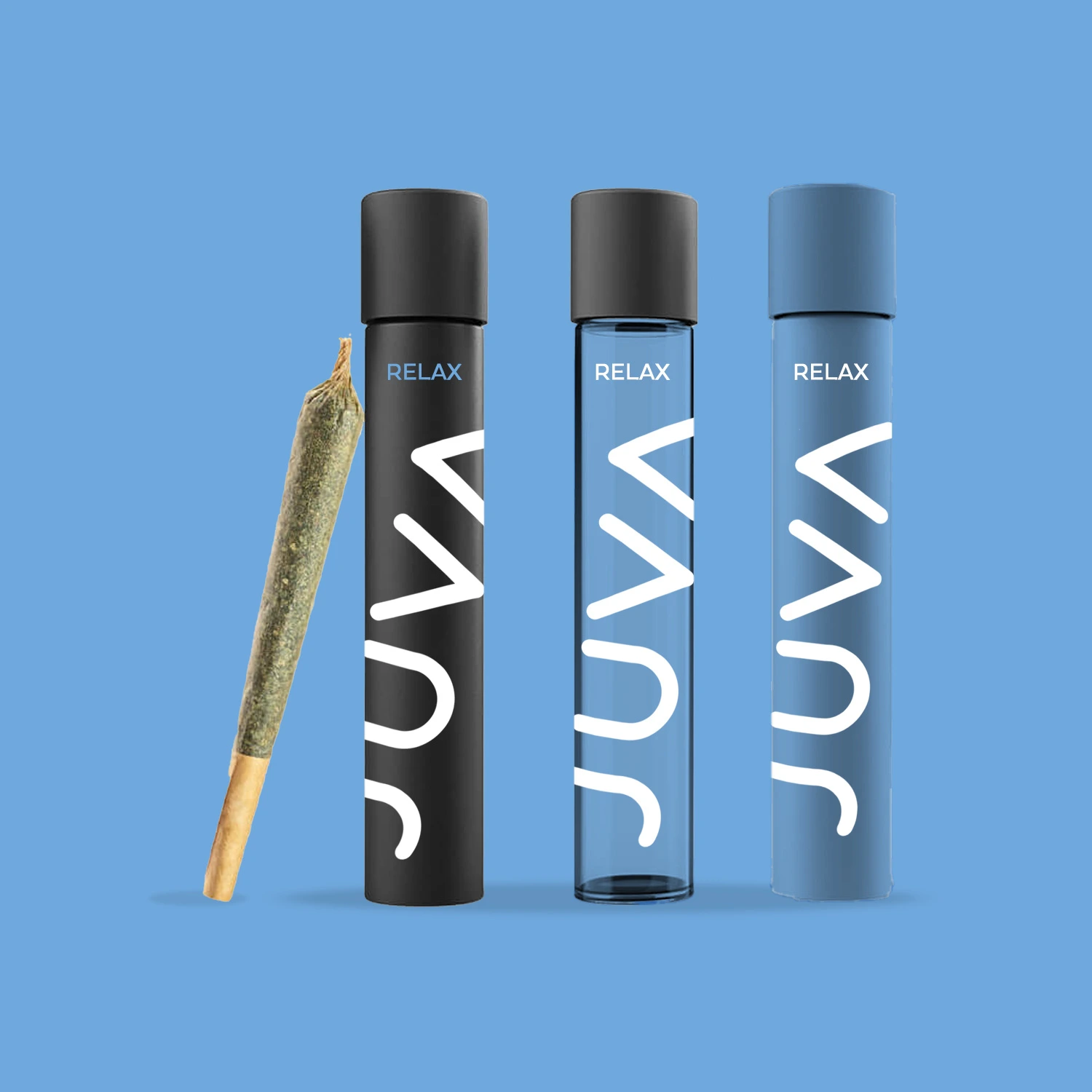
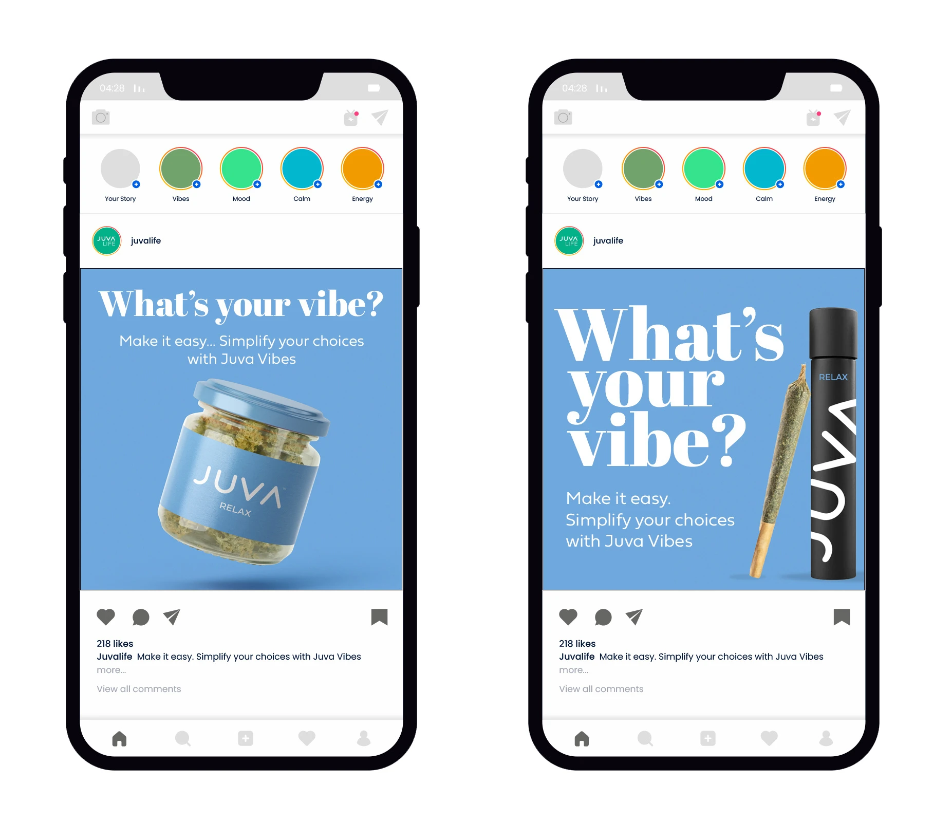
I was tasked with a packaging design project for a cannabis brand, Juva Life. I proposed simplifying their product line to describe them as “vibes” for their flavors. “Mood,” “Relax,” & “Energy”.
Strains can get VERY confusing to the everyday consumer. I know I get confused. So, let the customer choose their vibe. Get simple, and get stupid. (Sorry, weed joke.) To complement the simplicity of the product line, I simplified a design theme with bold primary colors and subtle fonts. Some cannabis brands can get pretty trippy and melty (not a great description, but appropriate), so this is an excellent visual contrast on a shelf amongst the melted unicorn mushroomed graphics…
This brand experiment is part of my new awareness project on my packaging design services for the wine, spirits, and cannabis industry.
Like what you see? Idea Circus can help create a brand, identity, and packaging for your product that can be built fast, on time, and on budget.
Creative can be a circus. Let us help.
Cheers
Greg
Idea Circus 💡 🎪
Like this project
Posted Apr 16, 2025
I was tasked with a packaging design project for a cannabis brand, Juva Life. I proposed simplifying their product line to describe them as “vibes”.