
About the project:
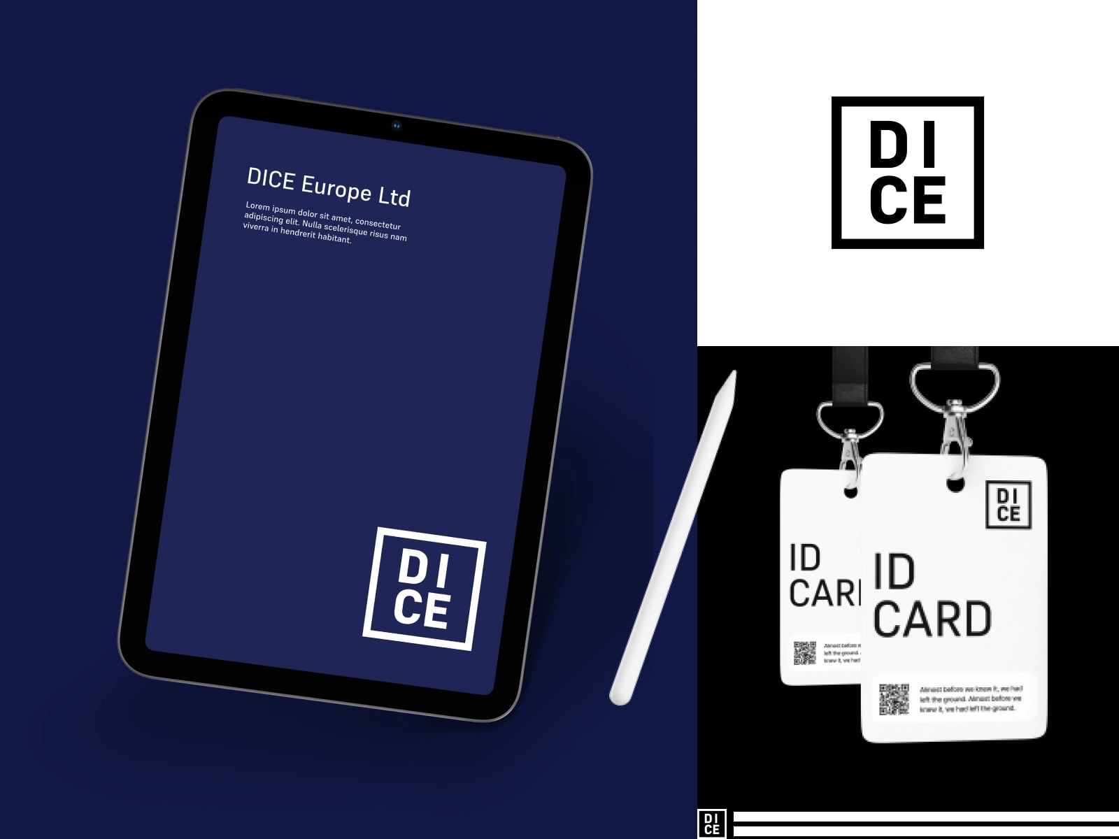
Dice is an import-export trading company that distributes fresh produce and soft goods. The goal of the project was to modernize the current brand. The client required a minimalistic and clean style that could work across all types of applications such as websites, email, invoice signatures, business cards, product packaging, and social media profiles.
The task:
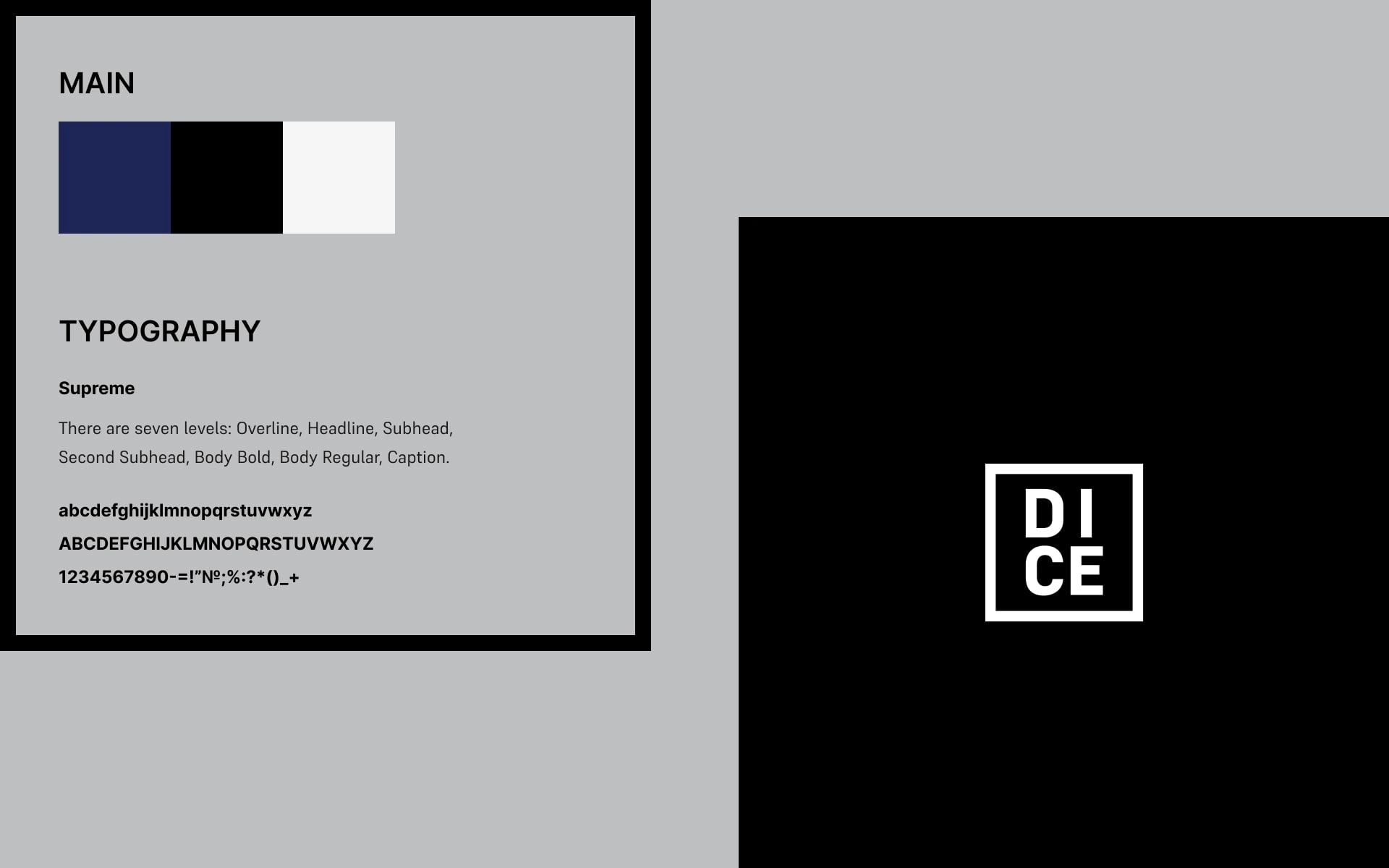
The owner of DICE told us his basic desires and vision for branding. The main points were touse a simple color palette, fonts and design, and to emphasize effective minimalism.. The logo has no additional visual elements. It is simple text on a white background or vice versa.
Style:
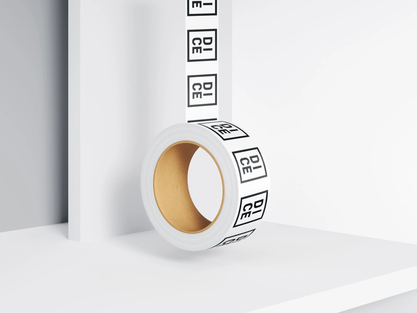
The logo is the brand name with a simple, bright line curved across it to form a square. The line creates a border for the letters. The black and white logo is a win-win because it looks restrained and stylish at all times.

The result:
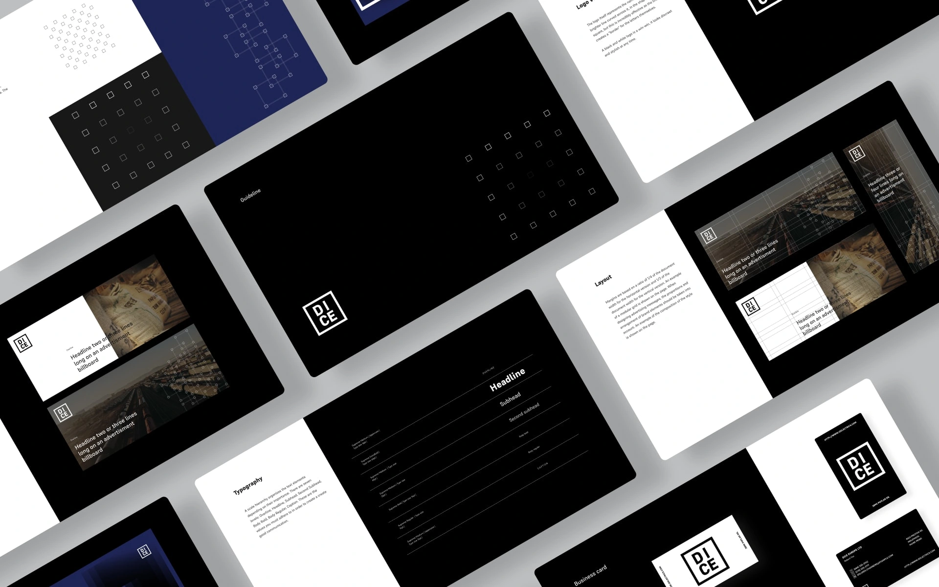
Our team researched the market, competitors and audience. In order to make a logo effective you should stick to the simplest solutions and make it relevant to the brand, giving it personality so it sticks in people's minds.
0 likes · 18 views · Nov 7, 2023
Dice is an import-export trading company that distributes fresh produce and soft goods.


