Onclusive - Media Monitoring
Ali Dabbouk
Here is how the old dashboard looked like:
After conducting qualitative research. Here are some of the main pain points clients had:
Some users prefer to select to all contacts to add them into Email list and create advertising campaigns.
It was difficult for some users to interact with the contact as it was overwhelming. As well as, most clients addressed that they want to see more contacts per page
Searching for contacts was really difficult for most users as it was really confusing for them. Especially the UX writing of the options.
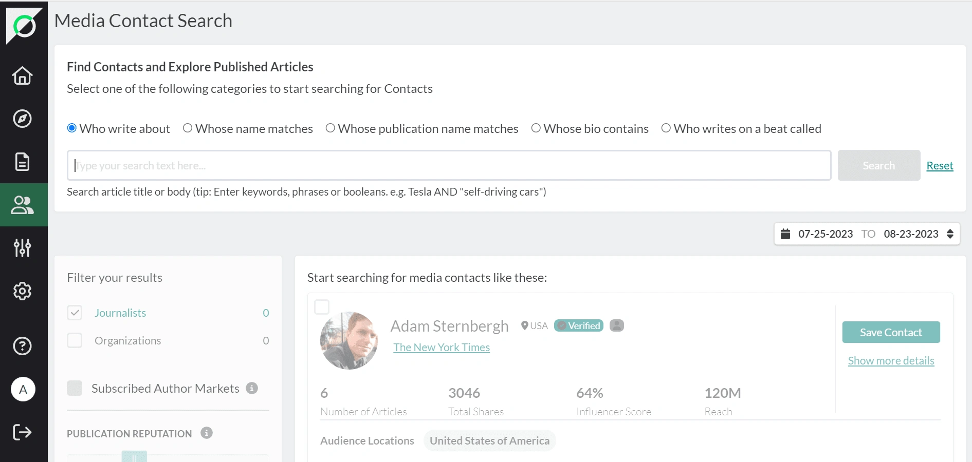
Here is what the new platform looks like after modernising with a new integrated design system.
The new design shows a better " search engine " and more contacts with relevant information.
Like this project
Posted Jun 14, 2024
I revamped the contact search page into a modern interface that allows users to easily navigate contacts and add them to pitch lists and email campaigns
Likes
0
Views
16