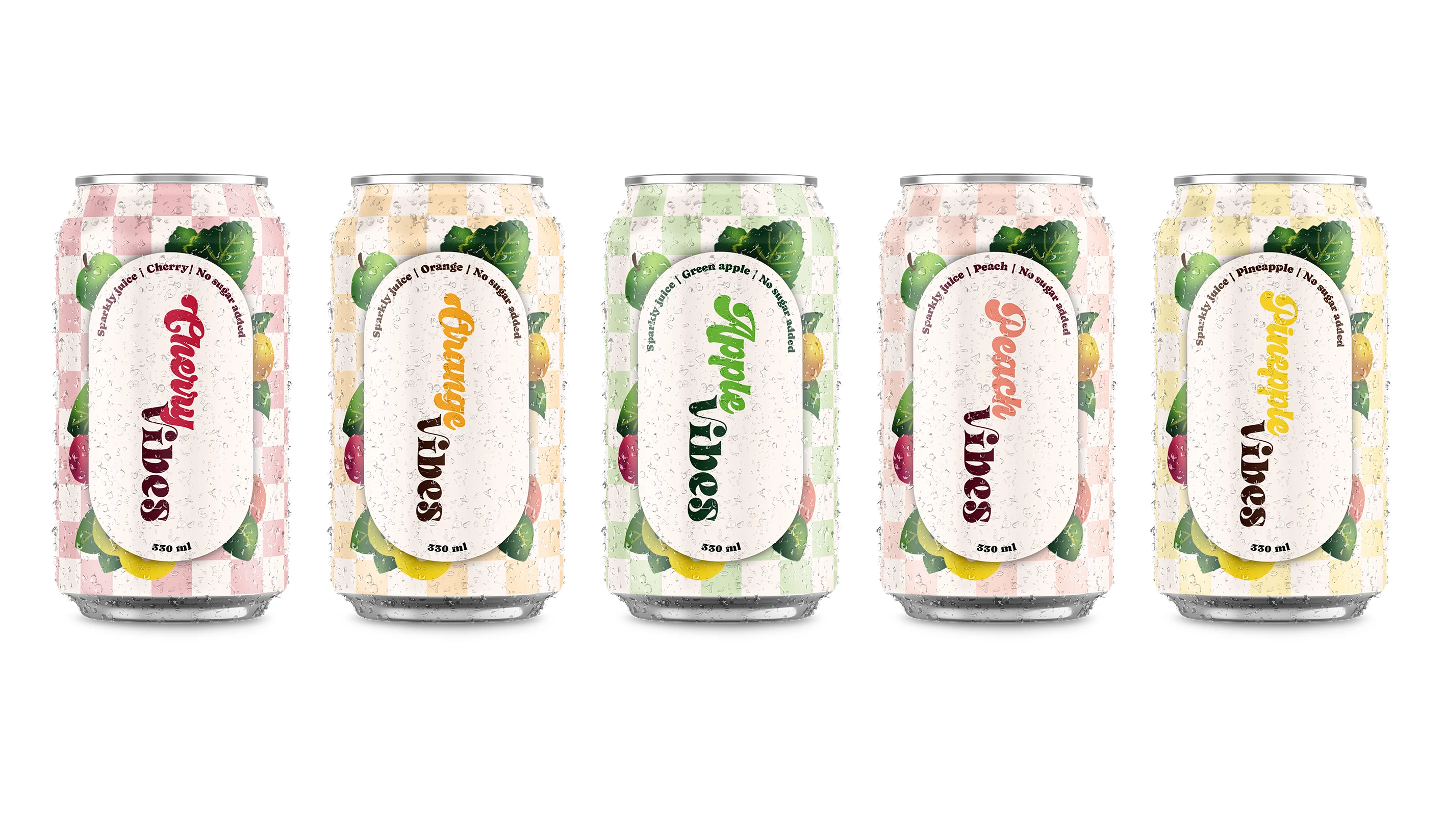
Juice Packaging Redesign
Maria Papoiian
The Challenge
The goal was to redesign an existing juice packaging to connect with a younger audience, specifically Generation Z. While the original design had an interesting concept, it appeared messy and lacked the vibrant, clean look needed to appeal to this demographic. The main task was to create a design that conveys a sense of freshness, naturalness, and a great taste.
The Solution
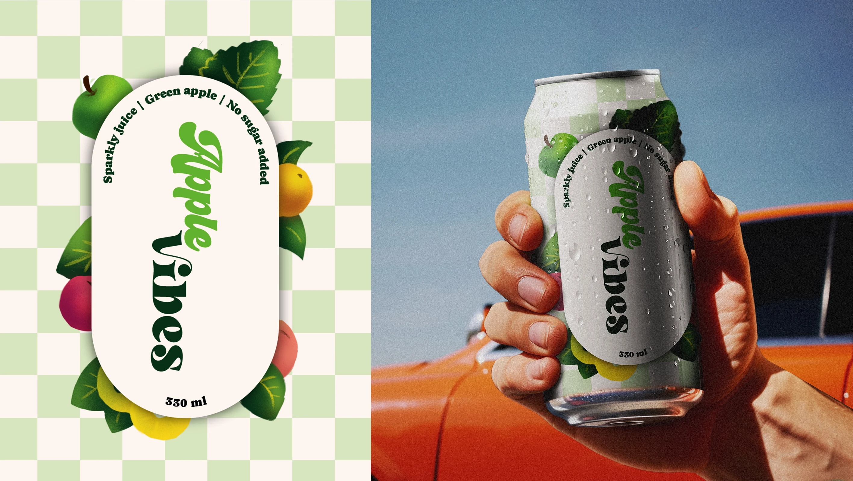
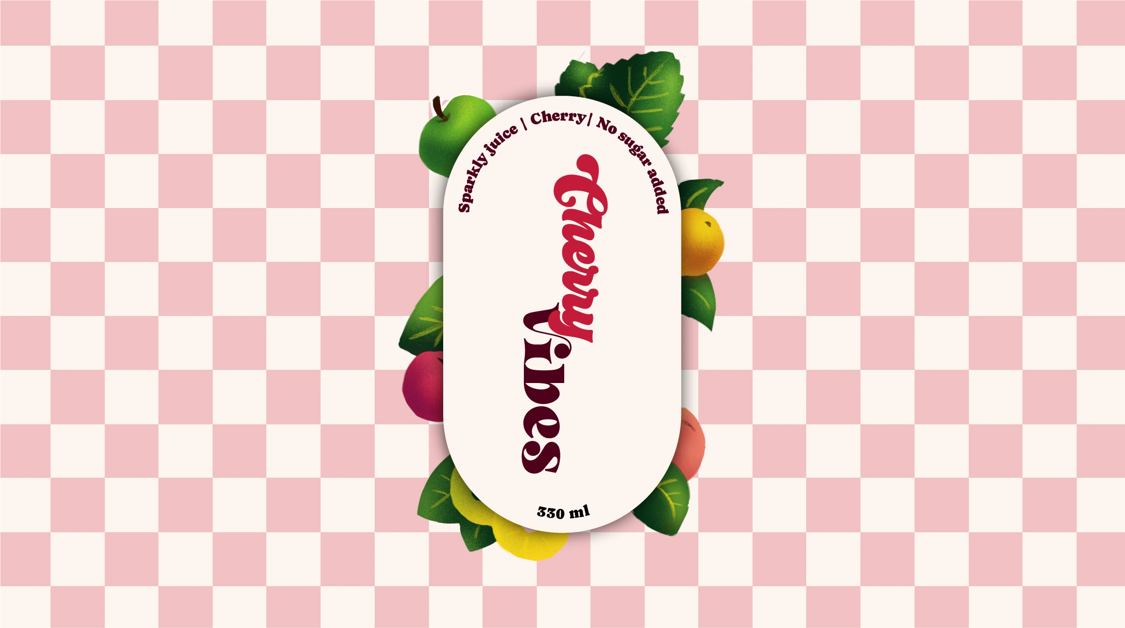
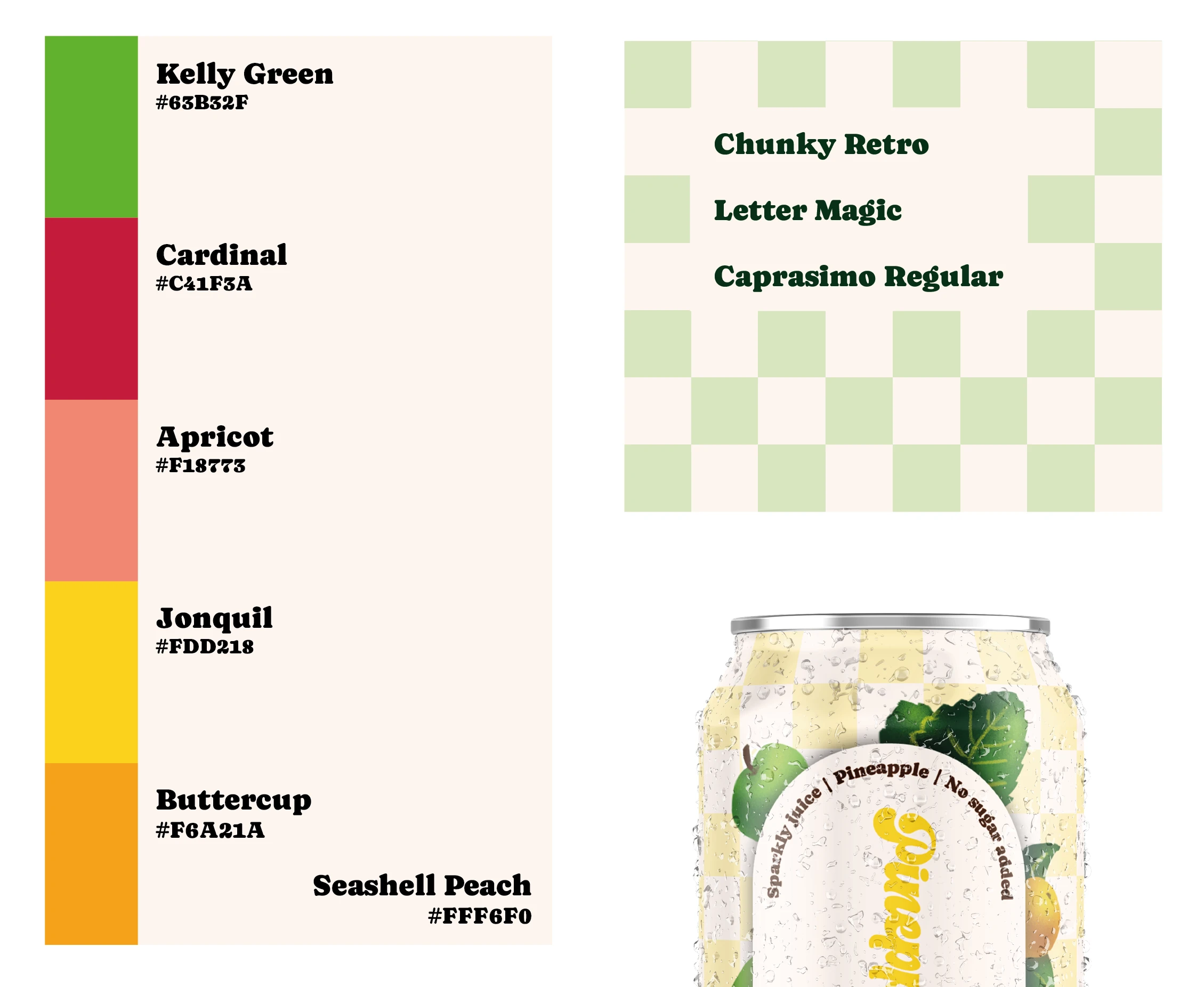
I created a new, modern color palette and typography that reflects the mood of the brand. To make the brand more dynamic and unique, I developed hand-drawn illustrations that highlight the naturalness of each flavor. The composition was revised to be more cohesive and visually appealing to the target audience.
The Result
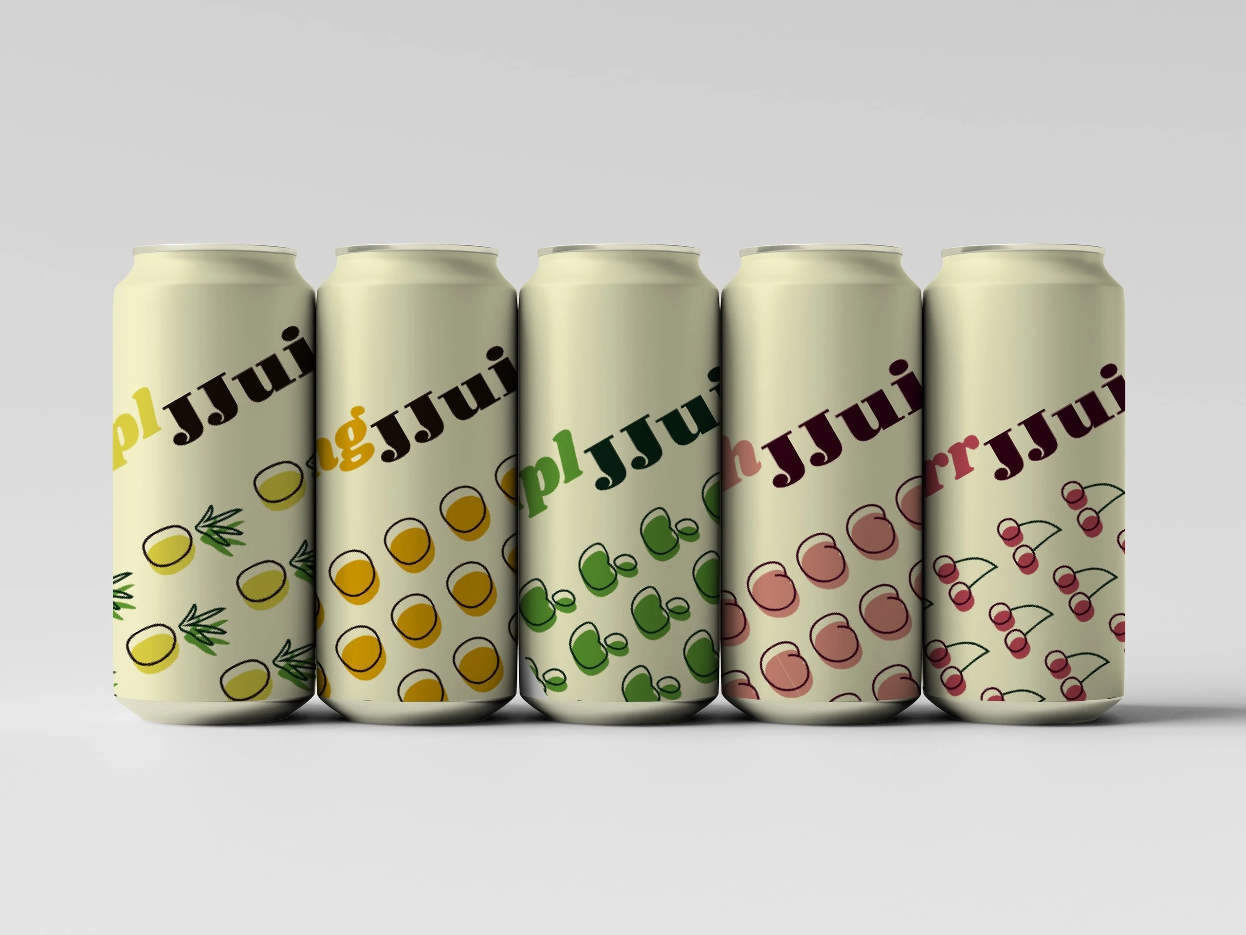
The new packaging is a fresh and vibrant take on the brand. It successfully captures the essence of great taste and natural ingredients, creating a strong and memorable visual identity that resonates directly with the modern, youth-oriented market.
The original design suffered from poor readability and a dull color palette, making it difficult for the name to fit on the can and stand out on the shelf.
The updated design features a vibrant, modern aesthetic with improved typography and a clear composition, ensuring the product is easily recognizable and appealing to its target audience.
The "Before" Design
Like this project
Posted Jul 14, 2025
A fresh summer project born from the redesign of one of my older works. An experiment in typography, retro vibes, and juicy colors.