Travel Opodo / Logo Animation

Omar Jabr


Travel Opodo
Logo Animation
Overview
I created a logo animation for a fictional company. It's simple yet has an interesting concept: a plane takes off and moves through the logo. I also played around with the letters to make them lively, dynamic, and visually appealing.
The Challenge
A logo with two similar sections can feel repetitive if both sections move in the same way. The second half might seem like a copy of the first instead of a thoughtful choice.
The Process
Two versions of the logo's second section were created: one copied the first section's drag-and-follow-through style, and the other was intentionally simple, with clean letters and no rotation or drag. The second version was chosen as the final design, allowing each part of the logo to have its own identity instead of mimicking the first.
The first version
The second version
The plane's motion taking off through the logo connects both styles into one idea, making the difference look deliberate rather than random.
The key moment is the follow-through on the letters with drag. The secondary motion that trails the main movement gives them a physical feel instead of just looking repositioned.
Behind the scenes
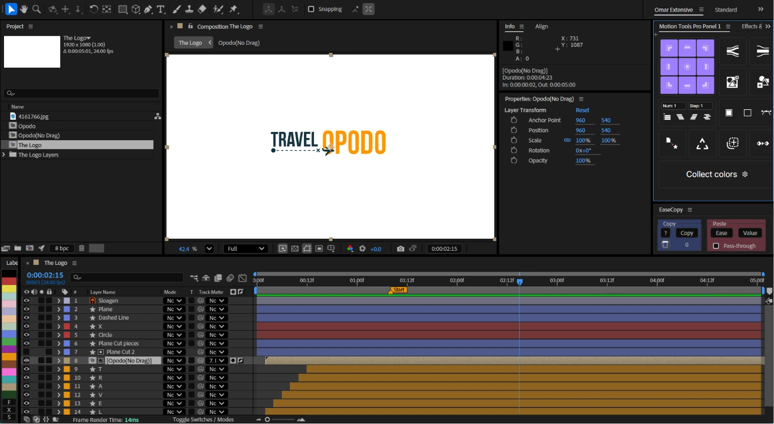
Inside After Effects
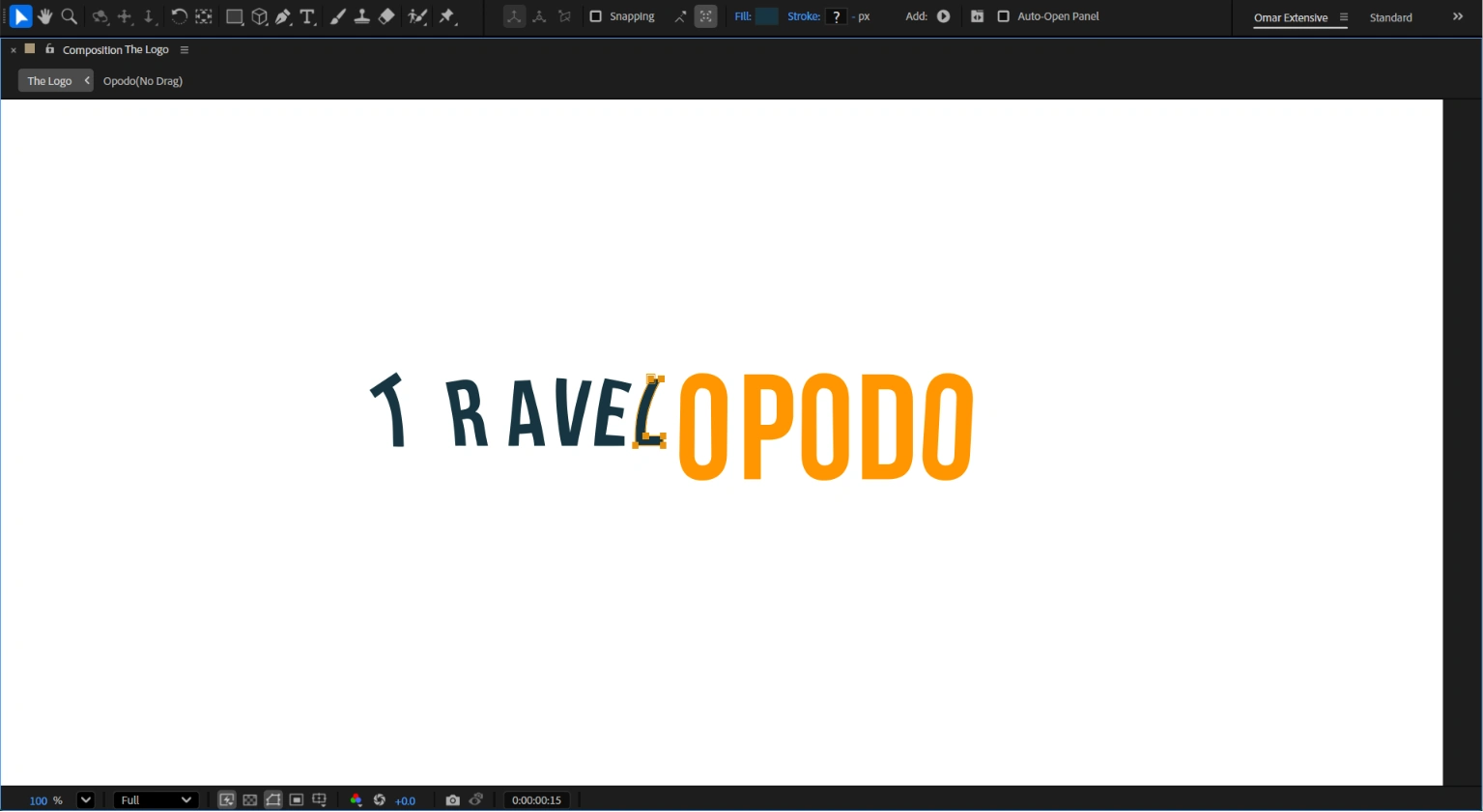
Letters Drag and offsetting
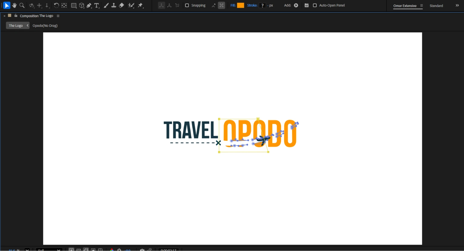
Msking the Plane Cut
Credits
Design & Animation: Omar Jabr
Tools: After Effects, Illustrator.
Like this project
Posted Jul 6, 2026
Created a dynamic logo animation featuring plane movement. I played around with the letters to make them lively, dynamic, and visually appealing.
Likes
1
Views
6
Timeline
Jul 25, 2024 - Jul 29, 2026