Web3 Brand Identity Design for Traxspro

Tobi Victor



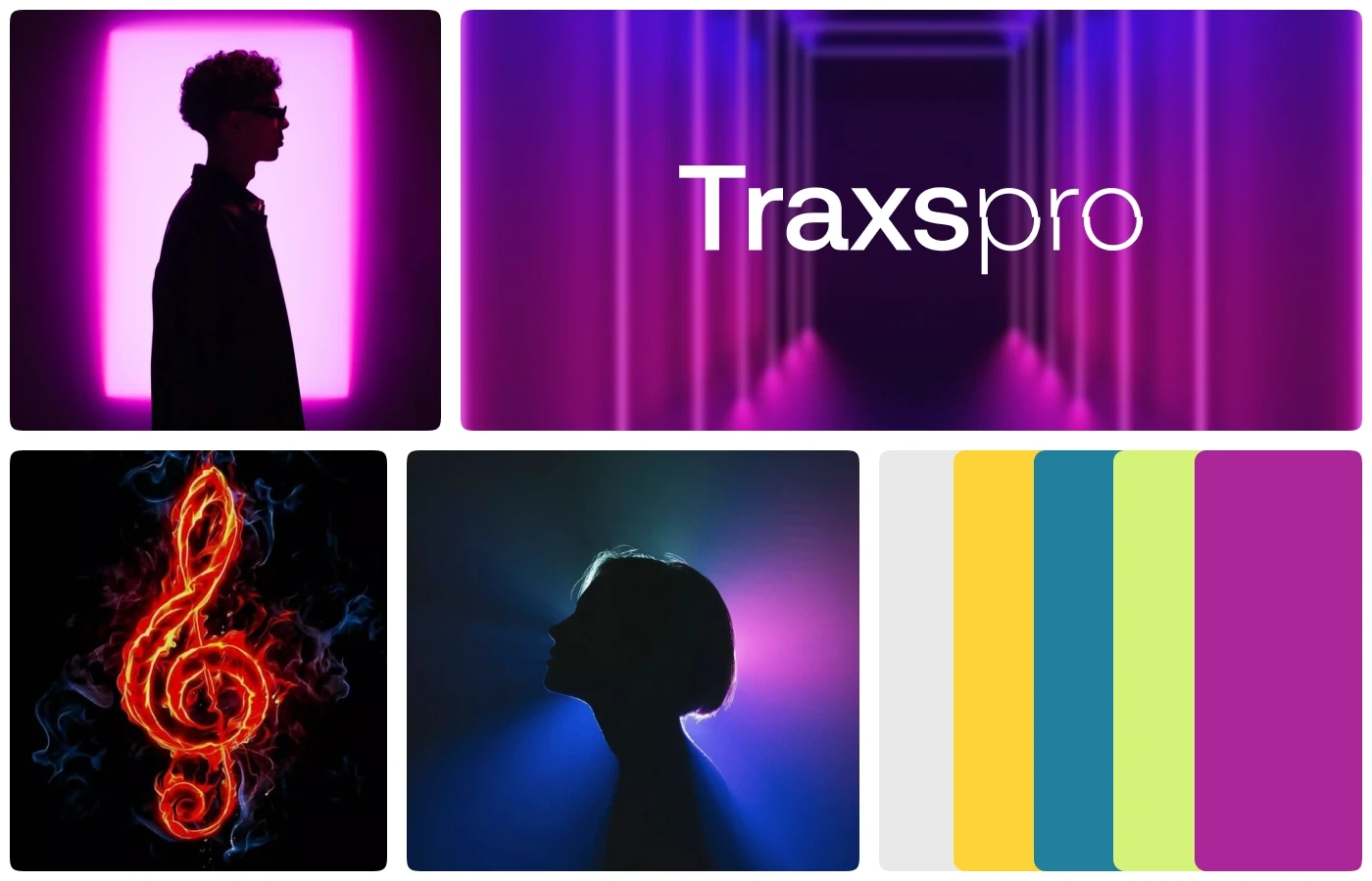
Visual board
Refined, strategic web3 brand identity packed with simple meaningful symbol
The name Traxspro reflects the fusion of "Trax" (short for tracks, representing music) and "Pro" (professionals), symbolizing our mission to support artists in turning their passion into a professional and sustainable career.
Traxspro was born from the realization that independent musicians often lack the tools to sustain their careers. The idea emerged from observing how artists juggle creativity with administrative burdens, miss out on digital income opportunities, and struggle to connect with fans meaningfully. Our goal is to provide a system that simplifies their workload and helps them thrive.
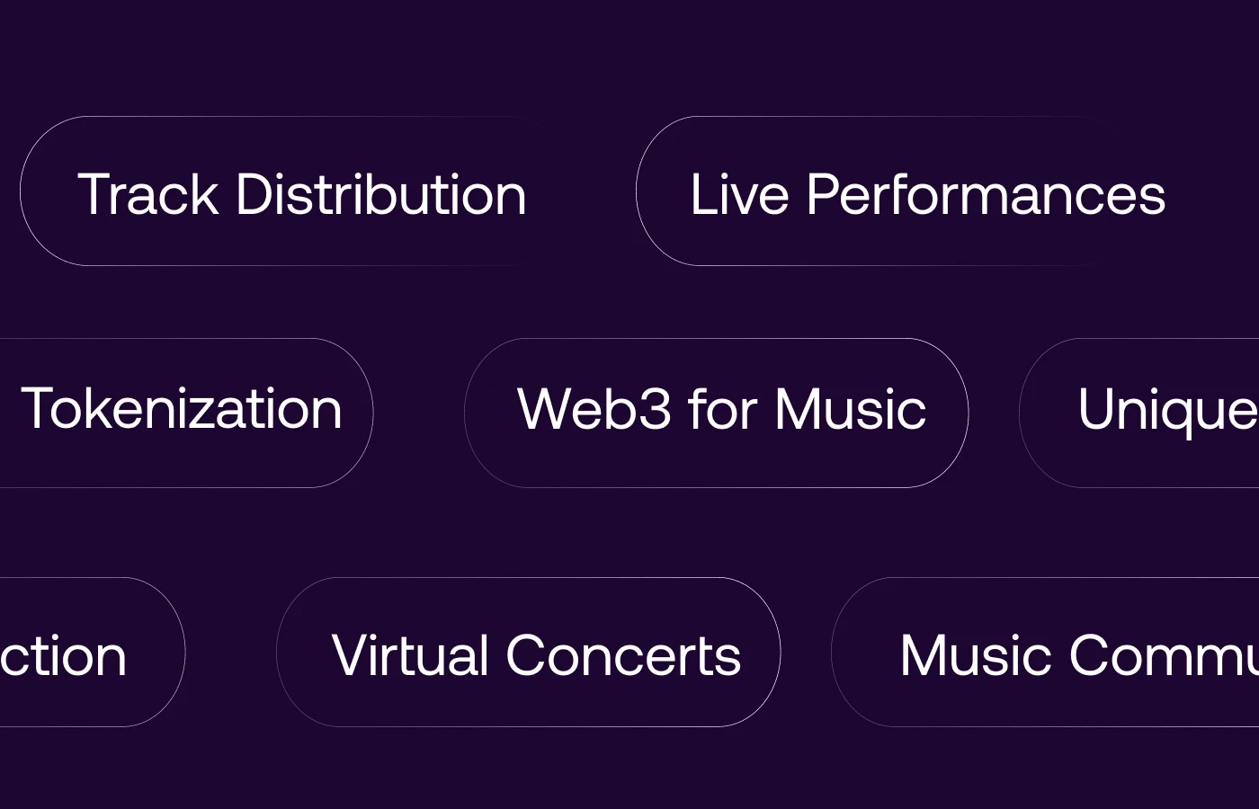
Core Values
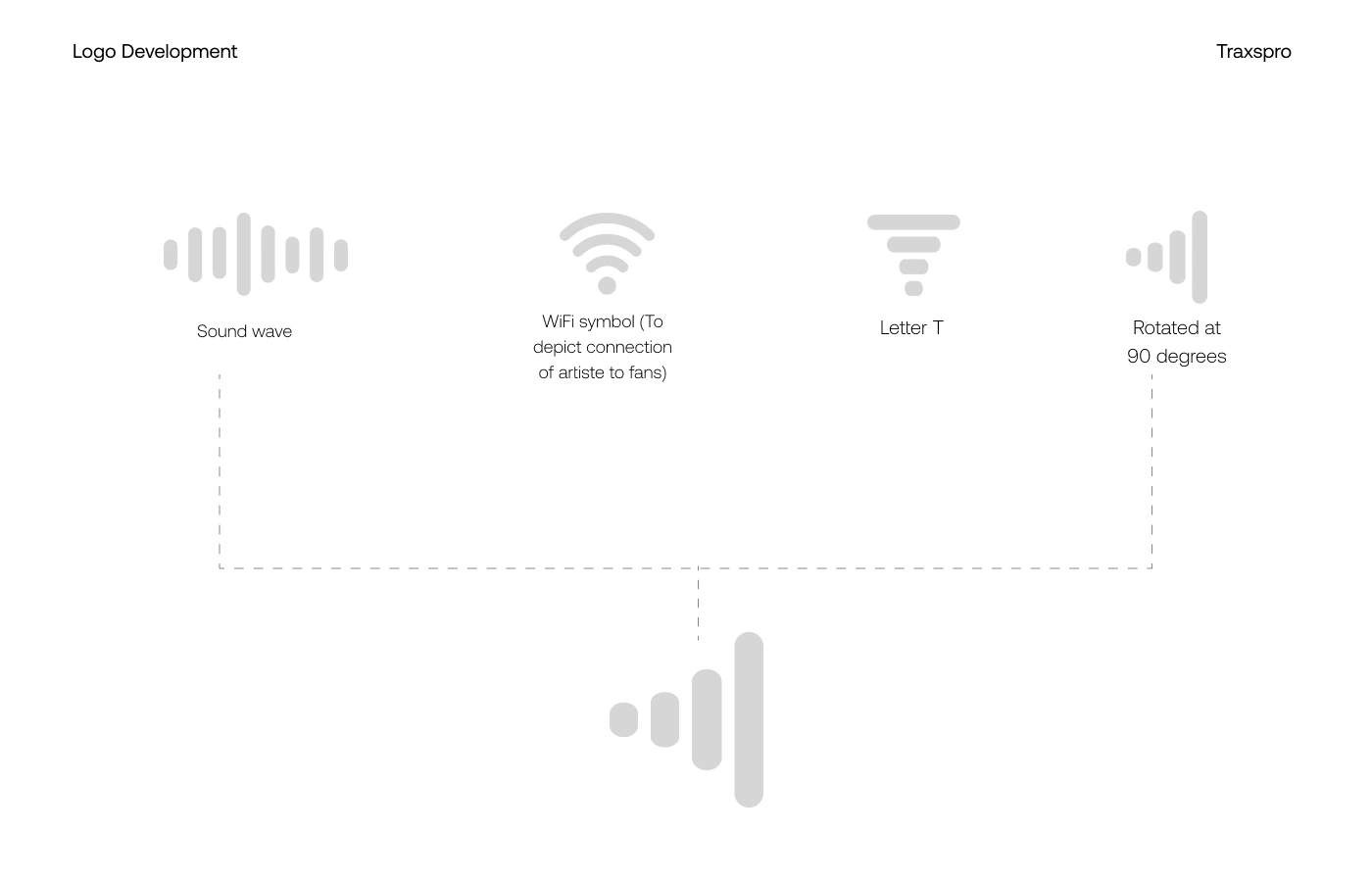
Designing an identity that depicts Connectivity, Growth and Togetherness
At the heart of the brand identity is the Traxspro submark - a symbol that embodies the brand's sole as a web3 music distribution platform
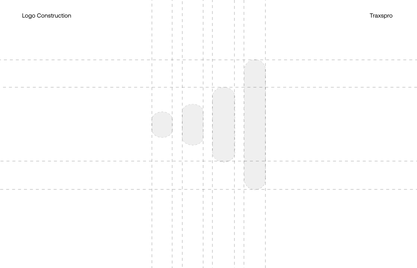
A. Soundwave
A stylized soundwave shaped like a rising graph stylized moving vertically.
B. Wifi Symbol
A wifi symbol to depict the connection of the artiste directly to it's audience
C. Letter T stacked
The first letter of the Name; which is Traxspro was stylized appropriately to have a unique feel of the identity
D. Rotated at 90 degrees
Finally rotated at 90 degrees to feel the movement and growth of every artiste on ourplatform

Color Pallete
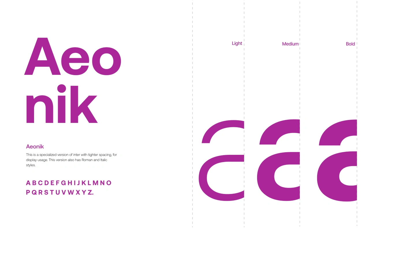
Tyoography

Type Construction
At Traxspro, our color palette isn’t just about aesthetics — it’s rooted in meaning, emotion, and mission. The primary colors we chose are Purple and Baby Green, and together, they capture the heart of our brand: creative freedom, financial empowerment, and futuristic innovation.

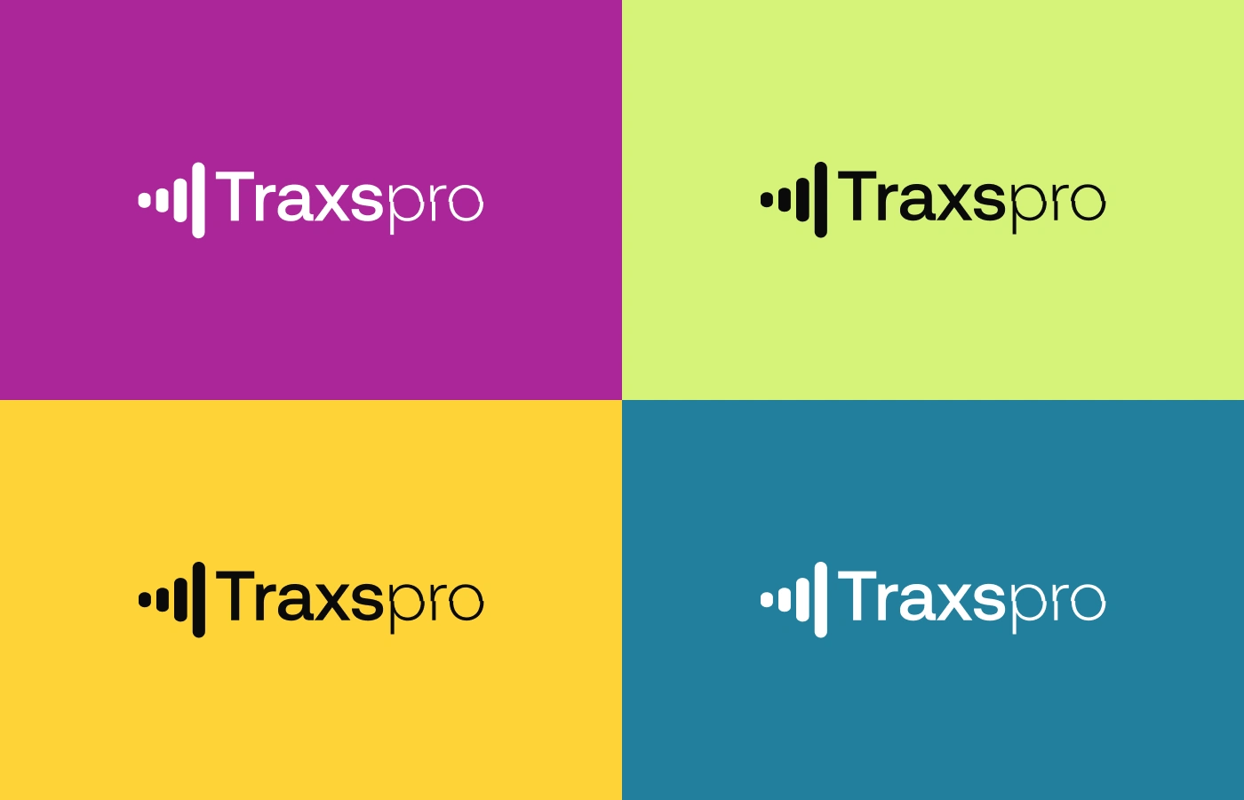
Logo Variations

The Logo

Favicon
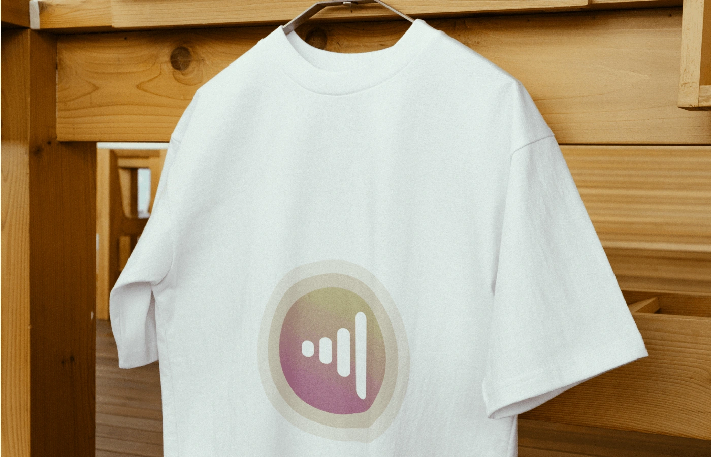
Tshirt Mockup
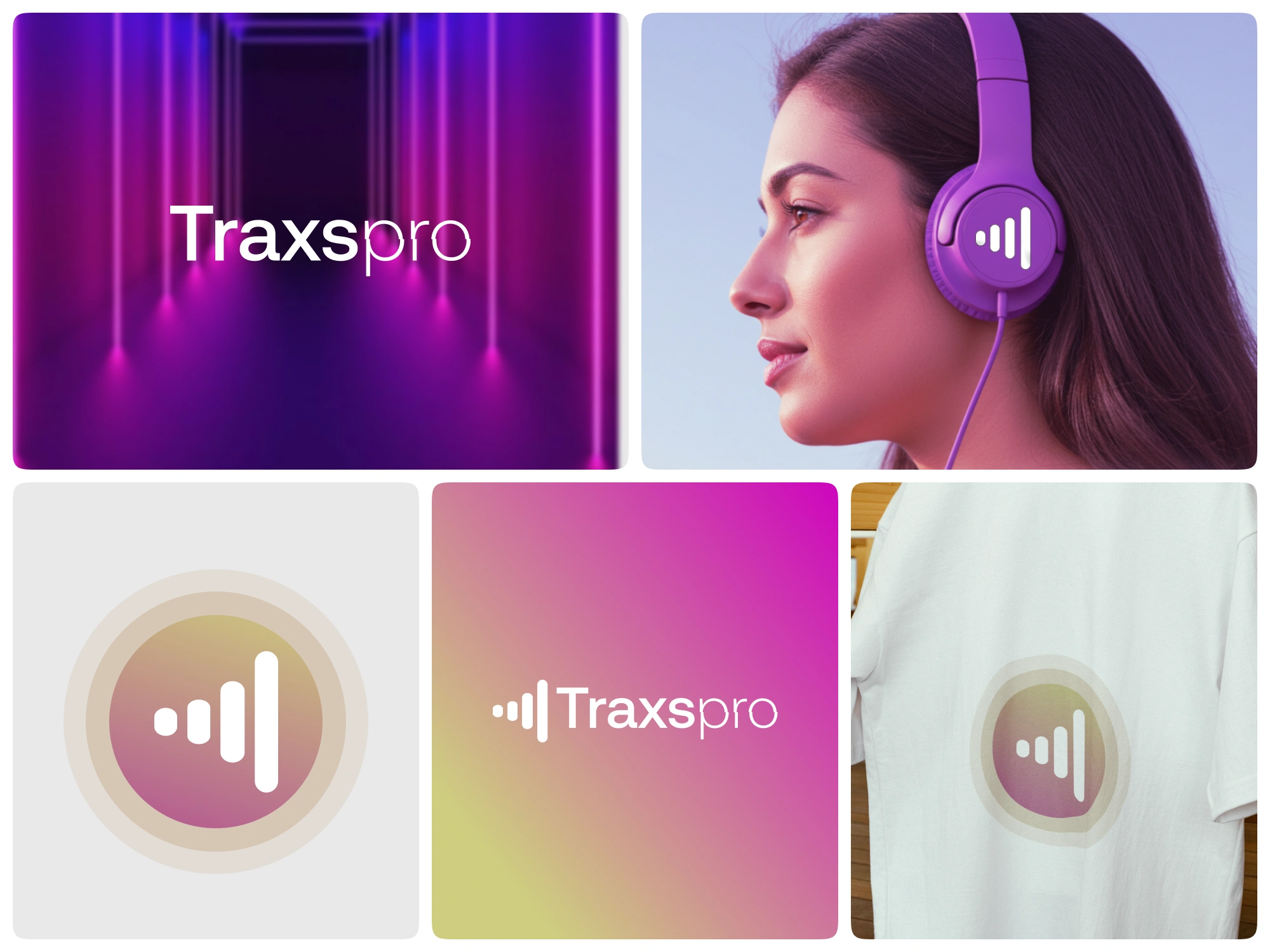
Bento grids
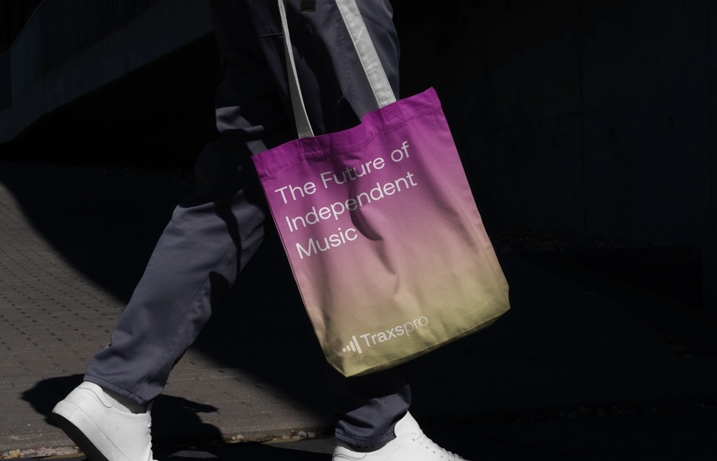
Tote bag mockup
Loading this content connects you to Behance.
Behance privacy informationLike this project
Posted Jul 8, 2025
Created a web3 brand identity for Traxspro, focusing on connectivity and growth.
Likes
2
Views
11
Timeline
Feb 13, 2025 - Mar 12, 2025