
PROJECT OVERVIEW
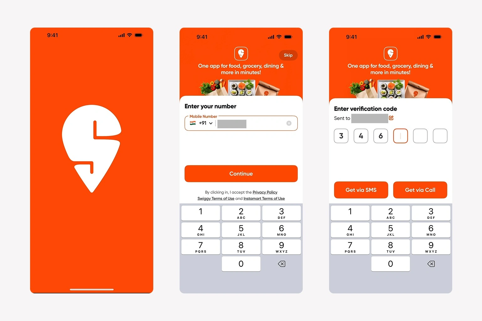
A visual UI study of the Swiggy onboarding journey, covering a splash screen, mobile-number entry, and verification-code entry. Presented as a portfolio design study, not commissioned work for Swiggy.
DESIGN FOCUS
The screens use a strong orange brand presence, white form panels, large primary actions, and a consistent mobile layout. The phone-entry and code-entry stages make the next action visible while keeping supporting information secondary.
WHAT IS SHOWN
• Three mobile interface screens
• Form and verification input styling
• Button hierarchy and keyboard context
This showcase demonstrates visual interface design. It does not claim a shipped app, user-testing findings, or measured conversion improvements. Swiggy branding belongs to its respective owner.
Need a focused onboarding flow for your product? Message me with the screens and user journey you need.
0 likes · 0 views · Nov 17, 2026
A three-screen UI study exploring splash, phone entry, and verification screens for a food delivery app.