A landing page doesn’t have

Amir Ostowar


A landing page doesn’t have to be complicated to feel premium.
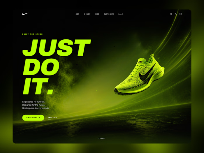
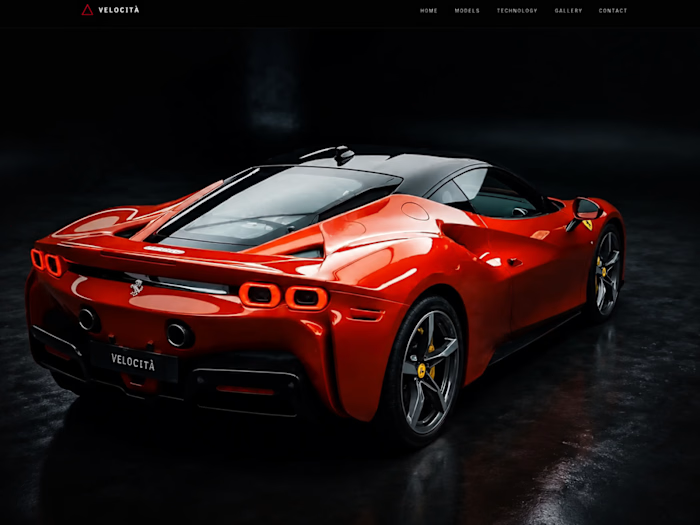
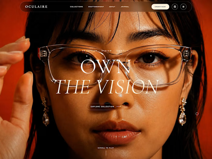
For this hero section, I focused on creating a balance between strong visual direction, clean UI, and a clear call to action without letting the visuals take over the experience.
The goal was simple:
Make the first impression memorable
Keep the message clear
Build a layout that feels modern and intentional
Make it feel alive through subtle motion and interaction
I also paid close attention to how the hero adapts across screen sizes, because a design that looks great on desktop shouldn’t fall apart on mobile.
Built with a focus on modern web design, interaction, and performance.
What do you think would you click the CTA? 👀
#WebDesign #UIUX #FrontendDevelopment #WebDevelopment #LandingPage #UIDesign #CreativeDevelopment #AI
Like this project
Posted Sep 1, 2026
A landing page doesn’t have to be complicated to feel premium. For this hero section, I focused on creating a balance between strong visual direction, clean ...
Likes
0
Views
4