Chair Exercises for Seniors
Hamza Munir
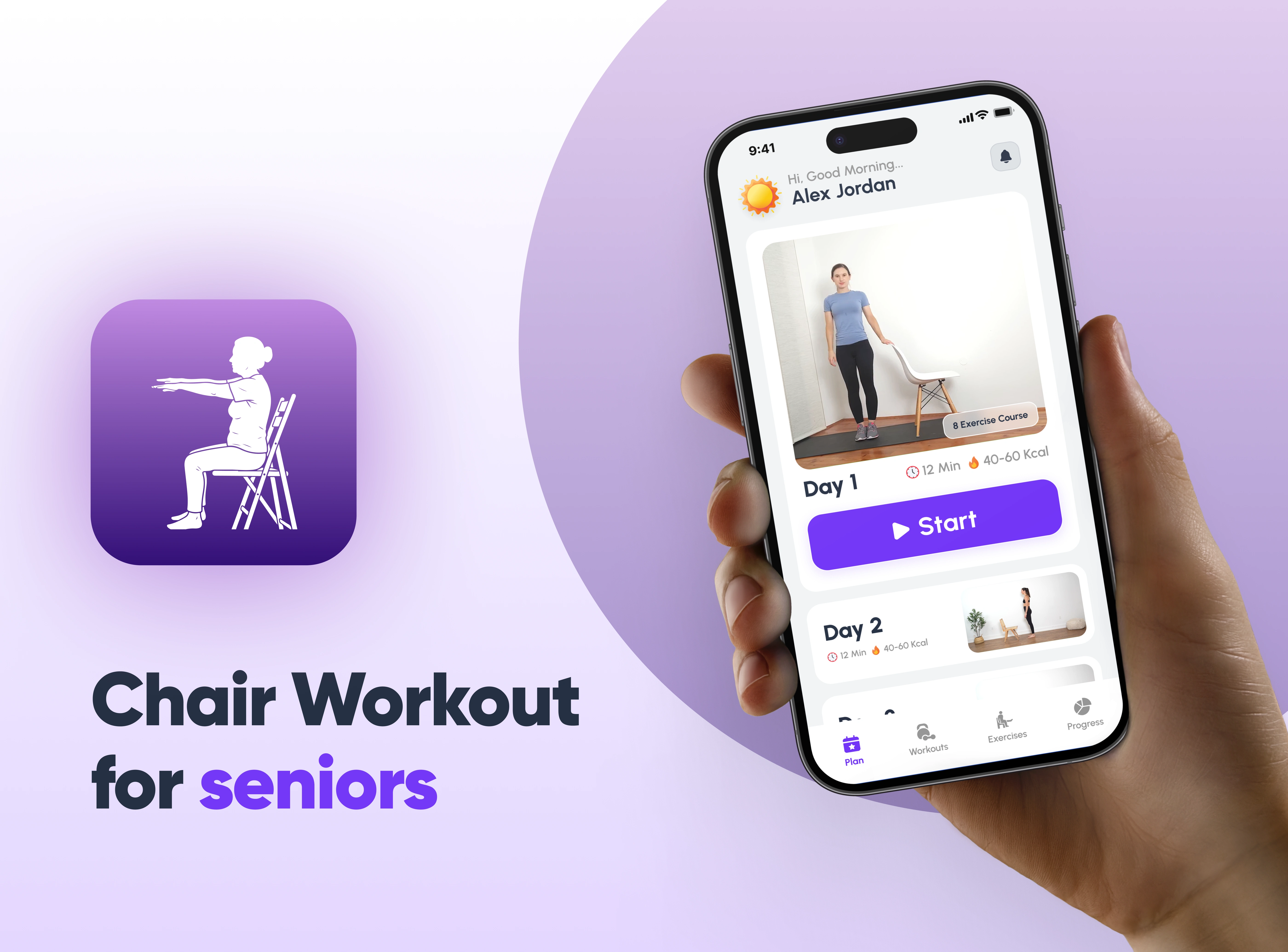
Chair Workout for Seniors
Reimagining senior fitness through accessible, chair-based workouts built with empathy.
The Challenge
Fitness apps are typically designed for speed, intensity, and high physical performance.
But seniors don’t need intensity.
They need safety.
Clarity.
Confidence.
Most workout apps today:
Use small typography
Overload screens with information
Assume full mobility
Prioritize aesthetics over accessibility
For many older adults, this creates friction instead of motivation.
At the same time, traditional workout routines are often not suitable for seniors with:
Limited mobility
Balance concerns
Joint stiffness
Lower back pain
Recovery needs
The real problem wasn’t fitness.
It was usability and physical accessibility.
This project was built around one core belief:
Seniors deserve a fitness experience designed for them not adapted for them.
My Role
Lead UX Designer · Researcher · Product Strategist
Fully reimagined product experience
Mobile App + Web Landing Page Ecosystem
I led:
User research & behavioral analysis
Accessibility-focused UX strategy
Information architecture
Interaction design
Visual system decisions
Product positioning
Landing page experience strategy
Research & Behavioral Insights
Before designing the interface, I focused on understanding how seniors interact with digital products and fitness routines.
Key Observations from Senior User Behavior:
1. Visual Strain & Reduced Precision
Smaller fonts increase cognitive fatigue.
Low contrast reduces readability.
Small tap targets cause hesitation and mis-taps.
2. Slower Interaction Patterns
Seniors take more time to process instructions.
Complex navigation structures increase abandonment.
Too many choices create overwhelm.
3. Fear of Injury
High-intensity workout visuals can discourage participation.
Standing-only exercises exclude limited mobility users.
Unclear modifications reduce trust.
4. Emotional Drivers
Seniors value independence.
They want reassurance, not pressure.
Encouragement works better than competition.
This led to a major insight:
The problem wasn’t motivation. It was confidence and clarity.
Accessibility Strategy
This product was intentionally designed around physical and cognitive comfort.
1. Large Typography
Large font sizes were not a stylistic decision they were functional.
Improved readability without zooming
Reduced eye strain
Clear hierarchy between titles, instructions, and actions
Better comprehension during live exercise sessions
Typography was treated as an accessibility tool, not decoration.
2. Bold, High-Visibility Buttons
Seniors often struggle with:
Small tap targets
Low contrast elements
Hidden primary actions
To solve this:
Primary CTAs use bold shapes and high contrast
Large tap areas reduce motor friction
Clear “Start” and “Continue” buttons remove hesitation
Rounded buttons feel softer and more inviting
Every major action is visually obvious.
No hidden gestures.
No tiny icons.
No unnecessary complexity.
3. Chair-Based Exercise Focus
Instead of adapting traditional workouts, the entire system was built around:
Seated workouts
Supported balance movements
Low-impact routines
Gentle mobility improvements
This removes:
Fear of falling
Fear of overexertion
Physical intimidation
The chair becomes a symbol of safety.
App Icon Exploration
The app icon was designed to communicate calmness, trust, and clarity at first glance.
Unlike high-intensity fitness brands, this product required a softer visual presence. Rounded edges and a simple central mark reinforce approachability and safety aligning with the emotional needs of senior users.
Color Strategy
Purple was intentionally selected to convey calm confidence. It avoids the aggression of red and the clinical feel of blue, creating a balanced tone of reassurance and energy.
Accessibility Focus
The icon was optimized for small-scale visibility to ensure:
Strong silhouette recognition
Clear contrast
No fine details that disappear
The final result reflects the product philosophy supportive movement, designed with empathy.
Onboarding Experience
The onboarding flow was designed to feel simple, supportive, and non-intimidating.
Instead of overwhelming users with technical setup, the experience focuses on understanding the individual first.
Personalization with Clarity
Users select:
Fitness goals
Current activity level
Sensitive body areas
Preferred workout frequency
Each step is isolated and easy to process, reducing cognitive load and decision fatigue.
Large Typography & Clear CTAs
Every screen uses:
Generous spacing
Large, readable text
Bold “Continue” buttons
This ensures confidence at every step.
Building Routine Through Reminders
The reminder setup reinforces consistency without pressure, supporting habit formation in a gentle, reassuring way.
The result is an onboarding experience that builds trust before the first workout begins.
Workout Experience Design
Based on the main app screens Main App, the workout system was structured for clarity and control.
Key Design Decisions
1. Large “Start” Button
Immediate visibility
No confusion about how to begin
Reduces hesitation
2. Clean Exercise Cards
Clear duration (12 Min · 40–60 Kcal)
Visual preview of movements
Minimal clutter
3. Structured Session Flow
Warm-up
Main exercises
Relaxation
This predictable structure builds psychological comfort.
Live Workout Screen
During active sessions:
Large timer display
High-contrast pause/play controls
Clear exercise naming
Minimal distractions
The goal was simple:
Allow seniors to focus on movement not navigation.
The pause button is highly visible, reinforcing a sense of control and safety.
Progress & Motivation System
Seniors are less motivated by competition and more by progress.
The progress section includes:
Calendar tracking
Workout count
Minutes completed
Calories burned
Weight logging
But unlike typical fitness apps, this is not gamified aggressively.
There are:
No leaderboards
No pressure messaging
No intensity challenges
Instead, the system reinforces:
Consistency
Gentle achievement
Self-improvement
This aligns with emotional motivation rather than external validation.
Web Landing Page Strategy
The web landing page Web landing Page was designed to complement the app ecosystem.
Strategic Purpose
Build trust before download
Educate family members & caregivers
Clarify benefits clearly
Reduce skepticism
The messaging focuses on:
“Stay Active, Stay Independent”
Expert-designed routines
Fall prevention
Mental well-being
Ease of use
Large typography and simple content blocks ensure the website mirrors the app’s accessibility principles.
The testimonials section builds credibility and social reassurance.
The landing page is not just marketing.It’s part of the trust-building ecosystem.
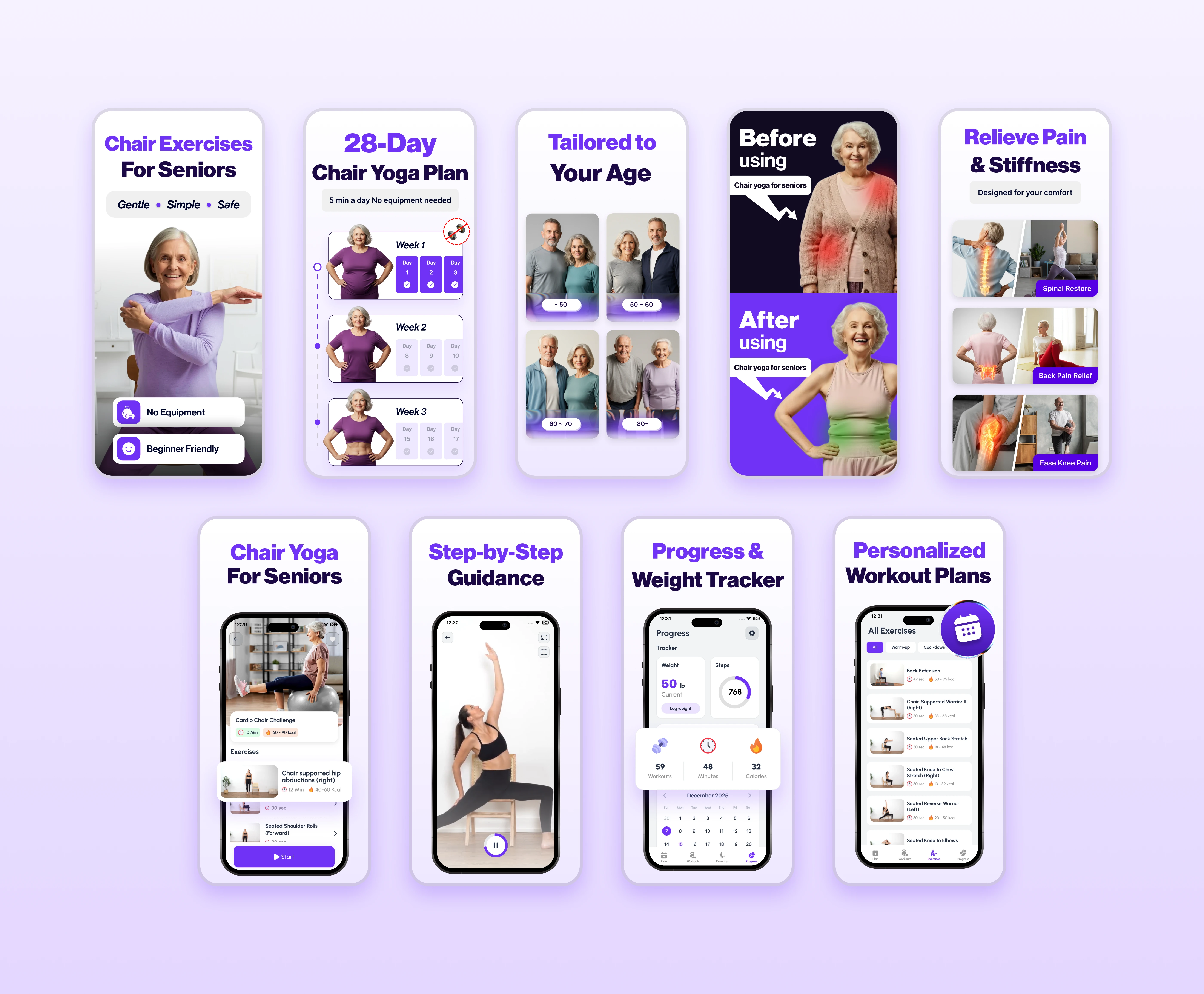
App Store Marketing Strategy
Beyond product design, I crafted the App Store screenshot system to clearly communicate value within seconds.
The structure follows a narrative flow:
Identify the audience
Highlight safety and simplicity
Address pain points
Show guided support
Reinforce progress and personalization
Each screenshot uses:
Large typography
Clear benefit-driven headlines
Emotional reassurance
Clean visual hierarchy
The goal was simple:
Build trust before download.
Final Reflection
This project reflects my approach to human-centered design.
Rather than adapting a standard fitness template, I reimagined the entire product around:
Physical limitations
Cognitive comfort
Emotional reassurance
Accessibility-first interaction
Every decision from large typography to bold CTAs was driven by empathy, not aesthetics.
Because great product design is not about complexity.
It’s about removing friction for the people who need clarity the most.
Like this project
Posted Feb 26, 2026
Designed an accessible fitness app for seniors featuring safe, chair-based workouts, large typography, and intuitive navigation for ease of use.
Likes
0
Views
1
Clients
Confidential