App Redesign: The Wim Hof Method
Katie Nickel
Helping The Wim Hof Method improve their app experience.
The Wim Hof Method is an app that helps users improve their connection to their body through meditation and cold water therapy. Our goal was to improve the existing app's user flow to make it easier for new users to complete the Cold Shower Challenge.
Helping The Wim Hof Method improve their app experience.The ProblemBusiness & User frustrations-Usability ReviewPrimary FrustrationSecondary FrustrationProblem SpaceIdeationWhat can we addWhat can we improveUser FlowsWireframesThe SolutionStyles & ComponentsHigh Fidelity PrototypeThree key learningsNext steps
The Problem
We focused on solving the following problems found in the Wim Hof app:
Lack of information hierarchy on the home screen makes it difficult for users to know where to start
Little explanation and guidance through the 20-day cold shower challenge resulted in increased user drop-off
Business & User frustrations-Usability Review
During the usability review, we found that the main frustrations revolved around the difficulty of starting and completing the Cold Shower Challenge.
Primary Frustration
The primary pain point was in the cold shower setting screen. The labels on the screen are confusing and there is no real guidance for the user as to what they are selecting or why. This leads to fewer users completing the challenge.
Secondary Frustration
The secondary frustration was on the home screen. When a new user enters the app, there is no clear starting point due to a lack of information hierarchy. This makes it difficult for users to know how/where to start the challenge.
Problem Space
After conducting a usability review and some competitor benchmarking, we were able to conclude The Wim Hof Method's main problem:
—> Users need a more efficient and satisfying experience when starting the Cold Shower Challenge.
From there, we were able to come up with the following question to focus our ideation and design: How might we guide people to start the cold shower challenge to ensure their continued use of the app?
Ideation
Using mind maps and crazy 8's, we were able to brainstorm and prioritize how we improve upon and add to different elements of the app.
What can we add
Screens before the start of the challenge that would give background information on what the cold shower challenge is and how it works.
What can we improve
We can make the challenge set up more efficient and less confusing by minimizing the number of timer-setting options.
User Flows
We mapped out the existing user flow to identify possible friction, which the user might come across, as well as how we could incorporate our new ideas. An improved user flow was made so the user would have a more efficient journey in their completion of the Cold Shower Challenge.
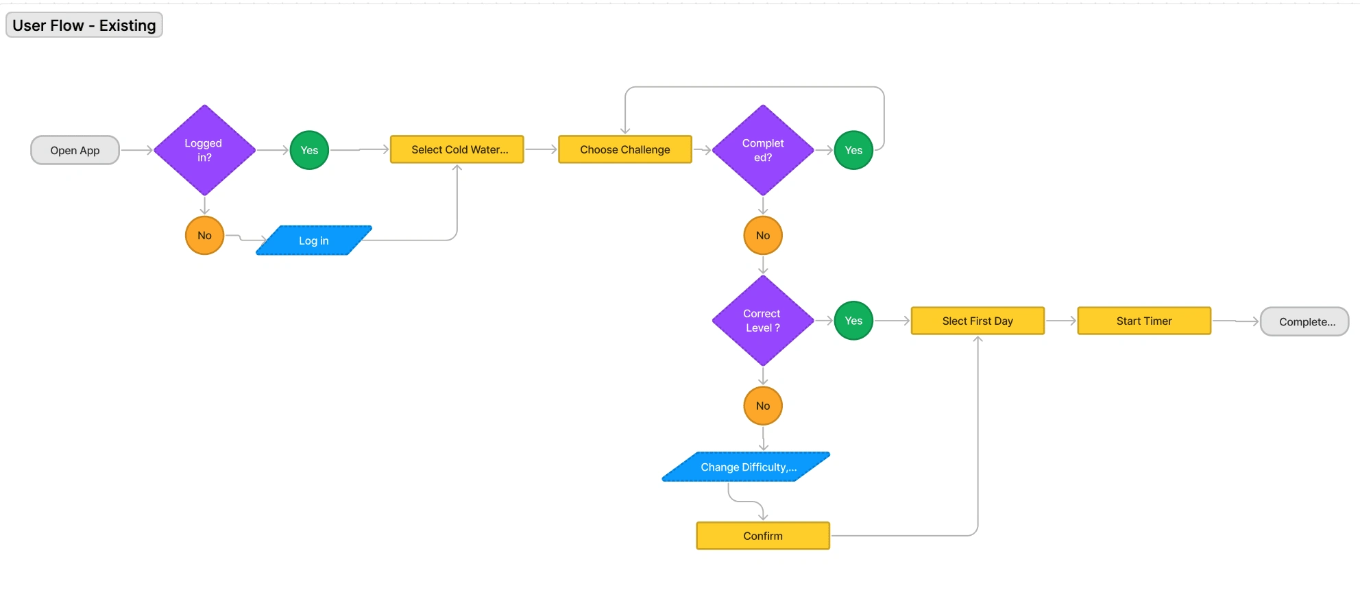
Original User Flow
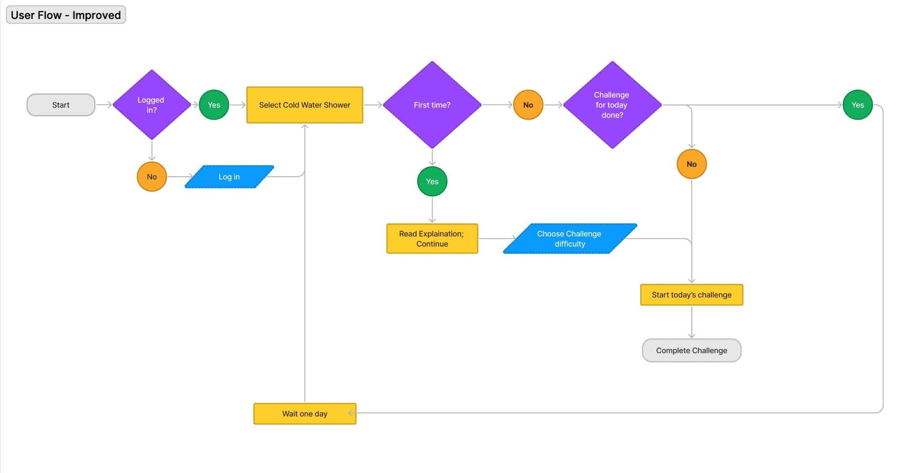
Improved User Flow
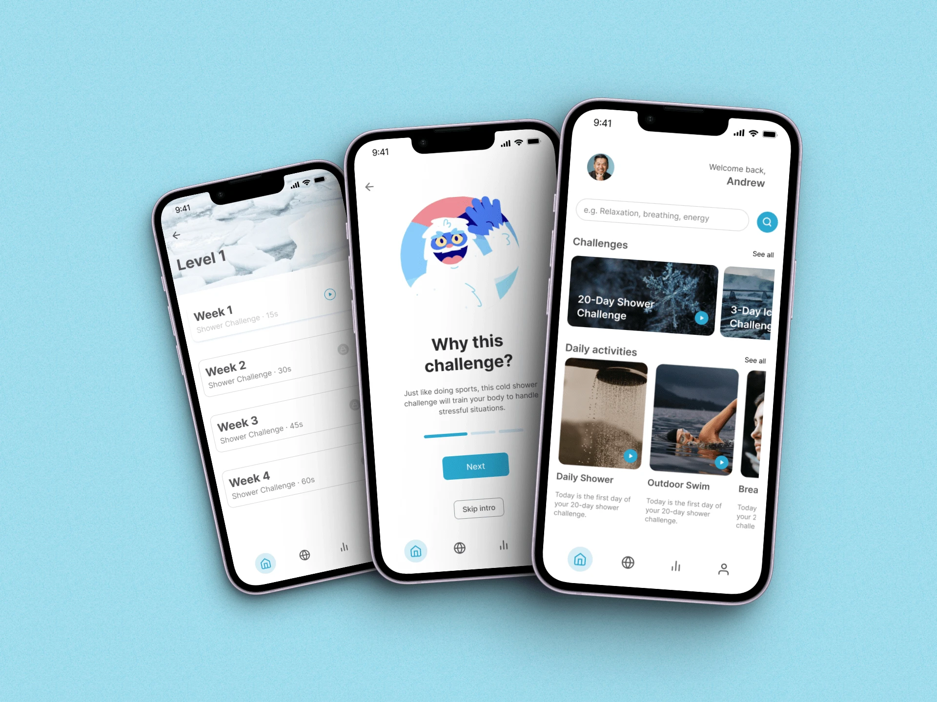
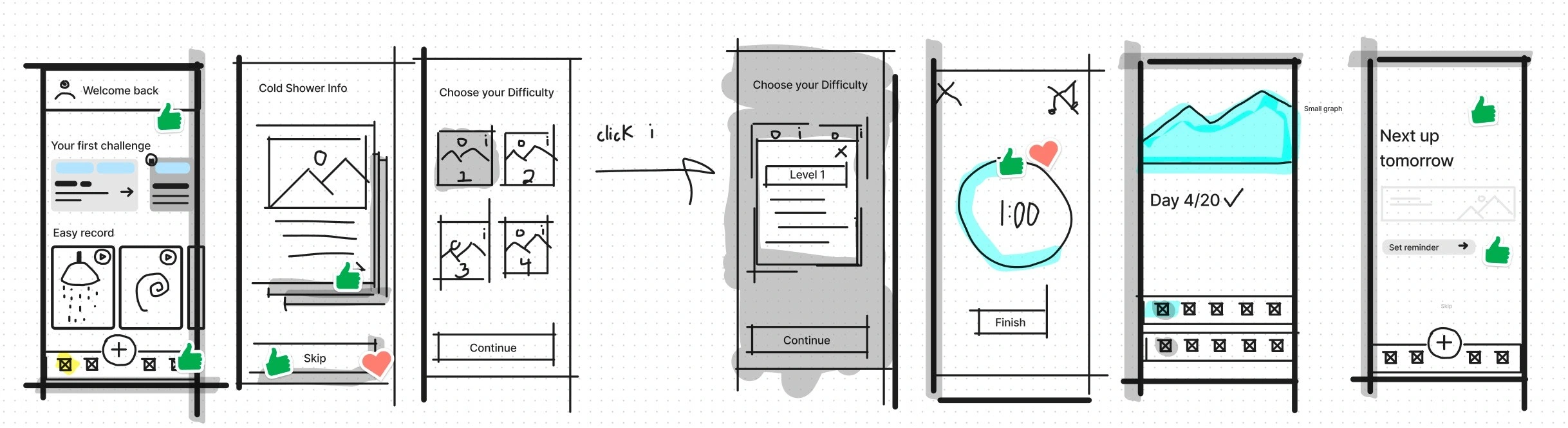
Wireframes
With our improved user flow as a guide, we built wireframes to create a rapid lo-fi prototype of our design.
The Solution
To solve the problem and make it easier for new users to start and complete the 20-Day Cold Shower Challenge we:
Improved the information hierarchy on the home interface
Provided a streamlined explanation of the challenge throughout the user journey
Minimized timer setting options so as not to overwhelm new users
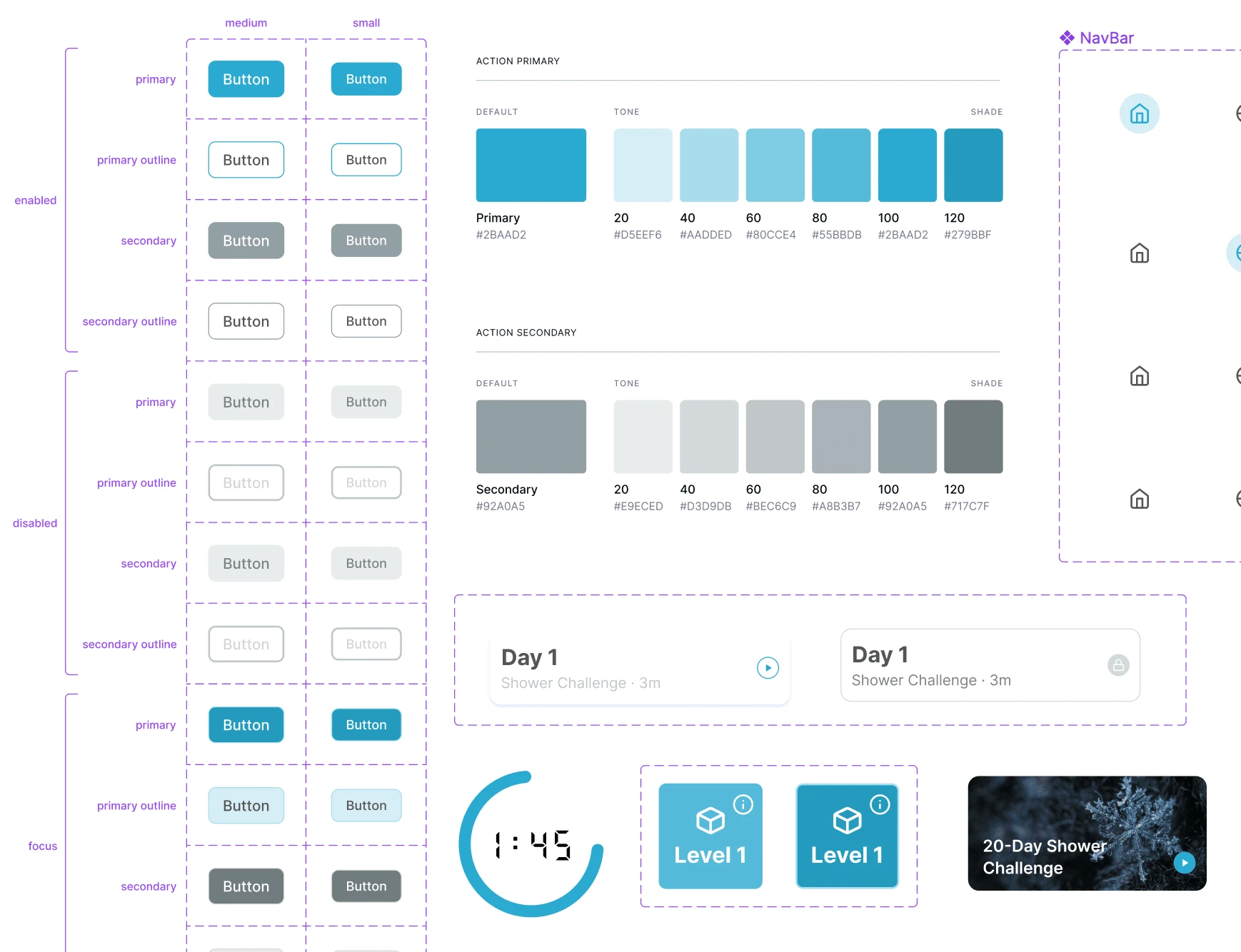
Styles & Components
Before starting on our final hi-fi prototype, we built a design system to ensure consistency in color, text styles, and components throughout our prototype.
To simplify the display and match the theme of cold showers, we decided to update the color theme for the app to blue and a cool gray. These colors also bring a calmer tone to the app, more befitting of meditation than that active-driven orange they had in their original design.
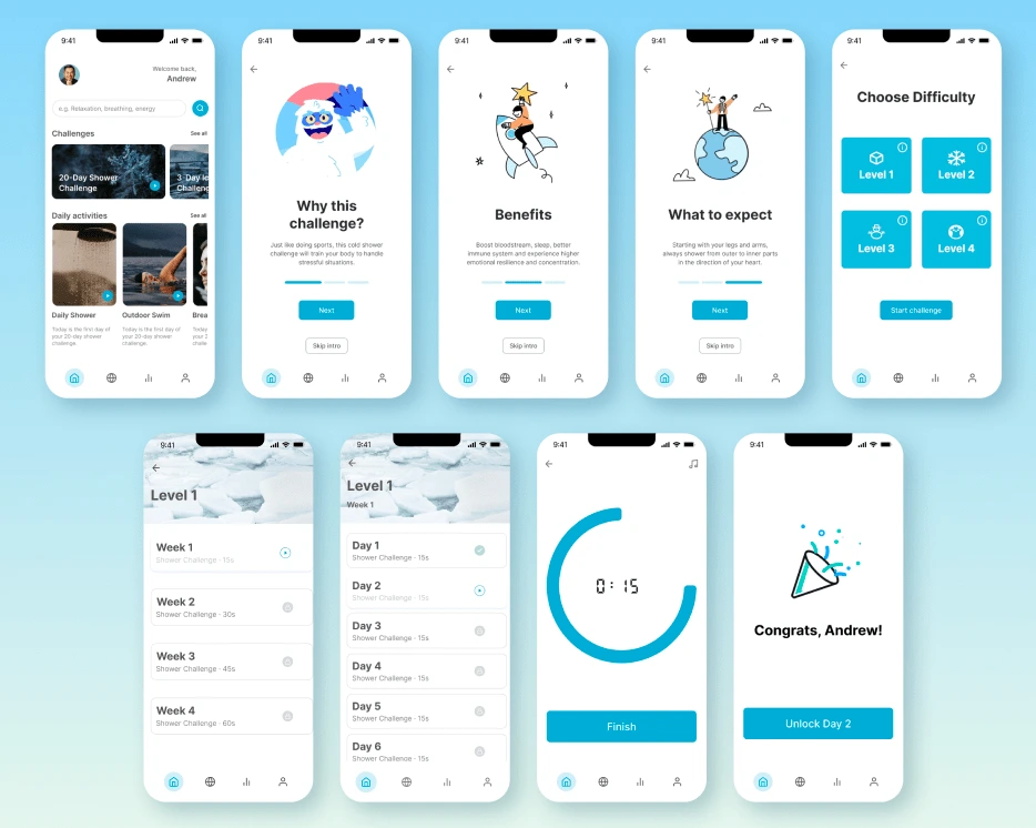
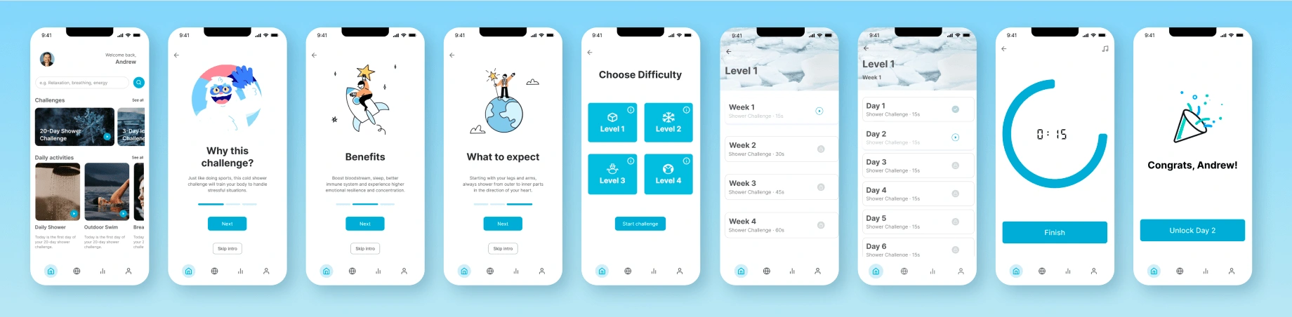
High Fidelity Prototype
Our high-fidelity prototype walks users through how to start and complete the Cold Shower Challenge.
Select the Cold Shower Challenge card
Learn about the reasoning behind cold showers and why they are beneficial
Pick your difficulty level
Select the week and day you are on and start the timer
After completion, notice your marked progress before returning to home
Three key learnings
1. Having a clear defined problem statement is important to guide ideation.
2. When working in a team, it is important to have consistent and clear communication to keep the design process efficient.
3. Keeping designs simple is a challenge, but important since overcomplicating a design can diminish the user experience.
Next steps
With the hi-fi prototype complete, our next step would be to conduct a usability review so we can get feedback from users on our design. This would provide insight into what users like and what we would need to change to improve the user experience of the app before having it developed.
Like this project
Posted Mar 5, 2024
The Wim Hof Method is an app that helps users improve their connection to their body through meditation and cold water therapy. Our goal was to improve the exis
Likes
0
Views
16