My Framer Portfolio
Seun Hannah Moses
My Portfolio Website
Role: UI/UX Designer & Framer Developer
Tools: Figma, Framer
Focus Areas: Responsive design, interaction design, layout systems, personal branding.
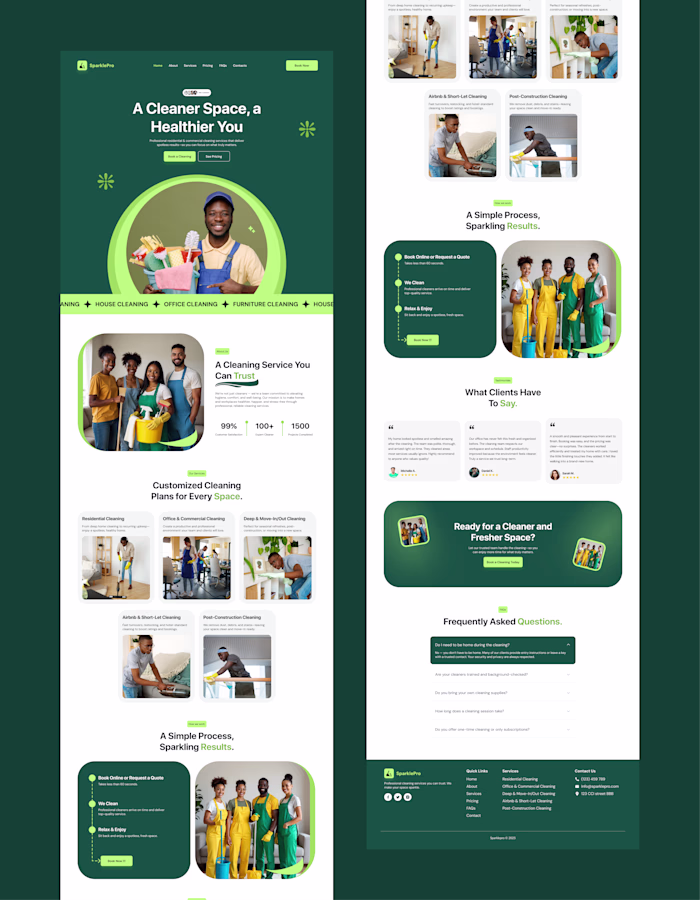
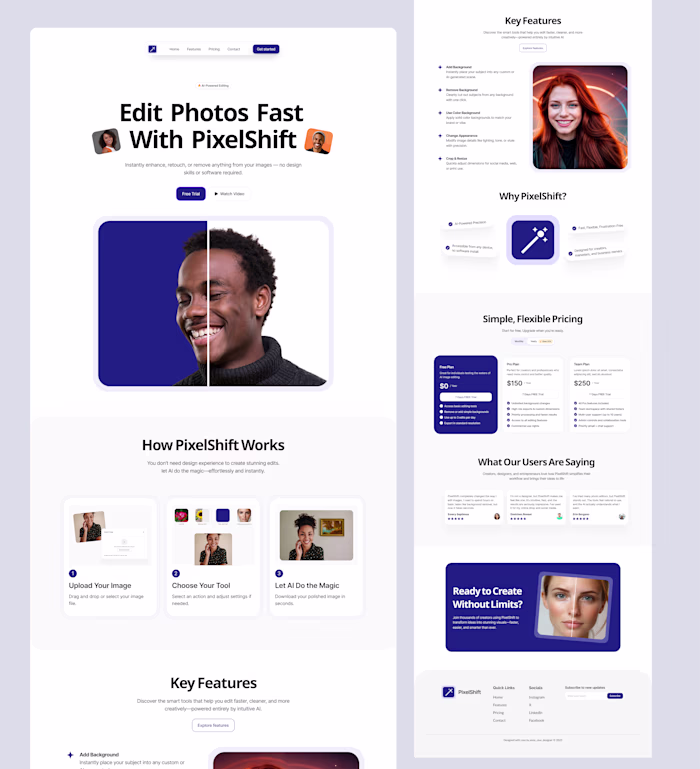
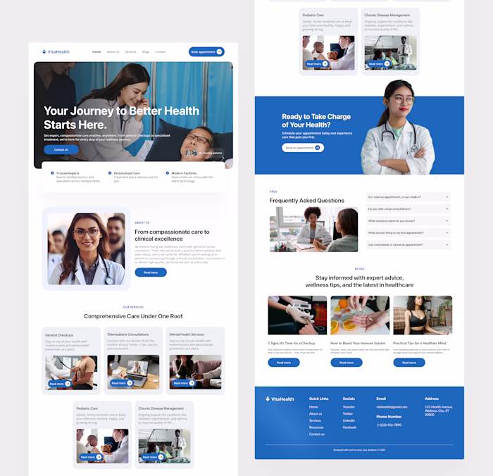
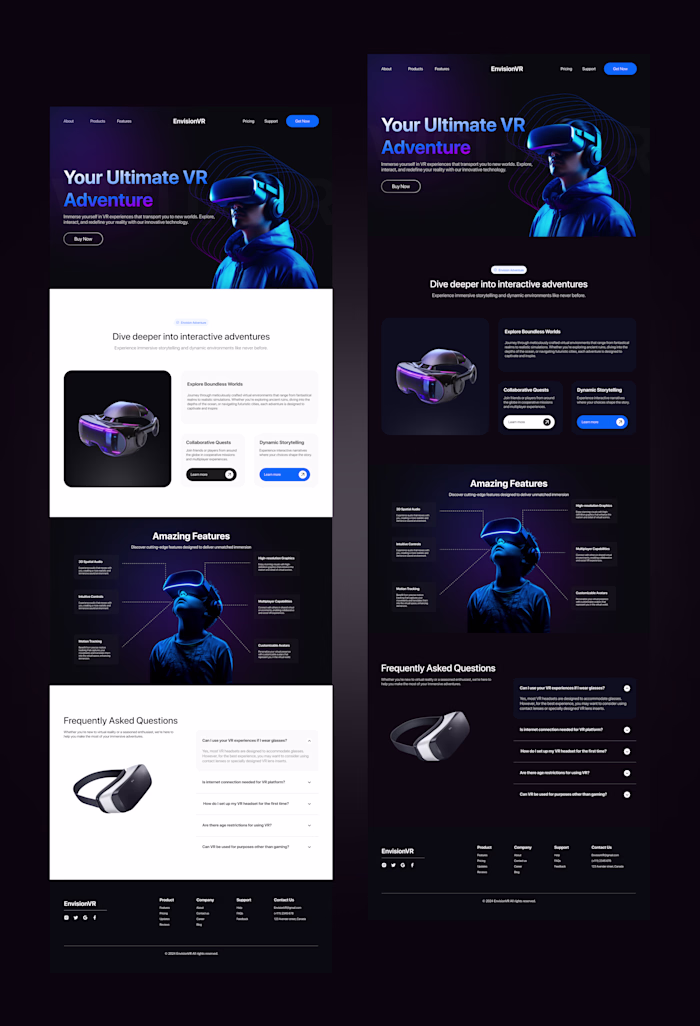
I built my personal portfolio website with Framer to serve as a professional showcase of my design and development skills. The site highlights selected design projects, services, and capabilities while positioning me as a strong candidate for freelance and contract opportunities.
Using Framer, I implemented a fully responsive layout that adapts seamlessly across desktop, tablet, and mobile devices. I also created reusable components to ensure scalability and easy updates as my portfolio grows. Interactions and animations were kept subtle and purposeful to enhance usability without distracting from the content.
The final result is a fast, polished, and conversion driven portfolio website that strengthens my personal brand, showcases real design work, and serves as a central hub for attracting freelance and contract opportunities.
Link to portfolio
Like this project
Posted Apr 18, 2025
This portfolio showcases my passion for designing intuitive, and user-first digital experiences, and my love for clean aesthetics.
Likes
2
Views
13