William Keyser's Portfolio Website
About the Client
William Keyser is a contemporary artist. For over 60 years, he's been creating dynamic artworks at the intersection between painting, sculpture, and furniture design.
His 35 years of teaching Woodworking and Furniture Design at the School for American Craftsmen at RIT allowed William to mentor many young, aspiring students. As someone who sees beauty in and is intrigued by found objects and unfamiliar or accidental shapes, William's work is unexpected and dynamic.
The "Before"
Before we started working together, William's website was not optimized for mobile, images took ages to load, and his work was presented as tiny thumbnail pictures, without consistent organization or details about the individual pieces.
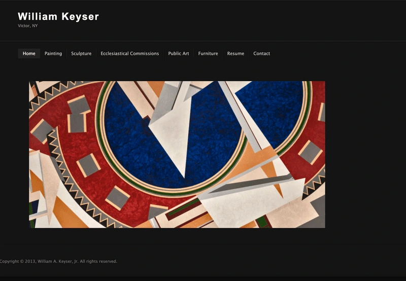
William Keyser's home page before working together
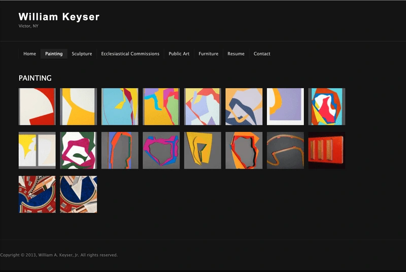
William Keyser's painting category page before working together
Project Goals
William was still making amazing artwork, but his web presence was stuck in the past.
He was ready for a website that:
Presented his artwork in a professional and visually appealing way.
Was easy to navigate and organized, so that his large body of work was a joy to browse through, and not overwhelming or slow.
Could act as a legacy for his life's work.
Choosing Professional and Visually Appealing Colors and Fonts
To create a website that reflected William's professional energy and would be able to let his artwork shine I chose colors and fonts that were contemporary enough that they would nod towards the aesthetic of his pieces, without drawing attention away from them.
The monochromatic black of his original website was working well to not draw attention away from his work, but it didn't amplify or complement it.
I chose a tan and white to add to a dark grey color in order to add a more open, less suffocating energy to the space around his pieces.

Color choices for William Keyser's website re-design
The specific colors I chose are a reference to both open, non-distracting gallery spaces where his work would be shown, and fundamental drawing and painting materials, such as newsprint paper, charcoal and gesso. Though they have high contrast, the colors are not pure black or white, and therefore easy on the eyes.
Finally, to create a contemporary, functional, and timeless look that matches William's artwork and furniture, I chose Newake for headings and IBM Plex Mono for body text.
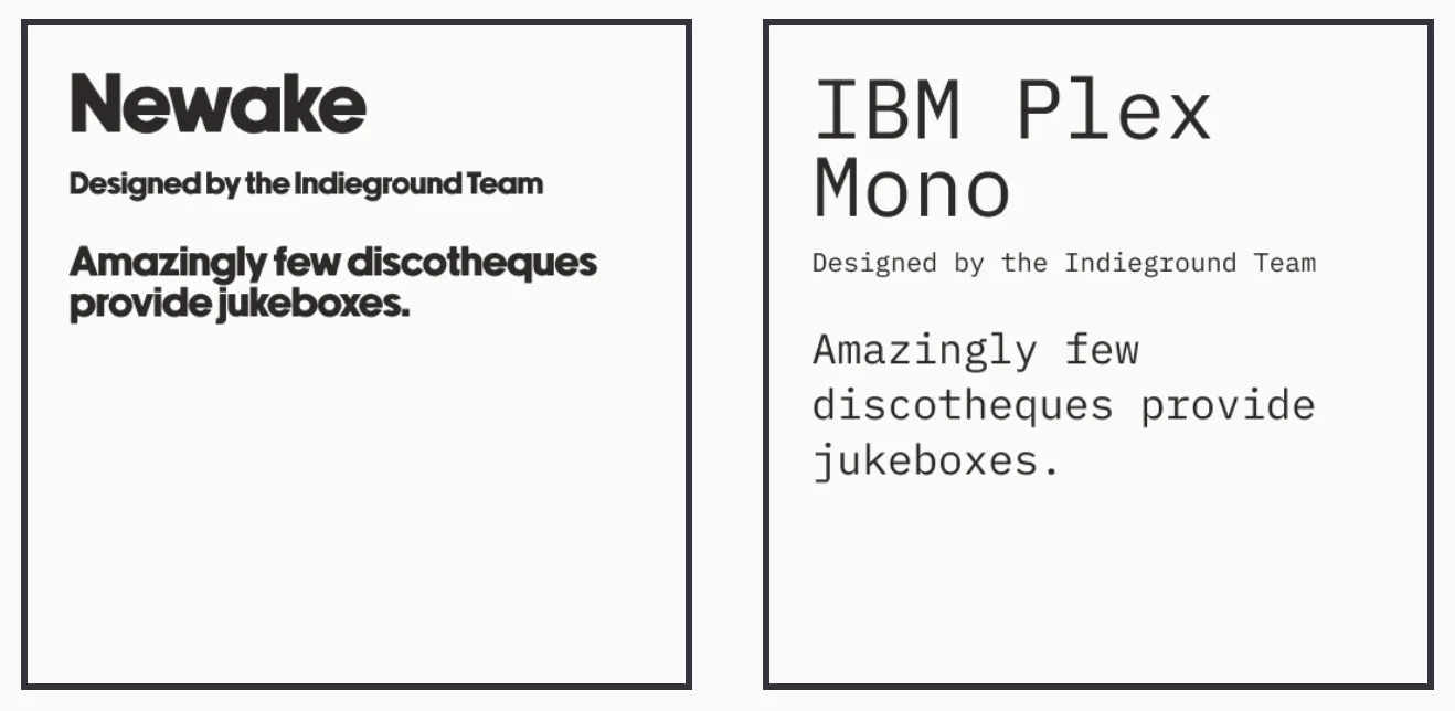
Font Choices for William Keyser's website re-design
Making William's Body of Work a Joy to Browse
William's original website had every page of his site lumped into one navigation bar without a clear hierarchy or categorization. The only way to view his work was by the discipline of work, and each artwork within was not clearly sorted by the date it was completed. Furthermore, William had a LOT of work, spanning over multiple decades, and it wasn't clear to the visitor what the trajectory of William's work was from the past to the present due to separating the work into discipline.
It was clear to me that an additional way to view William's work and accomplishments was needed - people visiting the site should have a chance to browse his work by the date it was completed.
Allowing the visitor to browse his work in multiple ways, by the decade in addition to by discipline, gives the chance for each piece of work to be discovered and enjoyed in different contexts.
I took care to design the interface of each browsing method in a dynamic way. Each decade is displayed in a rotating carousel, and the disciplines are organized in a diagonal fashion, further enhancing the geometric and dynamic aspect of his work.
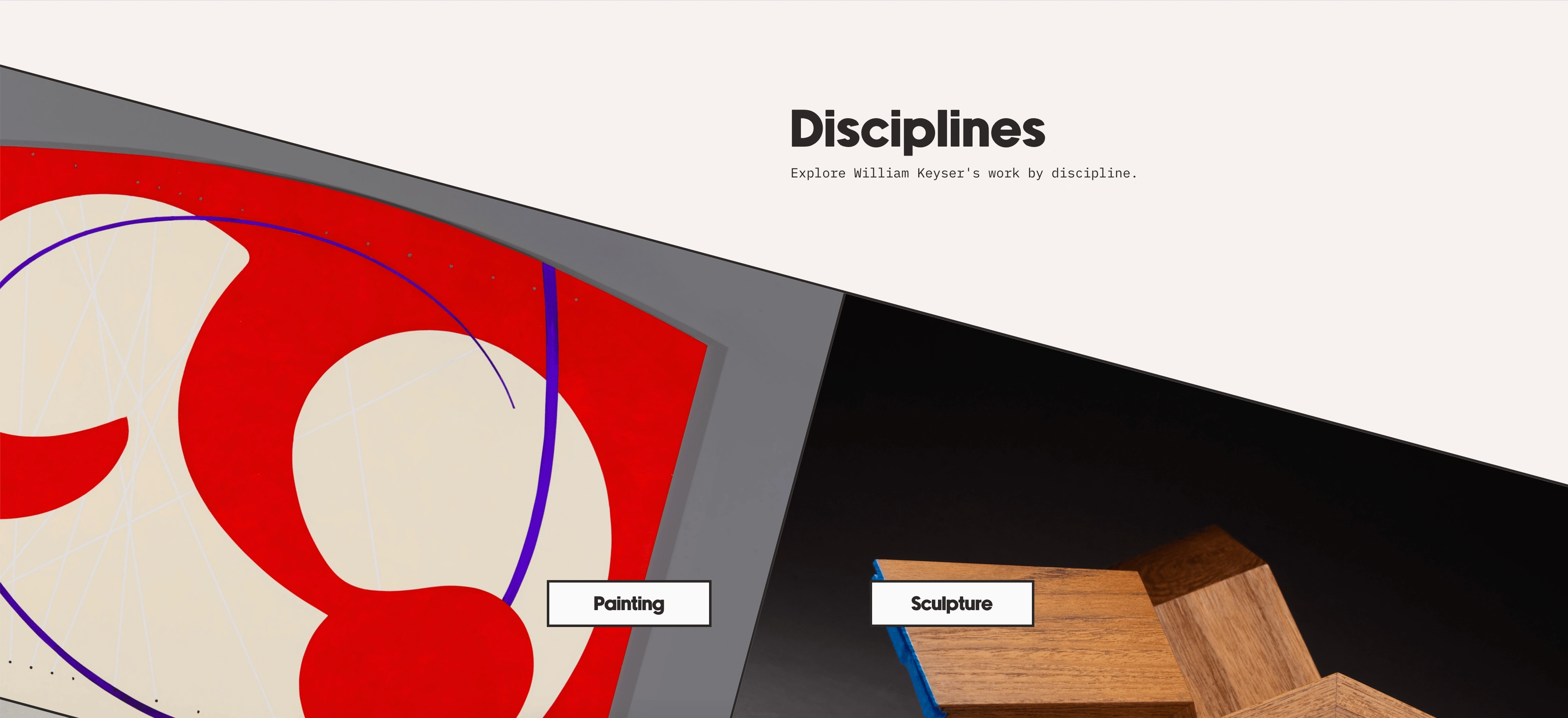
Browse by discipline section of William Keyser's website re-design
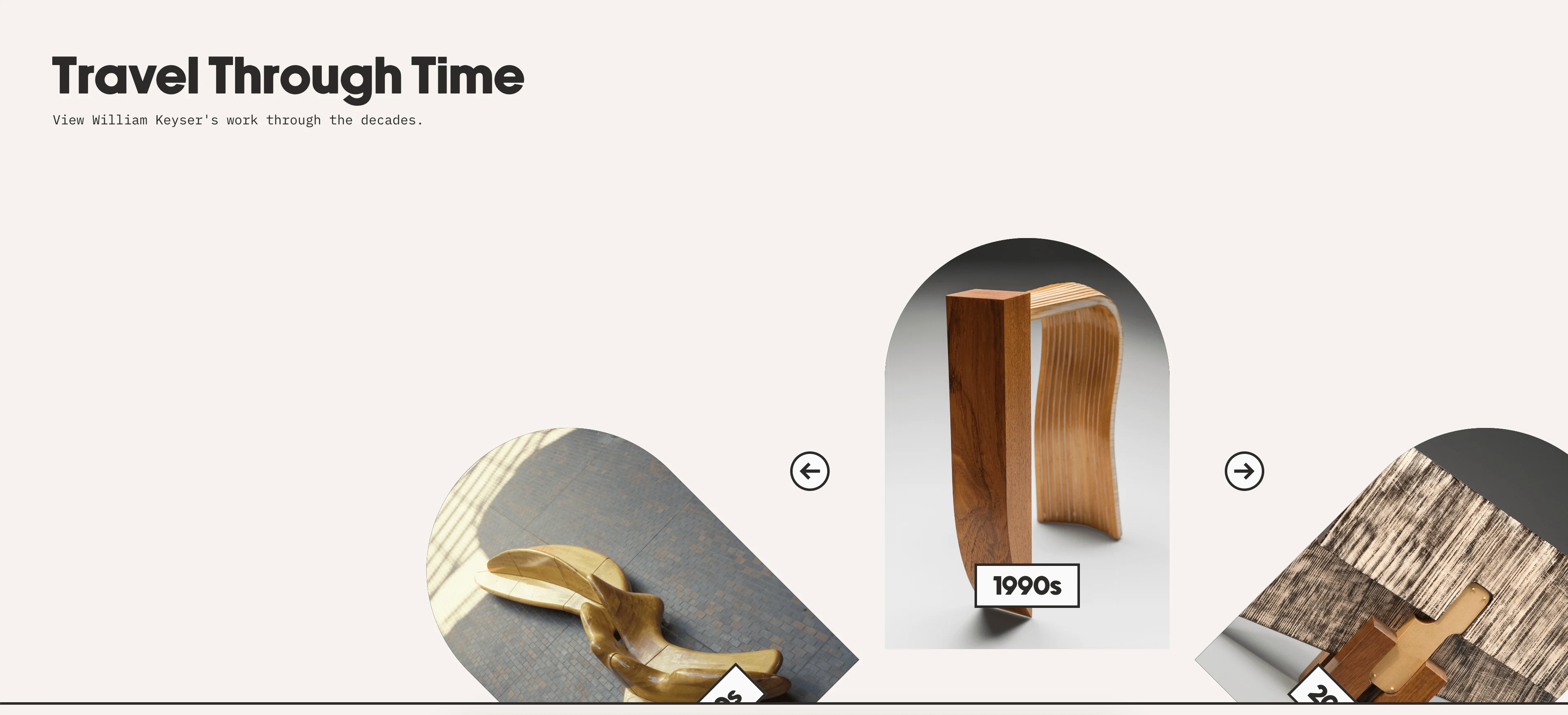
Browse by decade section of William Keyser's website re-design
Creating a Legacy
William's original site had an about page and a resume page to list his many accomplishments, but to act as a legacy and truly provide context for his furniture, ecclesiastical pieces, and artwork, this text needed to be integrated more naturally into the browsing experience.
To provide this context, I included places for William to describe his work, thought process, and accomplishments.
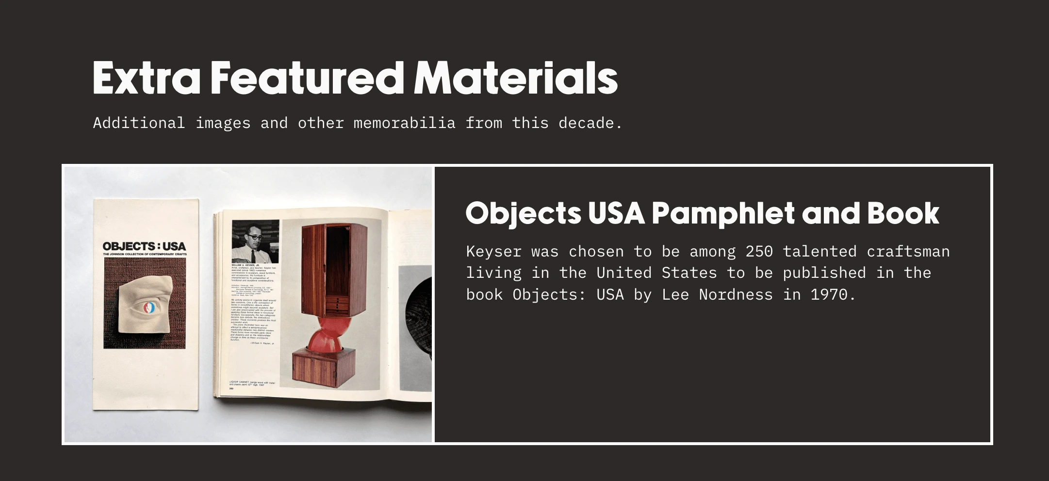
The Extra Featured Materials section highlights objects, awards, and memorabilia from certain decades and the context surrounding them.
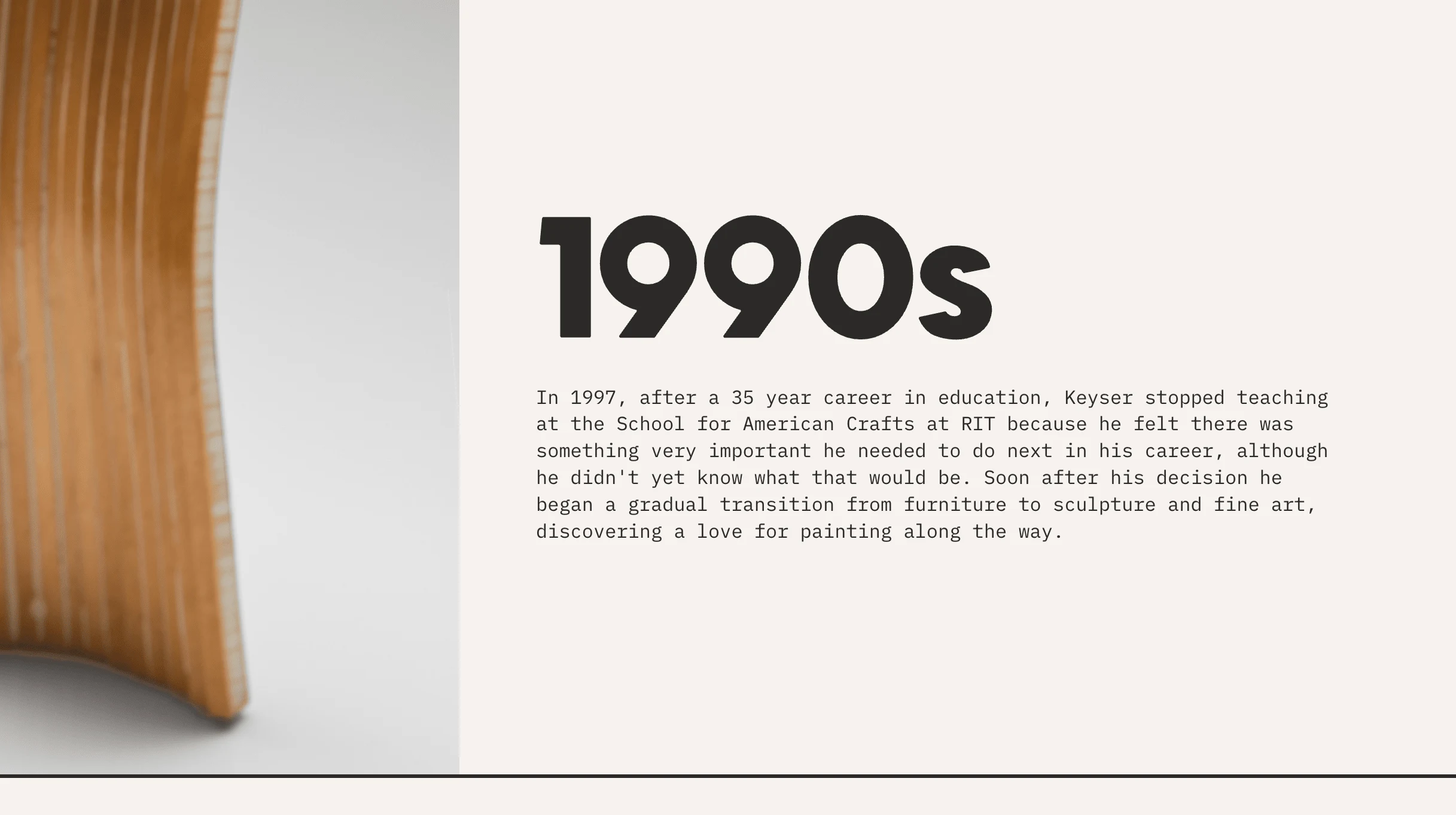
Each decade section provides space for reflections and descriptions of Keyser's approach to art and design at that time, as well as other things going on during his career.
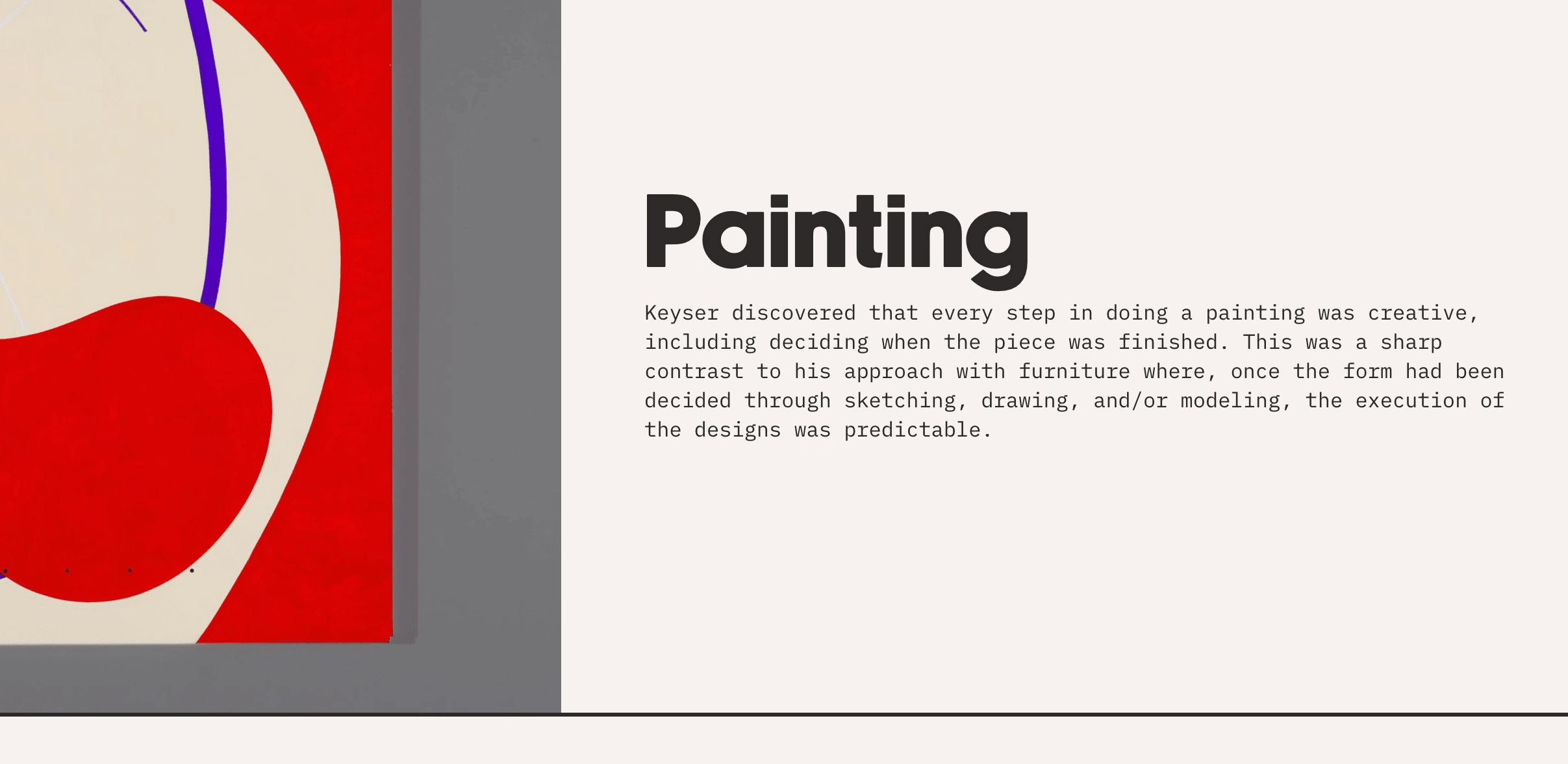
Each discipline section provides space for descriptions of Keyser's approach to that discipline as a whole and his affinity for each medium and category of work.
You can view the completed website for yourself here:
Like this project
Posted Jun 28, 2024
Professional contemporary artist portfolio site re-design and build.
