Fashion Film
colorist rk
1 collaborator
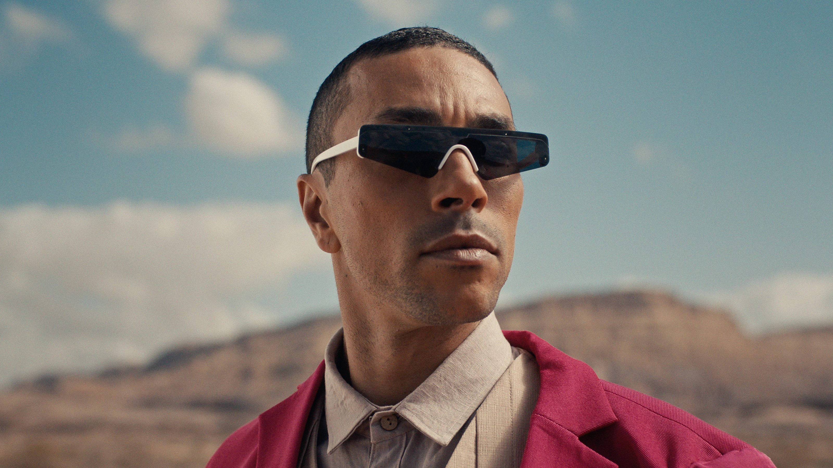
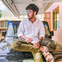
Still 1
Overview
This case study explores the color grading process for a fashion film project, focusing on how strategic color choices enhance the visual narrative and align with the aesthetic demands of the fashion industry. The project aimed to create a distinct visual identity that complements the featured apparel and overall artistic direction.
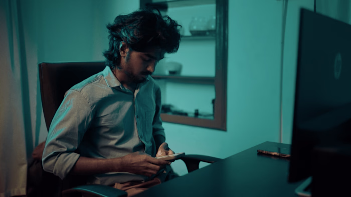
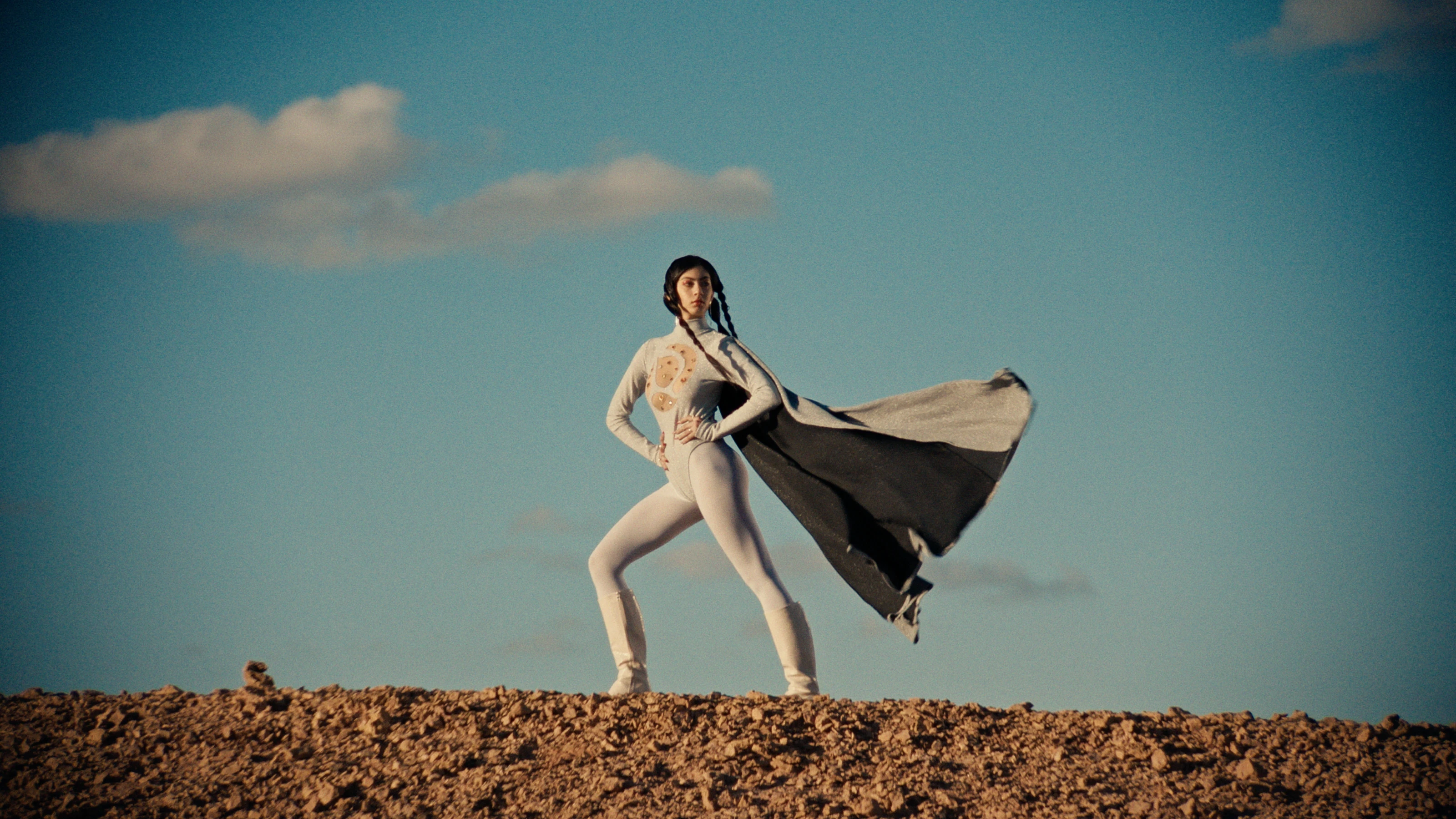
Still 2
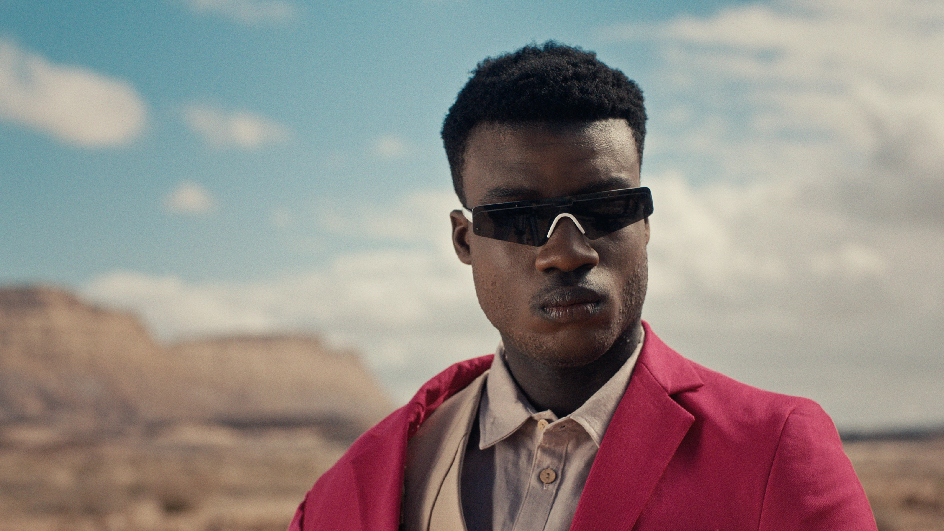
Creative Vision and Color Palette
The fashion film presented a unique opportunity to craft a bold and impactful visual style. The creative vision leaned towards a modern, edgy aesthetic, utilizing a color palette that was both striking and complementary to the fashion pieces. The grading reveal a deliberate use of desaturated backgrounds to make the vibrant colors of the clothing and accessories pop. This approach ensures that the fashion elements remain the focal point, while the environment provides a subtle yet effective backdrop.
Key elements of the color palette include:
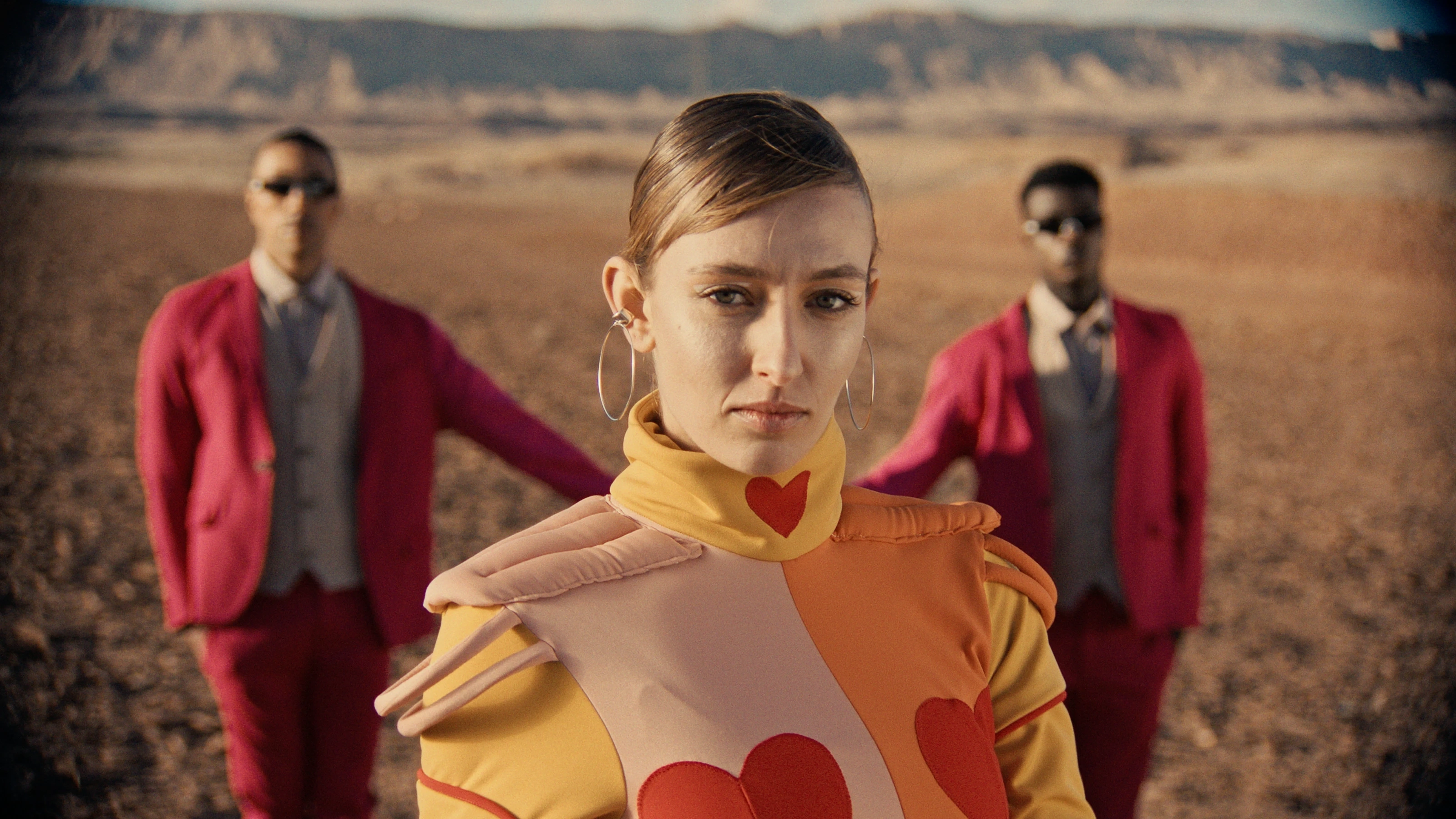
Bold Accents: The use of strong, saturated colors in the clothing (e.g., the fuchsia jacket, the orange and red jumpsuit) creates immediate visual interest and defines the film's energetic tone.
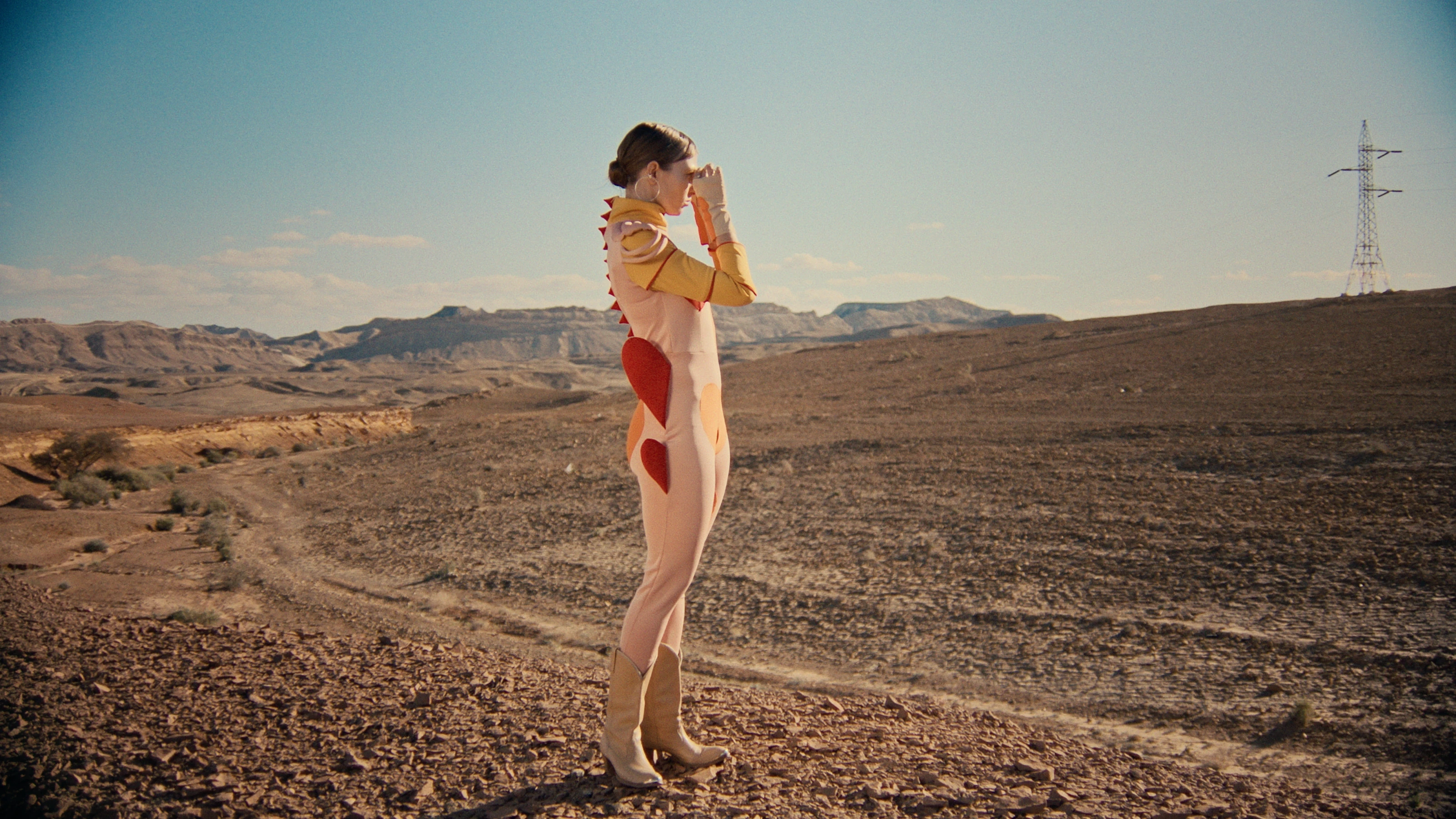
Earthy Neutrals: The desert landscape provides a foundation of warm, desaturated browns and beiges, offering a natural contrast to the vibrant fashion elements.
Cool Sky Tones: The clear blue skies, often with subtle cloud formations, introduce cool tones that balance the warmth of the desert and the intensity of the clothing colors.
The overall color grading strategy aimed to create a sense of heightened reality, where colors are impactful but still feel organic within the natural setting. This was achieved by carefully controlling saturation and luminance, ensuring that the bright colors did not appear artificial or overwhelming.
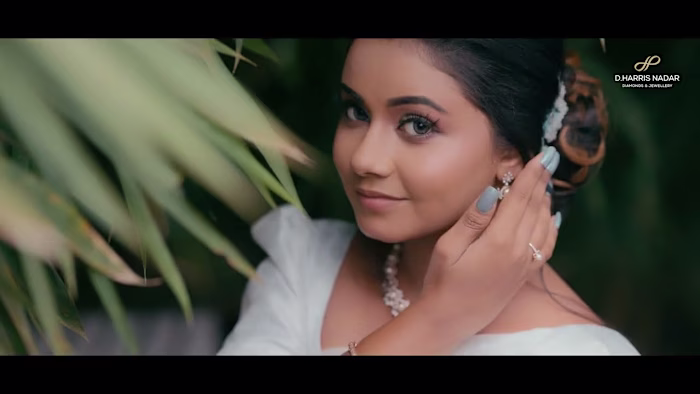
Still 3

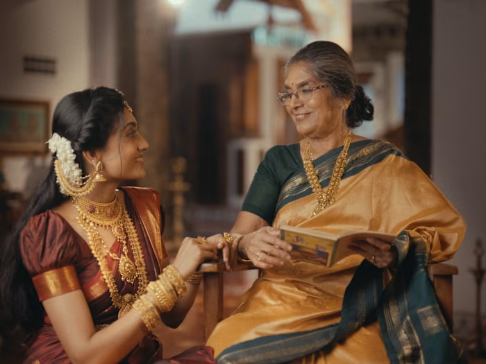
Still 4
Technical Approach
The color grading for this fashion film was executed in DaVinci Resolve, leveraging its comprehensive toolset to achieve the desired aesthetic. The technical workflow focused on precision and creative control:
Primary Correction: Initial adjustments were made to exposure, contrast, and white balance to establish a clean base for grading. This ensured that the raw footage had optimal dynamic range and color neutrality.
Targeted Saturation and Hue Adjustments: To make the fashion elements stand out, specific hues were isolated and selectively saturated. For instance, the vibrant fuchsia of the jacket and the warm tones of the jumpsuit were enhanced without over-saturating the surrounding environment. This involved using HSL and custom curves to precisely control color intensity.
Contrast and Tonal Shaping: The contrast was carefully managed to create a punchy, high-impact look while preserving detail in both highlights and shadows. Lift, Gamma, and Gain controls were utilized, along with custom curves, to sculpt the tonal response and add depth to the images.
Skin Tone Preservation: Despite the bold color choices, maintaining natural and pleasing skin tones was a critical consideration. Secondary corrections were applied to ensure that skin tones remained accurate and healthy, preventing them from being influenced by the broader color shifts.
Environmental Harmonization: The desert environment, while serving as a backdrop, was also carefully graded to complement the fashion. Its earthy tones were subtly enhanced to provide a rich, textured foundation that grounded the vibrant clothing.
Grain and Texture: A subtle layer of film grain was introduced to add a tactile, cinematic quality to the digital footage, enhancing the overall aesthetic and contributing to a more organic feel. This meticulous approach allowed for a highly stylized look that remained visually coherent and professional, emphasizing the fashion without compromising the integrity of the overall image.
Still 5
RESULT
The color grading for this fashion film successfully transformed the raw footage into a visually compelling and impactful piece. The strategic use of color and contrast effectively highlighted the fashion elements, making them pop against the desaturated desert backdrop. The resulting aesthetic is modern, bold, and perfectly aligned with the dynamic nature of contemporary fashion.
Like this project
Posted Jun 17, 2025
I color graded this fashion film we did this as an experimental project to try new color grading techniques. It was very fun to be a colorist of this project
Likes
10
Views
83
Collaborators