Dashboard UI: Home Energy Management
Overview
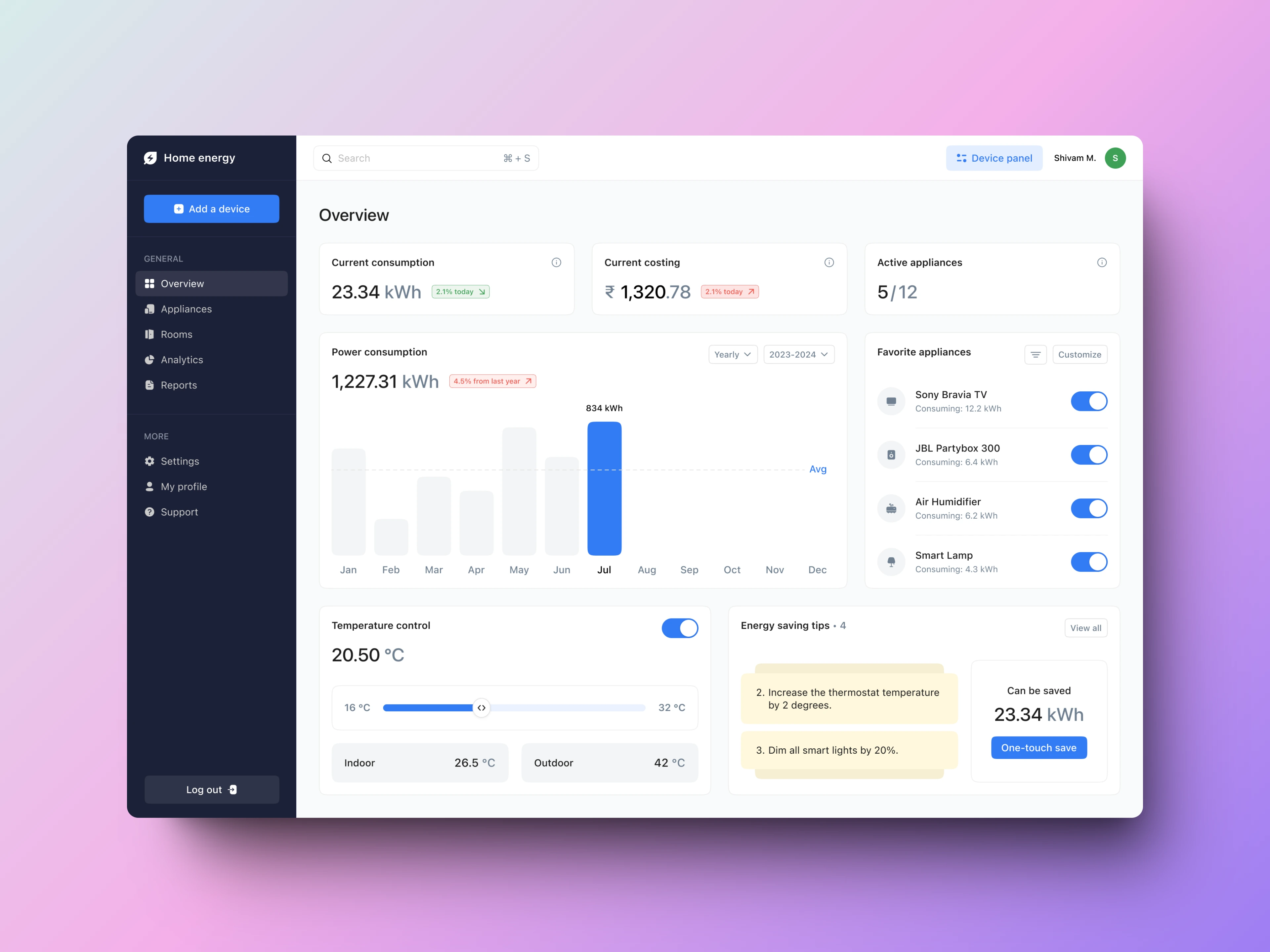
This project showcases a user-friendly dashboard design created by Figma for a home energy management system. The interface provides homeowners with a comprehensive overview of their energy consumption, costs, and ways to optimize usage.
The design employs a clean, modern aesthetic with a dark sidebar for navigation and light content area for easy readability. Color-coding (green for savings, red for increases) helps users quickly grasp performance changes. The layout prioritizes the most crucial information, placing current consumption, costs, and active appliances at the top.
Key points -
Aesthetic Appeal: The dashboard boasts a clean, modern design with a sophisticated color palette. The dark navy sidebar contrasts beautifully with the light content area, creating visual interest and improving readability.
Color Psychology: Strategic use of colors enhances usability - green for positive changes (e.g., 2.1% consumption decrease) and red for attention-needed areas (e.g., 2.1% cost increase).
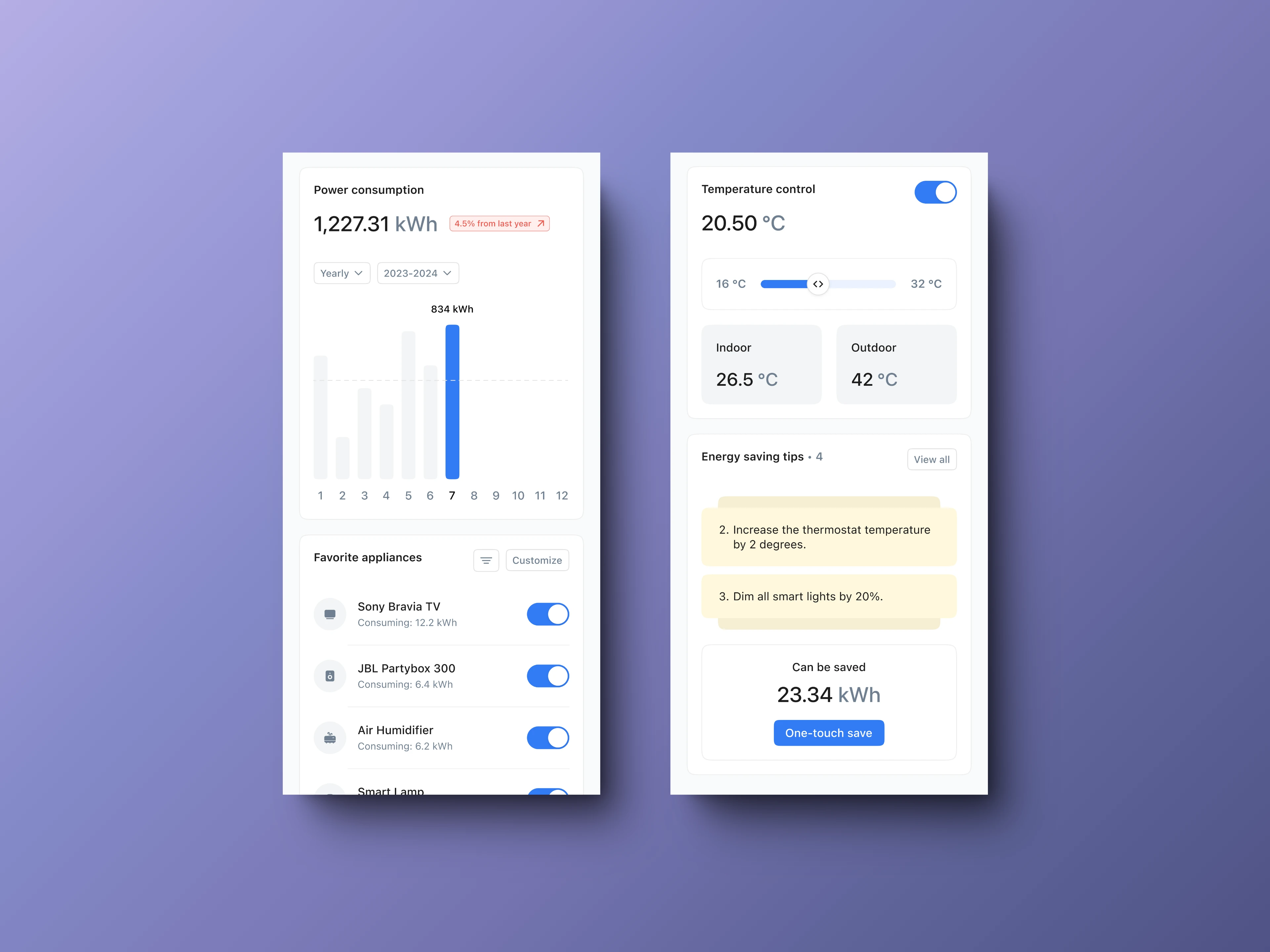
Responsive Design: The layout adapts seamlessly to different screen sizes, ensuring a consistent experience across devices.
Readability: High contrast between text and background, combined with clear typography, ensures excellent readability.
Iconography: Custom icons for appliances and features add visual interest while improving navigation and recognition.

Web view

Mobile
Checkout the project here -
Like this project
Posted Oct 8, 2024
Crafted a vibrant home energy UI with intuitive toggle controls, clean data charts, and smart temperature slider. Bold blue accents and crisp icons deliver both
Likes
0
Views
5


