BuildEdge — SaaS Pricing Section (Concept)
Mustofa Al-Ameen Mustafa
Cover
Type: Concept / spec project (not a client engagement)
Role: Web Designer
Tools: Figma
What This Is
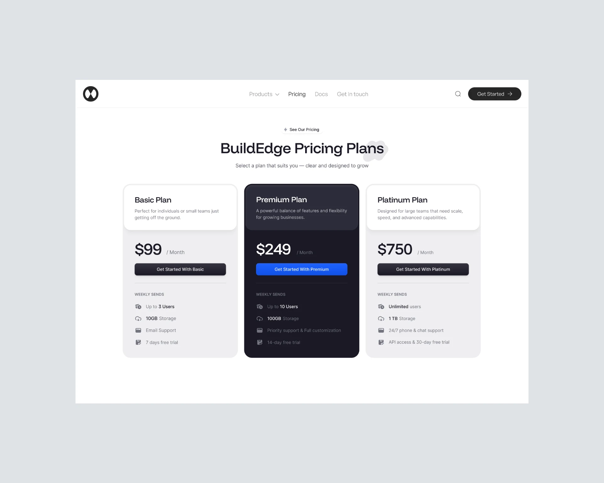
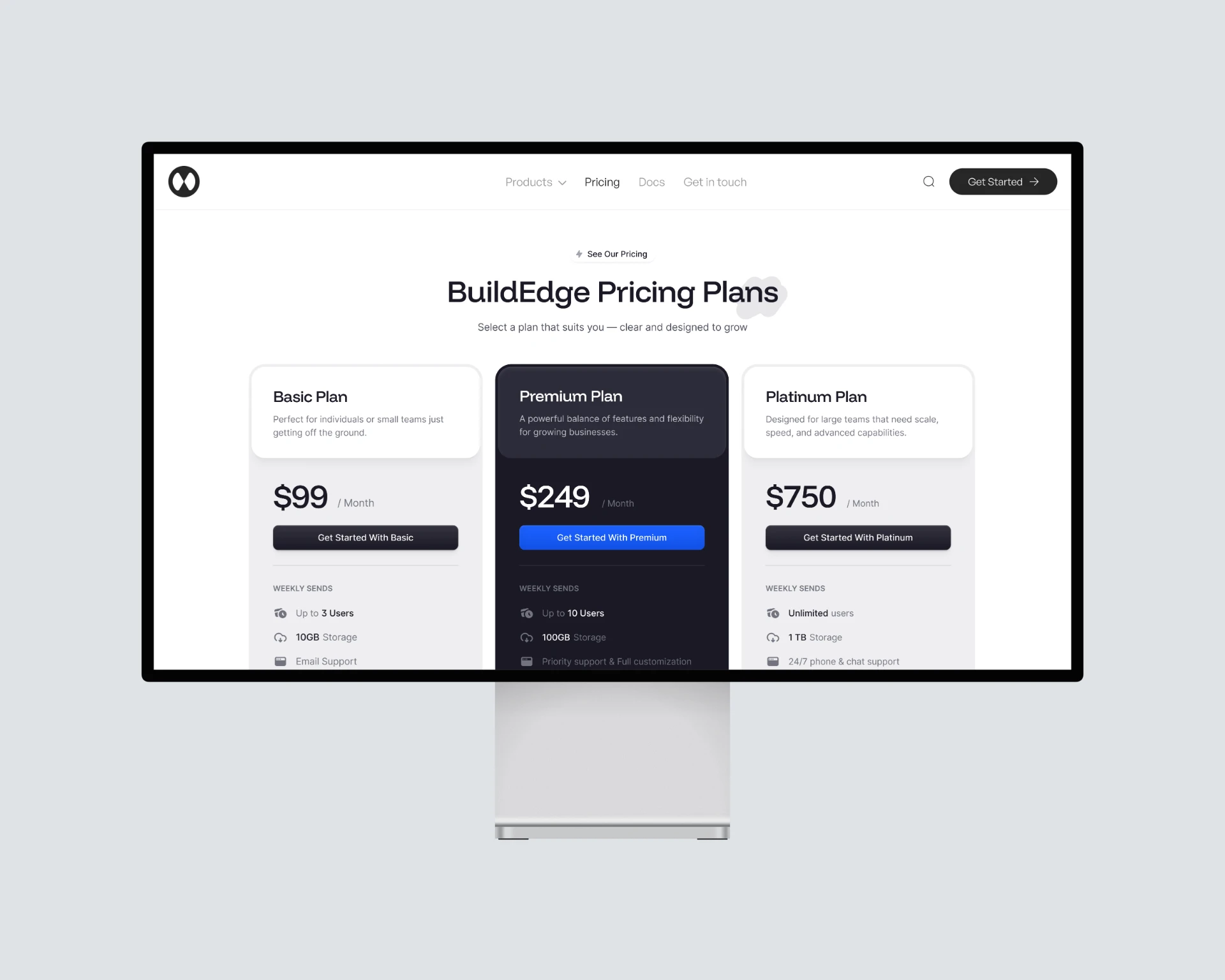
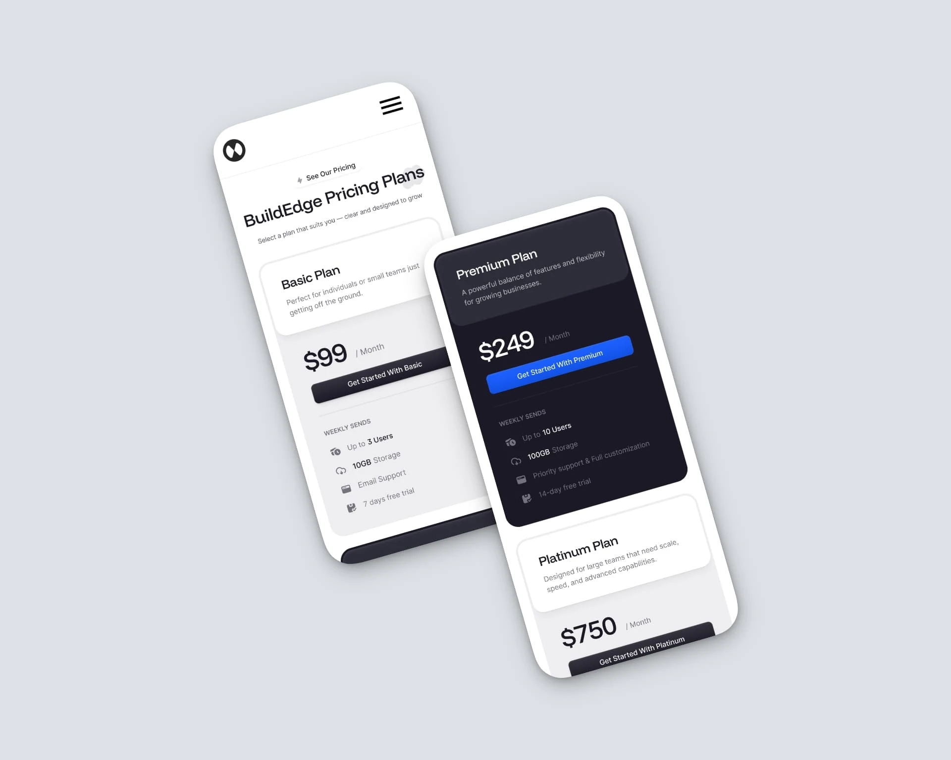
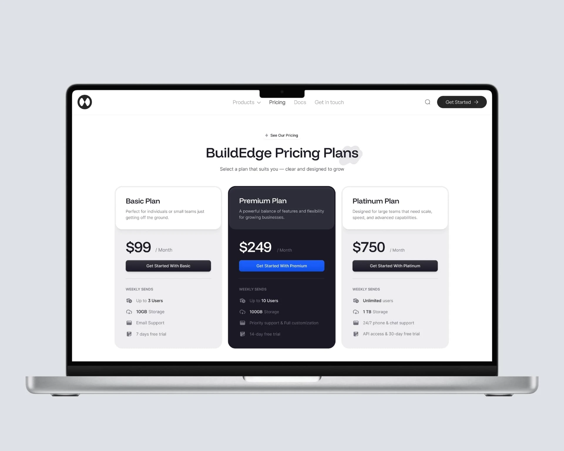
BuildEdge is a concept construction SaaS platform. I designed the pricing section to explore how B2B SaaS products can present tiered pricing clearly and drive conversions through visual hierarchy and strong CTAs.
What I Did
Designed 3 pricing tiers — Basic (individuals), Premium (small teams), and Platinum (large teams). Each tier has clear feature lists and pricing
Created visual emphasis on the recommended plan — Premium is visually highlighted as the best value to guide decision-making
Built for quick comparison — clean layout with consistent column structure so visitors can scan across tiers without confusion
Designed strong CTAs — each tier has a clear action button, with the Premium tier's CTA given the most visual weight
Key Design Decisions
Visual emphasis on Premium — the middle tier is highlighted with a different background and badge, following the common SaaS pattern of anchoring users to the mid-tier option
Feature comparison layout — consistent formatting across all 3 tiers so users can scan horizontally
Bold pricing typography — price is the largest element in each card, reducing the time to understand cost
Why This Matters
This is a focused UI exercise: one section, done well. It demonstrates how to handle tiered pricing design for B2B SaaS with clear hierarchy and conversion-focused layout.
Light mode

Dark mode
Variant 1
Variant 2
Like this project
Posted Jun 1, 2025
Concept project: designed a 3-tier pricing section for a construction SaaS platform.
Likes
2
Views
17