Brand Identity & Visual for KRACK'D

Didem Dönmez

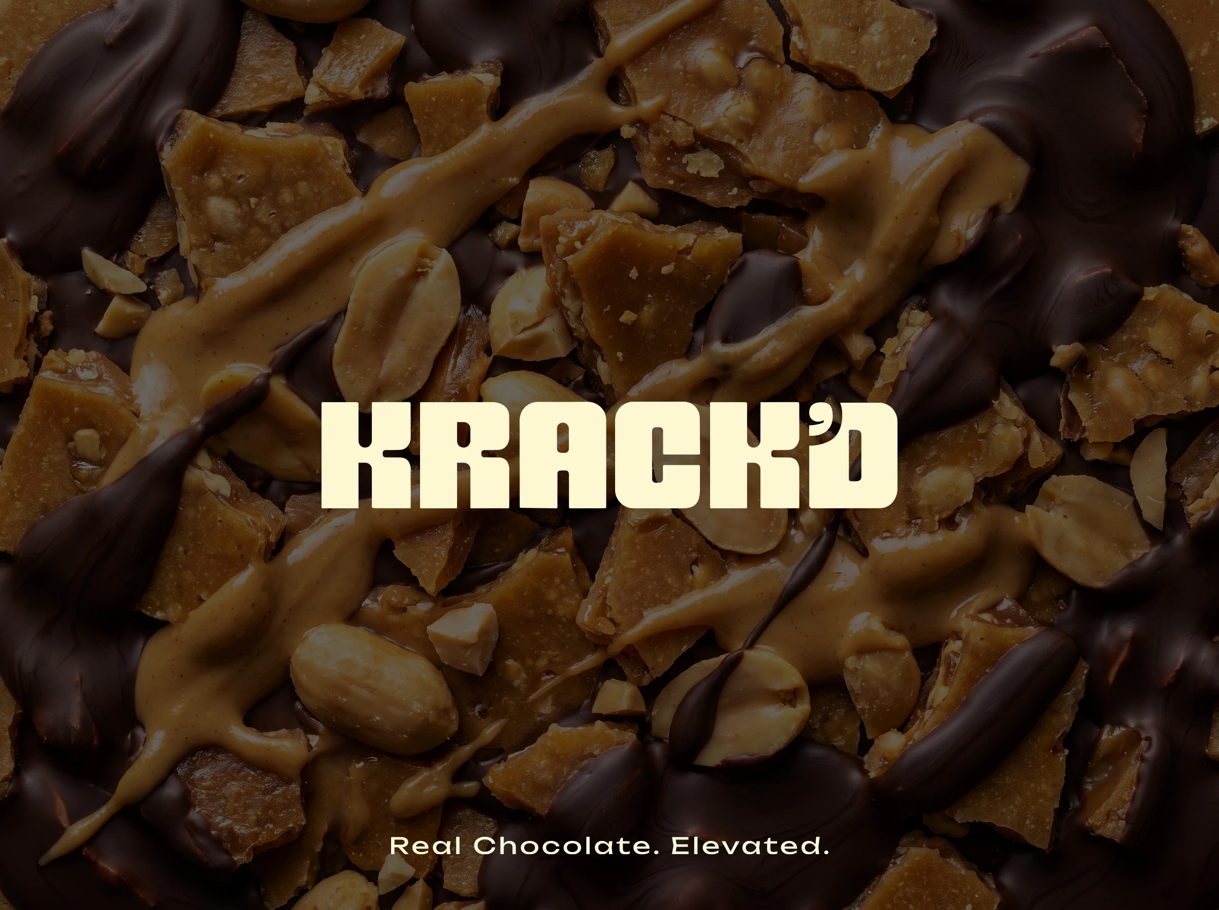
KRACK'D is a bold, premium snack brand built around one simple promise: satisfying every craving without compromise. The identity combines confident typography with a distinctive fractured apostrophe inspired by the crisp snap of brittle toffee, creating a memorable brand asset that works across every touchpoint—from packaging to digital experiences.
The visual system balances playful energy with premium simplicity through a restrained palette, bold layouts, tactile packaging, and clean editorial photography. Every detail was designed to make KRACK'D feel modern, approachable, and instantly recognizable on the shelf.
Scope:
• Logo Design
• Brand Guidelines
• Business Cards
• Tape Design
• Package Insert Card Design
• Product Mockups
(Credits: Wrapper design and cartoon design by client)
Krack'd isn't a health brand that happens to make candy bars. It's a candy bar that happens to be good for you. That distinction is everything.
One bar. Done.
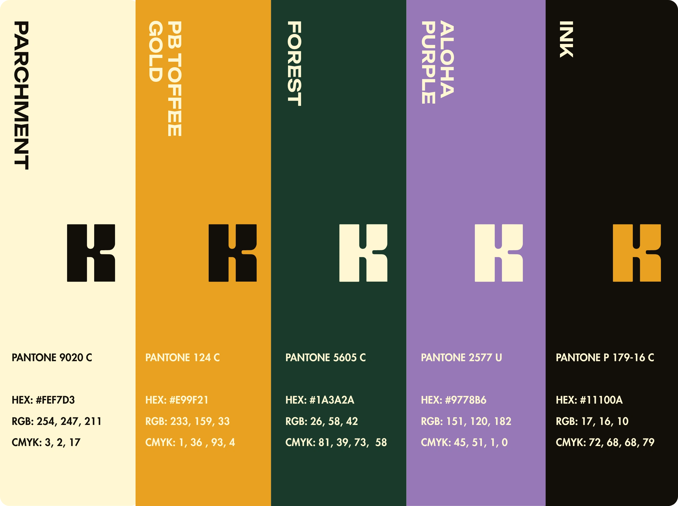
Color Palette
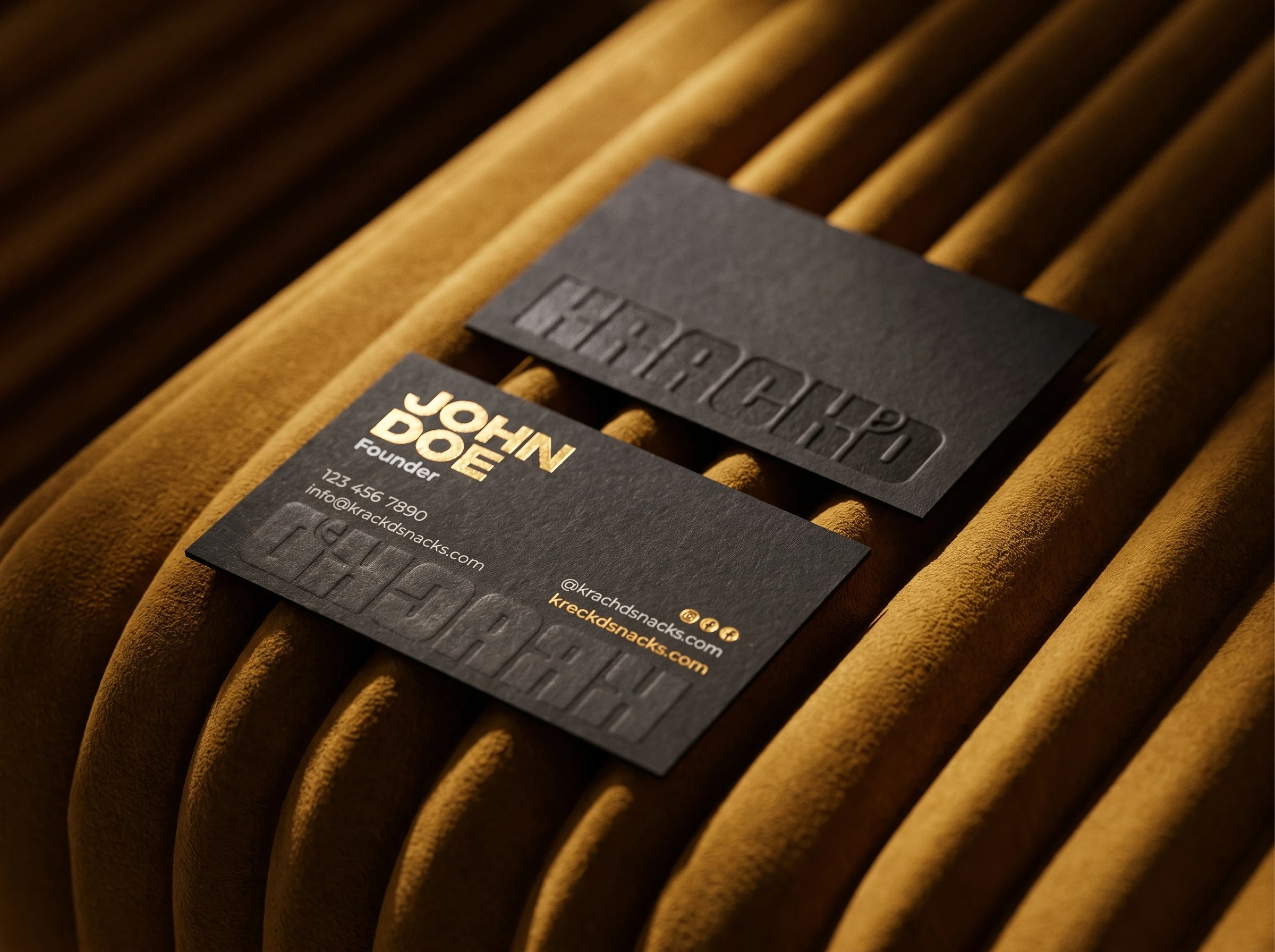
Business Cards
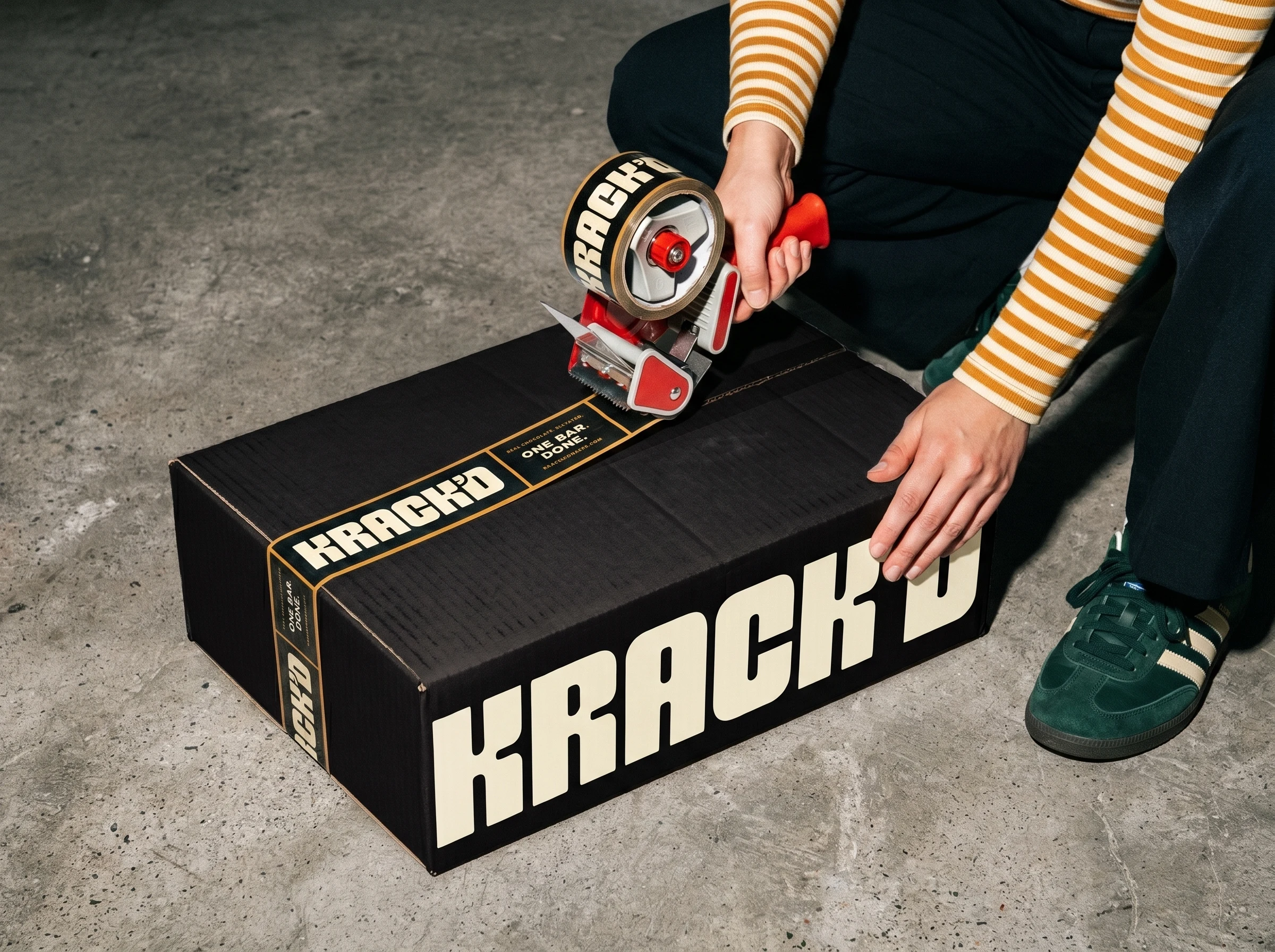
Tape Design
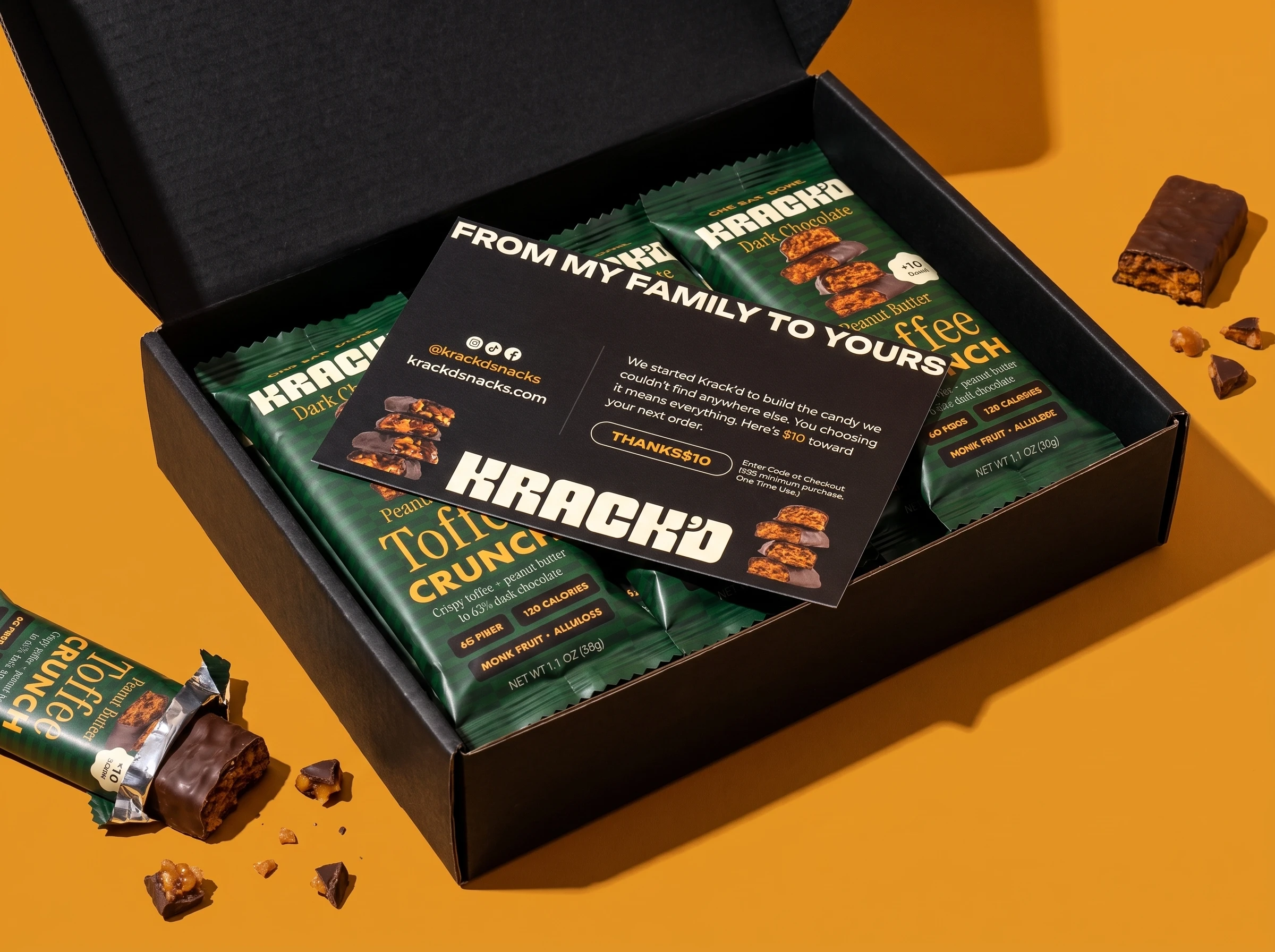
Insert Card
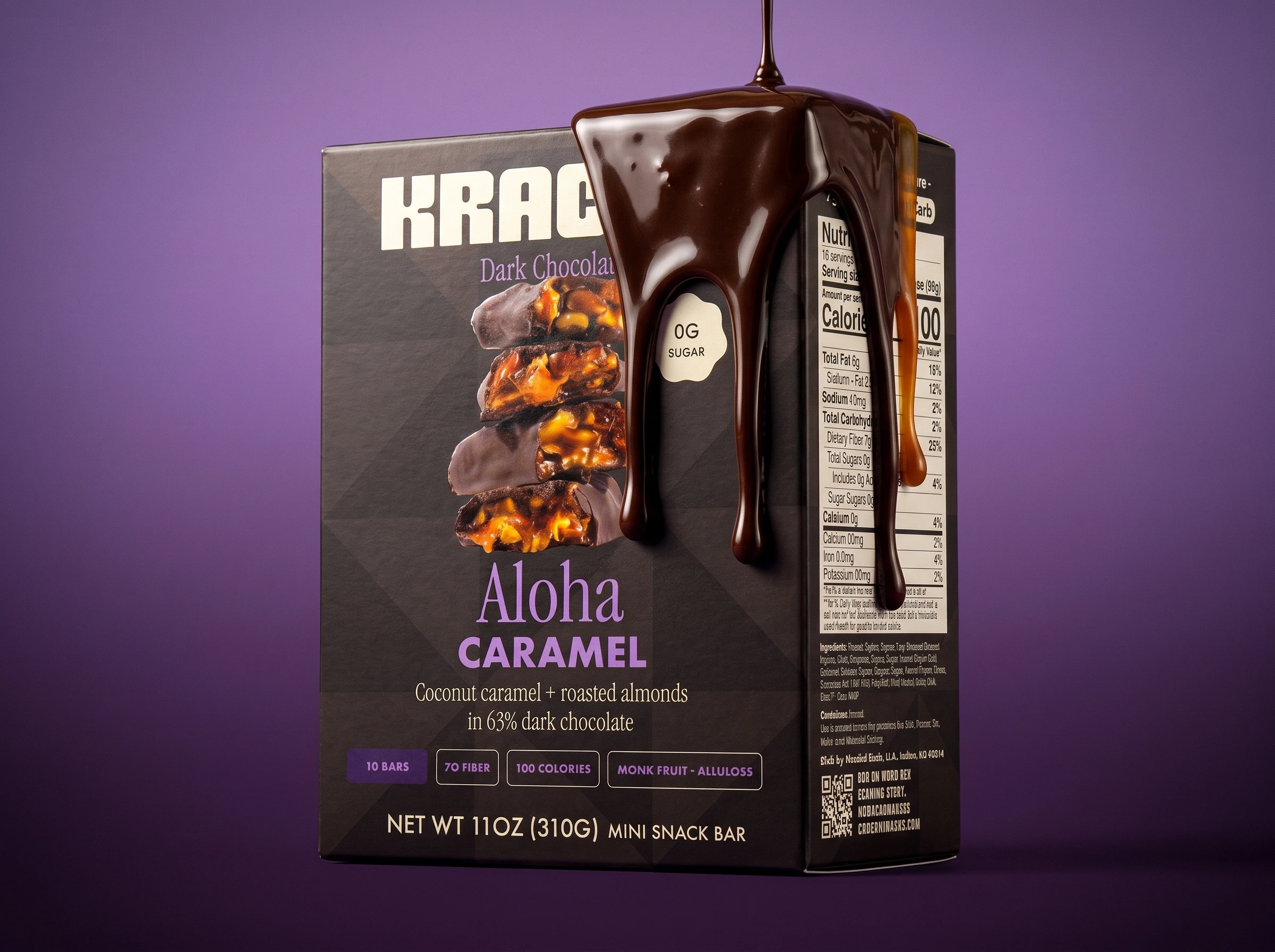
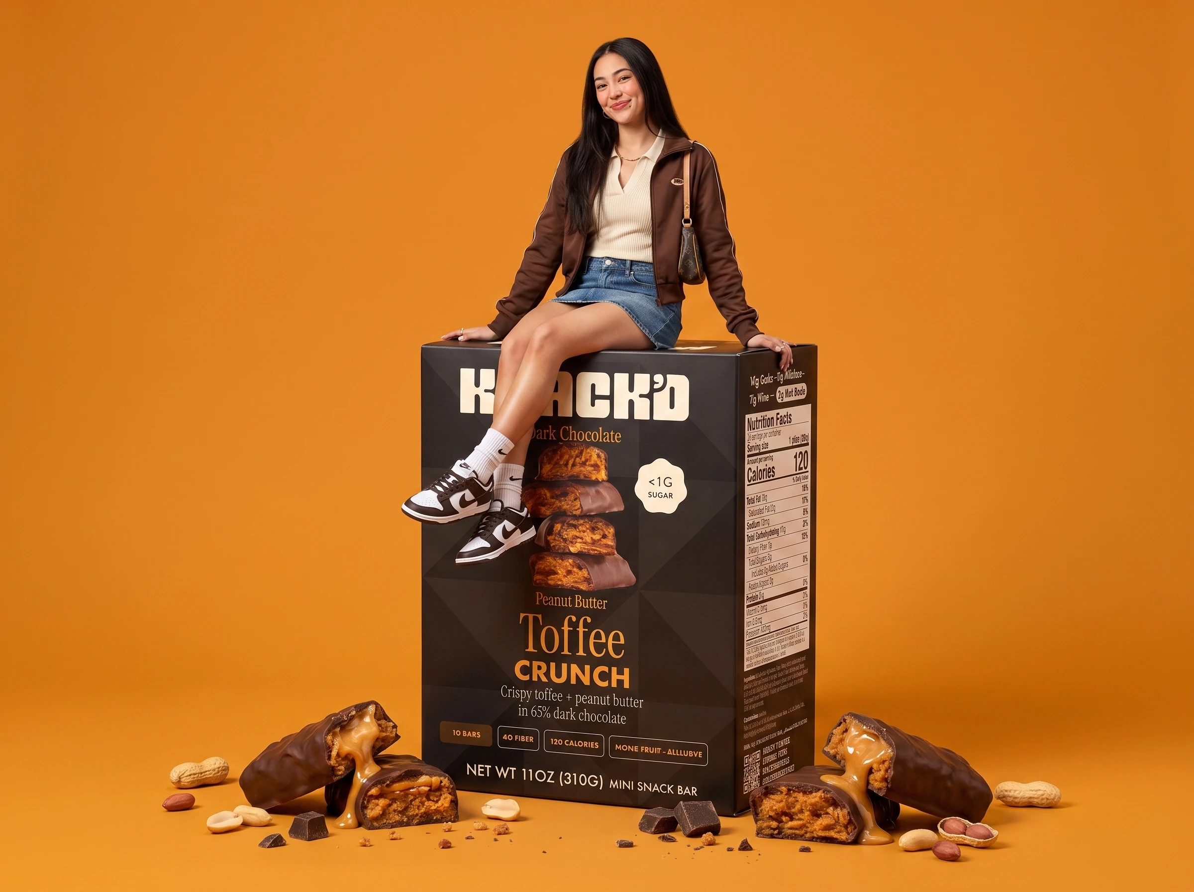
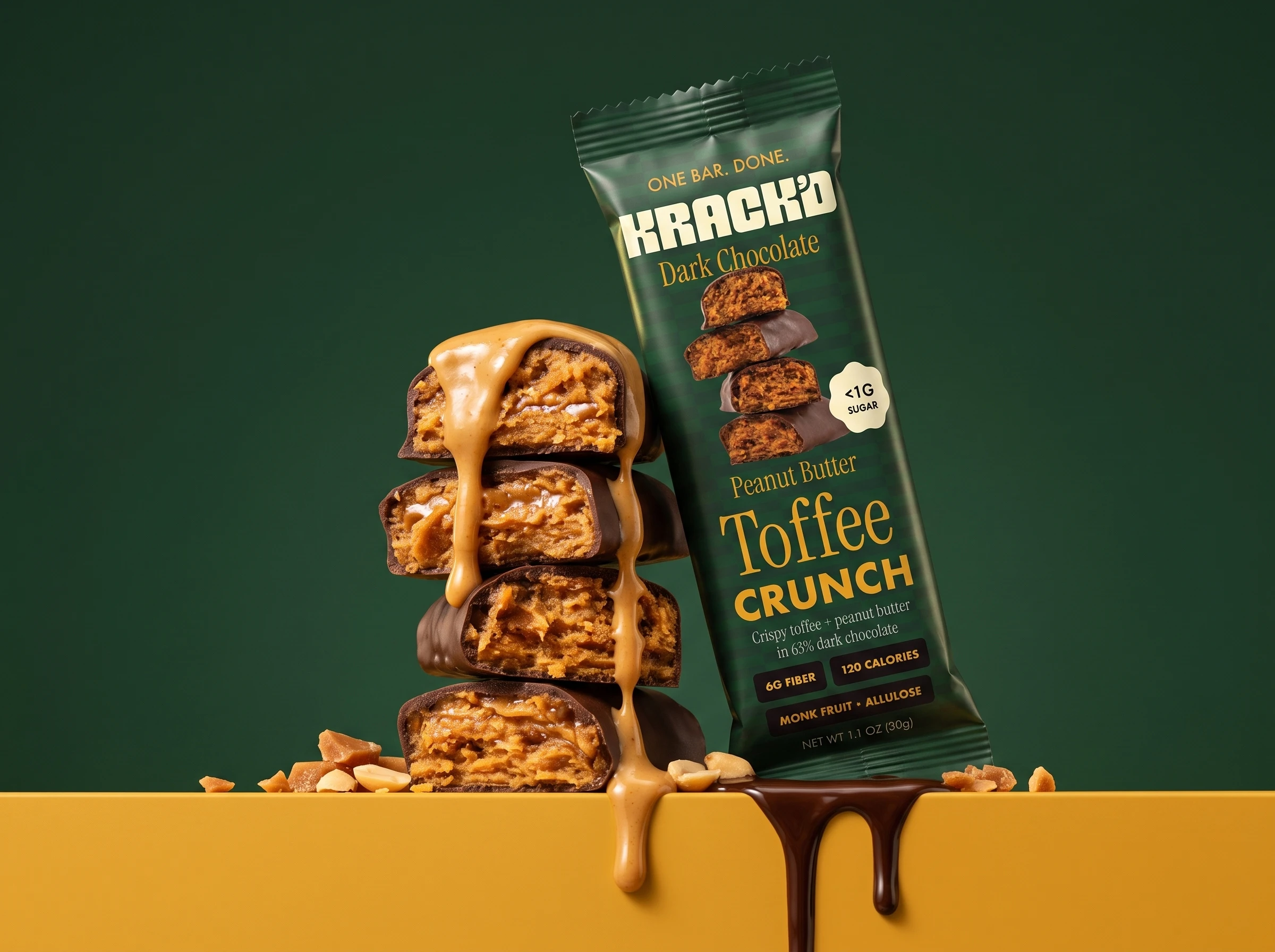
Credits: Wrapper artwork by client. Logo refinement, brand identity system, packaging applications, stationery, mockups, and creative direction by me.
Like this project
Posted Jul 30, 2026
Created a bold and premium logo, brand guidelines, product mockups, business cards and Insert Card Design for keto candy bar brand KRACK'D.
Likes
1
Views
15
Timeline
Jul 17, 2026 - Jul 30, 2026