Built with Framer
Filmmaking Workshop - Landing page design & development (Framer)
This project was built on a quick turnaround time of 24 hours!
The client was ready with the content and the brief was clear and straightforward forward hence the priority was to go live ASAP to test the waters on Instagram as to how would the audience respond to a workshop like this.
Here's a breakdown of the process:
Framer: Leveraging Framer's capabilities, I completely skipped designing the Website on Figma as the brief was a single-page website. This saved a lot of time for me as I could quickly publish the site as I built it section by section and got it approved on the go from my client.
Features -
A simple Hero Section with a subtle looping animation of the banner nudging the visitor to scroll below.
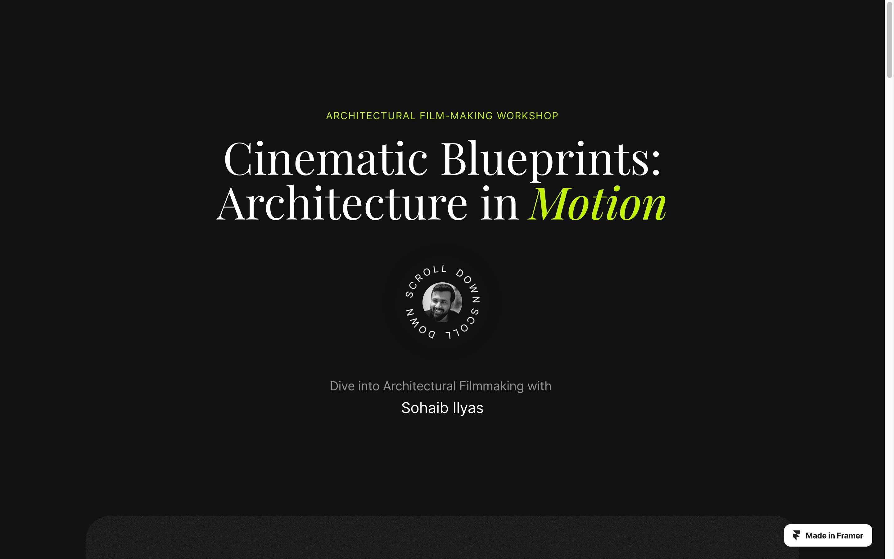
Landing page hero section
Next using the sticky effect and z index I created the different parts of the workshop to appear as a stack of cards that overlap with each other in perspective.
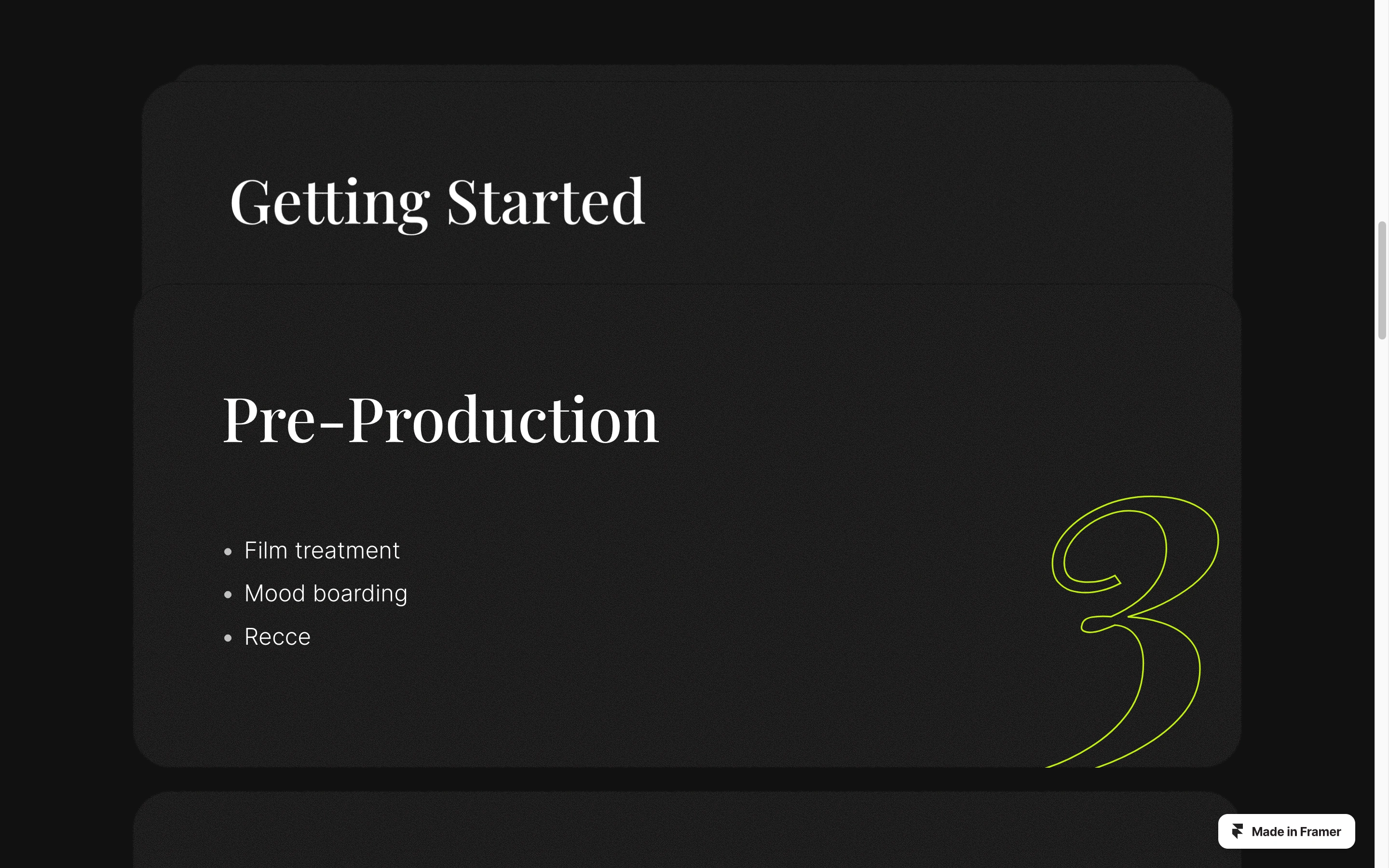
Stacking cards animation with sticky effect showing parts of the workshop
Other sections created include an About section to talk about the background and achievements of the person holding the workshop.
A subtle looping ticker displaying the clients he has worked with.
A FAQ section addressing some common questions that visitors might have
A minimalist footer displaying links to social media and the main website etc.
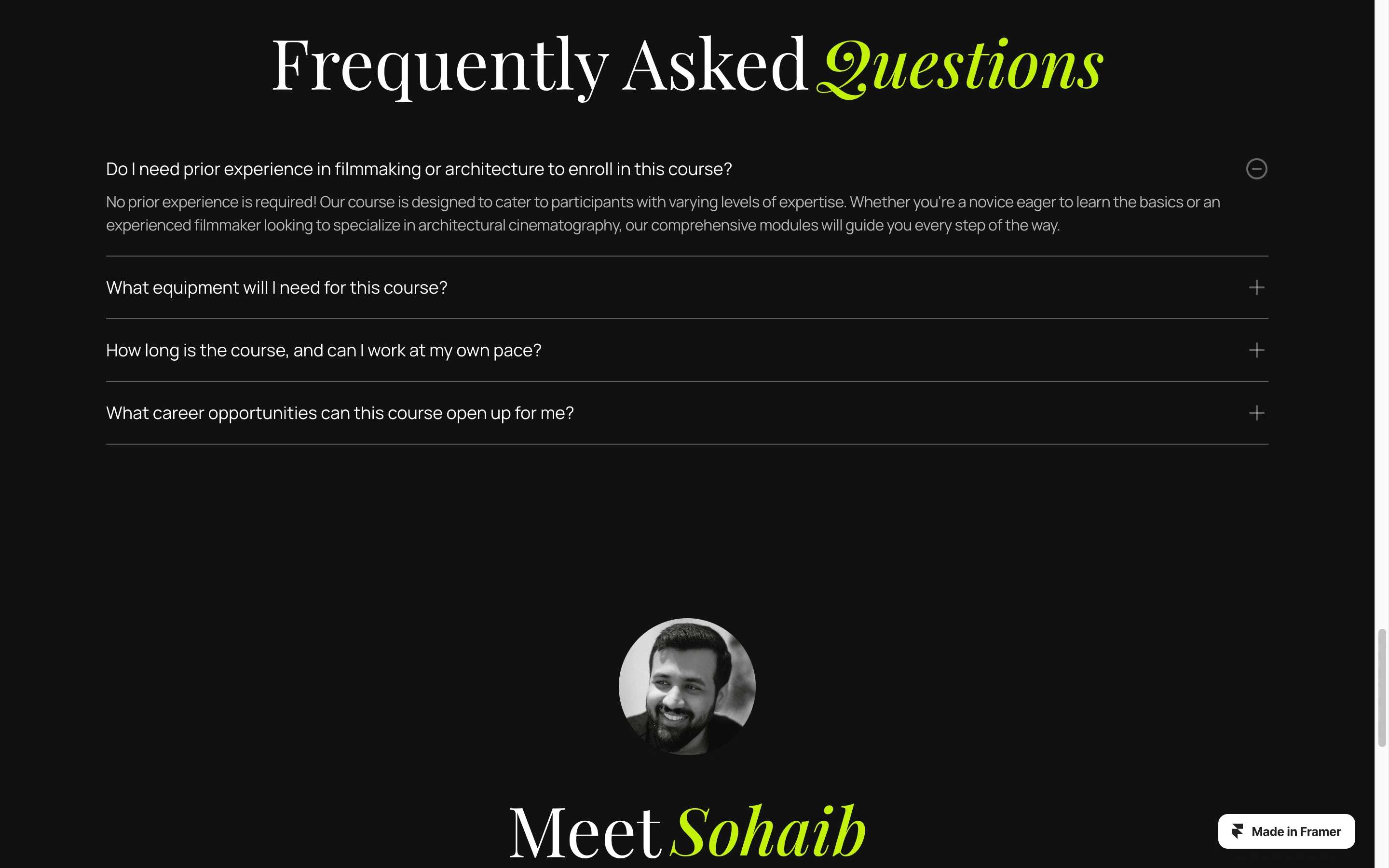
FAQ section
This project exemplifies my ability to deliver quick turnaround times while still delivering high-quality design. The client gathered a lot of insights by posting the link immediately on Instagram and got a massive response and suggestions which validated his idea and now I am in the process of making the final detailed workshop page.
Like this project
Posted May 26, 2024
A minimalist landing page for a workshop built on a quick turnaround time of 4 hours! [Web Design] [Style Guide] [Micro interactions]
