Built with Framer
Studio Recall – Architecture & Design Photography Website
This project involved crafting a captivating portfolio website for Studio Recall, a company specialising in architectural photography.
Studio Recall
Here's a breakdown of the process:
Design
Figma: I meticulously designed the landing page in Figma, focusing on a visually stunning layout that showcases Studio Recall's exceptional portfolio. The design prioritised a clear information hierarchy, compelling calls to action, and a user-friendly experience.
Development
Framer: Leveraging Framer's capabilities, I brought the Figma design to life, ensuring the landing page functioned flawlessly across various screen sizes (mobile, tablet, desktop). This responsive design approach guarantees a seamless user experience for potential clients visiting Studio Recall's website.
Homepage
The homepage features the latest project from the studio, which is nested in a mask to create a dramatic arrival on entry. Right after which a brief explanation sets the context for the visitor
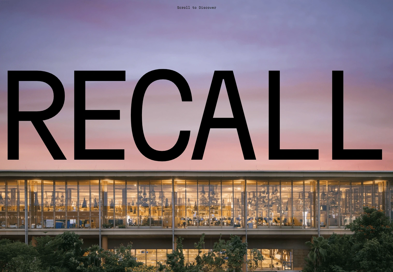
Hero Section Reveal
Featured projects
The Featured Section is built using a CMS collection list in Framer to quickly present the most recent and best work first, which later opens up the project page from the explore more works button.
Using the components Default, hover states are built into these buttons to display more info about the project title and the architect's names
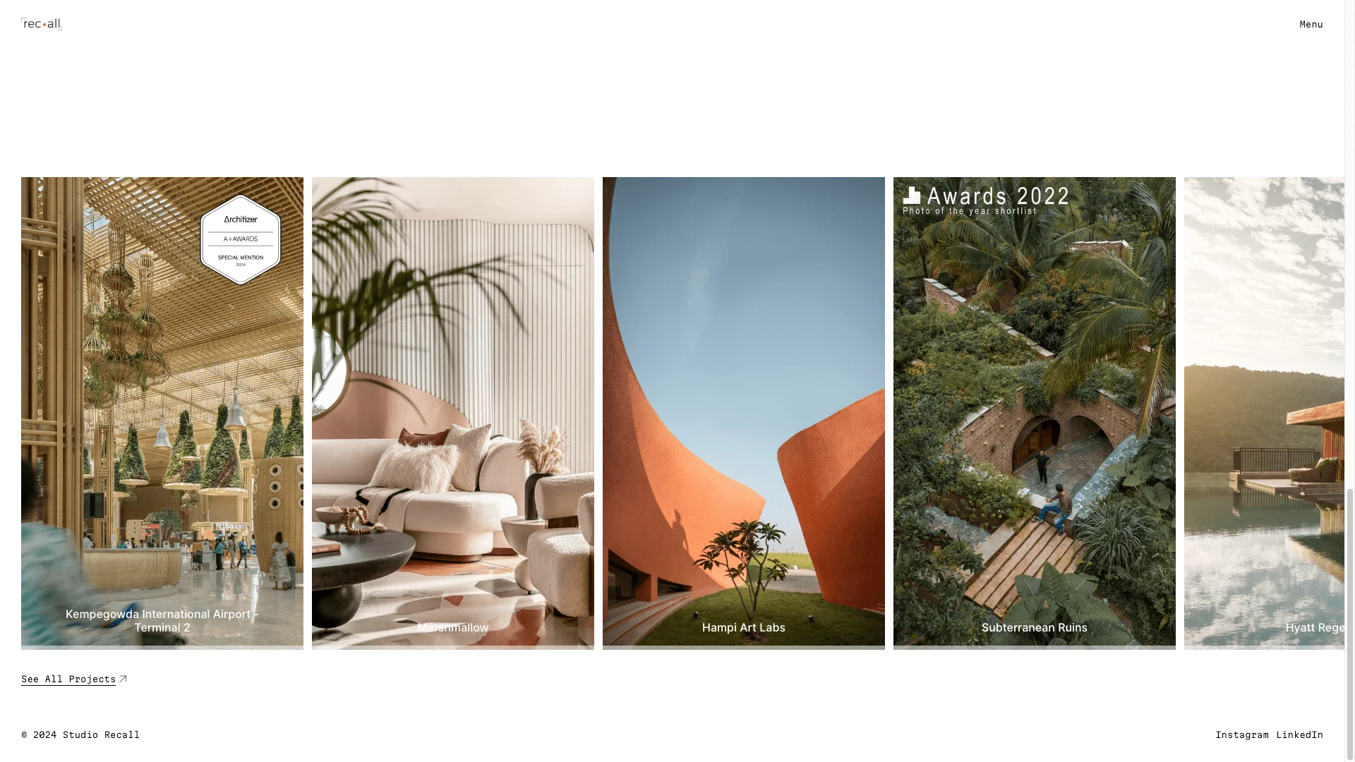
featured projects displayed on the homepage
Project Page
The Project page is meticulously designed using the CMS features in Framer so that the client can showcase important photos larger than the others. A hierarchy of Hero, Featured photo and a footer is set up to present all projects.
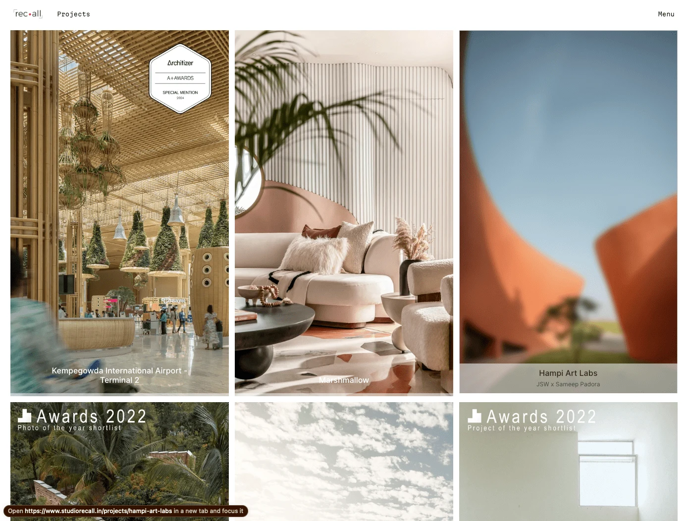
The projects page displays all the thumbnails in a responsive grid
Similar Projects
Another style of cards is created to host the featured project list at the end of each project page to give relevant suggestions and keep visitors interested in the projects.
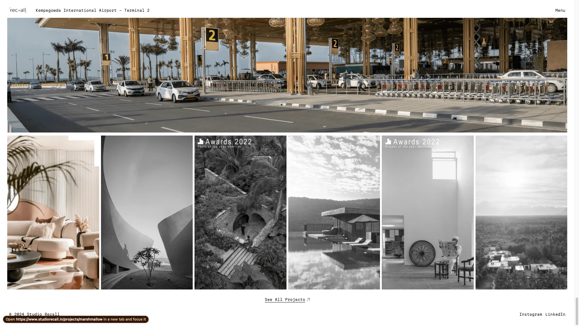
Suggestion cards at the end of the project page
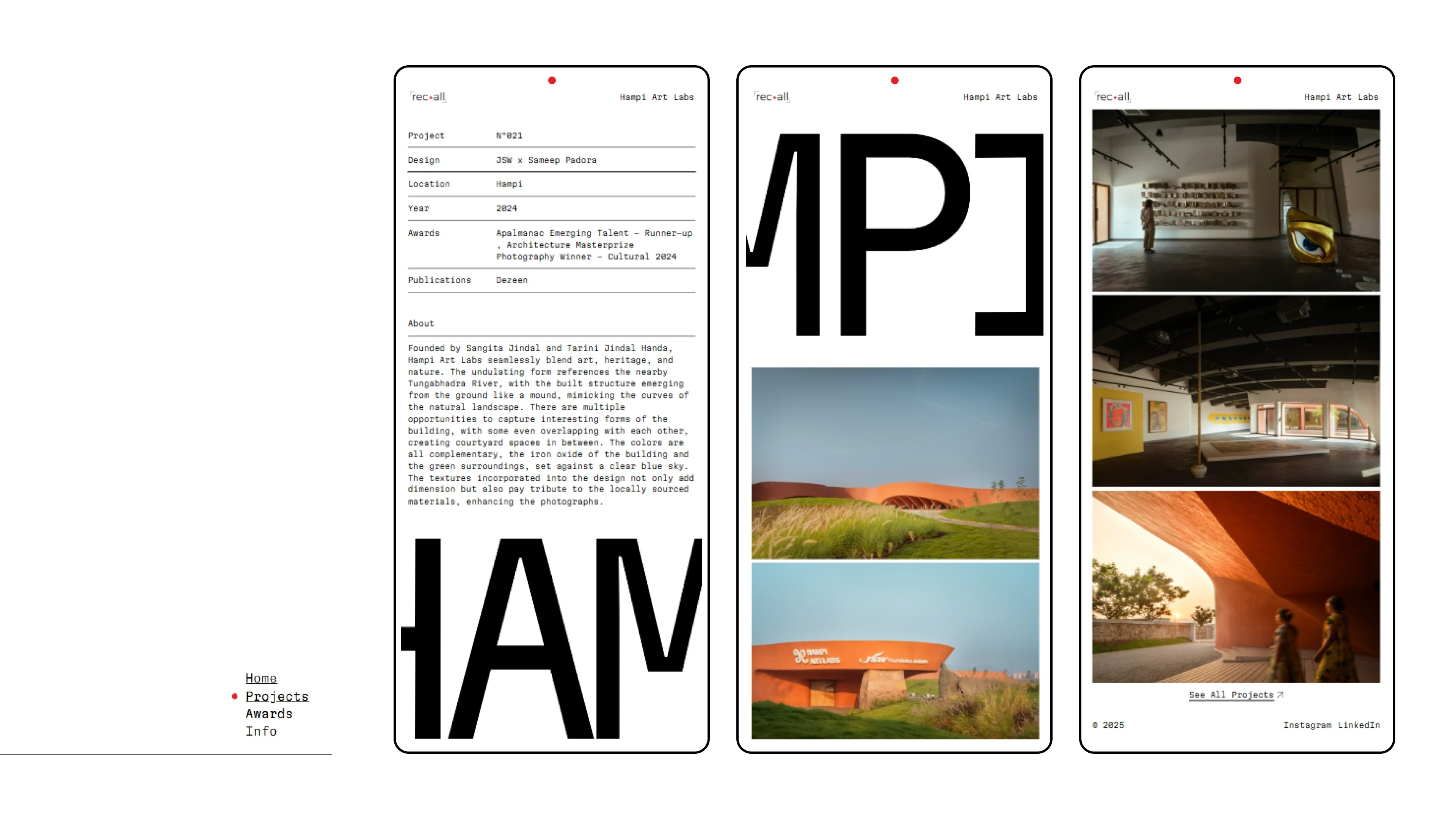
mobile design
Navigation
The navigation bar and its links are built inspired by the company's logo to mimic the pulsating recording red dot.
Other pages built include -
Info page to host all contact links, about the photographer and list clients.
Awards page to house all awards, honourable mentions and publications.
Strategy
All of this came into synergy because of an exhaustive mood board created with the client to include all their likes, dislikes, preferences, and inspiration from other websites and external sources along with gathering a detailed understanding of competitors in the field. The mood board also serves as the north star throughout the process to make design decisions and not veer off-course.
This project exemplifies my ability to translate design vision into a functional and visually appealing landing page. I understood the client's requirements by working on an exhaustive moodboardBy combining design expertise in Figma and development proficiency in Framer, I delivered a solution that effectively strengthened Studio Recall's online presence.
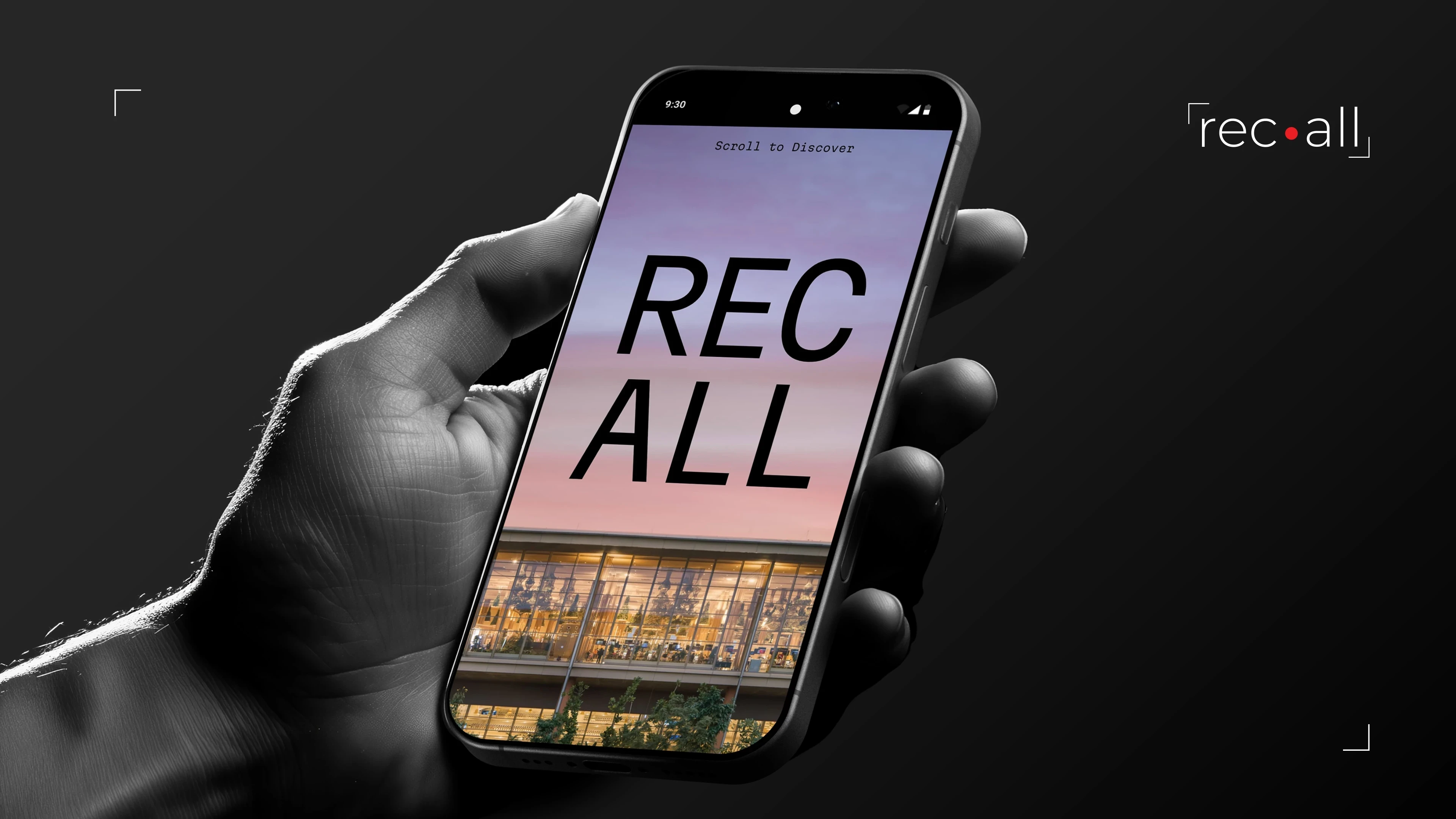
mobile cover
Like this project
Posted May 26, 2024
Studio Recall is a custom-built portfolio website built for a Award award-winning architectural Photography & videography Studio in India.
Likes
1
Views
52
Clients

Studio Recall


