Visual Identity Design for Edil Italiana
Luka Ivanovic
Introduction
Edil Italiana is a real estate company with over 20 years of experience in the industry. As the company continued to grow, it needed a visual identity that would reflect its reputation and position in the market. The objective was to create a modern, premium brand that communicates trust, quality, and proudly reflects the company's Italian roots.
Challenge
The challenge was to design a visual language that felt sophisticated and contemporary while preserving the character that had defined the business for two decades. A key requirement was to subtly express the company's Italian roots without relying on obvious national symbols or clichés, resulting in a timeless identity that would remain relevant for years to come.
Logo Design
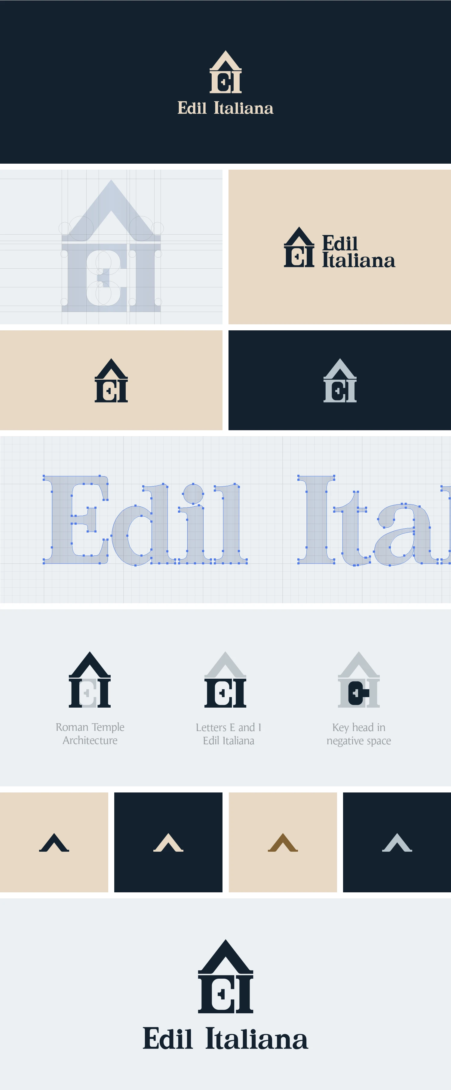
The logo was designed to express both the company's Italian identity and its expertise in real estate. Inspired by the timeless forms of Roman temple architecture, the symbol combines classical architectural elements with the company's initials to create a distinctive and memorable mark. A subtle use of negative space introduces a key head - a reference to property ownership.
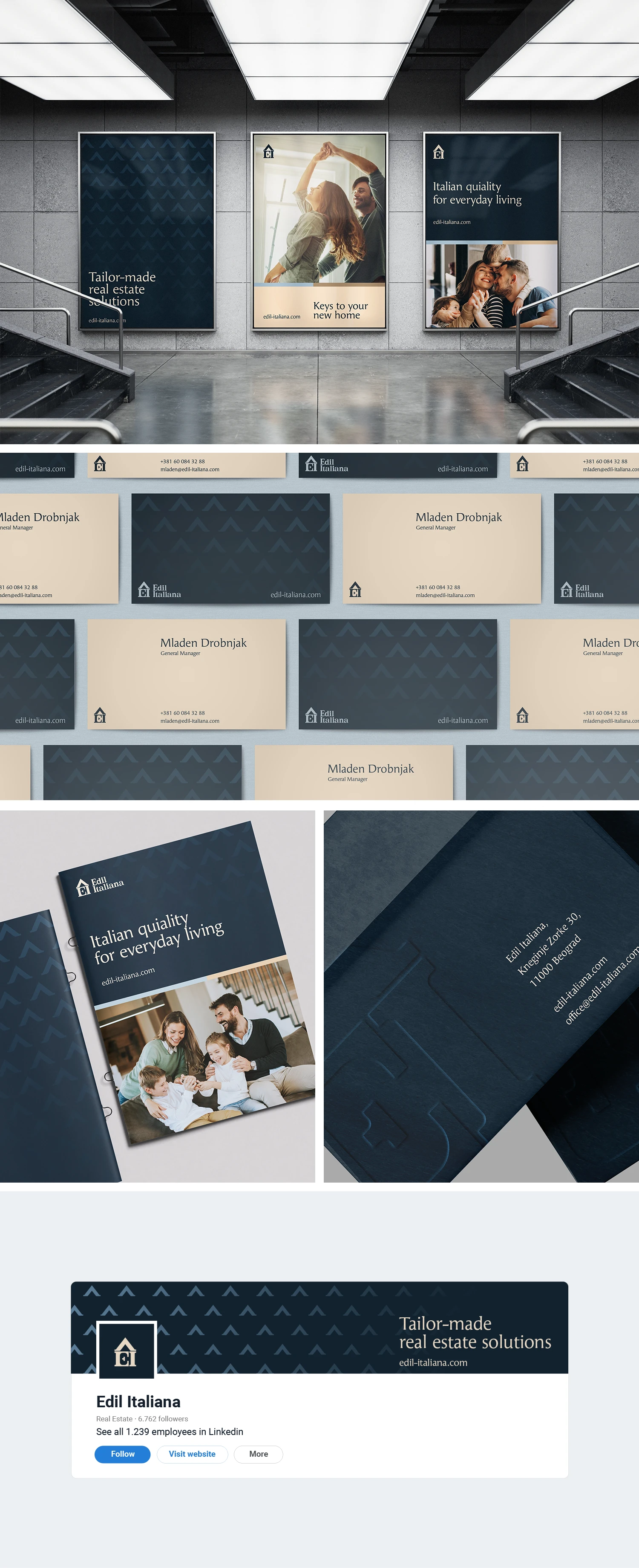
Visual identity
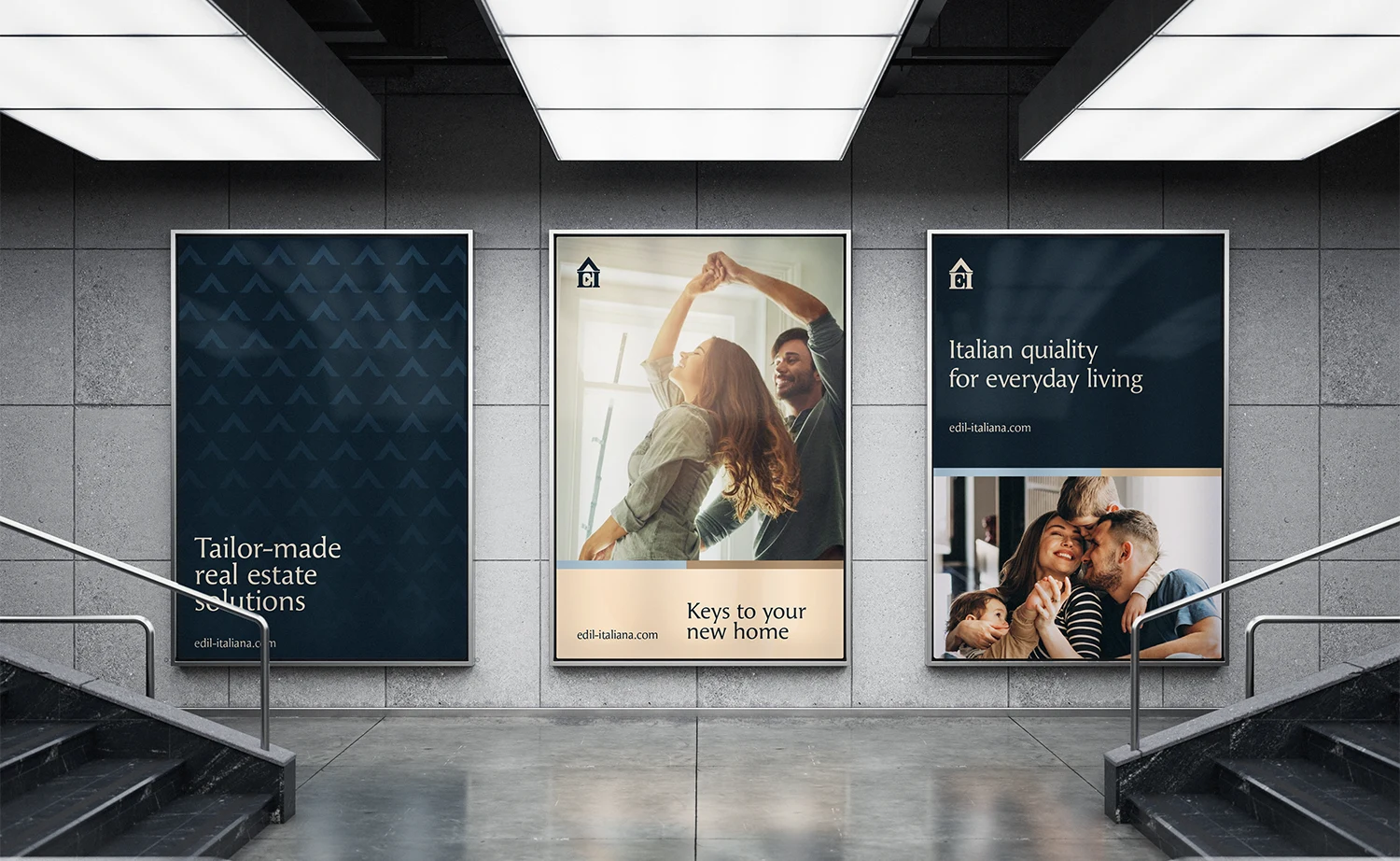
The visual identity extends the concept into a refined and cohesive brand system. A restrained color palette, elegant typography, architectural-inspired graphic elements, and carefully selected photography create a premium visual language that communicates professionalism and trust.
Like this project
Posted Jun 30, 2026
Designed a sophisticated visual identity for Edil Italiana, emphasizing Italian roots and expertise.