Fotona Energy Solutions Visual Identity
Luka Ivanovic
Introduction
Fotona Energy Solutions was a startup company entering the fast-expanding market of residential solar systems. They were looking for the visual identity that will distance them from the competition and become memorizable
Logo Design
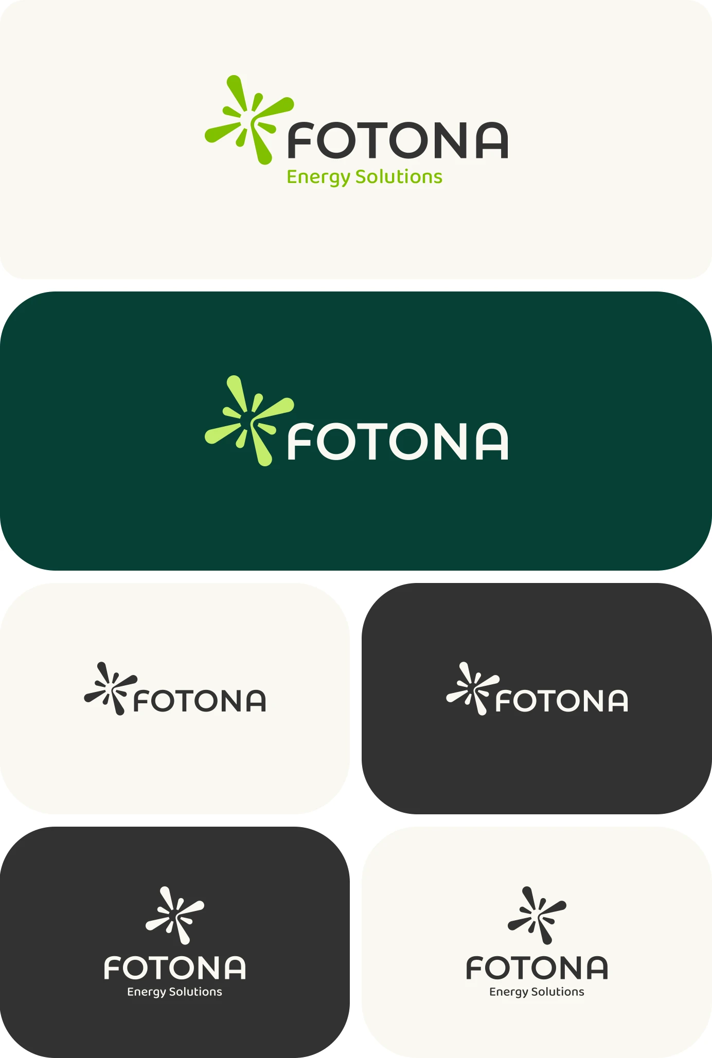
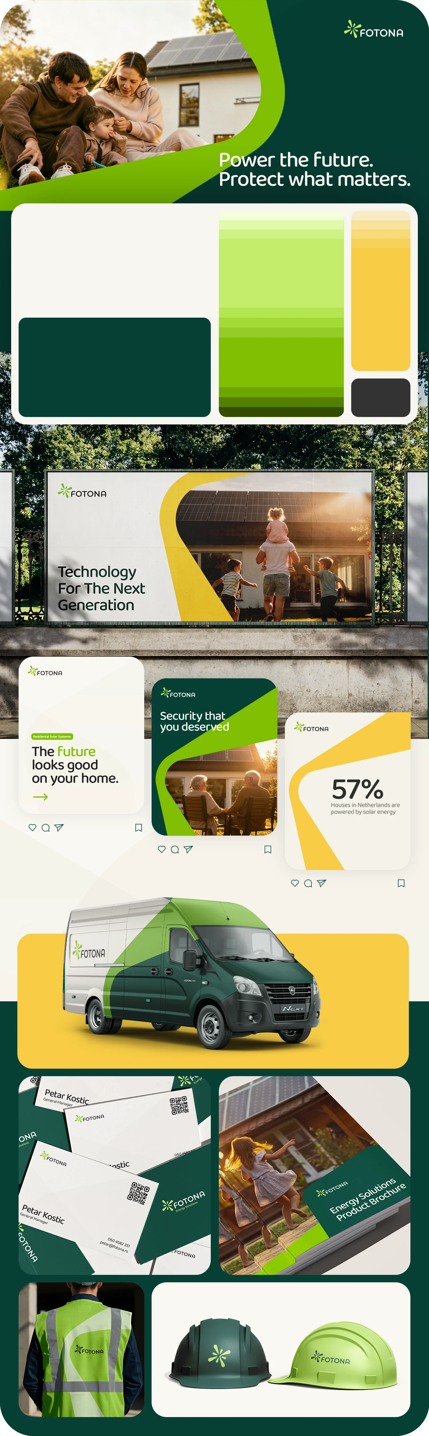
Name Fotona comes from the word Photon - the smallest possible particle of light, so we used that as the logo design starting point.
Photons are massless particles and travel at the speed of light, representing the fundamental unit of energy transmission. Inspired by this idea, the logo symbol visualizes a burst of light - the concept of solar energy.
The dynamic radial form expresses movement, power, and sunlight, while the clean geometry keeps the symbol professional, modern, and approachable. Letter F hidden in the symbol gives it uniqueness and connects it with the name. Together with the typography, the mark reflects Fotona’s role as a reliable provider of innovative long-term energy solutions.
Visual Identity
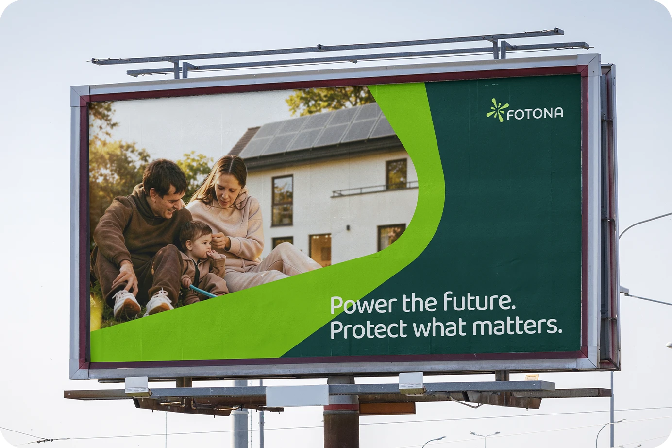
After taking a research at the market and its players, we noticed that the focus is mostly on technology, innovations, electricity etc. In order to create a truly unique and memorizable visual identity, we tried to shift the perspective and turn to people and their emotions.
Solar system represents investing in the future, and it comes as a product of a long-term vision. As the trigger for that investment we recognized peoples need for safety and security, and used it as a way to connect with the audience. The final product is not the solar system, it is the feeling of safety and stability.
We tried to create an identity that is modern and bold, but still approachable and human-oriented.
Like this project
Posted Jun 30, 2026
Designed logo and visual identity for Fotona Energy Solutions, highlighting solar energy and connection to people.